Rule of Thirds
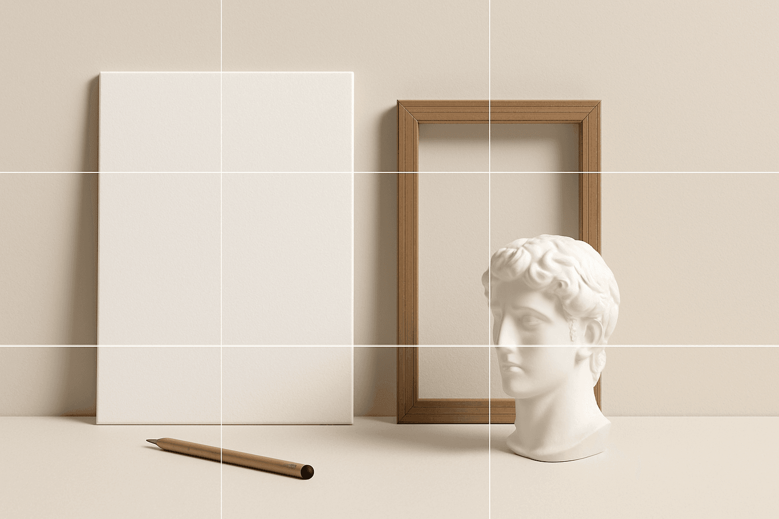
Rule of Thirds is a composition method that places the subject along imaginary thirds of the frame rather than exactly in the center.
Definition
Rule of Thirds is a composition method that places the subject along imaginary thirds of the frame rather than exactly in the center.
Visual Characteristics
- Off-center subject placement with balanced empty space.
- A natural editorial look often used in photography and film.
- Works well for portraits, landscapes, products, lifestyle, and business images.
Best Use Cases
- Portraits, lifestyle scenes, travel images, product photos, and editorial layouts.
- Images where designers need room for text on one side.
- Stock concepts about work, lifestyle, travel, wellness, and storytelling.
Prompt Examples
- A freelancer working by a window, rule of thirds composition, soft light, modern workspace.
- A hiker overlooking mountains, rule of thirds, golden hour, negative space in sky.
- A coffee product photo placed on the left third, warm tones, clean commercial layout.
Adobe Stock Potential
Rule of Thirds is excellent for commercial stock because it creates natural-looking images with room for copy. It is broadly useful across many categories.
FAQ
Is rule of thirds better than center composition?
It depends. Rule of thirds feels natural and editorial; center composition feels direct and formal.
How do I prompt for copy space?
Combine rule of thirds with negative space or room for text.
Continue Exploring
Related Prompts
Negative Space
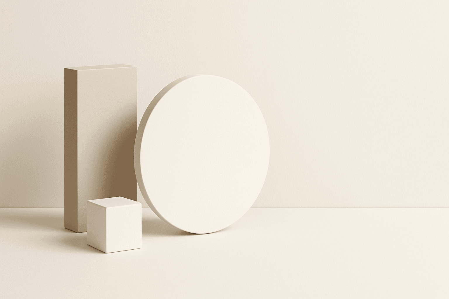
Negative Space is the empty or quiet area around a subject. In AI prompts, it creates cleaner compositions and gives designers room for text, logos, or layout elements.
Leading Lines
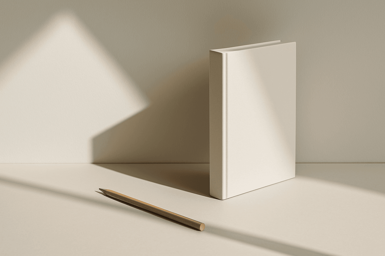
Leading Lines are visual lines that guide the viewer's eye toward a subject or deeper into the scene. In AI prompts, they improve depth, direction, and composition.

Diagonal Composition
Diagonal composition is a popular and effective technique used in photography, painting, and design to enhance visual interest. By positioning important elements along diagonal lines instead of horizontal or vertical axes, the image gains a dynamic flow that naturally draws the viewer’s eyes through the scene. This approach breaks away from static layouts, injecting energy and a sense of motion. Using diagonals can also create depth by suggesting perspective or distance within flat images. Photographers often look for strong lines in the environment—like roads, rivers, or architectural details—to compose their shots diagonally. The result is an engaging, well-balanced image that feels both harmonious and lively, suitable for a variety of creative contexts.
Diagonal Movement Layout
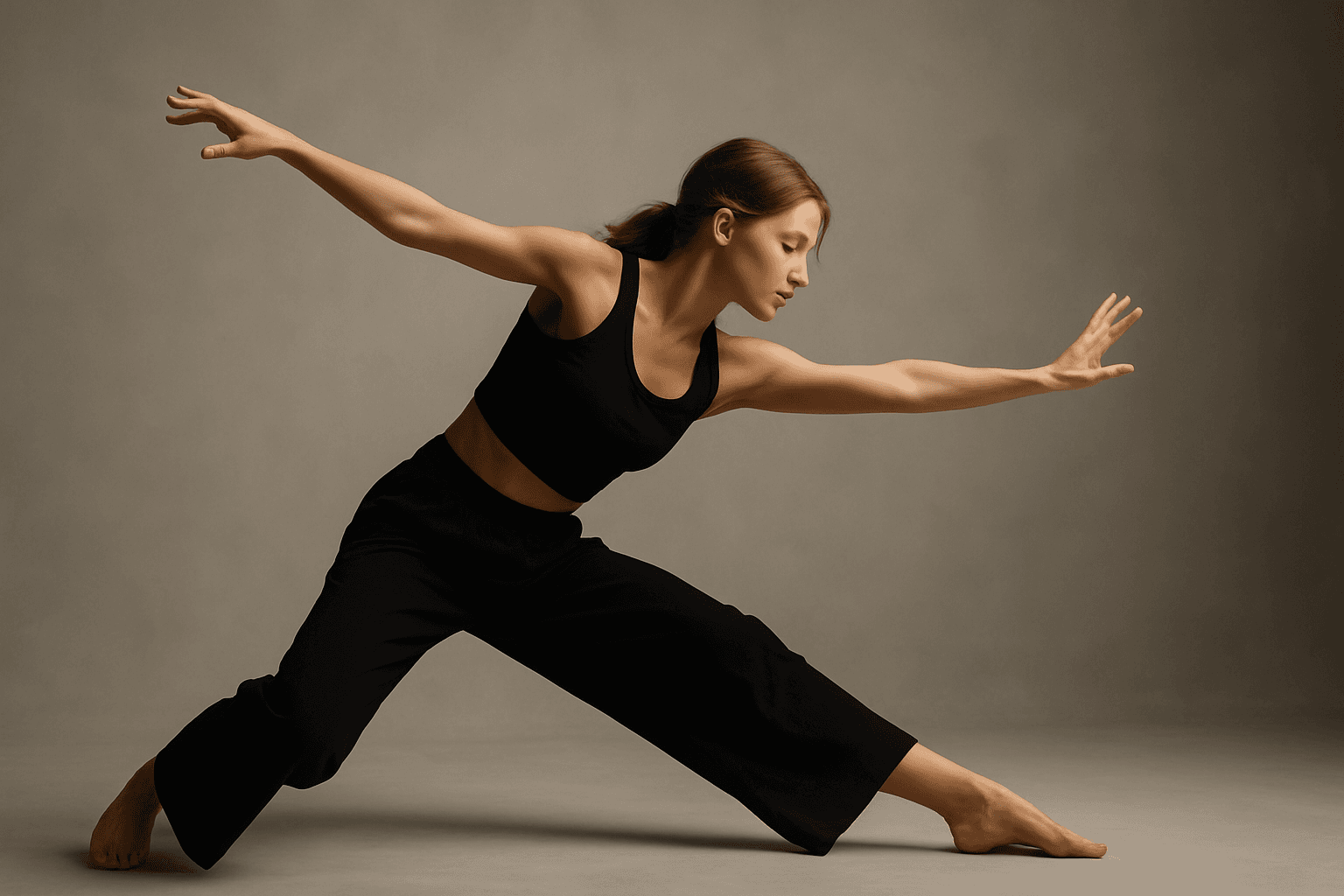
Diagonal Movement Layout is a popular visual strategy in creative imagery that infuses energy and direction into a composition. By aligning main subjects, backgrounds, or elements along diagonal axes, AI-generated images achieve a feeling of flow and progression that captures viewers' attention. This approach contrasts with static horizontal or vertical layouts by introducing tension and rhythm. Using this layout in AI prompts, artists and designers can create more engaging visuals for editorial, advertising, and artistic uses where motion and storytelling are key.

Dynamic Asymmetric Layout
Dynamic asymmetric layouts break away from the predictability of centered designs by introducing imbalance that attracts the viewer's eye across the composition. This style is widely used in editorial design, advertising, and digital media to convey energy, modernity, and sophistication. By emphasizing contrast and selective clustering, the layout guides attention strategically without relying on rigid balance. In AI image generation, specifying dynamic asymmetric layout in your prompt encourages the model to produce visually compelling scenes with elements arranged unevenly yet harmoniously, enhancing the overall narrative or mood of the image. This approach works particularly well for premium stock images and design headlines where a clean, polished look with subtle depth is desired.

Center Composition
Center Composition places the main subject in the middle of the frame. It creates clarity, focus, and a direct visual message.