AI prompt encyclopedia
Discover the Perfect AI Prompt Style
Browse curated prompt categories, styles, and keywords for Midjourney, ChatGPT, Flux, Stable Diffusion, and more.
7
Categories
208
Keyword guides
5
AI tools
Prompt style starter kit
Popular picks
Start with structure
Popular Categories
Explore the core building blocks behind stronger AI images: light, mood, layout, style, color, surfaces, and commercial use cases.
Lighting
41Prompt keywords for shaping light direction, quality, glow, and photographic drama.
Explore Lighting
Atmosphere
30Mood-setting language for emotion, haze, weather, ambience, and cinematic tone.
Explore Atmosphere
Composition
27Framing and visual structure keywords that guide layout, focus, and balance.
Explore Composition
Style
29Aesthetic directions for design languages, eras, interiors, and visual identity.
Explore Style
Color
32Palette keywords for controlling temperature, contrast, softness, and brand feeling.
Explore Color
Texture & Material
32Surface and material cues for tactile realism, reflection, luxury, and craft.
Explore Texture & Material
Commercial Use
17Keywords tuned for stock imagery, ads, branding, product visuals, and business assets.
Explore Commercial Use
High-impact terms
Trending Keywords
Start with versatile prompt keywords that improve image quality, visual style, and commercial usefulness.
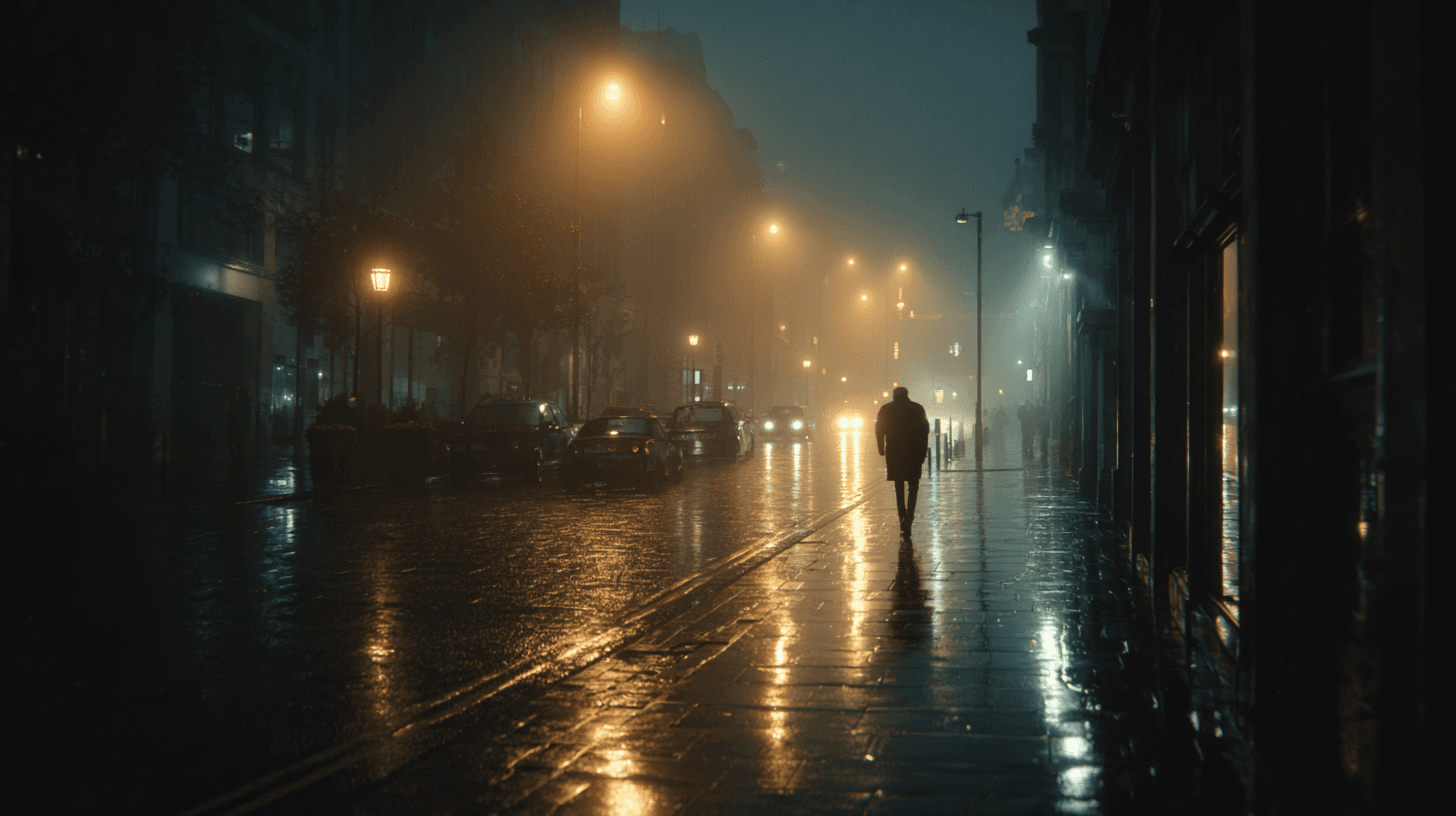
Cinematic Lighting
Cinematic Lighting is one of the most useful prompt keywords for making AI-generated images feel intentional, polished, and story-driven. Instead of asking for a flat, evenly lit image, this keyword signals that the scene should feel as if it was lit for a film, commercial, or high-end editorial shoot. The result often includes stronger direction in the light source, more purposeful shadows, richer contrast, and a clearer sense of atmosphere. For beginners, it is a reliable way to move an image away from a generic render and toward something that feels composed, dramatic, and visually memorable.
View keyword

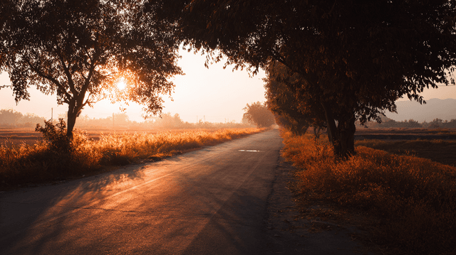
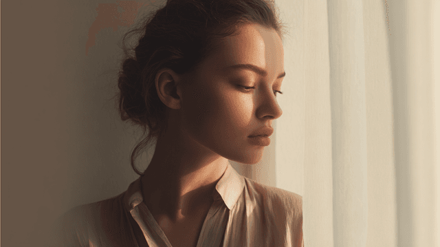
Golden Hour
Golden Hour is a lighting keyword that refers to the warm, low-angle sunlight shortly after sunrise or shortly before sunset. In AI image prompts, it is one of the easiest ways to make a scene feel natural, emotional, and commercially appealing. The light is usually softer than midday sun, the shadows are longer, and the color temperature leans warm. This makes subjects feel more flattering and environments feel more inviting. For beginners, Golden Hour is a dependable keyword because it improves mood without requiring a complicated lighting setup. It works for people, landscapes, products, interiors, food, travel scenes, and lifestyle imagery.
View keyword
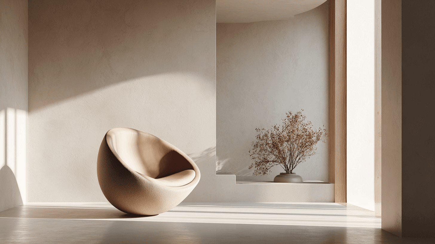
Minimalist
Minimalist is a style keyword that emphasizes simplicity, clarity, and restraint. In AI image prompts, it helps remove visual clutter and creates images that feel calm, modern, and easy to use in real design projects. A minimalist image usually has fewer objects, cleaner backgrounds, more negative space, and a clearer focal point. This makes it especially useful for commercial work because designers often need images that can support text, branding, or layout elements. For beginners, Minimalist is one of the best keywords to use when a generated image feels too busy, decorative, or hard to read.
View keyword
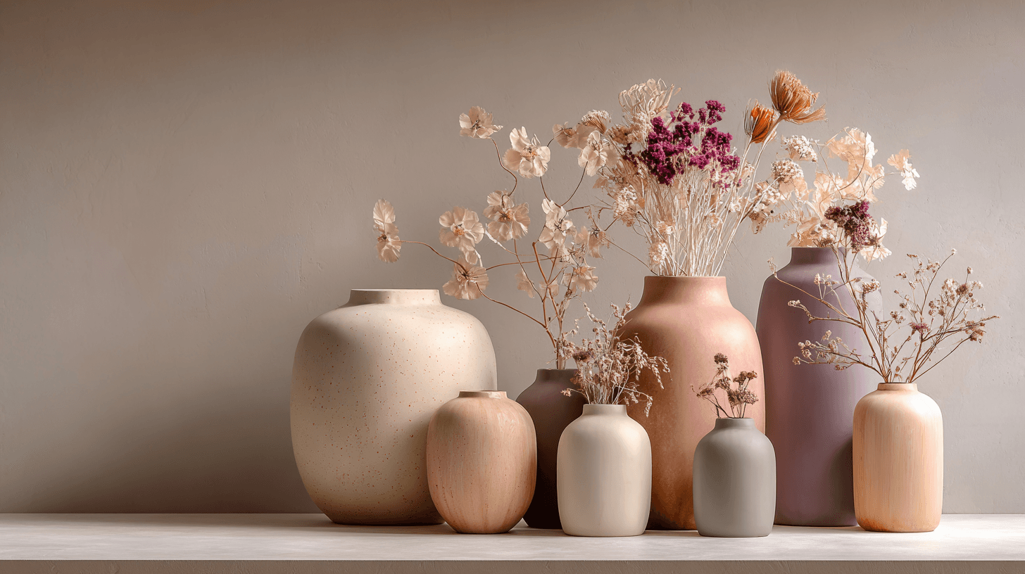
Morandi Palette
Morandi Palette is a color keyword inspired by the quiet, dusty tones associated with painter Giorgio Morandi. In AI image prompts, it usually points the model toward muted, low-saturation colors such as dusty rose, warm gray, clay, sage, beige, soft blue, faded mauve, and stone. The effect is refined, calm, and slightly editorial. This palette is useful when you want an image to feel sophisticated without becoming cold or overly minimal. For beginners, Morandi Palette is a practical way to control color harmony. It can make a scene feel more tasteful, cohesive, and brand-ready, especially when default AI colors look too bright or artificial.
View keyword
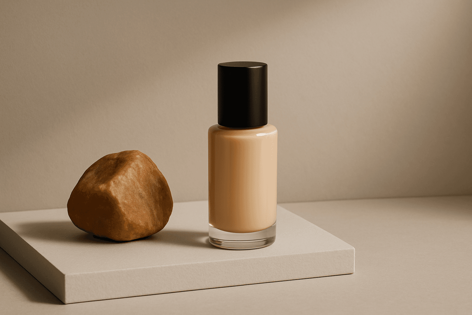
Product Photography
Product Photography is a prompt keyword for clear, sellable images focused on a product. It emphasizes lighting, staging, surface, material, and commercial clarity.
View keyword
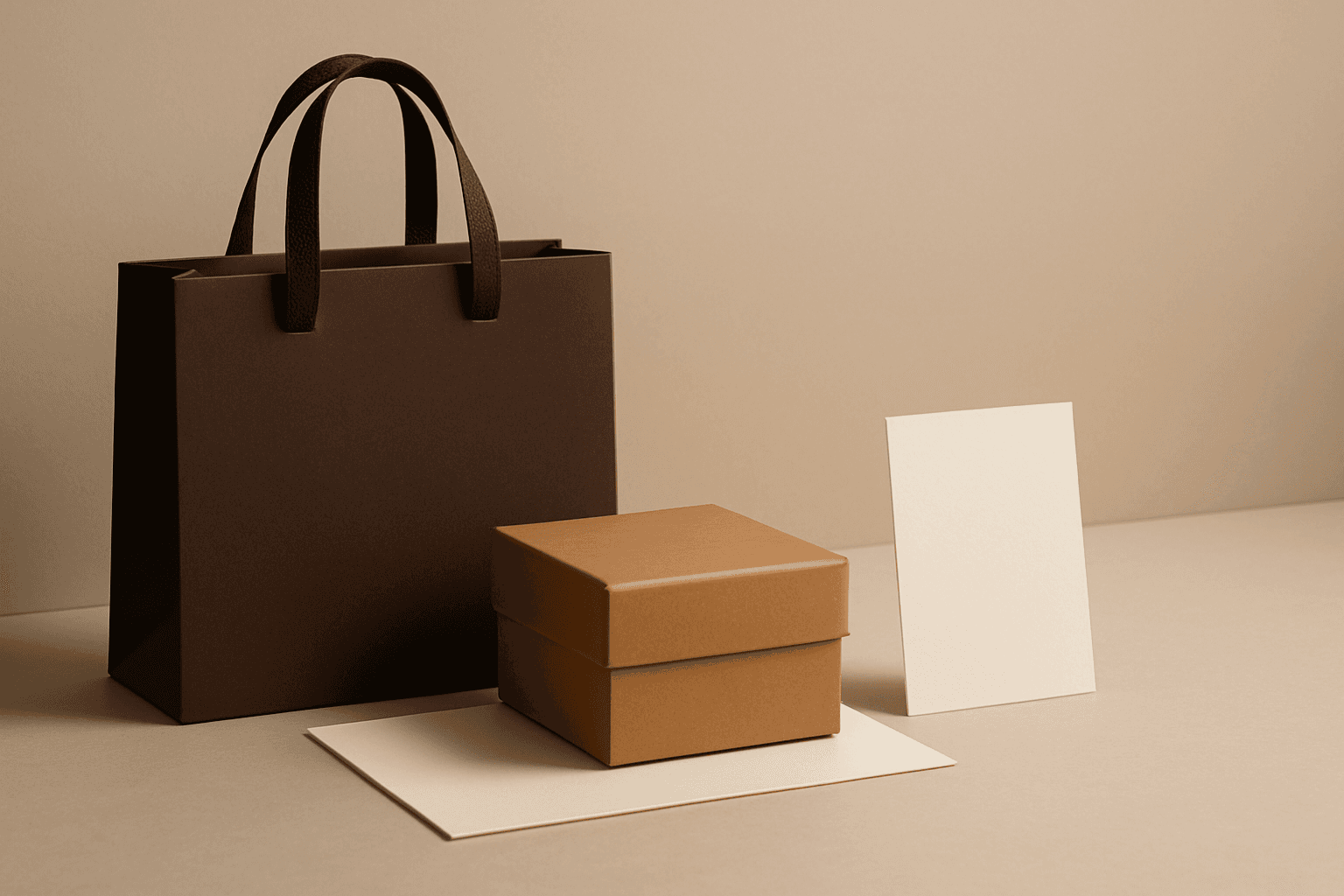
Luxury Branding
Luxury Branding is a commercial style keyword for elegant, premium, restrained images that suggest quality, exclusivity, and high perceived value.
View keyword
Recently added
Latest Guides
New keyword pages from the PromptAtlas content library, ready for practical AI image prompting.

Split Lighting Technique
Split lighting is a classic photographic lighting technique widely used for portraits to craft dramatic and intense images. When applied in AI image prompts, it guides the generation to simulate this lighting style by illuminating one half of the subject brightly while casting the other half in shadow. This technique enhances depth and character, often lending a mysterious or serious tone to portraits. It is especially effective for emphasizing facial features, textures, and emotional expressions. Utilizing split lighting in AI art allows creators to generate compelling, high-contrast images that stand out in editorial, commercial, or artistic contexts.
View keyword
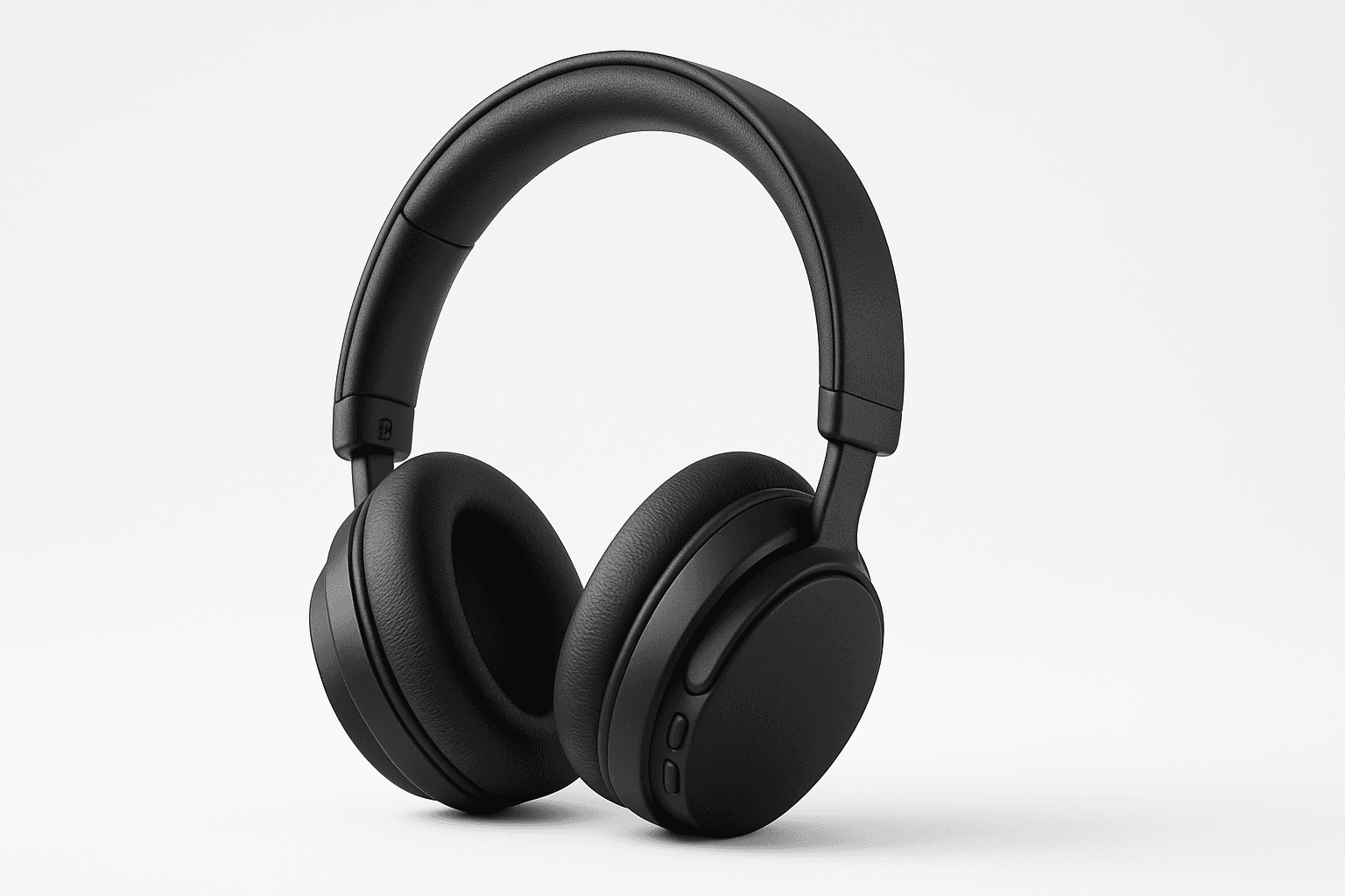
Ecommerce Product Photography
Ecommerce Product Photography as an AI prompt keyword is essential for creating appealing product images suitable for online stores and catalogs. It guides the AI to render products with clarity and a commercial polish that enhances their attractiveness to potential buyers. This style emphasizes minimalistic compositions and true-to-life textures, ensuring products appear tangible and appealing on digital platforms. Using this keyword helps content creators, marketers, and designers rapidly produce consistent, high-quality product imagery without a physical photoshoot.
View keyword

Stock Image Marketing Use
Incorporating the keyword 'Stock Image Marketing Use' into your AI image prompts ensures the generated visuals are optimized for commercial marketing applications. This keyword steers the AI towards producing images that embody clarity, professionalism, and adaptability—qualities essential for effective marketing content. It emphasizes a modern, polished aesthetic with clean compositions and realistic textures, suitable for hero images, website banners, or promotional materials. Utilizing this keyword helps designers and marketers quickly obtain images that resonate with target audiences and align with brand standards, eliminating the need for extensive post-processing or adjustments.
View keyword
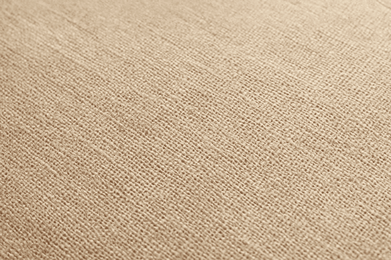
Textured Canvas Material
Using the textured canvas material keyword in AI image generation simulates the look and feel of real canvas fabric, widely appreciated in art and design fields. It brings a traditional, handcrafted quality to digital images, making them appear as if printed or painted on a physical canvas. This effect improves the sensory richness and realism of images, especially paintings, portraits, or background textures. Digital artists and content creators can use this keyword to add authentic fabric texture without manually editing textures, saving time while enhancing visual appeal.
View keyword
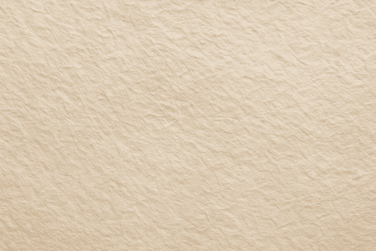
Paper Fiber Texture
Paper Fiber Texture in AI-generated images enhances realism by simulating the microscopic fibers found in physical paper. This texture adds subtle detail and tactile qualities to artwork, making backgrounds or materials appear organic and handcrafted. When included in prompts, it helps models focus on delicate and uneven surfaces rather than flat or overly smooth ones. This keyword is especially useful in designs needing authenticity or vintage aesthetics, offering an alternative to digital or synthetic textures. It works well combined with lighting descriptions to highlight the tactile aspects of the fibers and create refined editorial visuals.
View keyword
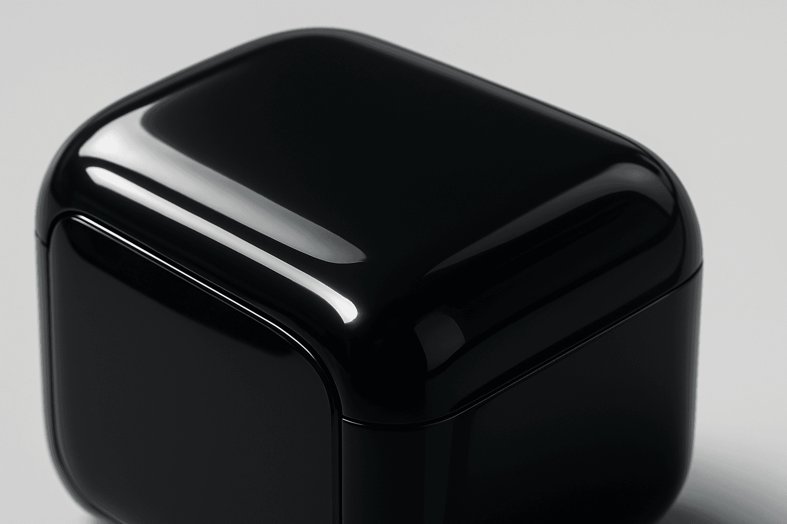
Glossy Plastic Surface
Adding 'Glossy Plastic Surface' in AI prompts introduces a sleek, shiny material effect that mimics polished plastic. This texture conveys a modern, manufactured feel, often used to depict objects with synthetic coatings or stylish packaging. The characteristic shine results from simulated light reflections, creating distinct highlight spots and smooth gradients that emphasize surface smoothness. This keyword helps differentiate images by adding an artificial luster, elevating the material realism in digital renders and creative compositions.
View keyword