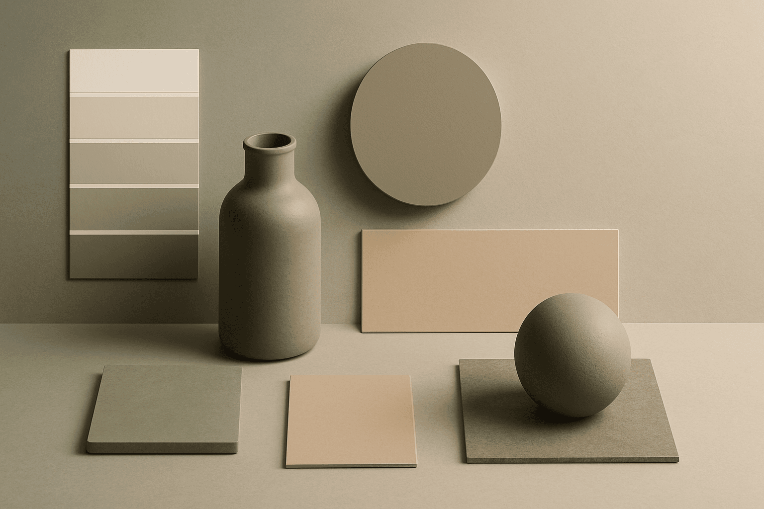
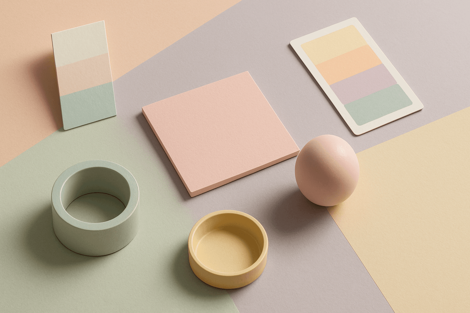
Morandi Palette
Morandi Palette is a color keyword inspired by the quiet, dusty tones associated with painter Giorgio Morandi. In AI image prompts, it usually points the model toward muted, low-saturation colors such as dusty rose, warm gray, clay, sage, beige, soft blue, faded mauve, and stone. The effect is refined, calm, and slightly editorial. This palette is useful when you want an image to feel sophisticated without becoming cold or overly minimal. For beginners, Morandi Palette is a practical way to control color harmony. It can make a scene feel more tasteful, cohesive, and brand-ready, especially when default AI colors look too bright or artificial.
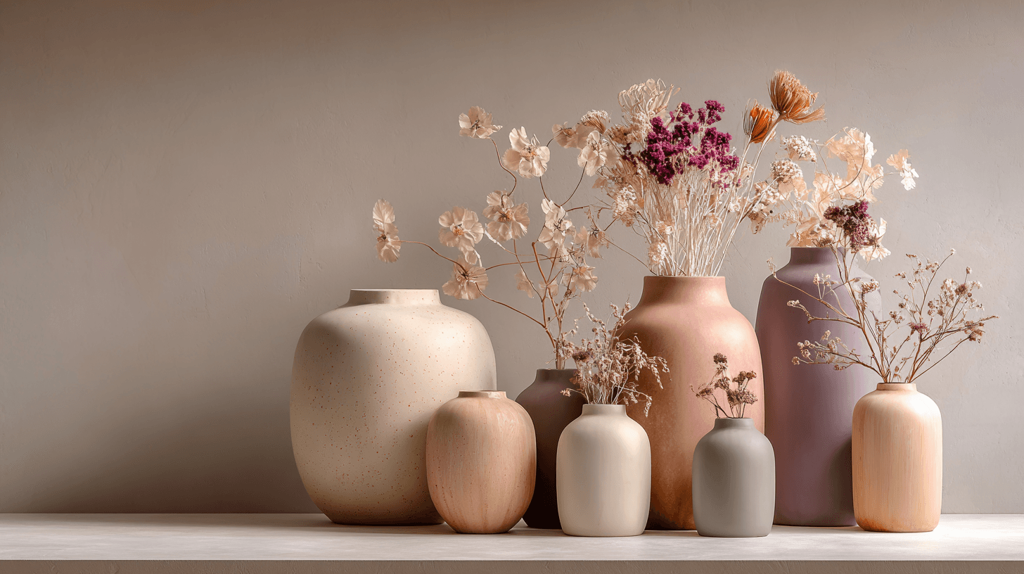
Overview
Morandi Palette is a color keyword inspired by the quiet, dusty tones associated with painter Giorgio Morandi. In AI image prompts, it usually points the model toward muted, low-saturation colors such as dusty rose, warm gray, clay, sage, beige, soft blue, faded mauve, and stone. The effect is refined, calm, and slightly editorial. This palette is useful when you want an image to feel sophisticated without becoming cold or overly minimal. For beginners, Morandi Palette is a practical way to control color harmony. It can make a scene feel more tasteful, cohesive, and brand-ready, especially when default AI colors look too bright or artificial.
What It Does
Adding Morandi Palette to a prompt reduces color intensity and encourages subtle relationships between hues. Instead of strong primary colors or neon contrast, the image may use softened colors that feel natural, dusty, and carefully chosen. This can improve the professional quality of still lifes, interiors, packaging mockups, beauty products, stationery, ceramics, and lifestyle scenes. Morandi Palette is not the same as pastel colors. Pastels can feel sweet and light, while Morandi tones are usually more muted, mature, and painterly. It pairs well with minimalist, soft light, paper texture, ceramic objects, organic modern, Japandi, and negative space. If the result feels too dull, add gentle contrast, warm highlights, or a clear focal object.
Best Use Cases
- Beauty, skincare, fragrance, and wellness product imagery where the brand should feel calm, premium, and refined. The palette can make packaging feel more editorial.
- Interior design and home decor visuals that need a soft, sophisticated color story. Morandi tones work well with ceramics, linen, plaster, wood, stone, and natural light.
- Stationery, packaging, and branding mockups where the image should feel designer-friendly without strong visual noise. Muted colors leave room for typography and identity systems.
- Stock images for calm lifestyle concepts, slow living, creative work, handmade objects, modern homes, art direction, and boutique retail.
Example Prompt
Adobe Stock Potential
Morandi Palette has good Adobe Stock potential for buyers who need refined, design-aware visuals. It is especially strong for beauty branding, wellness, home decor, stationery, packaging, boutique retail, and editorial lifestyle content. The palette can make simple objects feel intentional and premium, which helps images stand out from generic colorful stock. To make Morandi-style images more useful, keep the subject clear and avoid making the entire frame too low contrast. Designers often need images that are soft but still readable. This keyword also works well for backgrounds and mockups because the colors are gentle enough to support text overlays. For stock submissions, avoid brand names, copyrighted artwork, and overly specific product labels.
Continue Exploring
Related Prompts
Muted Colors
Muted Colors are useful when you want AI-generated images to feel sophisticated instead of loud. They are common in interiors, lifestyle photography, fashion editorials, packaging, wellness brands, and business imagery. For stock creators, muted palettes can make images more flexible because they do not overpower text or brand elements. They also help avoid the overly saturated look that many AI images produce by default.
Warm Color Palette
Warm Color Palette is a practical keyword for guiding emotional tone. It can make a breakfast scene feel cozy, a travel image feel sunny, or a brand visual feel more approachable. Warm palettes are strong for commercial images because they connect quickly with themes like comfort, care, family, food, hospitality, wellness, and optimism. For beginners, this keyword is easier to control than listing many individual colors.
Earth Tone Colors
Earth Tone Colors are useful for creating grounded, organic, and commercially current AI images. They are common in wellness branding, sustainable packaging, interiors, handmade products, food, outdoor lifestyle, and natural beauty campaigns. For stock creators, earth tones can communicate authenticity and trust without needing obvious eco symbols. They also work well in minimalist layouts because the palette is calm but still warm.
Pastel Colors
Pastel Colors are a beginner-friendly way to make AI images feel soft, clean, and emotionally light. They are especially helpful when default AI results look too saturated or visually loud. Pastels can make a product feel more approachable, an interior feel calm, or a social graphic feel cheerful without becoming aggressive. For stock image creators, this keyword works well because pastel images often support text overlays, seasonal campaigns, beauty brands, lifestyle blogs, and gentle product presentation.
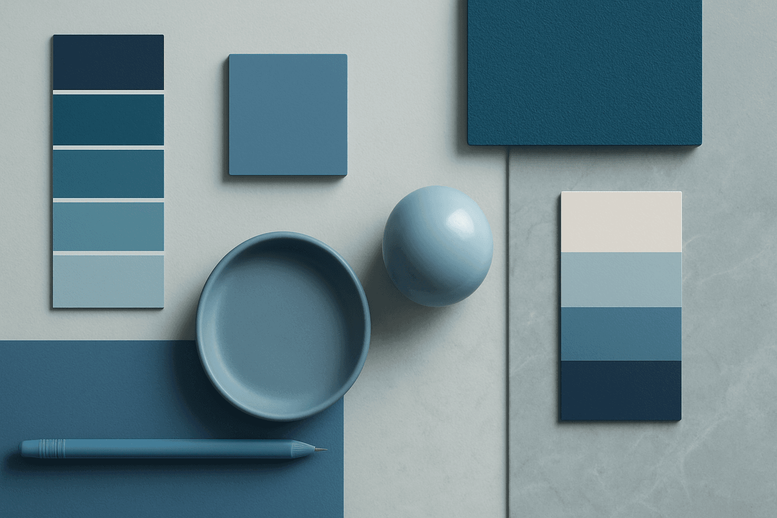
Cool Color Palette
Cool Color Palette is useful when you want an image to feel clear, composed, and modern. It is common in healthcare, technology, finance, architecture, SaaS, clean beauty, and wellness visuals. The palette can reduce emotional heat and make a design feel more trustworthy or focused. For AI creators, this keyword is helpful when a scene needs professionalism or calm rather than warmth and intimacy.
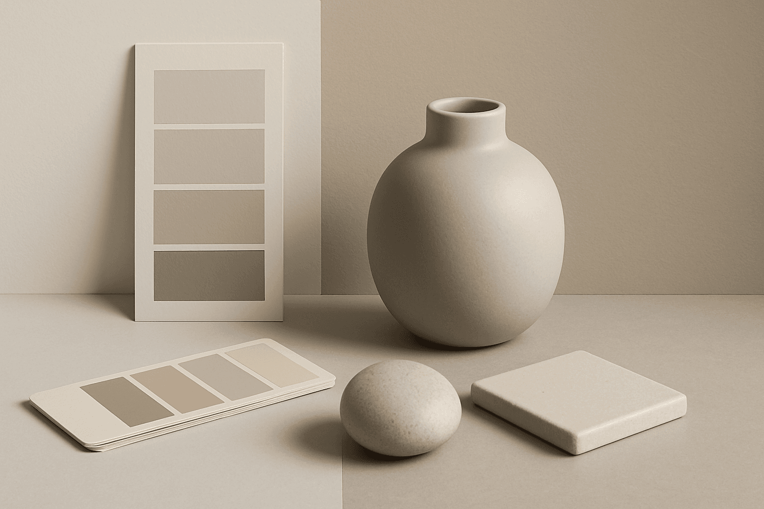
Neutral Colors
Neutral Colors are among the most commercially useful palette keywords. They help AI images feel clean, versatile, and layout-friendly. Neutral images can support text overlays, product packaging, editorial design, websites, and presentations without competing with brand colors. For stock creators, this is a practical keyword because buyers often need visuals that can blend into many design systems.