Category
Color
Palette keywords for controlling temperature, contrast, softness, and brand feeling.
What Color Prompt Keywords Mean
What this category means
Color prompt keywords describe palette, temperature, contrast, saturation, and emotional tone. They help control whether an image feels warm, cool, muted, vibrant, neutral, premium, playful, or calm.
Why it matters for AI image prompting
Color is one of the fastest ways to shape audience perception. Good palette prompts make images easier to match with brands, campaigns, seasonal themes, and layout systems.
When to use this category
Use color keywords when default outputs feel too saturated, when a brand mood matters, or when images need to fit a specific design system.
Prompt Pattern
Use this as a starting structure, then swap in specific keywords from the category below.
Start Here
Popular Keywords in this Category

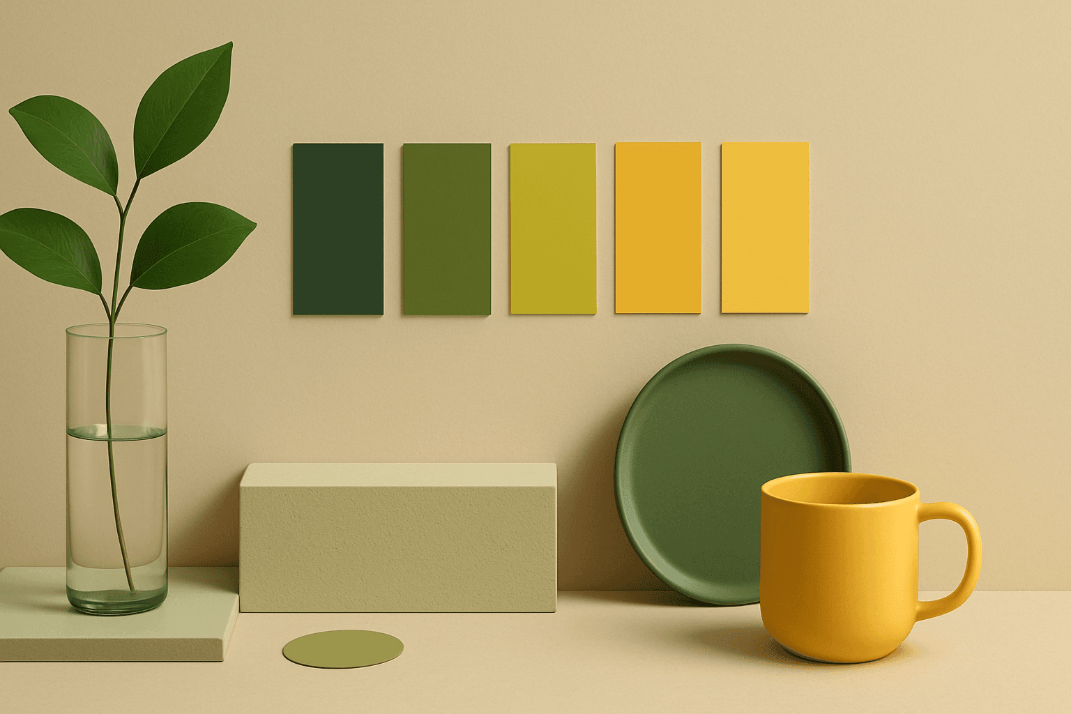
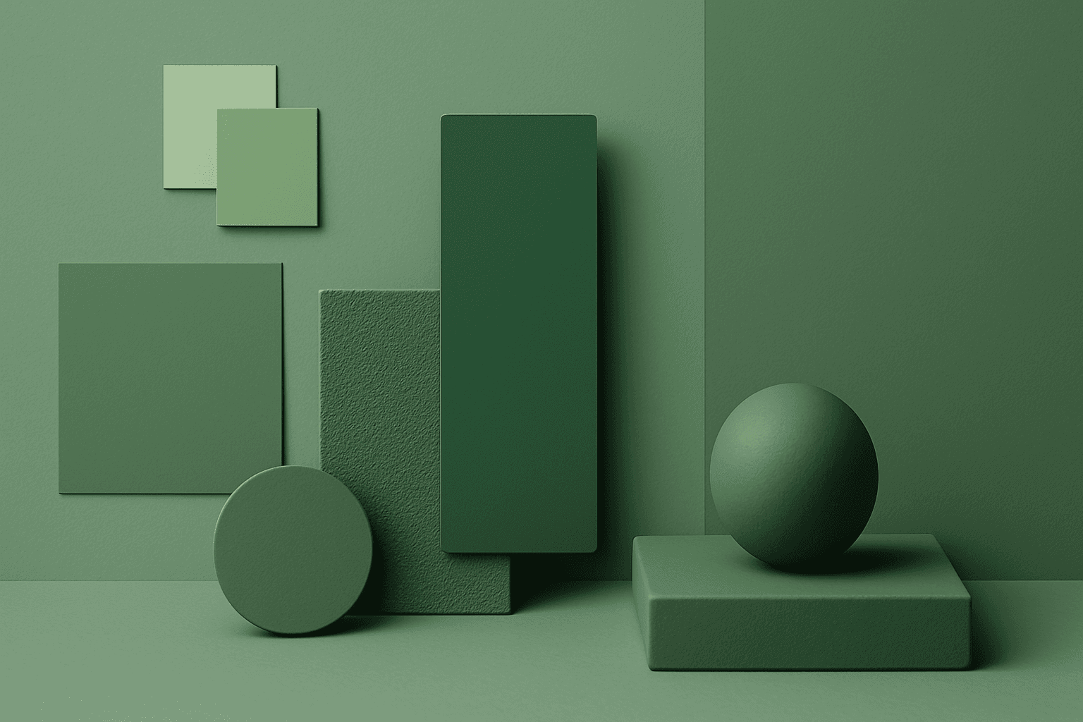
Analogous Color Schemes
Analogous color schemes bring a visually pleasing harmony to AI-generated images by combining hues that neighbor each other on the color wheel. This creates images with gentle transitions and a cohesive mood, avoiding stark contrasts. When used in prompts, this scheme helps produce illustrations, photography-style renders, or digital art that feel naturally balanced—ideal for themes that require softness or unity like nature scenes, interiors, or fashion visuals. This approach makes images feel comfortable and inviting without overwhelming the viewer.
View keyword
Analogous Colors
Analogous Colors are useful when you want an AI image to feel harmonious and easy to look at. Because the colors are related, the image often feels more cohesive and less visually jarring. This makes the keyword helpful for interior design, nature scenes, wellness branding, beauty campaigns, fashion styling, and editorial backgrounds. For beginners, Analogous Colors are easier to control than complex palettes because the colors naturally belong together.
View keyword

Black and Gold Palette
The Black and Gold Palette is a timeless color combination used widely across design, fashion, and branding to convey luxury, exclusivity, and elegance. The deep black background serves as a solid, grounding base that enhances the rich, lustrous tone of metallic gold accents. This pairing is versatile enough to appear in editorial layouts, product packaging, and digital art, offering a premium and refined visual appeal. The interplay between matte black and reflective gold elements creates subtle depth and sophisticated contrast, drawing viewers' attention effectively. Its association with opulence and tradition makes it a popular choice for high-end projects seeking a polished and stylish aesthetic.
View keyword
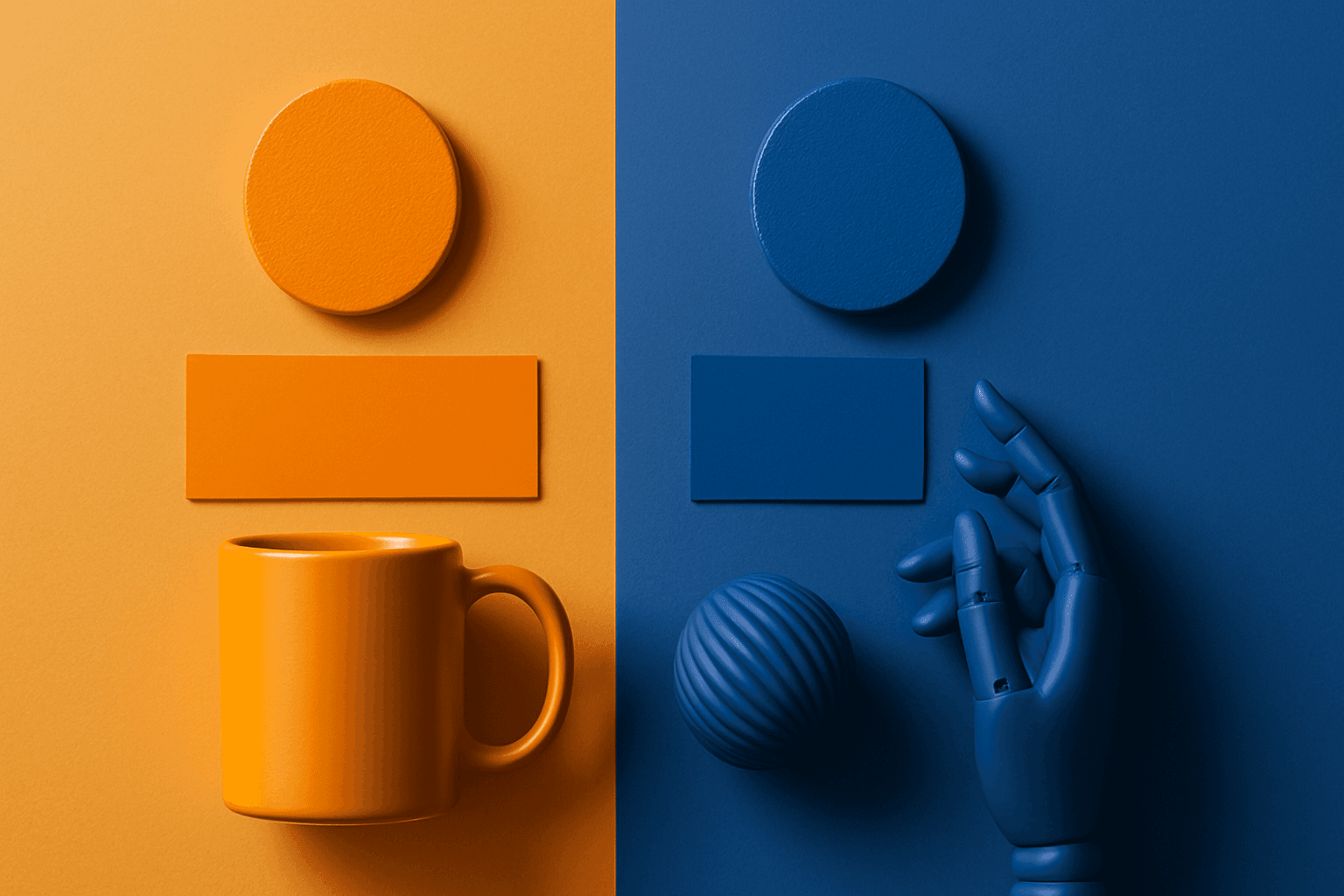
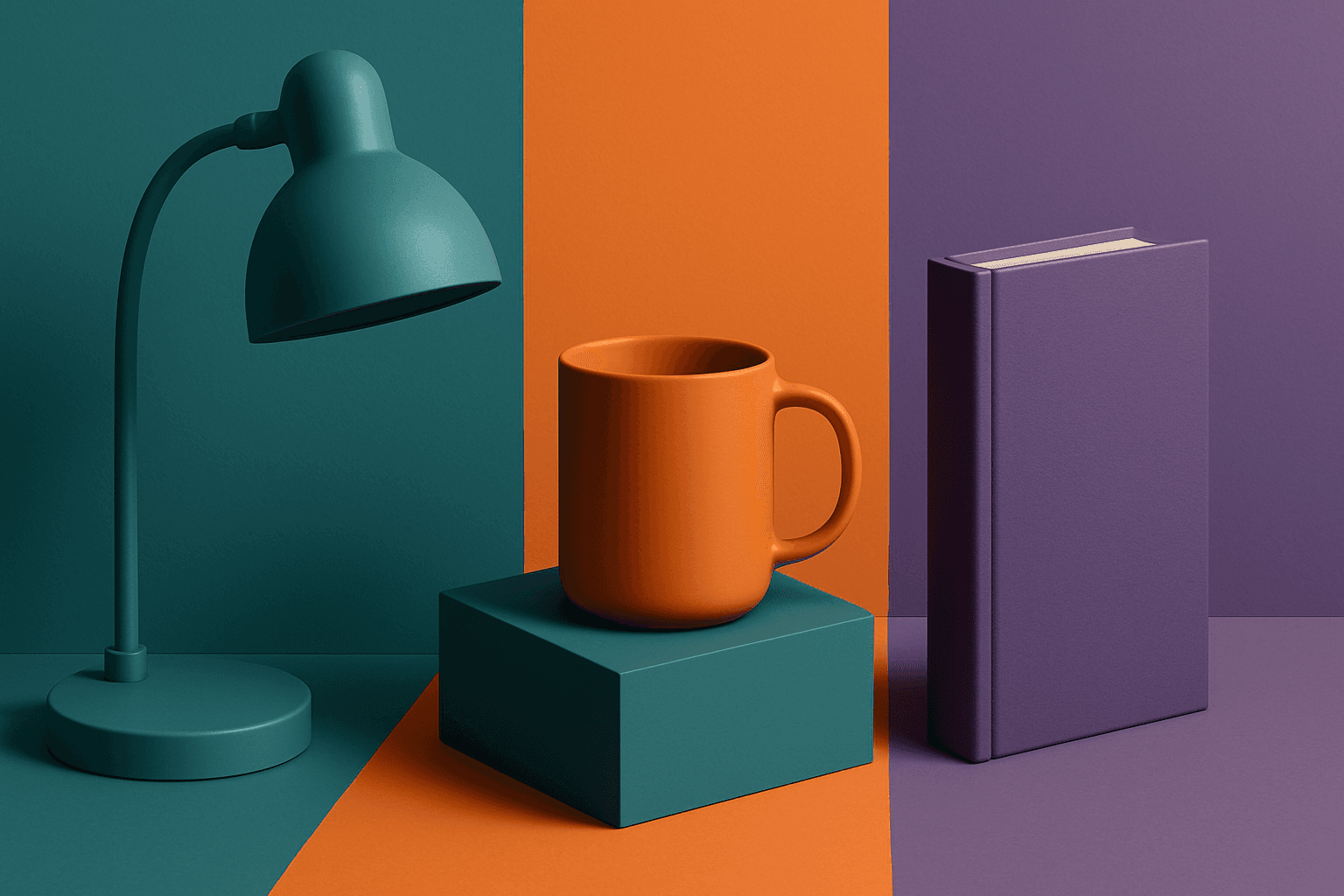
Complementary Colors
Complementary Colors are useful when an AI image needs to stand out quickly. The contrast can make a subject pop, create visual tension, and improve thumbnail impact. This keyword is common in movie posters, sports ads, product campaigns, music visuals, gaming art, and modern editorial imagery. For beginners, the key is balance: complementary palettes work best when one color leads and the opposite color supports it.
View keyword
Cool Color Palette
Cool Color Palette is useful when you want an image to feel clear, composed, and modern. It is common in healthcare, technology, finance, architecture, SaaS, clean beauty, and wellness visuals. The palette can reduce emotional heat and make a design feel more trustworthy or focused. For AI creators, this keyword is helpful when a scene needs professionalism or calm rather than warmth and intimacy.
View keyword
Cool Tones
Cool Tones are colors with blue, green, cyan, teal, gray, or silver undertones. They create calm, clarity, professionalism, and modernity.
View keyword
How to Use This Category
- Use one main palette keyword, then add two or three supporting color words if precision matters.
- Balance color with lighting language so the palette does not become flat or unrealistic.
- Choose neutral or muted palettes for flexible stock, slide, and website assets.
- Use contrast keywords carefully when the subject needs to remain readable.
All Color Keywords
Browse the full set of published PromptAtlas keywords in this topic area.
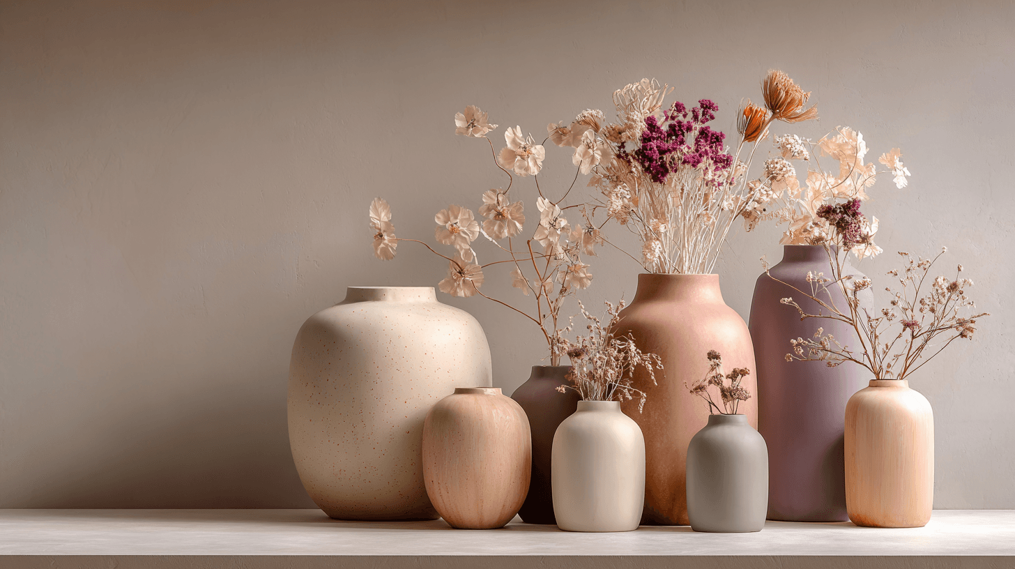
Morandi Palette
Morandi Palette is a color keyword inspired by the quiet, dusty tones associated with painter Giorgio Morandi. In AI image prompts, it usually points the model toward muted, low-saturation colors such as dusty rose, warm gray, clay, sage, beige, soft blue, faded mauve, and stone. The effect is refined, calm, and slightly editorial. This palette is useful when you want an image to feel sophisticated without becoming cold or overly minimal. For beginners, Morandi Palette is a practical way to control color harmony. It can make a scene feel more tasteful, cohesive, and brand-ready, especially when default AI colors look too bright or artificial.
View keyword
Warm Tones
Warm Tones are colors with red, orange, yellow, peach, tan, clay, or golden undertones. They create comfort, optimism, energy, and human warmth.
View keyword
Cool Tones
Cool Tones are colors with blue, green, cyan, teal, gray, or silver undertones. They create calm, clarity, professionalism, and modernity.
View keyword

Monochrome
Monochrome is a color approach using one color family or black-and-white values. It creates strong unity, simplicity, and graphic focus.
View keyword
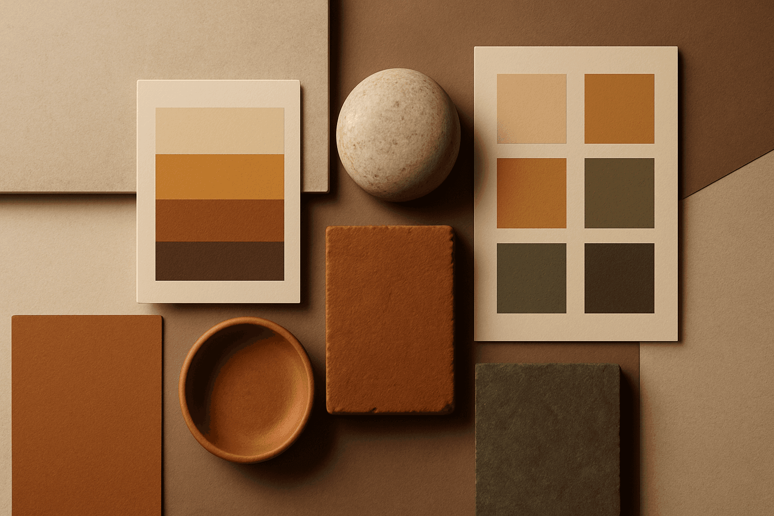
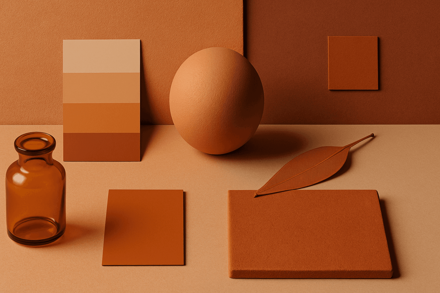
Earth Tones
Earth Tones are natural colors inspired by soil, stone, clay, plants, wood, and sand. They create a grounded, organic, and sustainable feeling.
View keyword
High Contrast Colors
High Contrast Colors use strong differences in hue, value, or saturation to create visual impact. They help subjects stand out quickly.
View keyword
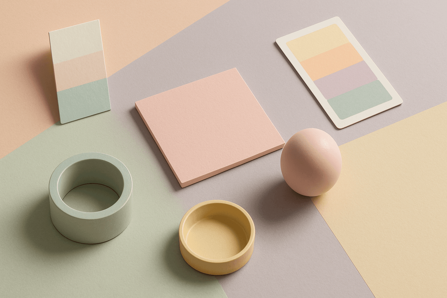
Pastel Colors
Pastel Colors are a beginner-friendly way to make AI images feel soft, clean, and emotionally light. They are especially helpful when default AI results look too saturated or visually loud. Pastels can make a product feel more approachable, an interior feel calm, or a social graphic feel cheerful without becoming aggressive. For stock image creators, this keyword works well because pastel images often support text overlays, seasonal campaigns, beauty brands, lifestyle blogs, and gentle product presentation.
View keyword
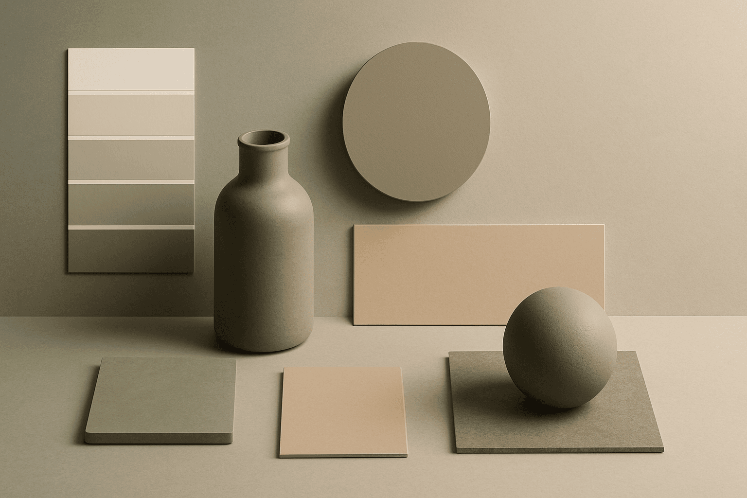
Muted Colors
Muted Colors are useful when you want AI-generated images to feel sophisticated instead of loud. They are common in interiors, lifestyle photography, fashion editorials, packaging, wellness brands, and business imagery. For stock creators, muted palettes can make images more flexible because they do not overpower text or brand elements. They also help avoid the overly saturated look that many AI images produce by default.
View keyword
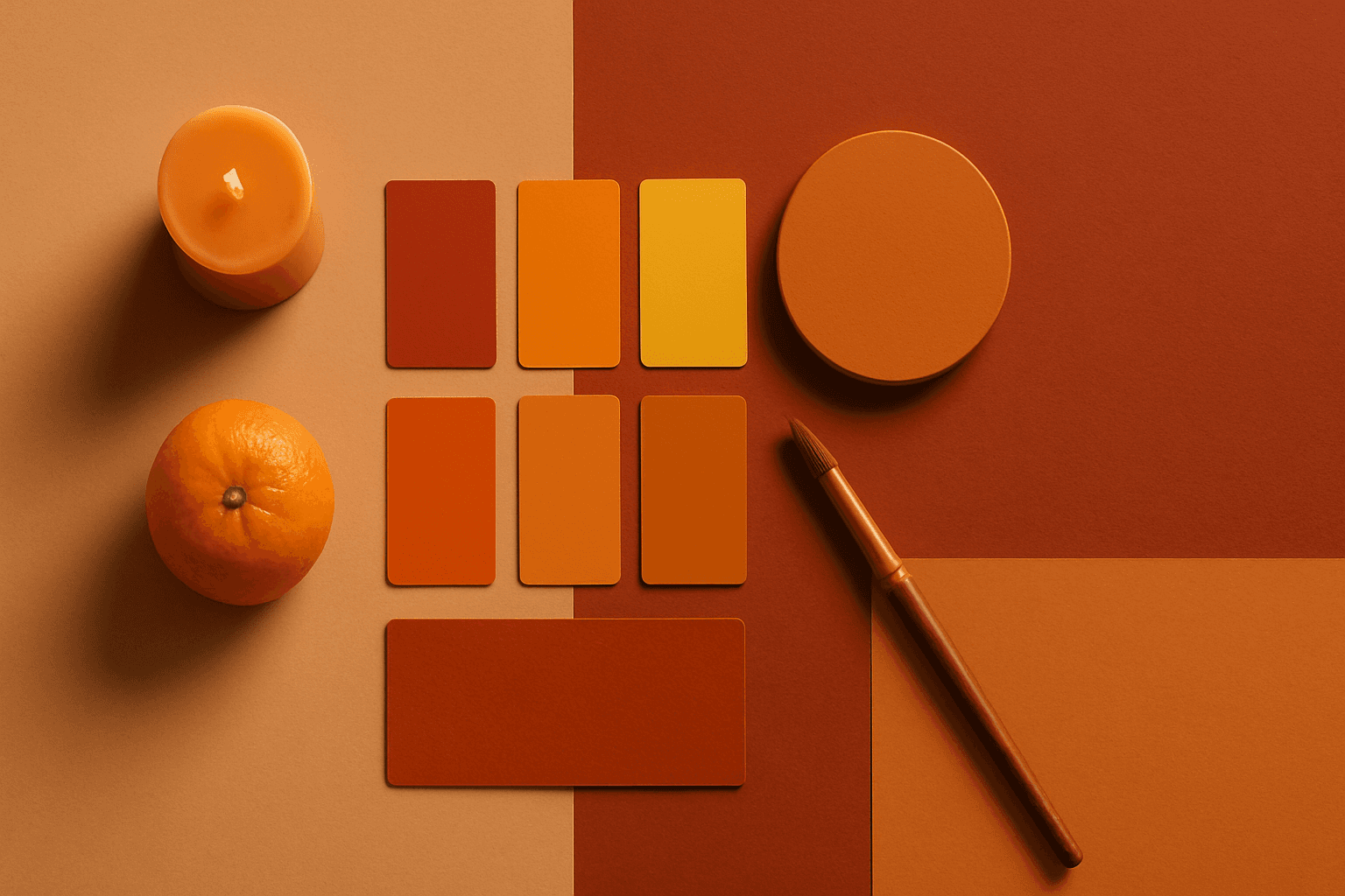
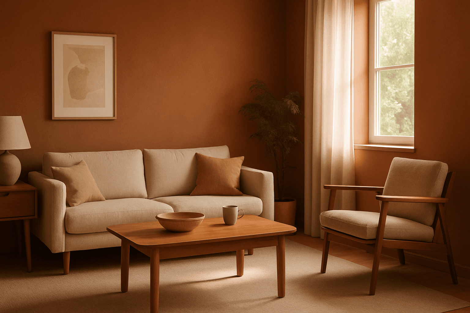
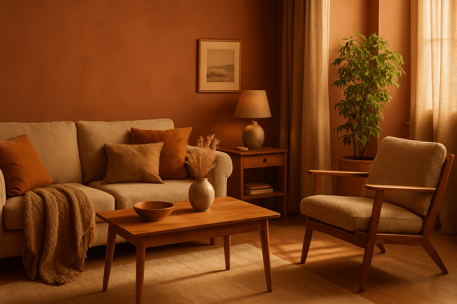
Warm Color Palette
Warm Color Palette is a practical keyword for guiding emotional tone. It can make a breakfast scene feel cozy, a travel image feel sunny, or a brand visual feel more approachable. Warm palettes are strong for commercial images because they connect quickly with themes like comfort, care, family, food, hospitality, wellness, and optimism. For beginners, this keyword is easier to control than listing many individual colors.
View keyword
Cool Color Palette
Cool Color Palette is useful when you want an image to feel clear, composed, and modern. It is common in healthcare, technology, finance, architecture, SaaS, clean beauty, and wellness visuals. The palette can reduce emotional heat and make a design feel more trustworthy or focused. For AI creators, this keyword is helpful when a scene needs professionalism or calm rather than warmth and intimacy.
View keyword
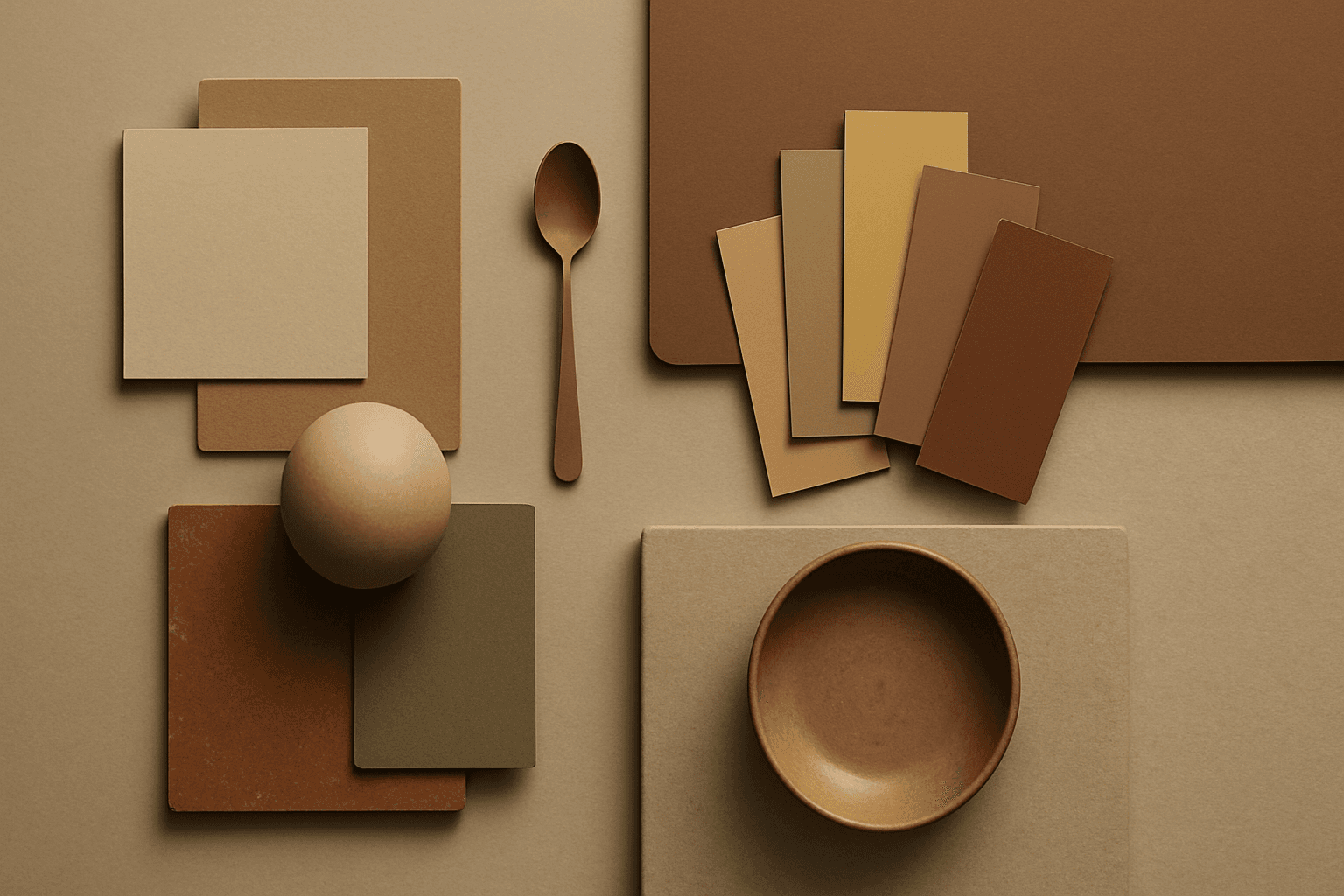
Earth Tone Colors
Earth Tone Colors are useful for creating grounded, organic, and commercially current AI images. They are common in wellness branding, sustainable packaging, interiors, handmade products, food, outdoor lifestyle, and natural beauty campaigns. For stock creators, earth tones can communicate authenticity and trust without needing obvious eco symbols. They also work well in minimalist layouts because the palette is calm but still warm.
View keyword
Monochromatic Colors
Monochromatic Colors are useful when an AI image needs strong cohesion and a design-led feel. Because the palette is limited, the viewer pays more attention to form, light, texture, and layout. This can make images feel editorial, premium, minimal, or graphic. For stock creators, monochromatic images can be useful for backgrounds, posters, fashion, architecture, product shots, and brand campaigns where color consistency matters.
View keyword
Complementary Colors
Complementary Colors are useful when an AI image needs to stand out quickly. The contrast can make a subject pop, create visual tension, and improve thumbnail impact. This keyword is common in movie posters, sports ads, product campaigns, music visuals, gaming art, and modern editorial imagery. For beginners, the key is balance: complementary palettes work best when one color leads and the opposite color supports it.
View keyword
Analogous Colors
Analogous Colors are useful when you want an AI image to feel harmonious and easy to look at. Because the colors are related, the image often feels more cohesive and less visually jarring. This makes the keyword helpful for interior design, nature scenes, wellness branding, beauty campaigns, fashion styling, and editorial backgrounds. For beginners, Analogous Colors are easier to control than complex palettes because the colors naturally belong together.
View keyword
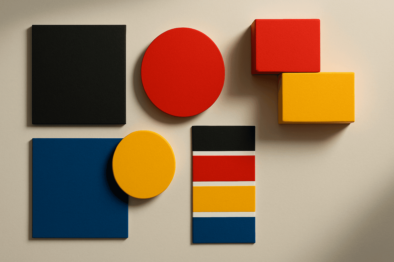
Vibrant Colors
Vibrant Colors are useful when you want an AI image to grab attention quickly. They can make products look exciting, posters feel energetic, and social content stand out in feeds. This keyword is powerful for commercial creators, but it needs control. Too many saturated colors can feel chaotic or cheap. The best vibrant images usually have a clear subject, strong composition, and a limited set of bold colors.
View keyword
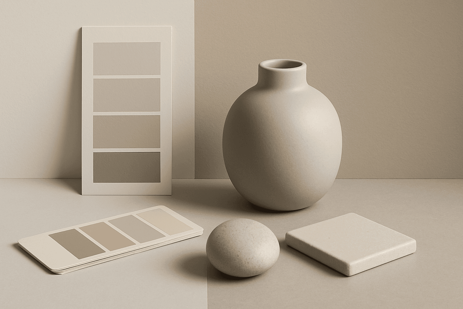
Neutral Colors
Neutral Colors are among the most commercially useful palette keywords. They help AI images feel clean, versatile, and layout-friendly. Neutral images can support text overlays, product packaging, editorial design, websites, and presentations without competing with brand colors. For stock creators, this is a practical keyword because buyers often need visuals that can blend into many design systems.
View keyword

Jewel Tone Colors
Jewel tone colors are a palette of rich, saturated hues inspired by natural gemstones like emerald green, sapphire blue, ruby red, and amethyst purple. These colors are known for their vibrant intensity and luxurious feel, making them popular across various creative fields including fashion, interior design, and digital art. Jewel tones stand out for their ability to add depth and sophistication to compositions, offering a bold yet elegant aesthetic. Their luminous quality helps convey a sense of opulence and timeless beauty, making them favored choices for premium design projects and high-end branding.
View keyword

Duotone Colors
Duotone colors combine two distinct hues—often contrasting—to produce visually impactful images that balance simplicity and dynamism. This technique became popular in photography and graphic design where it adds a modern, artistic touch by emphasizing shadows and highlights through just two colors. Duotone visuals work well in various media including digital art, branding, and advertising. By limiting the color scheme, duotone designs offer clarity and a bold aesthetic that can communicate emotion effectively. With advances in AI image generation and editing, creating duotone visuals has become straightforward, allowing designers to experiment with color combinations and achieve stylized imagery that stands out.
View keyword

Gradient Colors
Gradient colors are a popular design element characterized by a seamless shift between two or more colors. They range from subtle transitions, such as a light blush to soft pink, to vibrant combinations like bright blue fading into emerald green. Used widely in digital design, web interfaces, branding, and art, gradients add visual interest and guide the viewer's eye across a composition. Modern tools allow designers to customize gradients with various styles — linear, radial, angular, or diamond-shaped — enhancing the flexibility and creative potential of this technique.
View keyword
Black and Gold Palette
The Black and Gold Palette is a timeless color combination used widely across design, fashion, and branding to convey luxury, exclusivity, and elegance. The deep black background serves as a solid, grounding base that enhances the rich, lustrous tone of metallic gold accents. This pairing is versatile enough to appear in editorial layouts, product packaging, and digital art, offering a premium and refined visual appeal. The interplay between matte black and reflective gold elements creates subtle depth and sophisticated contrast, drawing viewers' attention effectively. Its association with opulence and tradition makes it a popular choice for high-end projects seeking a polished and stylish aesthetic.
View keyword
Desaturated Colors
In AI image generation, 'desaturated colors' guide models to produce images with toned-down color intensity, resulting in a muted and understated appearance. This technique is valuable for conveying moods such as tranquility, nostalgia, or elegance by avoiding overly bright or saturated colors. Using desaturated colors can help shift the focus to composition, texture, and lighting rather than vivid color contrasts, making images more versatile for editorial content, fashion, or natural scenes. It balances realism and artistic subtlety, especially when paired with refined lighting and soft shadows to emphasize material qualities and depth.
View keyword
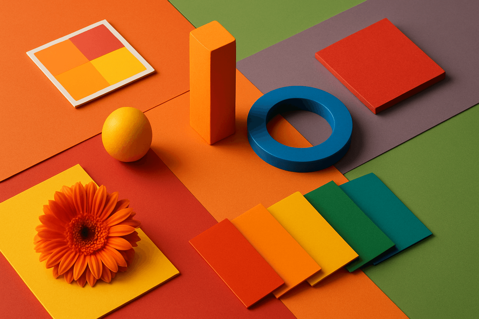
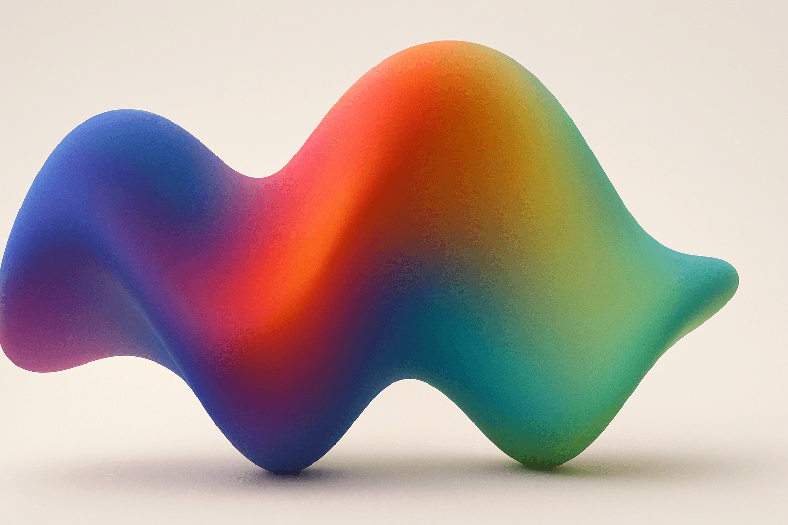
Triadic Color Scheme
The triadic color scheme is a classic color theory concept widely used in art and design, characterized by choosing three colors equally spaced around the color wheel, such as red, yellow, and blue. This approach produces vibrant, balanced images that are visually stimulating yet cohesive. When integrated into AI image generation prompts, directing the model to use a triadic palette influences the overall color composition, encouraging distinct color blocks or gradients that harmonize well. This can be particularly useful for achieving dynamic but balanced aesthetics, making compositions stand out while maintaining visual unity. Triadic schemes often evoke a lively, engaging mood, suitable for varied creative fields including branding, illustration, and editorial design.
View keyword
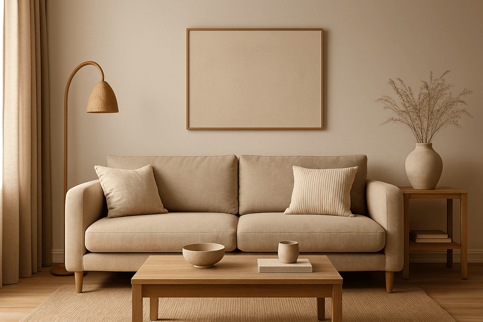
Warm Neutral Palette
The Warm Neutral Palette is a popular color scheme choice in design and AI-generated imagery for its timeless and soothing qualities. This palette combines warm earthy tones with soft neutrals, producing images that feel natural and approachable. Incorporating warm neutrals can enhance mood by bringing subtle warmth and comfort to visuals without overpowering them. When added to AI prompts, it guides the model to emphasize harmonious colors that evoke calmness and sophistication. The palette works well across various genres, including lifestyle, interiors, fashion, and nature themes, helping create polished and refined visuals suitable for editorial or commercial use.
View keyword
Gradient Mesh Coloring
Gradient mesh coloring enriches AI-generated images by introducing smooth, multidirectional color blends that mimic real-life shading and lighting nuances. Unlike standard gradients, which follow linear or radial flows, gradient meshes form intricate color maps over an object's surface, allowing fine control over color shifts and highlights. When used in AI prompts, this keyword encourages the model to create images with sophisticated color depth, making visuals feel more natural and textured. This effect is especially powerful in subjects requiring realistic rendering of materials like fabric, skin, or liquid, as well as in abstract compositions demanding refined chromatic transitions.
View keyword
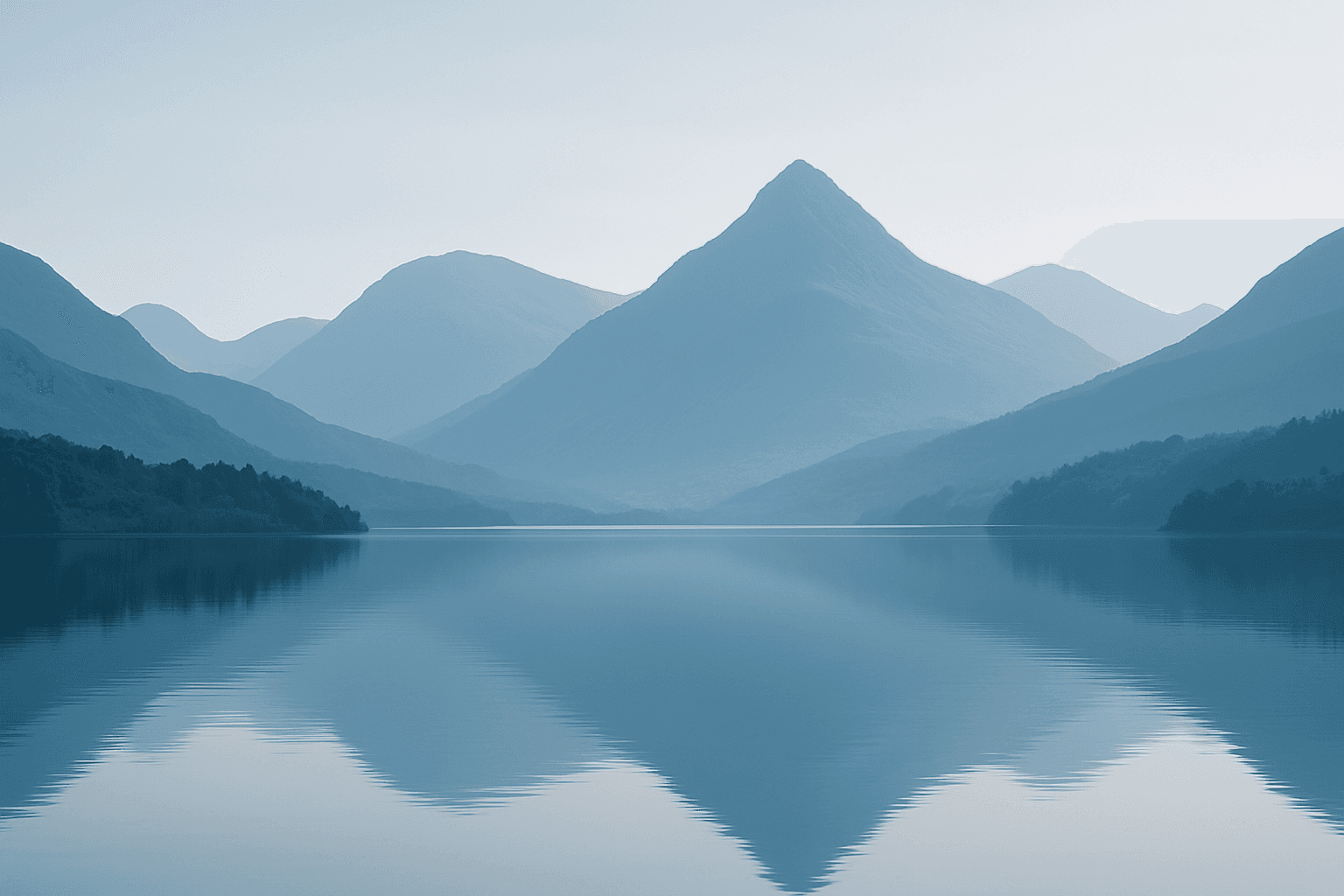
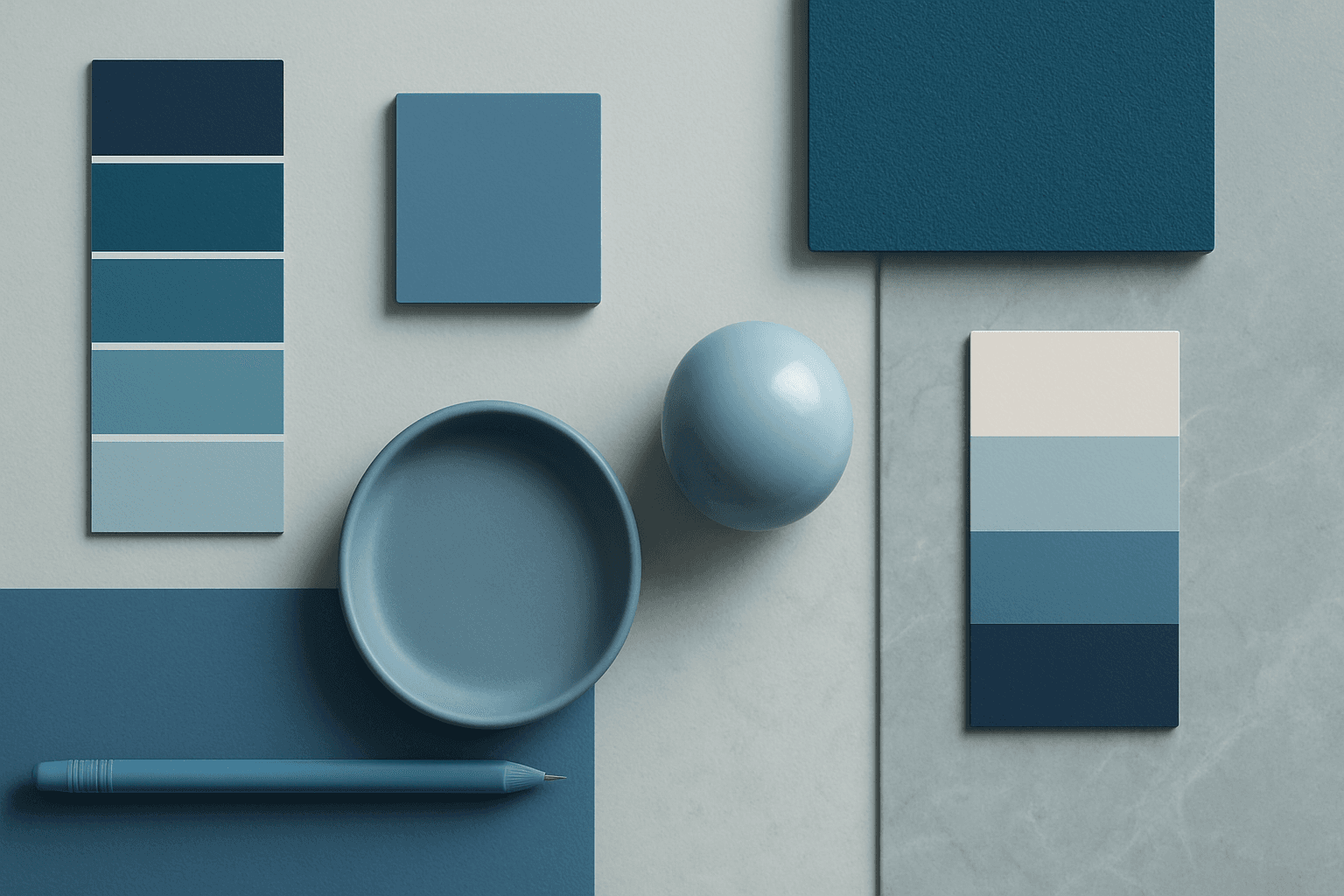
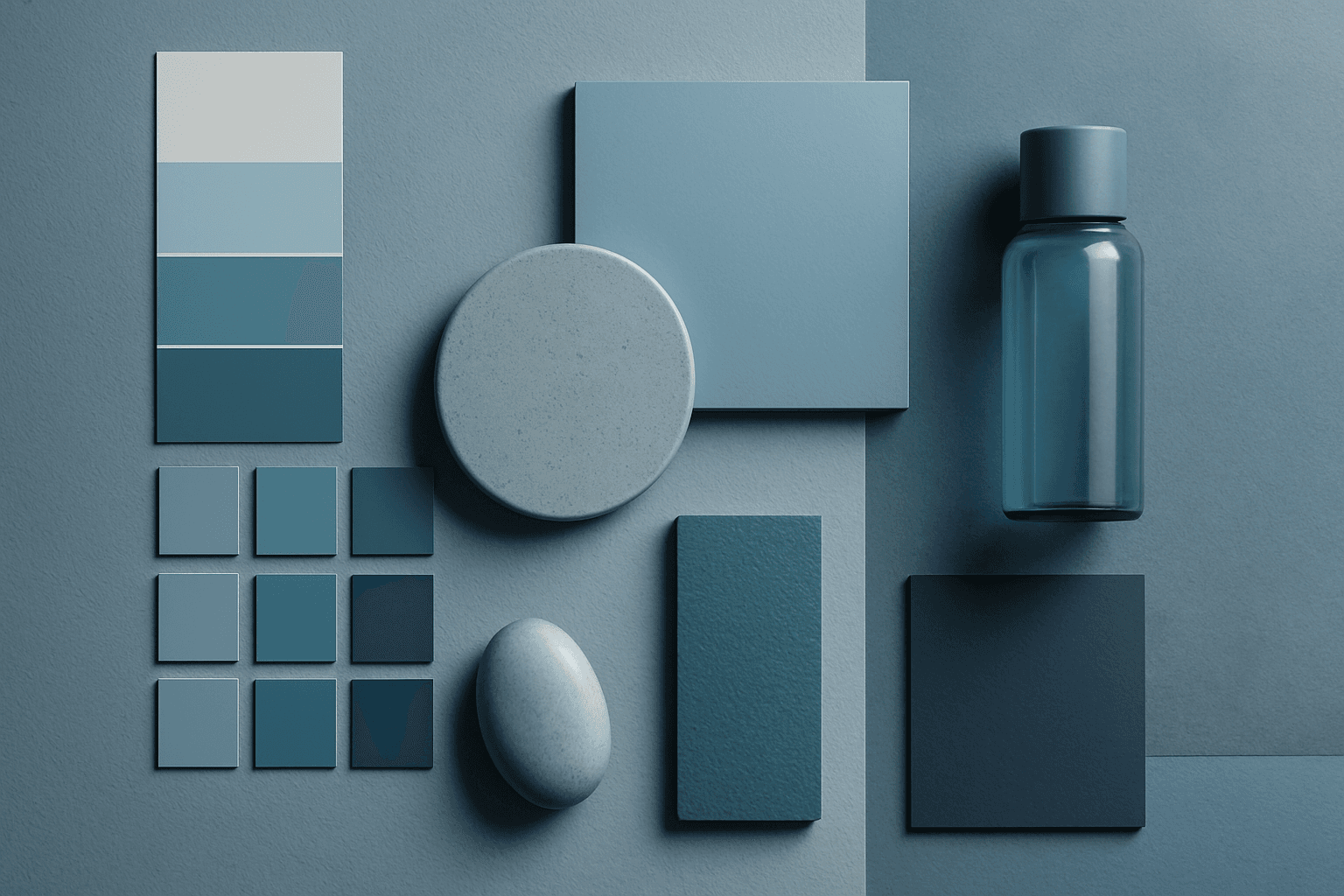
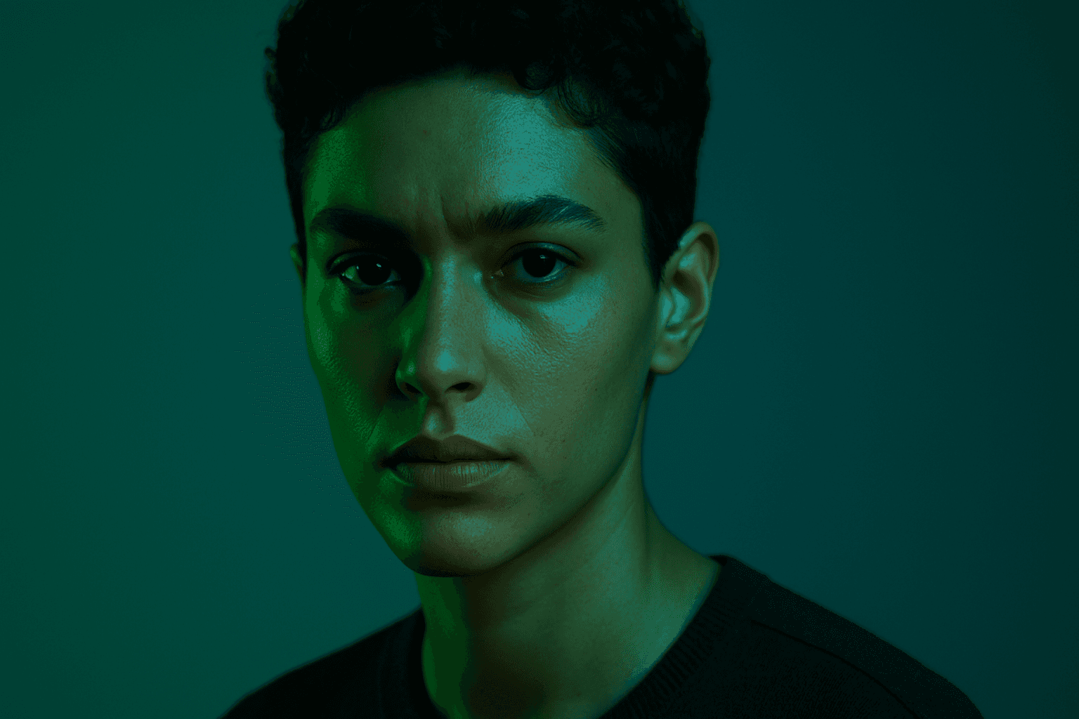
Monotone Blue Palette
The Monotone Blue Palette is a specialized coloring style used in AI-generated imagery that embraces blue tones exclusively, from pale icy blues to deep navy. This approach simplifies color complexity while adding a sophisticated, calming atmosphere to an image. It is ideal for creative projects necessitating mood-driven visuals or stylistic consistency. Incorporating this palette into prompts helps artists, designers, and marketers create images that evoke tranquility, stability, and trustworthiness. The technique fits a variety of themes including landscapes, portraits, and abstract compositions, providing a modern, refined aesthetic that stands out due to its monochromatic elegance.
View keyword
Earthy Warm Tones
Using Earthy Warm Tones in AI image generation brings a cozy and organic aesthetic to your visuals. This color keyword shifts the palette toward natural and muted warm colors that recall the earth's rich textures, often creating a calm and inviting mood. Ideal for images that require realistic materials and depth, these tones lend a premium, editorial polish without harsh contrasts. When combined with refined lighting and subtle depth, images gain a tactile, authentic feel, suitable for editorial hero imagery or sophisticated product presentations.
View keyword
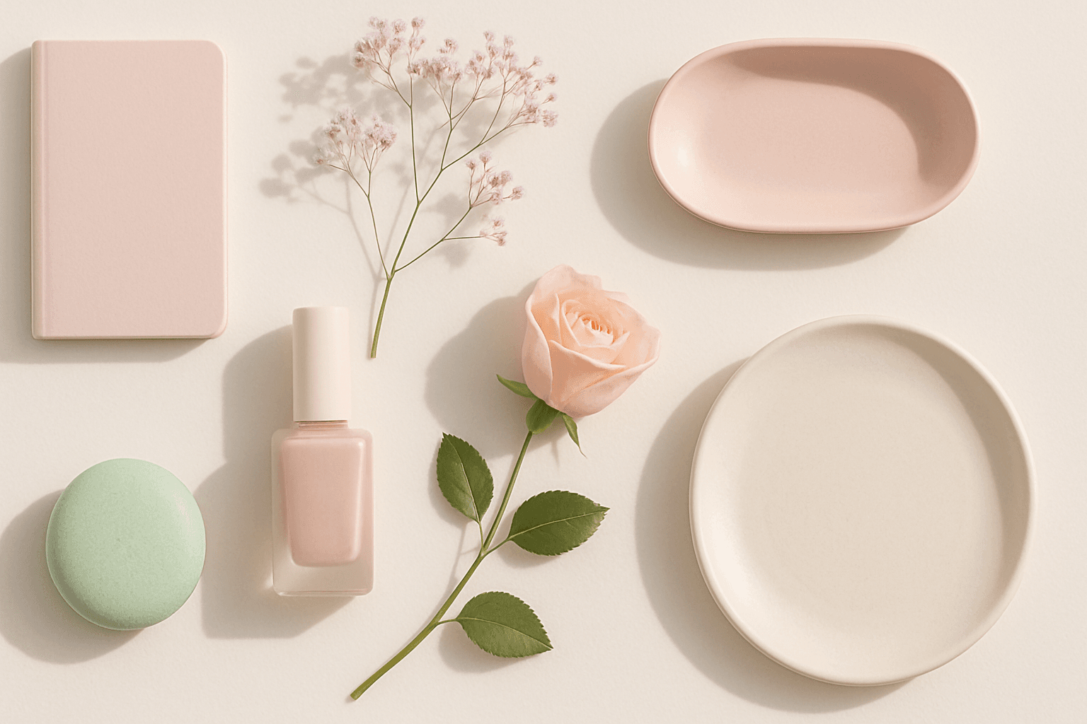
Soft Pastel Color Palette
Soft Pastel Color Palette embodies a range of delicate and subdued colors that convey tranquility and subtlety. When directing AI models, mentioning this palette guides the generation toward gentle gradations and harmonious blends of pale pinks, blues, lavenders, and creams. This palette is often employed to produce images with a dreamy, refined aesthetic, fitting for designs needing understated elegance or a nostalgic feel. The softness reduces visual noise and enhances compositions focused on mood rather than bold contrasts.
View keyword
Deep Jewel Tones
Deep jewel tones are a color category that draws inspiration from the vibrant and saturated hues of gemstones such as emeralds, sapphires, rubies, and amethysts. Using these colors in AI-generated images results in visuals that feel elegant, deep, and luxurious. The intense saturation combined with a natural richness adds emotional depth and visual interest without overwhelming the composition. This palette is especially effective for creating sophisticated editorial portraits, stylish fashion imagery, and premium product photography. By specifying 'deep jewel tones' in prompts, artists and creators can reliably evoke a refined atmosphere with distinctive, eye-catching colors.
View keyword
Earthy Warm Color Scheme
The Earthy Warm Color Scheme is a popular choice for artists and designers aiming to create images that feel natural, comforting, and connected to the environment. By focusing on warm, muted earth tones, this scheme lends a timeless aesthetic suited for a variety of subjects, including landscapes, portraits, interiors, and product shots. Using this palette in AI image prompts can help achieve visuals that emphasize quiet warmth and natural beauty, often evoking rustic charm or bohemian moods. It's well-suited for editorial photography, lifestyle branding, and environmental themes, enhancing images with a sophisticated yet approachable mood.
View keyword

Monochromatic Blue Palette
Using a Monochromatic Blue Palette in AI image generation focuses on deploying only blue hues within the composition. This technique results in images that appear cohesive and unified, emphasizing mood and atmosphere through color consistency. Blue tones evoke calm, trust, and professionalism, making this palette versatile for numerous visual contexts. By instructing AI prompts to apply this palette, designers gain refined control over color ambiance, ensuring that the final image communicates desired emotional undertones or branding colors effectively.
View keyword
Triadic Color Harmonies
Triadic color harmonies provide a powerful method to generate visually striking AI images with balanced contrast. By selecting three colors evenly distributed on the color wheel, this technique injects vibrancy and diversity into the palette while maintaining harmony. When included in AI image prompts, it helps produce compositions that pop with color but remain cohesive, suitable for a wide range of creative projects. This approach avoids monotone or clashing visuals and offers a natural yet exciting look. Understanding and applying triadic color harmonies in prompts empowers creators to craft images that stand out with rich, lively color schemes across digital art, design mockups, and branding visuals.
View keyword
Analogous Color Schemes
Analogous color schemes bring a visually pleasing harmony to AI-generated images by combining hues that neighbor each other on the color wheel. This creates images with gentle transitions and a cohesive mood, avoiding stark contrasts. When used in prompts, this scheme helps produce illustrations, photography-style renders, or digital art that feel naturally balanced—ideal for themes that require softness or unity like nature scenes, interiors, or fashion visuals. This approach makes images feel comfortable and inviting without overwhelming the viewer.
View keyword
All Categories
Lighting
41Prompt keywords for shaping light direction, quality, glow, and photographic drama.
Browse keywords
Atmosphere
30Mood-setting language for emotion, haze, weather, ambience, and cinematic tone.
Browse keywords
Composition
27Framing and visual structure keywords that guide layout, focus, and balance.
Browse keywords
Style
29Aesthetic directions for design languages, eras, interiors, and visual identity.
Browse keywords
Color
32Palette keywords for controlling temperature, contrast, softness, and brand feeling.
Browse keywords
Texture & Material
32Surface and material cues for tactile realism, reflection, luxury, and craft.
Browse keywords
Commercial Use
17Keywords tuned for stock imagery, ads, branding, product visuals, and business assets.
Browse keywords