Deep Jewel Tones
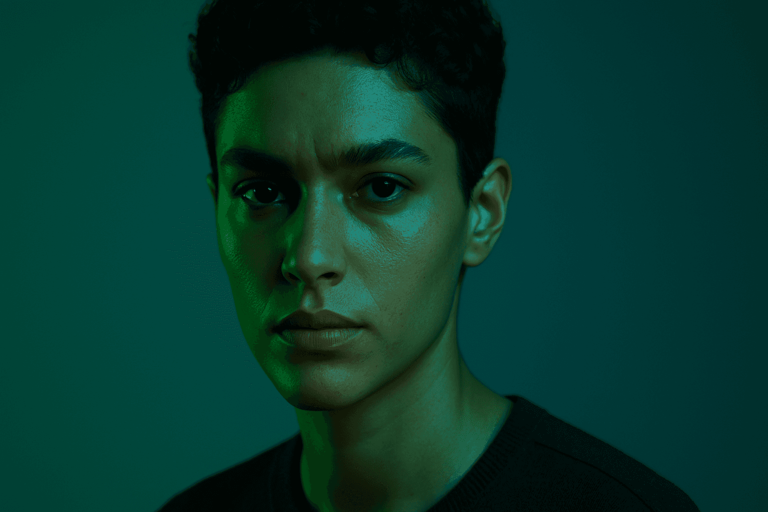
Deep jewel tones are a color category that draws inspiration from the vibrant and saturated hues of gemstones such as emeralds, sapphires, rubies, and amethysts. Using these colors in AI-generated images results in visuals that feel elegant, deep, and luxurious. The intense saturation combined with a natural richness adds emotional depth and visual interest without overwhelming the composition. This palette is especially effective for creating sophisticated editorial portraits, stylish fashion imagery, and premium product photography. By specifying 'deep jewel tones' in prompts, artists and creators can reliably evoke a refined atmosphere with distinctive, eye-catching colors.
Definition
Deep jewel tones describe a rich set of colors inspired by precious gemstones such as sapphires, rubies, emeralds, and amethysts. When included in AI image prompts, this keyword encourages the generation of images with intense saturation, luxurious hues, and color depth that evoke feelings of richness and opulence. It transforms the color atmosphere from flat or pastel into bold, vivid, and emotionally resonant, often linked with elegance and refinement.
Visual Characteristics
- Rich, saturated gemstone-inspired colors like emerald green, sapphire blue, ruby red
- Strong contrast with subtle shading and depth for a three-dimensional feel
- Luxurious and moody ambiance with vibrant yet balanced hues
Prompt Formula
To effectively incorporate deep jewel tones in AI prompts, use descriptive phrases that specify the gemstone color and mood. Example formula patterns include "portrait in deep jewel tones lighting," "still life with saturated ruby and sapphire colors," or "interior design featuring rich emerald and amethyst palette." Adding adjectives like 'luxurious,' 'vibrant,' and 'moody' can further guide the AI toward the desired atmosphere.
- "--vibrant deep jewel tones lighting"
- "saturated sapphire blue and ruby red colors"
- "luxurious emerald green accents with subtle shadows"
Best Use Cases
- Fashion and editorial portraits requiring bold yet elegant color schemes
- Product photography highlighting rich textures and premium materials
- Interior design visuals emphasizing sophisticated, moody atmospheres
Creative Variations
To diversify outcomes when using deep jewel tones, experiment with variations in lighting, composition, and complementary colors. Consider pairing jewel tones with soft metallic accents, such as gold or silver, or incorporating natural elements like dark wood to add warmth. Use different lighting styles such as soft diffused light for a dreamy effect or sharp directional light to enhance textures. Changing composition focus—from close-ups to wide interiors—also creates unique impressions while maintaining the jewel tone palette.
- Combine jewel tones with metallic gold or silver highlights
- Use soft diffused or dramatic directional lighting
- Include contrasting textures like velvet or polished wood
- Vary composition by mixing tight portraits with wide-angle interiors
Industry Applications
- Fashion advertising campaigns aiming to communicate luxury and elegance
- Editorial photo spreads requiring mood-rich, sophisticated color palettes
- E-commerce product imagery showcasing premium goods with vibrant appeal
Common Mistakes
A frequent mistake when prompting deep jewel tones is over-saturation, which can result in unnatural or overly harsh colors that appear unrealistic. Another issue is combining too many jewel tones without balance, making the image chaotic rather than elegant. Vague prompts may lead to muted or dull colors instead of deep, vibrant hues. To avoid these, specify particular gemstone colors and mood descriptions, and maintain color harmony by limiting the palette to 2–3 main jewel tones.
- Avoid excessive saturation causing unnatural colors
- Limit the number of jewel tones to prevent visual clutter
- Use specific gemstone color names for clarity
- Include mood adjectives like 'luxurious' or 'moody'
Advanced Techniques
Experienced prompt writers can refine deep jewel tone imagery by blending color grading instructions with lighting styles for enhanced realism. Combining 'deep jewel tones' with terms like 'cinematic lighting' or 'Rembrandt light' adds dramatic depth. Using negative prompts to exclude unnatural brightness or pastel colors maintains color integrity. Layering jewel tones with textures such as velvet, satin, or glass surfaces intensifies tactile richness, creating more immersive and high-end visuals.
- Combine with 'cinematic lighting' or 'Rembrandt lighting' for drama
- Use negative prompts to avoid pale or washed-out colors
- Describe materials like velvet or satin to enhance texture
- Specify light direction and softness for subtle shading
FAQ
What are deep jewel tones in AI image prompts?
They are rich, highly saturated colors inspired by gemstones like emerald, sapphire, ruby, and amethyst, used to create luxurious and vivid visuals.
How do I avoid over-saturation using deep jewel tones?
Specify balanced jewel tones with mood descriptors and limit the number of colors to prevent visuals from becoming unnatural or chaotic.
Continue Exploring
Related Prompts
Vibrant Jewel Tones
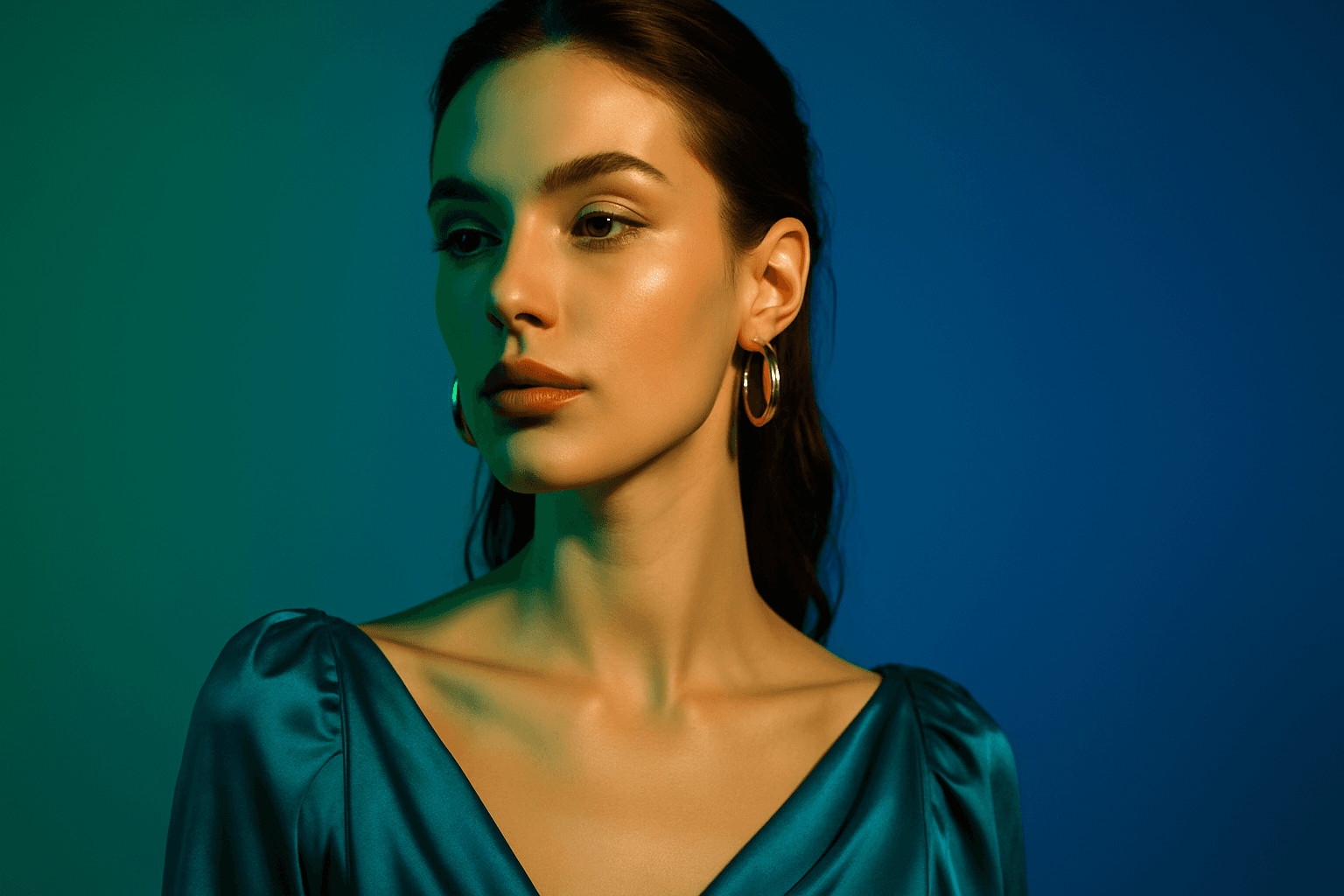
Using vibrant jewel tones in AI image prompts enhances digital artworks with saturated, eye-catching colors inspired by gemstones. These tones introduce a sense of luxury, richness, and visual depth, making images stand out with their jewel-like quality. Ideal for subjects needing an elegant or dramatic flair, jewel tones can elevate portraits, still life, fashion, and interior imagery with their bold and refined color presence. Incorporating this palette encourages AI models to prioritize vivid blues, greens, reds, and purples, often accented with subtle lighting and glossy textures for premium polish.
Rich Jewel Tone Palette
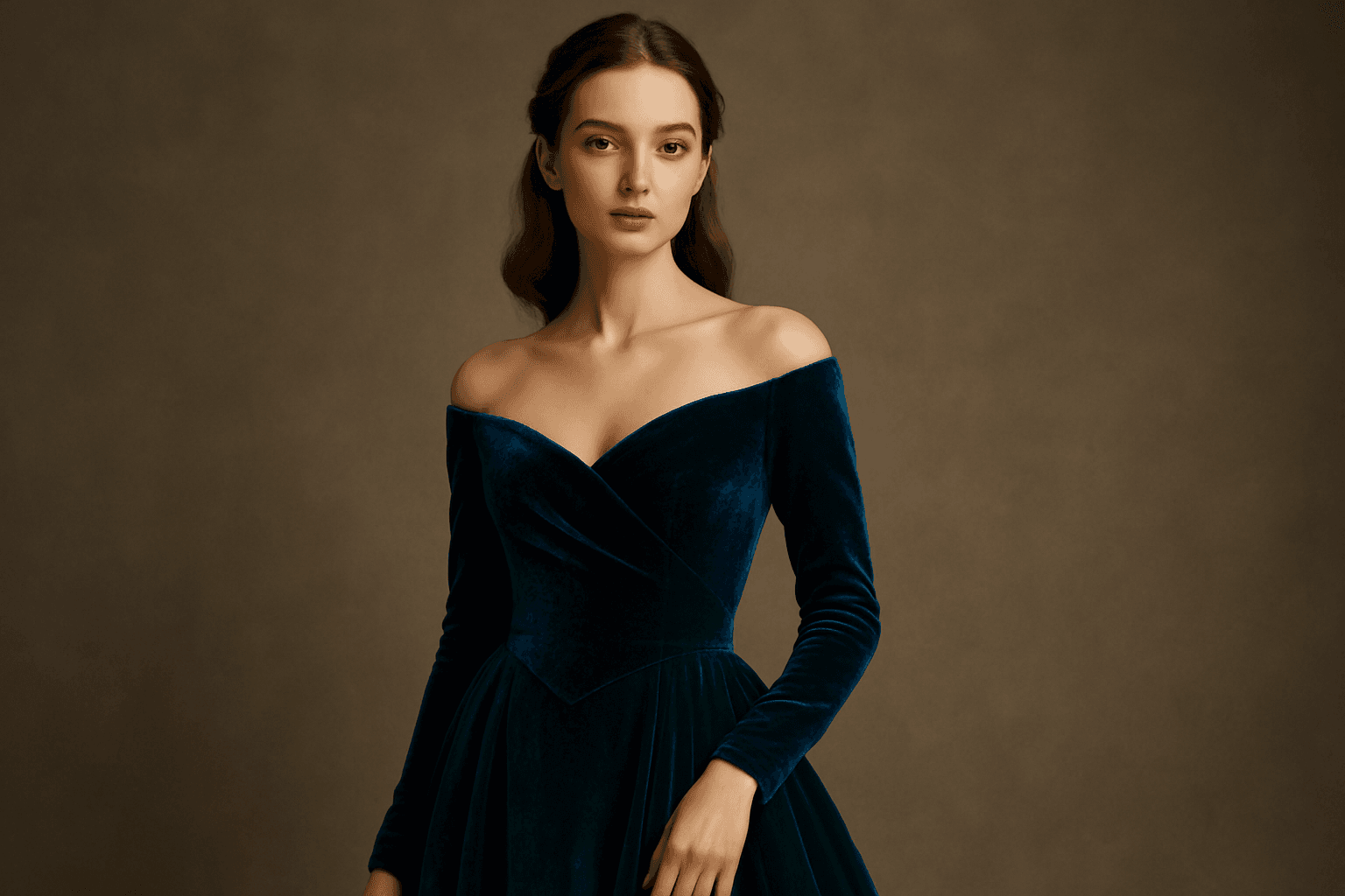
Using the Rich Jewel Tone Palette in AI image generation significantly influences the aesthetic by introducing highly saturated, gemstone-inspired colors. These tones create images that appear luxurious and visually striking, elevating compositions beyond simple color schemes. The palette often brings a sense of refinement and depth to scenes or subjects, making it a perfect choice for designs requiring rich, bold visual impact. Applying this palette modifies lighting and material perception to simulate the luminous qualities of jewels, enhancing realism and allure in the final output.
Earthy Warm Tones
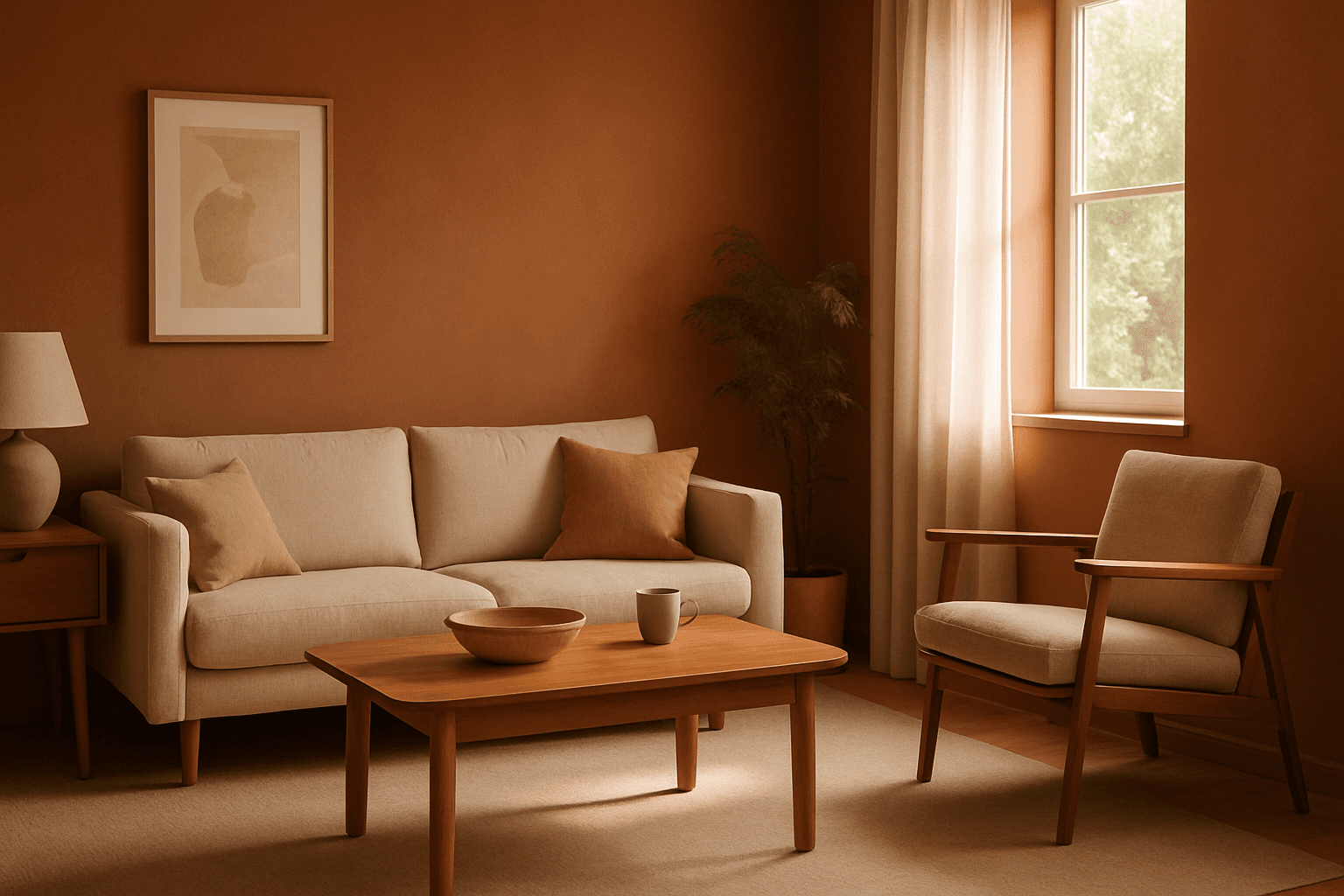
Using Earthy Warm Tones in AI image generation brings a cozy and organic aesthetic to your visuals. This color keyword shifts the palette toward natural and muted warm colors that recall the earth's rich textures, often creating a calm and inviting mood. Ideal for images that require realistic materials and depth, these tones lend a premium, editorial polish without harsh contrasts. When combined with refined lighting and subtle depth, images gain a tactile, authentic feel, suitable for editorial hero imagery or sophisticated product presentations.
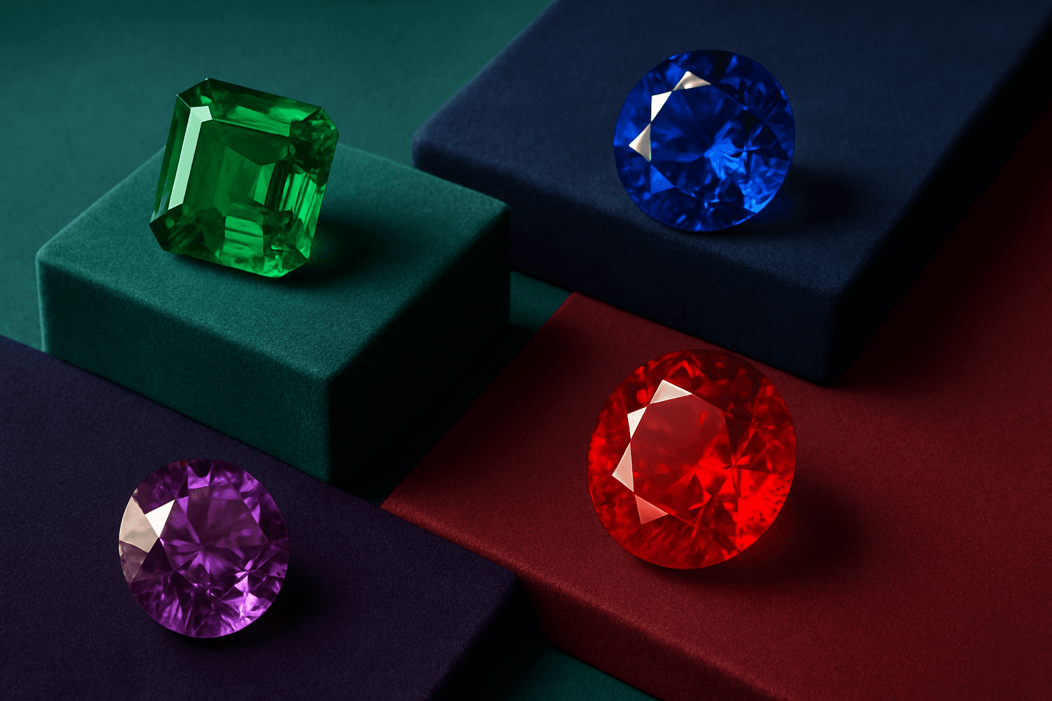
Jewel Tone Colors
Jewel tone colors are a palette of rich, saturated hues inspired by natural gemstones like emerald green, sapphire blue, ruby red, and amethyst purple. These colors are known for their vibrant intensity and luxurious feel, making them popular across various creative fields including fashion, interior design, and digital art. Jewel tones stand out for their ability to add depth and sophistication to compositions, offering a bold yet elegant aesthetic. Their luminous quality helps convey a sense of opulence and timeless beauty, making them favored choices for premium design projects and high-end branding.

Muted Earth Tone Palette
The Muted Earth Tone Palette is a popular color approach in AI image generation that emphasizes soft, natural hues inspired by the earth. These colors include warm browns, olive greens, beiges, and greys, all presented in subdued saturation levels to avoid overly bright or intense visuals. Using this palette creates images that feel organic, calm, and stylish, making it ideal for modern editorial content, lifestyle photography, and interior design renders. By focusing on muted tones, the images exude refinement and subtlety, appealing to viewers seeking sophistication without harsh contrasts. Incorporating this palette into your AI prompts helps generate visuals with a cohesive and naturalistic color balance.

Gradient Sky Colors
Incorporating Gradient Sky Colors into AI-generated images significantly enhances the atmospheric quality and visual depth of outdoor scenes. By blending multiple hues in a smooth, gradual fashion, these skies offer a natural yet captivating backdrop that supports various themes such as serenity, romance, or drama. This keyword is especially useful in settings featuring landscapes, cityscapes, or fantasy environments, enriching the emotional tone of an image. Using gradient skies in prompts allows creators to move beyond flat or uniform color skies, enabling more dynamic and mood-driven outputs that resonate well in editorial, advertising, and artistic contexts.