Vibrant Jewel Tones
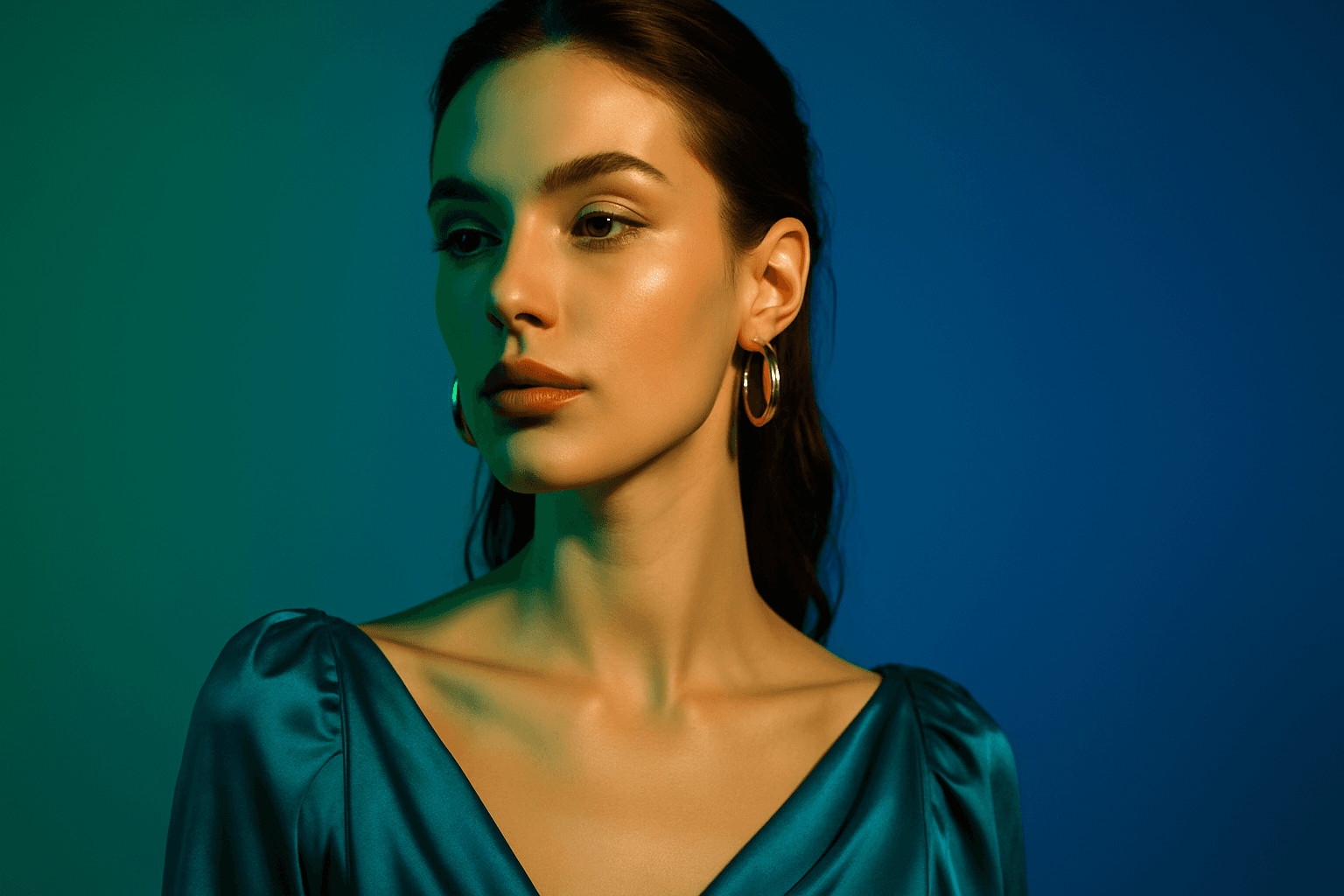
Using vibrant jewel tones in AI image prompts enhances digital artworks with saturated, eye-catching colors inspired by gemstones. These tones introduce a sense of luxury, richness, and visual depth, making images stand out with their jewel-like quality. Ideal for subjects needing an elegant or dramatic flair, jewel tones can elevate portraits, still life, fashion, and interior imagery with their bold and refined color presence. Incorporating this palette encourages AI models to prioritize vivid blues, greens, reds, and purples, often accented with subtle lighting and glossy textures for premium polish.
Definition
Vibrant jewel tones are a set of rich and highly saturated colors inspired by natural precious stones, such as emerald green, sapphire blue, ruby red, and amethyst purple. In AI image prompts, invoking vibrant jewel tones directs the model to emphasize these deep and vivid colors, imparting a sense of luxury, depth, and vividness to the generated image. Using this keyword transforms flat or muted color schemes into rich, glowing palettes that visually pop and evoke premium aesthetics.
Visual Characteristics
Images featuring vibrant jewel tones exhibit several distinct traits that make them visually striking.
- Deep saturation with intense hues similar to gemstones
- Strong contrast balancing bright highlights with dark shadows
- Materials often appear glossy or velvety, enhancing the richness and realism
Prompt Formula
To incorporate vibrant jewel tones effectively in prompts, you can structure your input by pairing jewel tone references with materials and lighting styles that amplify their depth. Here are formula ideas:
- "[Subject], illuminated by vibrant jewel tones such as sapphire blue, emerald green, ruby red"
- "[Subject], featuring gemstone-inspired colors with glossy and velvet textures"
- "Elegant [scene] with rich jewel tones, dramatic lighting, and strong contrast"]
Best Use Cases
Vibrant jewel tones excel in scenarios where rich color and luxury feel are desired. They serve practical purposes such as:
- High-end fashion photography emphasizing glamor and sophistication
- Product imagery for luxurious items like jewelry and beauty products
- Portraits and editorial content seeking dramatic, eye-catching visual moods
Creative Variations
To maintain freshness and avoid repetition when using vibrant jewel tones, try varying styles, lighting, and subjects:
- Experiment with different jewel stones as color inspirations, such as topaz or garnet
- Combine jewel tones with natural light or neon to create contrasting moods
- Create compositions with reflective surfaces to enhance jewel-like qualities
- Use close-up shots emphasizing textures like velvet or polished metals
- Incorporate jewel tones in various environments from interiors to fantasy settings
Industry Applications
Vibrant jewel tones have strong commercial relevance in various creative fields:
- Advertisting campaigns for luxury brands to visually communicate exclusivity and quality
- Editorial photography and magazines focusing on fashion and lifestyle content
- Ecommerce product photography and marketing for premium cosmetics, jewelry, and designer goods
Common Mistakes
Mistakes to avoid when using vibrant jewel tones include:
- Over-saturating colors causing unnatural or overshiny results
- Using jewel tones without appropriate contextual lighting, resulting in flat colors
- Mixing too many jewel tones simultaneously that clash and reduce palette cohesion
- Neglecting material textures that support jewel tone richness, such as glossy or velvet finishes
Advanced Techniques
To refine the usage of vibrant jewel tones in prompts and outputs, consider these methods:
- Specify light sources that enhance reflections and color dispersion (e.g., soft diffused vs. sharp spotlight)
- Combine jewel tones with complementary neutral backdrops to intensify color impact
- Use modifiers like “hyperrealistic” or “photorealistic” to emphasize material accuracy
- Incorporate related color theory terms such as "analogous jewel tones" or "complementary gemstone palette" for nuanced color harmony
FAQ
What colors are typically considered vibrant jewel tones?
Vibrant jewel tones commonly include emerald green, sapphire blue, ruby red, amethyst purple, topaz yellow, and garnet shades — all rich, saturated hues inspired by gemstones.
How do jewel tones affect the mood of AI-generated images?
Jewel tones add depth, luxury, and vibrancy, creating an elegant and dramatic atmosphere that can transform ordinary images into visually captivating compositions.
Continue Exploring
Related Prompts
Deep Jewel Tones
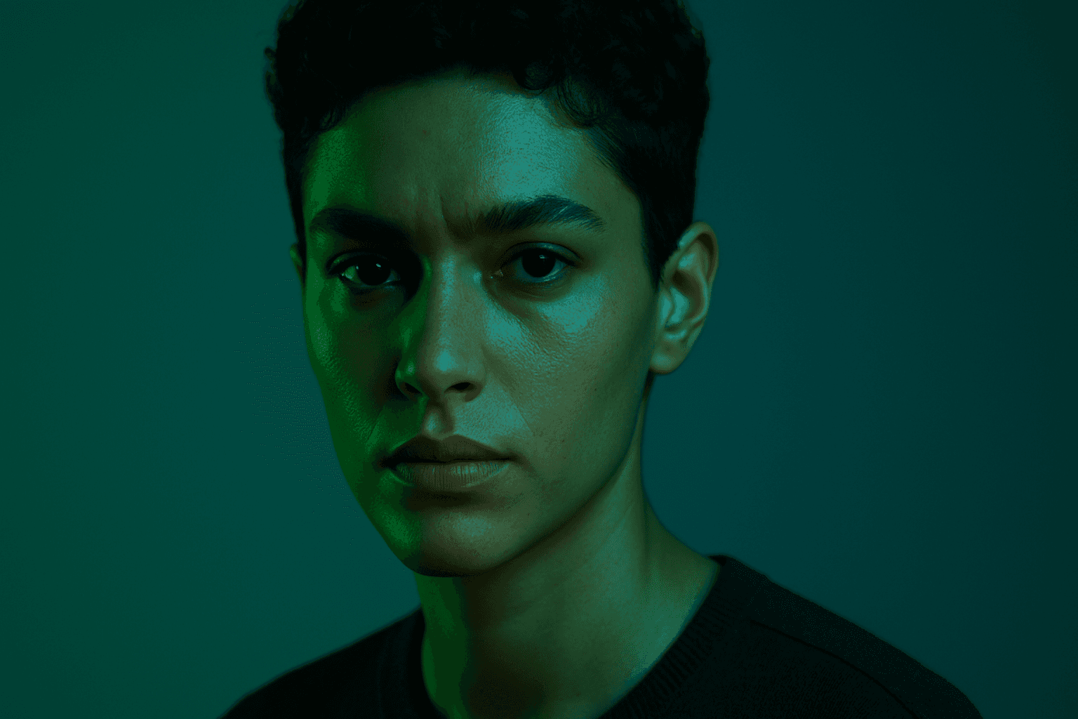
Deep jewel tones are a color category that draws inspiration from the vibrant and saturated hues of gemstones such as emeralds, sapphires, rubies, and amethysts. Using these colors in AI-generated images results in visuals that feel elegant, deep, and luxurious. The intense saturation combined with a natural richness adds emotional depth and visual interest without overwhelming the composition. This palette is especially effective for creating sophisticated editorial portraits, stylish fashion imagery, and premium product photography. By specifying 'deep jewel tones' in prompts, artists and creators can reliably evoke a refined atmosphere with distinctive, eye-catching colors.
Jewel Tone Colors
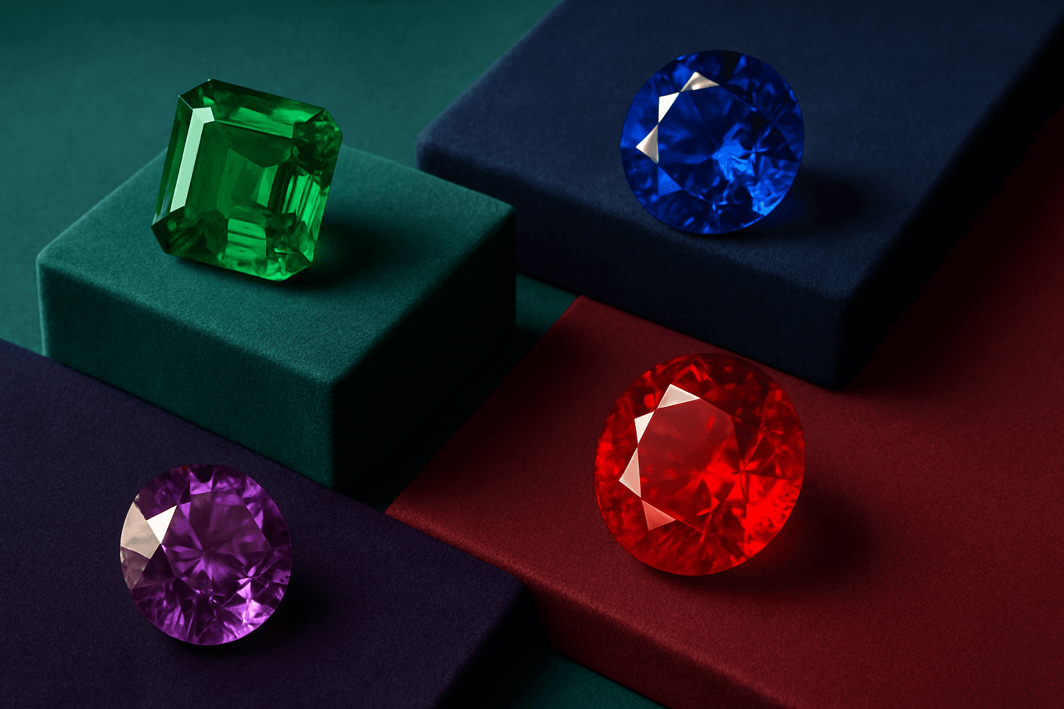
Jewel tone colors are a palette of rich, saturated hues inspired by natural gemstones like emerald green, sapphire blue, ruby red, and amethyst purple. These colors are known for their vibrant intensity and luxurious feel, making them popular across various creative fields including fashion, interior design, and digital art. Jewel tones stand out for their ability to add depth and sophistication to compositions, offering a bold yet elegant aesthetic. Their luminous quality helps convey a sense of opulence and timeless beauty, making them favored choices for premium design projects and high-end branding.
Vibrant Contrast Hues
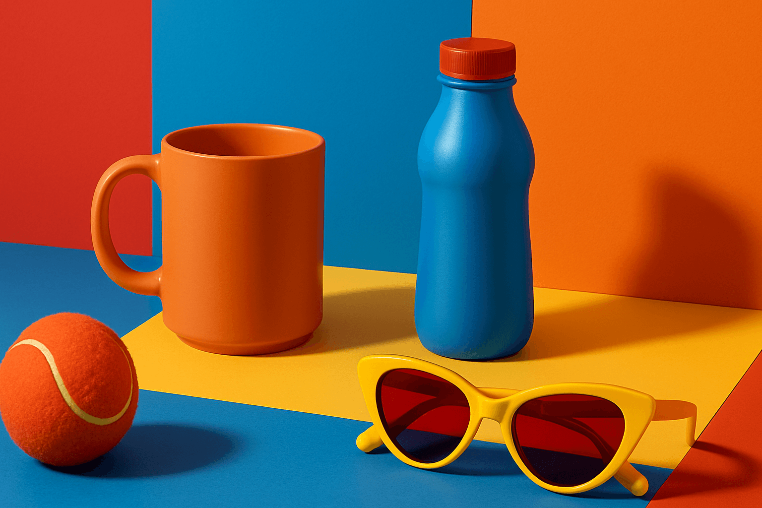
Vibrant Contrast Hues represent an essential color strategy in AI-generated imagery where vivid and complementary colors are juxtaposed to maximize visual appeal. Applying this concept in prompts leads to images with heightened energy and attention-grabbing qualities, often preferred in marketing materials, editorial photography, and creative digital art. The technique manipulates color relationships to create mood and focus, making elements within the frame more prominent and memorable. Integrating vibrant contrast hues can transform an ordinary image into a visually compelling composition that draws the eye and communicates with clarity and boldness.

Vibrant Accent Color Palette
Utilizing a vibrant accent color palette in AI image prompts transforms ordinary visuals into striking compositions by introducing bright, focused colors that highlight important elements. This technique leverages contrast and saturation to guide viewers' eyes toward key areas, adding energy and visual interest. When combined with modern design principles—such as clean layouts, realistic materials, and refined lighting—these palettes elevate the quality of AI-generated images, making them ideal for editorial designs, marketing materials, and digital art projects.
Earthy Warm Tones
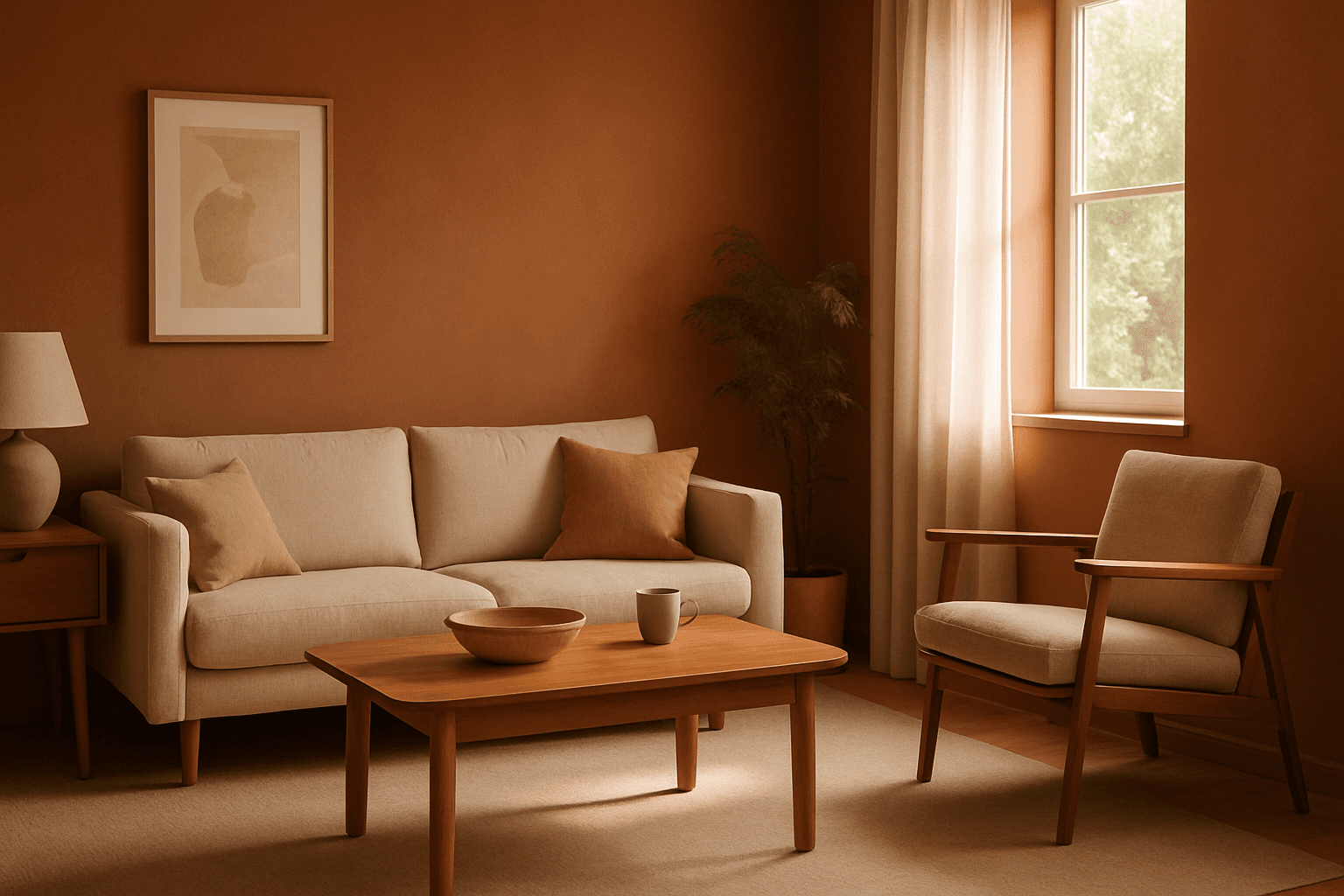
Using Earthy Warm Tones in AI image generation brings a cozy and organic aesthetic to your visuals. This color keyword shifts the palette toward natural and muted warm colors that recall the earth's rich textures, often creating a calm and inviting mood. Ideal for images that require realistic materials and depth, these tones lend a premium, editorial polish without harsh contrasts. When combined with refined lighting and subtle depth, images gain a tactile, authentic feel, suitable for editorial hero imagery or sophisticated product presentations.
Vibrant Contrast Colors
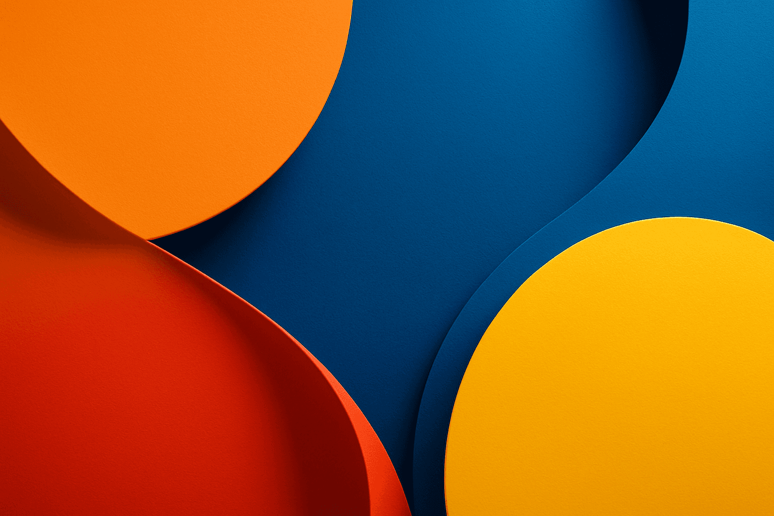
Using vibrant contrast colors in AI-generated images dramatically amplifies visual impact by pairing bright, intense hues that stand out against each other. This technique can create striking, memorable images with pronounced depth and energy. By incorporating this keyword into prompts, artists and designers can achieve images where colors pop distinctly, guiding the viewer's eye and enhancing compositional clarity. It is particularly valuable in designs aiming to convey excitement, energy, or modernity. The result is a colorful, lively composition that avoids dullness and monotony by leveraging color theory for maximum vibrancy.