Vibrant Accent Color Palette
Utilizing a vibrant accent color palette in AI image prompts transforms ordinary visuals into striking compositions by introducing bright, focused colors that highlight important elements. This technique leverages contrast and saturation to guide viewers' eyes toward key areas, adding energy and visual interest. When combined with modern design principles—such as clean layouts, realistic materials, and refined lighting—these palettes elevate the quality of AI-generated images, making them ideal for editorial designs, marketing materials, and digital art projects.

Definition
A vibrant accent color palette in AI-generated imagery involves the deliberate use of bright and saturated colors to highlight or emphasize specific areas within a composition. Unlike a full rainbow or multicolored palette, an accent palette strategically uses a limited set of vivid hues alongside more neutral or subdued tones, creating contrast and visual interest. When integrated into AI image prompts, it guides the model to focus on these key colors, enhancing focal points and the overall aesthetic impact.
Prompt Formula
Use this pattern to incorporate vibrant accent colors effectively: "[Main subject or scene] with a vibrant accent color palette of [color1], [color2], and [color3], featuring refined lighting, realistic materials, and clean composition" Examples of phrasing include: - "...vibrant accent colors highlighting key elements" - "...accent tones of vivid [color] to create dynamic contrast" - "...color pop effect using saturated [color] accents" Combine these phrases with style details to ensure premium image quality.
- [Main subject or scene] with vibrant accent color palette of [color1], [color2], [color3]
- ...vibrant accent colors highlighting key elements
- ...accent tones of vivid [color] to create dynamic contrast
- ...color pop effect using saturated [color] accents
- ...featuring refined lighting and realistic materials
Best Use Cases
- Advertising images focusing on product highlights and brand colors
- Editorial layouts requiring strong visual hierarchy and focal points
- User interface visuals emphasizing interactive or call-to-action elements
Advanced Techniques
Experienced prompt writers can refine vibrant accent color palettes by combining them with specific lighting conditions, material textures, and compositional constraints to produce nuanced effects. For example, pairing a vibrant accent palette with soft natural light can create a balanced contrast without overwhelming the viewer. Applying subtle depth cues such as shadow gradients or reflections on realistic materials enhances the perceived vibrancy and dimensionality. Additionally, limiting the accent colors to single-point highlights or repeating accents in symmetry can guide the AI towards more cohesive and deliberate color placements.
- Combine vibrant accent palette with soft natural lighting for balanced contrast
- Use reflections and shadow gradients to enhance depth
- Limit accent colors to selective focal points for cohesion
- Apply symmetry in color accents to create visual harmony
- Integrate realistic material textures to boost vibrancy effect
Professional Workflow
A streamlined workflow for using vibrant accent color palettes involves several key steps. First, the briefing stage should clearly define the primary subject, desired accent colors, and overall mood, emphasizing the use of bright, saturated hues for highlights. Next, generate multiple AI image variations using prompt formulas specifying the palette and style details. During selection, assess images based on how effectively accent colors guide attention and complement the composition without overpowering. Finally, refine chosen images through post-processing or iterative prompt adjustments to perfect lighting, material realism, and color balance, ensuring a polished final product suitable for professional use.
- Define subject and desired vibrant accent colors in briefing
- Generate multiple variations with color-focused prompts
- Select images emphasizing effective use of accent colors
- Refine lighting and color balance via prompt tweaks or editing
- Finalize images with realistic materials and depth for polish
FAQ
What is a vibrant accent color palette in AI image prompts?
It is a selection of bright, saturated colors used selectively in an AI prompt to highlight key visual elements, creating contrast and drawing viewer attention within the image.
How does a vibrant accent color palette improve AI-generated images?
It adds visual interest, depth, and focal points by creating contrast with neutral or muted backgrounds, making the images more dynamic and engaging.
Can vibrant accent colors be combined with specific lighting styles?
Yes, combining vibrant accent colors with refined or natural lighting enhances color impact while maintaining balance and realism in the composition.
Continue Exploring
Related Prompts
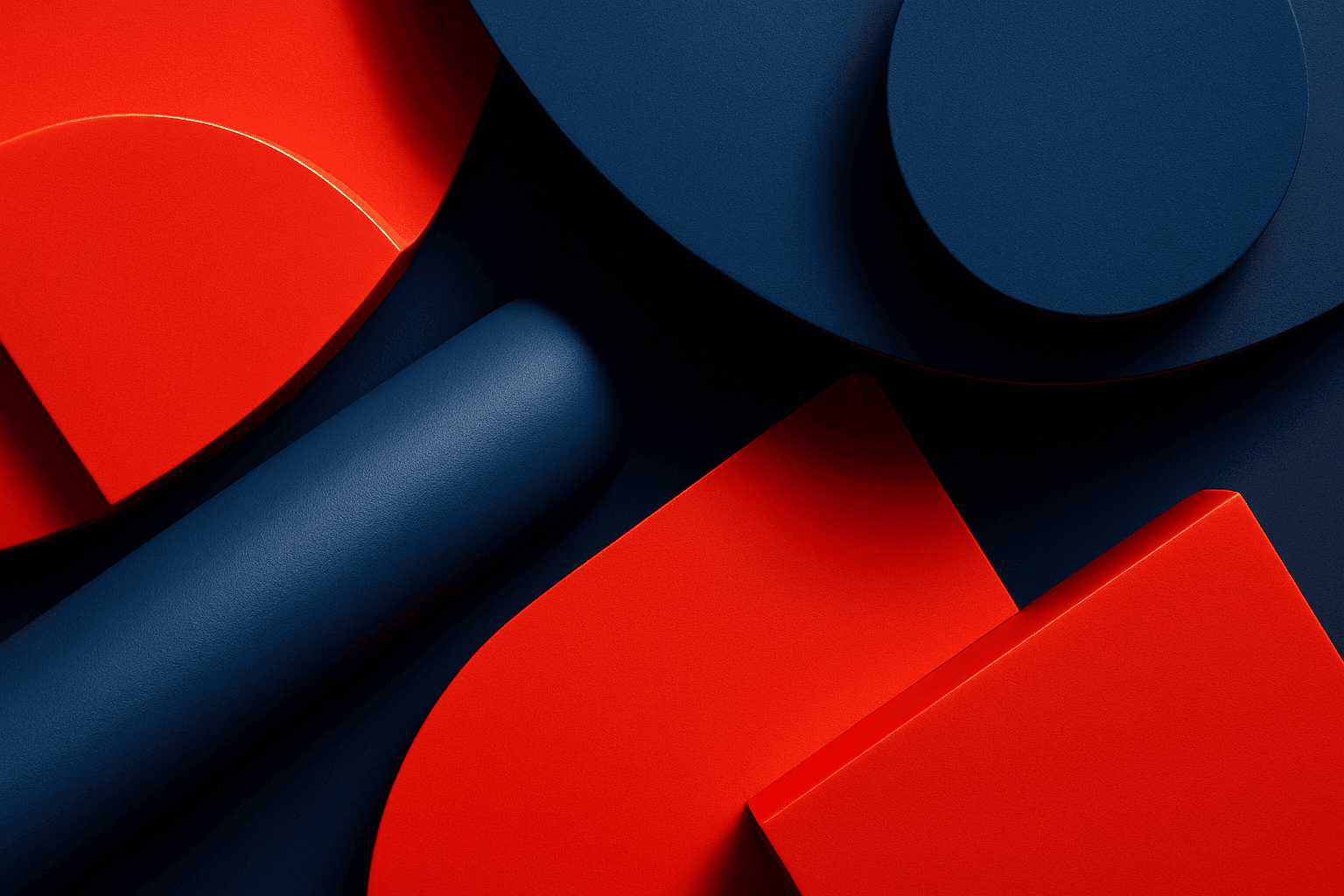
High Contrast Color Palette
A high contrast color palette significantly influences the mood and readability of visual content by emphasizing sharp differences between colors. This palette amplifies distinctions in tones and hues, resulting in images that feel vibrant, bold, and attention-grabbing. In AI image generation, specifying this keyword encourages models to produce compositions that highlight color differences, rather than blending or muted schemes. This enhances subject prominence and can evoke emotional responses or create memorable visuals, essential in advertising, editorial design, and digital art.

High Saturation Color Palette
Utilizing a High Saturation Color Palette in AI image generation transforms visuals into bold, lively compositions that capture attention instantly. This approach amplifies the color intensity beyond natural or muted levels, creating a vivid scene bursting with hues that feel powerful and immersive. Often chosen for marketing materials, modern art visuals, and stylized photography, artworks generated with high saturation evoke energetic and emotional responses. When combined thoughtfully with lighting, texture, and composition, it creates a striking balance of vibrancy and clarity, making it ideal for covers, header images, and creative projects needing dynamic coloring.
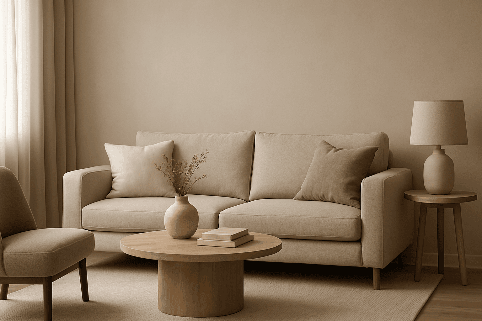
Muted Neutral Palette
The Muted Neutral Palette is an essential color theme used widely in design, photography, and digital imagery to produce a subtle, refined look. These colors lack vivid saturation and strong contrasts, resulting in images that feel calm, natural, and versatile. In AI-driven image generation, specifying a Muted Neutral Palette guides the model to avoid vibrant, saturated colors, focusing on softness and timelessness. It supports creating visuals that blend seamlessly in editorial, fashion, interior, and product contexts where sophistication and neutrality are paramount. This palette is particularly suited for minimalist compositions where color draws attention without overwhelming the scene.
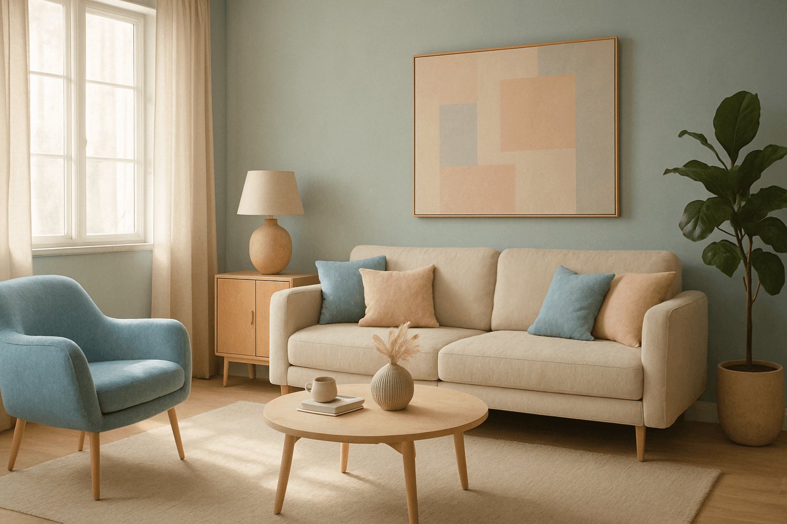
Muted Pastel Color Palette
The muted pastel color palette blends the gentle softness of pastel tones with a restrained saturation level, resulting in colors that evoke tranquility and refinement. When integrated into AI image generation, these colors provide a versatile aesthetic that suits a variety of creative and commercial needs. This palette can transform images into visually soothing experiences, often appearing in editorial designs, fashion imagery, and lifestyle branding. It avoids the brightness and intensity typical of standard pastels, offering a more mature and elegant atmosphere. The muted pastels produce harmonious compositions by pairing subdued colors, ideal for designs requiring subtlety, sophistication, and approachability.
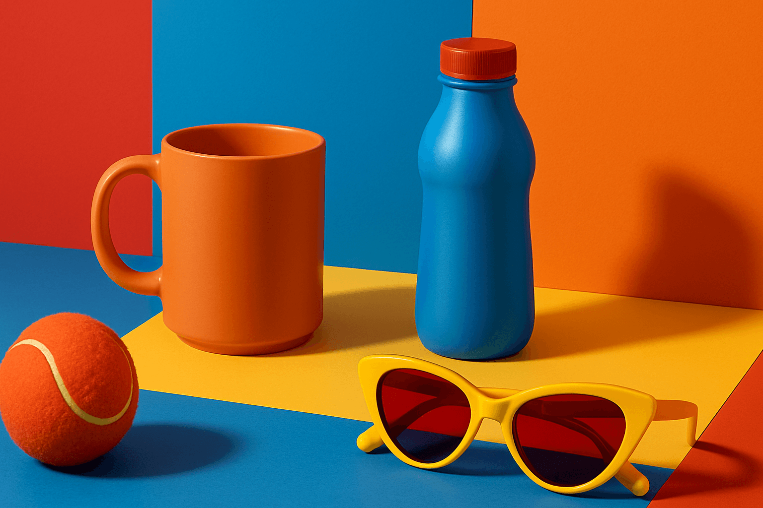
Vibrant Contrast Hues
Vibrant Contrast Hues represent an essential color strategy in AI-generated imagery where vivid and complementary colors are juxtaposed to maximize visual appeal. Applying this concept in prompts leads to images with heightened energy and attention-grabbing qualities, often preferred in marketing materials, editorial photography, and creative digital art. The technique manipulates color relationships to create mood and focus, making elements within the frame more prominent and memorable. Integrating vibrant contrast hues can transform an ordinary image into a visually compelling composition that draws the eye and communicates with clarity and boldness.

Saturated Color Splash
The Saturated Color Splash keyword is a powerful prompt modifier used in AI-driven creative workflows to generate images bursting with vibrant, intense colors and striking splash effects. It commands the AI to amplify the chroma and saturation of the color palette, producing visuals that are lively and compelling. These images typically showcase paint splashes or liquid color bursts that evoke motion and energy, making them ideal for dynamic compositions. Using this keyword enriches the visual storytelling, drawing viewers’ attention through high-impact color contrasts and expressive strokes. This effect suits various digital art applications, advertising visuals, and editorial imagery where boldness and vibrancy are desired.