High Contrast Color Palette
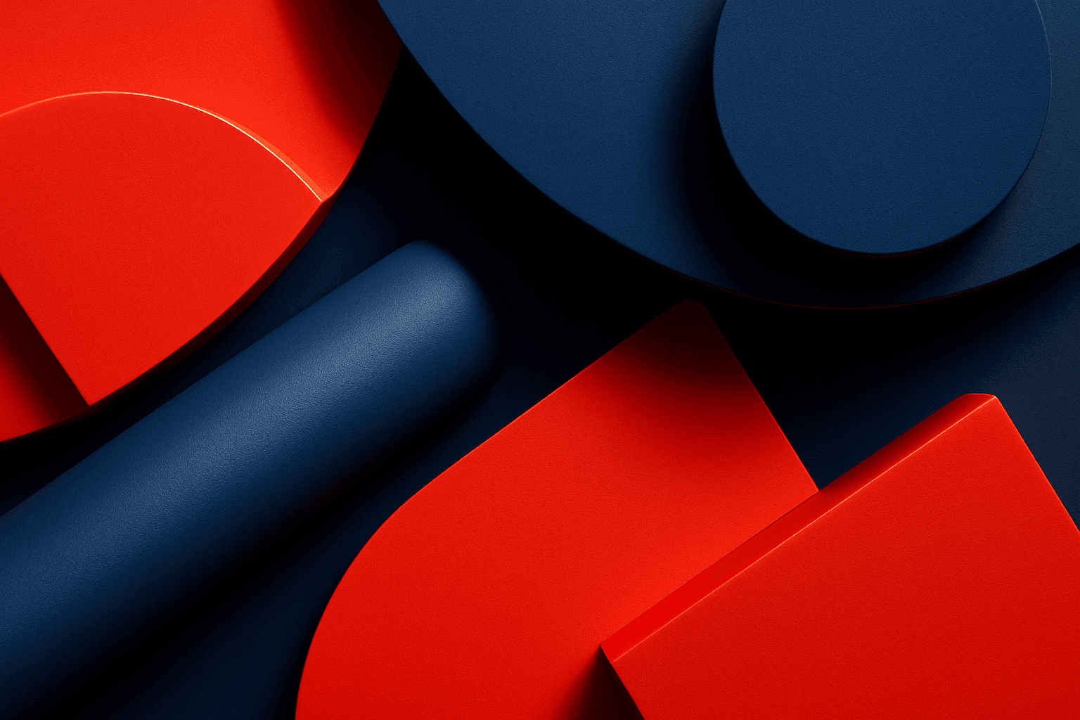
A high contrast color palette significantly influences the mood and readability of visual content by emphasizing sharp differences between colors. This palette amplifies distinctions in tones and hues, resulting in images that feel vibrant, bold, and attention-grabbing. In AI image generation, specifying this keyword encourages models to produce compositions that highlight color differences, rather than blending or muted schemes. This enhances subject prominence and can evoke emotional responses or create memorable visuals, essential in advertising, editorial design, and digital art.
Definition
A high contrast color palette refers to a set of colors selected to showcase strong visual differences in brightness and hue. This contrast creates striking and easily distinguishable elements within an image. In AI prompts, adding this keyword instructs the model to prioritize such vivid contrasts rather than soft or muted tones, resulting in dynamic, attention-grabbing visuals suitable for various creative uses.
Visual Characteristics
- Bold separation between light and dark areas
- Strong use of complementary colors like red and green or blue and orange
- Sharp edges and clear distinctions between color blocks
Prompt Formula
To incorporate a high contrast color palette in AI prompts, pair it with descriptive adjectives and related modifiers for precise output. Examples include: "vivid high contrast color palette," "sharp light-dark contrast," or "bright complementary colors with high saturation." Use these phrases alongside subject descriptions to enhance visual impact.
Best Use Cases
- Creating advertising visuals that demand viewer attention
- Producing editorial images with clear, focused subjects
- Designing digital art where color drama and mood are paramount
Creative Variations
To avoid repetitive results when using the high contrast color palette, vary lighting (e.g., dramatic side lighting, neon glows), color combinations (such as pairing warm hues against cool backgrounds), or composition styles (diagonal versus symmetrical layouts). Experimenting with subject matter, like urban environments or abstract shapes, also provides fresh perspectives while maintaining high contrast aesthetics.
Related Styles
- Complementary Colors
- Vibrant Color Scheme
- Dark and Light Contrast
Model-Specific Tips
Use direct, descriptive language when requesting high contrast palettes in prompts; avoid overly technical jargon. Emphasize terms like "vivid," "bold," and "sharp difference" paired with color references to maintain portability across models. Additionally, test slight variations in phrasing to ensure consistent output without dependency on one model’s syntax.
FAQ
What does 'high contrast color palette' mean in AI image prompts?
It means specifying colors that strongly differ in brightness and hue, prompting the AI to generate images with vivid, striking color differences to enhance visual impact.
How can I make my AI-generated images have more color contrast?
Include keywords like 'high contrast color palette,' 'vivid colors,' or 'sharp color differences' in your prompt, and specify complementary or bold color combinations.
Is a high contrast color palette suitable for all image types?
While it works well for dynamic and attention-grabbing images, it may not suit designs requiring subtlety or softness, such as delicate portraits or muted landscapes.
Continue Exploring
Related Prompts

High Saturation Color Palette
Utilizing a High Saturation Color Palette in AI image generation transforms visuals into bold, lively compositions that capture attention instantly. This approach amplifies the color intensity beyond natural or muted levels, creating a vivid scene bursting with hues that feel powerful and immersive. Often chosen for marketing materials, modern art visuals, and stylized photography, artworks generated with high saturation evoke energetic and emotional responses. When combined thoughtfully with lighting, texture, and composition, it creates a striking balance of vibrancy and clarity, making it ideal for covers, header images, and creative projects needing dynamic coloring.
Vibrant Contrast Hues
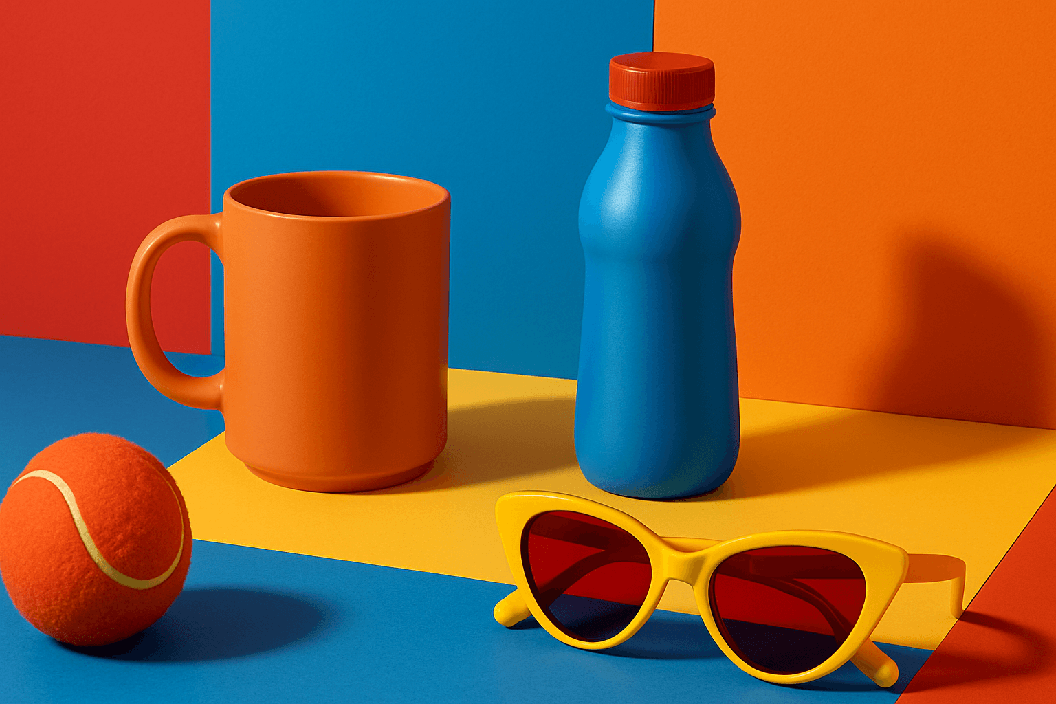
Vibrant Contrast Hues represent an essential color strategy in AI-generated imagery where vivid and complementary colors are juxtaposed to maximize visual appeal. Applying this concept in prompts leads to images with heightened energy and attention-grabbing qualities, often preferred in marketing materials, editorial photography, and creative digital art. The technique manipulates color relationships to create mood and focus, making elements within the frame more prominent and memorable. Integrating vibrant contrast hues can transform an ordinary image into a visually compelling composition that draws the eye and communicates with clarity and boldness.
Bold Contrasting Color Scheme
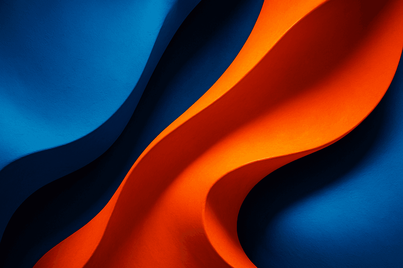
The Bold Contrasting Color Scheme keyword in AI prompts leverages vivid, sharply opposing colors to produce striking, high-impact visuals. This style harnesses color theory principles such as complementary and triadic schemes to make images pop with energy and clarity. It is widely used in graphic design, marketing, and digital art, where capturing attention quickly is essential. Utilizing this approach in AI image generation leads to photographs, illustrations, or digital compositions that feel fresh, modern, and aesthetically bold. The resulting images often feature intense colors side-by-side with strong differentiation, which guides viewer focus and enhances visual storytelling.

Duochrome Contrast Palette
Using a Duochrome Contrast Palette in AI-generated images involves combining two distinct contrasting colors to produce lively, attention-grabbing visuals. This method enhances compositions by providing a harmonious yet striking balance between two hues, often playing with differences in saturation, brightness, or temperature to add depth and vibrancy. Ideal for editorial designs, product renders, and artistic portraits, this palette style helps images stand out with refined color clarity and intensity, evoking strong mood and atmosphere.

Bright Primary Colors Palette
Using a Bright Primary Colors Palette in AI image generation emphasizes strong, pure colors—red, blue, and yellow—that are fundamental to color theory. This palette brings a dynamic, energetic feel to images, making them instantly attention-grabbing and easily distinguishable. It's ideal for designs aiming to evoke simplicity with power, evoke nostalgia for classic color schemes, or highlight specific elements through contrast. When integrated thoughtfully, it balances vibrancy with clarity, avoiding muddiness or oversaturation. This approach is especially popular in editorial, advertising, and graphic design work where visual directness is key.
Rich Jewel Tone Palette
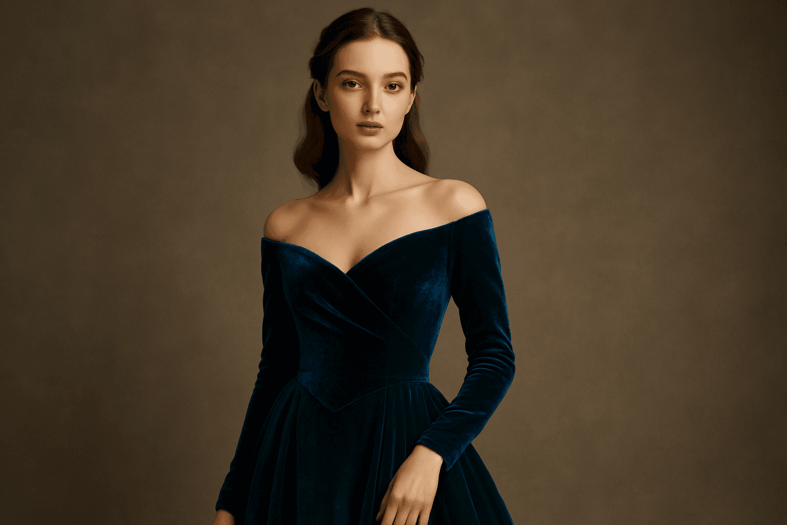
Using the Rich Jewel Tone Palette in AI image generation significantly influences the aesthetic by introducing highly saturated, gemstone-inspired colors. These tones create images that appear luxurious and visually striking, elevating compositions beyond simple color schemes. The palette often brings a sense of refinement and depth to scenes or subjects, making it a perfect choice for designs requiring rich, bold visual impact. Applying this palette modifies lighting and material perception to simulate the luminous qualities of jewels, enhancing realism and allure in the final output.