Bold Contrasting Color Scheme
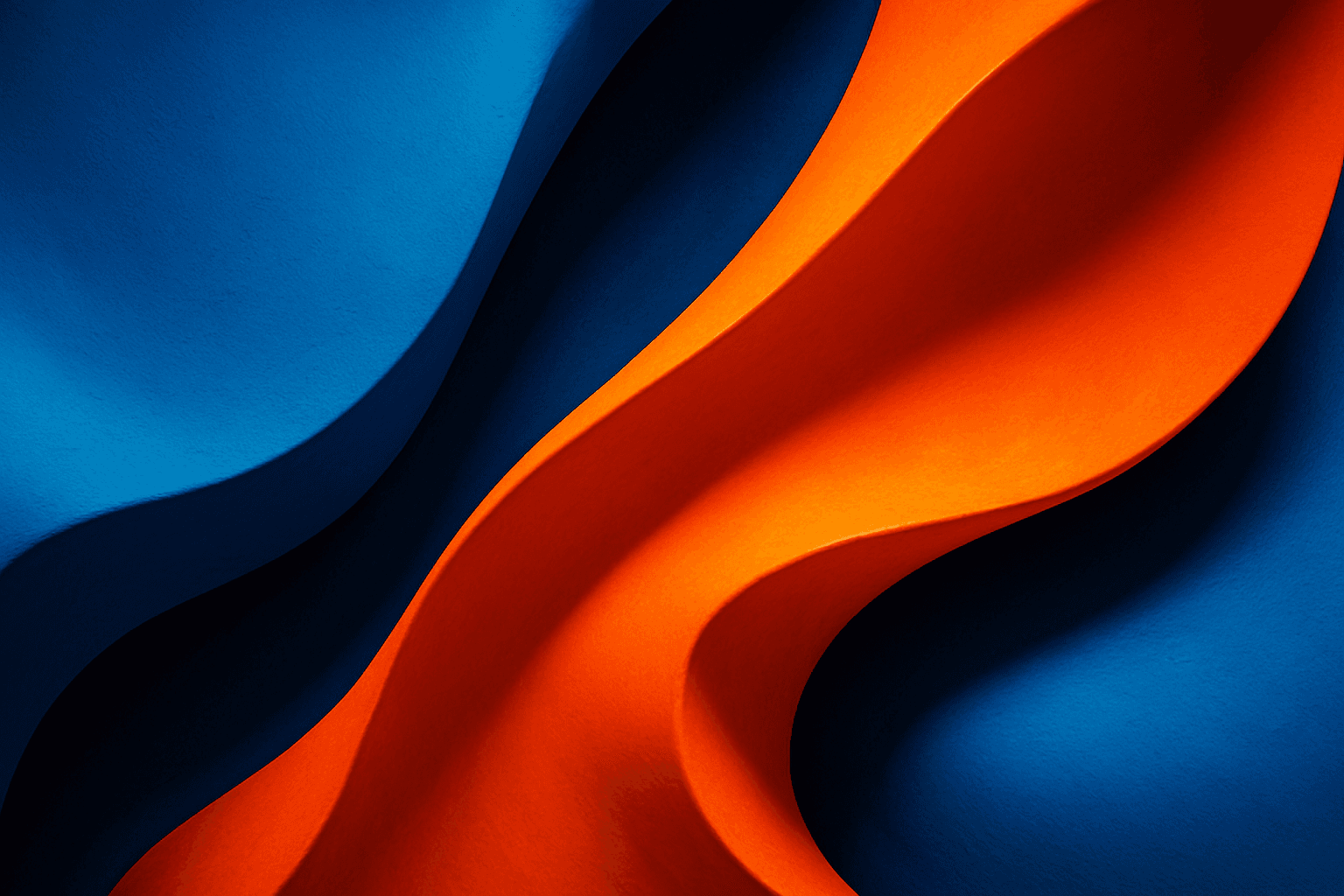
The Bold Contrasting Color Scheme keyword in AI prompts leverages vivid, sharply opposing colors to produce striking, high-impact visuals. This style harnesses color theory principles such as complementary and triadic schemes to make images pop with energy and clarity. It is widely used in graphic design, marketing, and digital art, where capturing attention quickly is essential. Utilizing this approach in AI image generation leads to photographs, illustrations, or digital compositions that feel fresh, modern, and aesthetically bold. The resulting images often feature intense colors side-by-side with strong differentiation, which guides viewer focus and enhances visual storytelling.
Definition
A Bold Contrasting Color Scheme refers to the deliberate use of strongly opposing or complementary colors in an AI image prompt to create vivid, visually dynamic images. This technique enhances color impact by placing colors that differ significantly in hue, brightness, or saturation side-by-side, ensuring the generated image is vibrant and attention-grabbing. Adding this keyword in prompts directs AI models to favor high-contrast palettes that emphasize clarity and energy, ideal for dynamic visuals.
Prompt Formula
Utilize the following prompt structures to incorporate a Bold Contrasting Color Scheme effectively: 1. "[subject] with a bold contrasting color scheme of [color1] and [color2]" 2. "[scene] featuring vivid color contrasts using complementary colors [color1] and [color2]" 3. "[style/genre] image emphasizing bold contrasting colors in [specific colors or palettes]" Combine with descriptive adjectives like "vibrant," "electric," or "high-saturation" to enhance effect.
- [subject] with a bold contrasting color scheme of [color1] and [color2]
- [scene] featuring vivid color contrasts using complementary colors [color1] and [color2]
- [style/genre] image emphasizing bold contrasting colors in [specific colors or palettes]
Best Use Cases
- Creating promotional banners that capture attention quickly
- Designing editorial covers where color contrast enhances subject focus
- Developing branding elements for a bold and modern identity
Professional Workflow
1. Define the project’s visual goal, focusing on vibrancy and clarity requiring bold contrast. 2. Compose AI prompts explicitly specifying the contrasting color palette and desired style. 3. Generate multiple image variants with varied color pairs and intensities. 4. Evaluate outputs for color balance, impact, and usability. 5. Select images with optimal contrast and refine further by adjusting prompt or post-processing. 6. Finalize and implement images in the project ensuring consistency with brand or editorial standards.
Related Styles
Bold Contrasting Color Scheme often pairs well with other high-impact styles such as High Saturation Palette and Vibrant Color Blocking. Complementary Colors form the theoretical basis for many contrasting schemes and align closely with this approach. Nearby PromptAtlas keywords include ‘Neon Glow Effect’ for luminous contrasts and ‘Minimalist Color Accent’ for focused bold color use.
- High Saturation Palette
- Complementary Colors
- Vibrant Color Blocking
Model-Specific Tips
When prompting modern AI image models for Bold Contrasting Color Schemes, use explicit color names along with saturation and brightness descriptors to ensure clear color separation. Avoid vague terms like 'bright colors' alone; instead specify 'electric blue and fiery orange with high saturation.' Including context such as lighting ('vibrant studio lighting') helps color clarity. Test variations if model defaults to muted palettes and guide with modifiers like 'high contrast' or 'colorful pop' to enhance output.
FAQ
How can I ensure my AI image has a true bold contrasting color scheme?
Specify exact color pairs with complementary or opposite color relationships in your prompt, include terms like 'high saturation' and 'vivid contrast,' and mention lighting that enhances color distinction. Experiment by naming colors directly and requesting strong contrast to guide the model.
Is bold contrasting color suitable for all image styles?
While versatile, bold contrasting colors work best in designs where high visual impact is needed, such as advertising, branding, or editorial images. It may overwhelm subtle or naturalistic styles, so consider your project needs before applying this scheme.
Continue Exploring
Related Prompts
Triadic Color Scheme
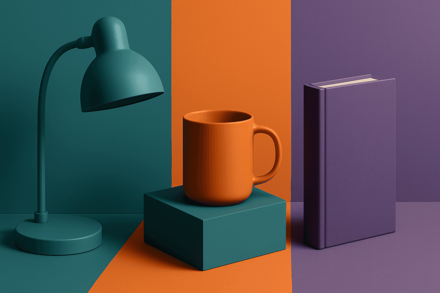
The triadic color scheme is a classic color theory concept widely used in art and design, characterized by choosing three colors equally spaced around the color wheel, such as red, yellow, and blue. This approach produces vibrant, balanced images that are visually stimulating yet cohesive. When integrated into AI image generation prompts, directing the model to use a triadic palette influences the overall color composition, encouraging distinct color blocks or gradients that harmonize well. This can be particularly useful for achieving dynamic but balanced aesthetics, making compositions stand out while maintaining visual unity. Triadic schemes often evoke a lively, engaging mood, suitable for varied creative fields including branding, illustration, and editorial design.
Harmonious Color Triads
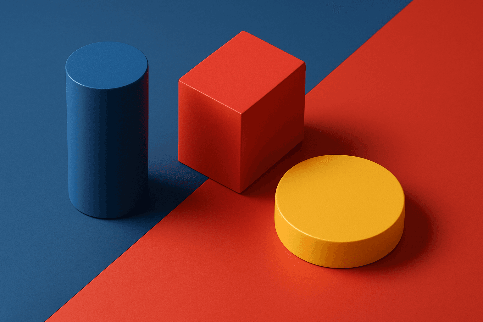
Harmonious color triads form a foundational concept in color theory, used to compose striking yet balanced color palettes by selecting three colors spaced evenly around the color wheel (120 degrees apart). In AI image generation, including harmonious color triads in prompts helps produce artworks or designs that display vibrant, dynamic color interplay while maintaining visual balance and unity. This technique prevents color over-saturation or dullness, enabling creation of visuals that feel lively without clashing. It is especially valued in editorial design, branding, digital art, and product visualization where color harmony impacts emotional and aesthetic response.
Triadic Color Harmony
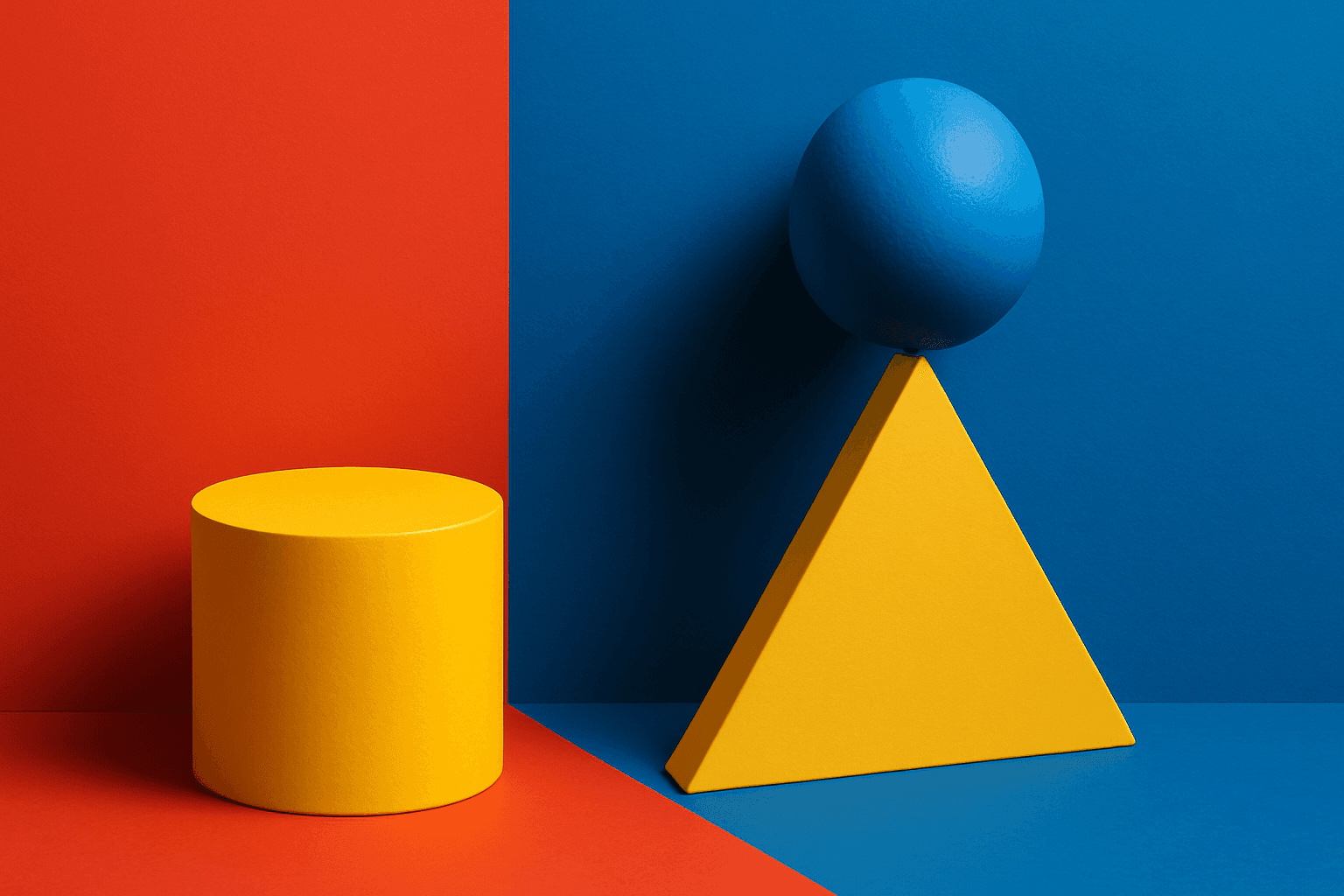
Triadic Color Harmony offers AI artists a powerful tool to create vibrant and balanced images by leveraging three colors equally spaced around the color wheel. This color scheme is known for producing striking yet harmonious compositions, making it ideal for colorful illustrations that maintain visual equilibrium. Including 'triadic color harmony' in your AI prompt encourages the model to incorporate this classic palette principle, resulting in images that pop with life but remain visually comfortable. This technique enhances themes ranging from nature scenes to abstract art and graphic design, providing a versatile framework for compelling color use.
Vibrant Contrast Hues
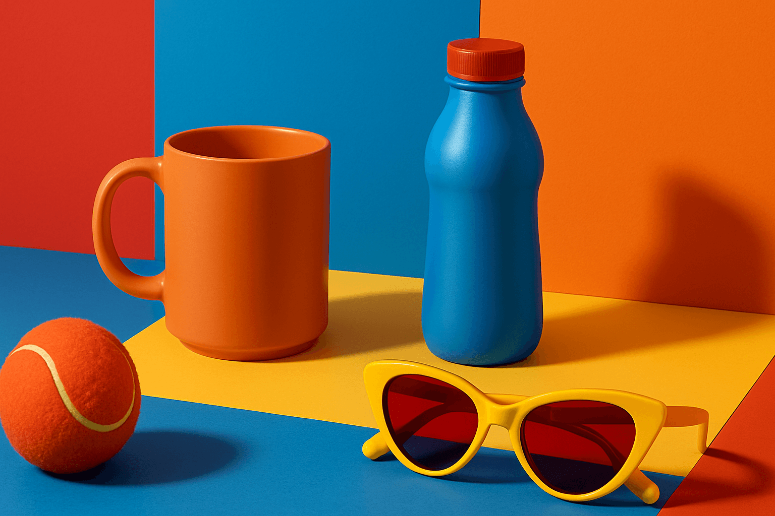
Vibrant Contrast Hues represent an essential color strategy in AI-generated imagery where vivid and complementary colors are juxtaposed to maximize visual appeal. Applying this concept in prompts leads to images with heightened energy and attention-grabbing qualities, often preferred in marketing materials, editorial photography, and creative digital art. The technique manipulates color relationships to create mood and focus, making elements within the frame more prominent and memorable. Integrating vibrant contrast hues can transform an ordinary image into a visually compelling composition that draws the eye and communicates with clarity and boldness.

High Saturation Color Palette
Utilizing a High Saturation Color Palette in AI image generation transforms visuals into bold, lively compositions that capture attention instantly. This approach amplifies the color intensity beyond natural or muted levels, creating a vivid scene bursting with hues that feel powerful and immersive. Often chosen for marketing materials, modern art visuals, and stylized photography, artworks generated with high saturation evoke energetic and emotional responses. When combined thoughtfully with lighting, texture, and composition, it creates a striking balance of vibrancy and clarity, making it ideal for covers, header images, and creative projects needing dynamic coloring.

Duochrome Contrast Palette
Using a Duochrome Contrast Palette in AI-generated images involves combining two distinct contrasting colors to produce lively, attention-grabbing visuals. This method enhances compositions by providing a harmonious yet striking balance between two hues, often playing with differences in saturation, brightness, or temperature to add depth and vibrancy. Ideal for editorial designs, product renders, and artistic portraits, this palette style helps images stand out with refined color clarity and intensity, evoking strong mood and atmosphere.