Harmonious Color Triads
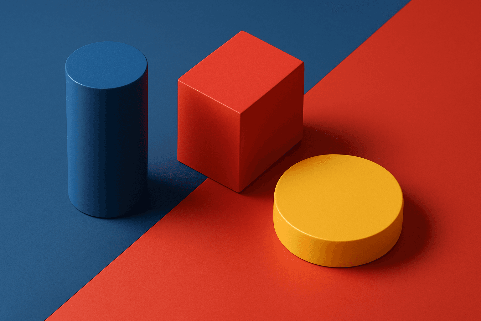
Harmonious color triads form a foundational concept in color theory, used to compose striking yet balanced color palettes by selecting three colors spaced evenly around the color wheel (120 degrees apart). In AI image generation, including harmonious color triads in prompts helps produce artworks or designs that display vibrant, dynamic color interplay while maintaining visual balance and unity. This technique prevents color over-saturation or dullness, enabling creation of visuals that feel lively without clashing. It is especially valued in editorial design, branding, digital art, and product visualization where color harmony impacts emotional and aesthetic response.
Definition
Harmonious color triads are sets of three colors equally spaced on the color wheel, typically 120 degrees apart, forming a triangle. This color arrangement offers a vibrant yet balanced palette that combines contrast with harmony. When included in AI image prompts, specifying harmonious color triads helps guide the model to focus on these three key colors, ensuring the resulting image maintains a captivating but cohesive color scheme that enhances visual interest without clashing or overwhelming the viewer.
Prompt Formula
Use these prompt-building phrases to incorporate harmonious color triads effectively: - "color palette featuring harmonious triads of [color1], [color2], and [color3]" - "balanced use of three evenly spaced colors on the color wheel" - "vibrant, harmonious triadic color scheme with refined lighting" - "dynamic composition emphasizing triadic colors evenly distributed" Combine color names or descriptive accents (e.g., pastel, saturated) for specificity and control.
- harmonious triads of [color1], [color2], and [color3]
- balanced triadic color scheme
- vibrant triadic palette with subtle depth
- dynamic triad-based composition
- even distribution of triadic colors
Best Use Cases
- Editorial and magazine illustrations needing vibrant, balanced visuals
- Branding assets requiring memorable and cohesive color schemes
- Digital paintings or concept art emphasizing vivid, appealing color contrasts
Common Mistakes
One common mistake when prompting for harmonious color triads is being too vague about the specific colors or neglecting their even spacing on the color wheel, leading to muddled or clashing colors. Another pitfall is oversaturating colors, which causes unnatural visuals. Avoid prompts that force unnatural blending or lack contrast, as they produce dull or unrealistic results. To prevent these issues, specify exact triad colors or use well-known triad sets and balance saturation and lighting carefully.
- Ignoring even spacing leads to clashing or muddied colors
- Overusing saturation causes unnatural visuals
- Failing to specify triad colors results in generic palettes
- Neglecting balance between colors reduces harmony
- Lack of lighting control diminishes color impact
Advanced Techniques
For experienced prompt writers, combine harmonious color triads with controlled lighting and material descriptors to enhance realism and depth. Use secondary modifiers such as "soft shadows" or "refined textures" to highlight color transitions. Experiment with triad saturation gradients (e.g., one dominant, two accents) to guide composition focus. Additionally, merge triadic palettes with related color harmony schemes like analogous accents to create multifaceted palettes with nuanced color interplay, boosting visual storytelling complexity.
- Combine triads with refined lighting and soft shadows
- Use saturation gradients to direct visual hierarchy
- Incorporate texture details that complement triadic colors
- Blend triads with analogous accents for depth
- Specify material realism to enhance color effects
Professional Workflow
Begin by selecting target triadic colors based on the project brief or mood board. Incorporate these into clear AI prompts using established formulas, specifying the triad distinctly. Generate multiple image variants to explore color balance and composition. Review outputs critically for accurate color harmony, saturation, and realism. Refine prompts iteratively, adjusting color terms and lighting cues to perfect results. Finally, select and retouch the best images as needed for client or commercial use, ensuring palette consistency and polish throughout.
- Identify triadic colors aligned with design goals
- Craft precise prompts with color triad emphasis
- Generate multiple variants for selection
- Evaluate and refine outputs based on harmony and realism
- Finalize and retouch chosen images for consistency
Related Styles
- Complementary Colors: using opposite colors for contrast
- Analogous Colors: neighboring colors on the wheel for subtle harmony
- Color Harmony: broader principles including triads and other schemes
FAQ
What are harmonious color triads in color theory?
They are sets of three colors evenly spaced around the color wheel, usually 120 degrees apart, used to create balanced and dynamic color schemes.
How do I specify harmonious color triads in AI prompts?
Include phrases like "harmonious triads of [color1], [color2], and [color3]" or "balanced triadic color scheme" with clear color names or shades.
Why are harmonious color triads useful in design?
They produce vibrant but balanced color palettes that enhance visual interest without causing color clashes or dullness, improving aesthetic appeal.
Continue Exploring
Related Prompts
Triadic Color Scheme
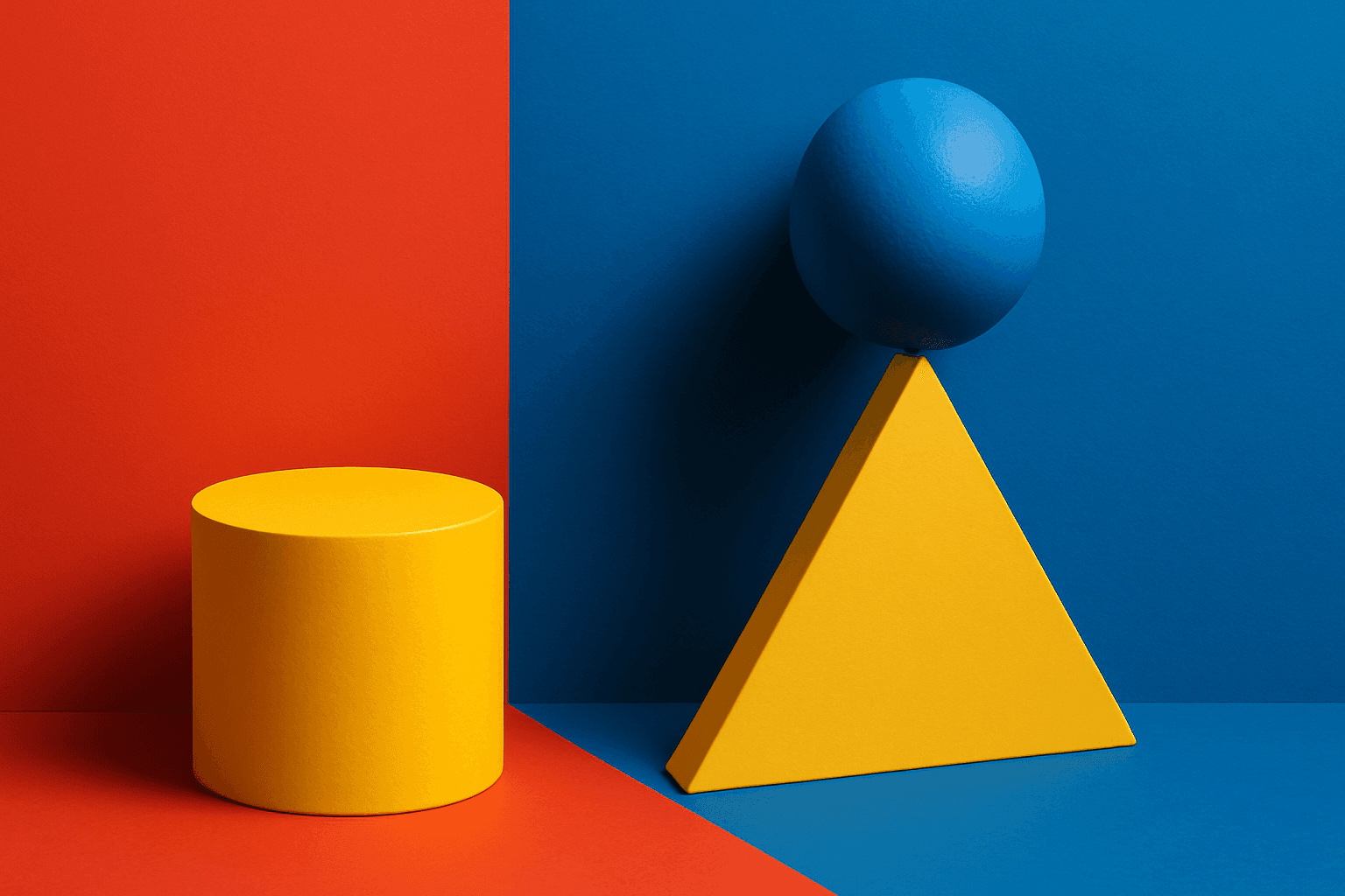
The triadic color scheme is a classic color theory concept widely used in art and design, characterized by choosing three colors equally spaced around the color wheel, such as red, yellow, and blue. This approach produces vibrant, balanced images that are visually stimulating yet cohesive. When integrated into AI image generation prompts, directing the model to use a triadic palette influences the overall color composition, encouraging distinct color blocks or gradients that harmonize well. This can be particularly useful for achieving dynamic but balanced aesthetics, making compositions stand out while maintaining visual unity. Triadic schemes often evoke a lively, engaging mood, suitable for varied creative fields including branding, illustration, and editorial design.
Triadic Color Harmony
Triadic Color Harmony offers AI artists a powerful tool to create vibrant and balanced images by leveraging three colors equally spaced around the color wheel. This color scheme is known for producing striking yet harmonious compositions, making it ideal for colorful illustrations that maintain visual equilibrium. Including 'triadic color harmony' in your AI prompt encourages the model to incorporate this classic palette principle, resulting in images that pop with life but remain visually comfortable. This technique enhances themes ranging from nature scenes to abstract art and graphic design, providing a versatile framework for compelling color use.

Duochrome Contrast Palette
Using a Duochrome Contrast Palette in AI-generated images involves combining two distinct contrasting colors to produce lively, attention-grabbing visuals. This method enhances compositions by providing a harmonious yet striking balance between two hues, often playing with differences in saturation, brightness, or temperature to add depth and vibrancy. Ideal for editorial designs, product renders, and artistic portraits, this palette style helps images stand out with refined color clarity and intensity, evoking strong mood and atmosphere.
Vibrant Contrast Hues
Vibrant Contrast Hues represent an essential color strategy in AI-generated imagery where vivid and complementary colors are juxtaposed to maximize visual appeal. Applying this concept in prompts leads to images with heightened energy and attention-grabbing qualities, often preferred in marketing materials, editorial photography, and creative digital art. The technique manipulates color relationships to create mood and focus, making elements within the frame more prominent and memorable. Integrating vibrant contrast hues can transform an ordinary image into a visually compelling composition that draws the eye and communicates with clarity and boldness.
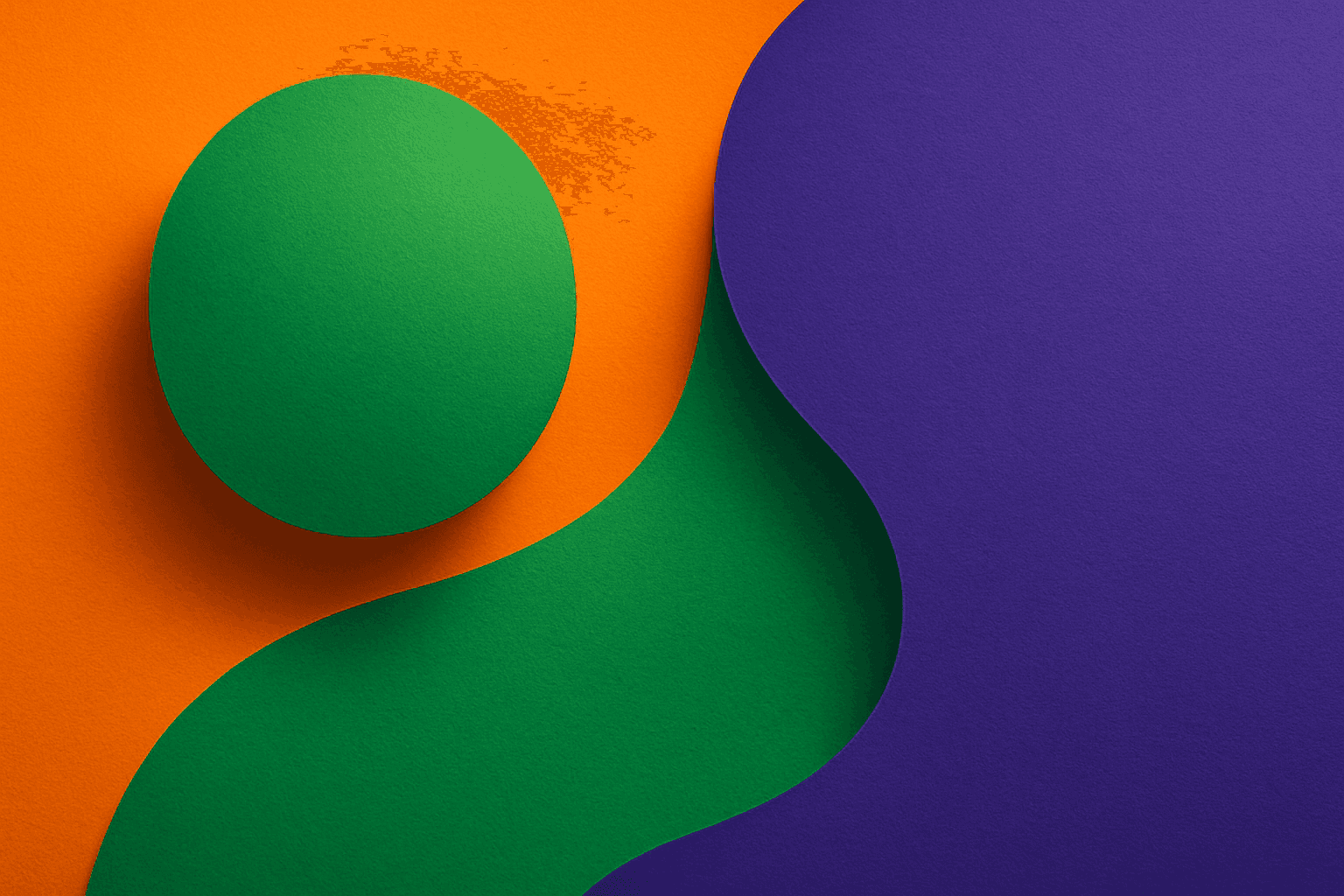
Triadic Color Harmonies
Triadic color harmonies provide a powerful method to generate visually striking AI images with balanced contrast. By selecting three colors evenly distributed on the color wheel, this technique injects vibrancy and diversity into the palette while maintaining harmony. When included in AI image prompts, it helps produce compositions that pop with color but remain cohesive, suitable for a wide range of creative projects. This approach avoids monotone or clashing visuals and offers a natural yet exciting look. Understanding and applying triadic color harmonies in prompts empowers creators to craft images that stand out with rich, lively color schemes across digital art, design mockups, and branding visuals.

Analogous Warm Color Scheme
Analogous Warm Color Schemes employ colors adjacent on the color wheel within warm tones—reds, oranges, and yellows—to produce harmonious, vibrant images. In AI-generated art, specifying this scheme guides the model to focus on these related colors, resulting in visuals that feel unified and energetic. This scheme evokes warmth, comfort, and optimism, excellent for compositions needing a welcoming or lively mood. Using it strategically in prompts helps artists and designers achieve balanced, naturally blended color palettes that enhance emotional impact without overwhelming the viewer.