Duochrome Contrast Palette
Using a Duochrome Contrast Palette in AI-generated images involves combining two distinct contrasting colors to produce lively, attention-grabbing visuals. This method enhances compositions by providing a harmonious yet striking balance between two hues, often playing with differences in saturation, brightness, or temperature to add depth and vibrancy. Ideal for editorial designs, product renders, and artistic portraits, this palette style helps images stand out with refined color clarity and intensity, evoking strong mood and atmosphere.

Definition
The Duochrome Contrast Palette is a color approach in AI-generated imagery where two contrasting colors or tones dominate the composition. This technique shifts the AI's focus to apply vibrant, balanced dual-color schemes that enhance visual interest and highlight subject details. Adding this keyword to prompts signals the model to produce images emphasizing color opposition, which adds striking dynamism without overwhelming complexity.
Visual Characteristics
- Distinct pairing of two bold and contrasting colors, often complementary
- Balanced brightness and saturation maintain visual harmony and depth
- Smooth or sharp transitions between hues emphasize shapes and lighting effects
Prompt Formula
Building prompts with the Duochrome Contrast Palette involves specifying the two colors explicitly or by referencing duochrome contrasts, combined with descriptors for lighting and clarity to maximize effect. Use patterns like:
- 'Duochrome contrast palette of [color1] and [color2]', emphasizing refined lighting
- 'Portrait with duochrome contrast palette in [color1] & [color2], realistic textures, clean background'
- 'Product shot using duochrome contrast palette [color1]/[color2], subtle depth and polished materials'
Best Use Cases
- Creating editorial hero and thumbnail images that require vibrant yet balanced colors
- Crafting product photography or branding assets that leverage striking dual-tone effects
- Designing concept art or portraits with dramatic visual contrast and mood
Professional Workflow
Start by defining the target colors for the duochrome contrast to match brand or style guidelines. Incorporate the palette into your AI prompt alongside lighting and material descriptors to ensure realistic rendering. Generate multiple variations to select the best balance and depth. Refine chosen images using post-processing tools to adjust color balance and sharpness while preserving the harmonic contrast. This workflow ensures polished, commercially viable visuals.
Related Styles
- Complementary Colors — use colors opposite on the color wheel to heighten contrast
- Color Contrast — enhance visual distinction through light-dark and hue contrasts
- Palette Harmony — blend colors pleasingly to maintain aesthetic cohesion
Model-Specific Tips
When working with modern AI image models, explicitly naming the two chosen colors in your prompt helps achieve precise duochrome results. Use terms like ‘dual-tone’ or ‘duochrome contrast palette’ along with lighting and material details to guide the image generation. Avoid vague color references, and experiment with specifying saturation and brightness to influence mood. Consistent phrasing across iterations stabilizes results and simplifies selection.
FAQ
What is a duochrome contrast palette in AI image generation?
It is a technique where two contrasting colors dominate the image, producing vibrant, visually striking results by balancing opposing hues within the composition.
How do I specify colors in prompts for duochrome palettes?
You can explicitly name the two contrasting colors or describe their qualities (e.g., warm vs. cool) to guide the AI to generate a balanced dual-tone color scheme.
Which projects benefit most from using duochrome contrast palettes?
Editorial images, branding visuals, product photography, and creative portraits gain strong impact and aesthetic clarity from this palette style.
Continue Exploring
Related Prompts
High Contrast Color Palette
A high contrast color palette significantly influences the mood and readability of visual content by emphasizing sharp differences between colors. This palette amplifies distinctions in tones and hues, resulting in images that feel vibrant, bold, and attention-grabbing. In AI image generation, specifying this keyword encourages models to produce compositions that highlight color differences, rather than blending or muted schemes. This enhances subject prominence and can evoke emotional responses or create memorable visuals, essential in advertising, editorial design, and digital art.
Vibrant Contrast Hues
Vibrant Contrast Hues represent an essential color strategy in AI-generated imagery where vivid and complementary colors are juxtaposed to maximize visual appeal. Applying this concept in prompts leads to images with heightened energy and attention-grabbing qualities, often preferred in marketing materials, editorial photography, and creative digital art. The technique manipulates color relationships to create mood and focus, making elements within the frame more prominent and memorable. Integrating vibrant contrast hues can transform an ordinary image into a visually compelling composition that draws the eye and communicates with clarity and boldness.
Duotone Contrast Palette
The Duotone Contrast Palette is a contemporary color technique often used in digital art, photography, and graphic design to create visually compelling images. By focusing on two contrasting colors, designers and AI image generators produce striking visuals that enhance mood and emphasize subject contours. This technique simplifies the color landscape, providing boldness and clarity, which is especially effective for editorial images, advertising, or brand messaging. Incorporating it as a prompt keyword guides AI models to generate images that leverage strong color contrasts, appealing to modern aesthetics with a clean, polished finish.
Harmonious Color Triads
Harmonious color triads form a foundational concept in color theory, used to compose striking yet balanced color palettes by selecting three colors spaced evenly around the color wheel (120 degrees apart). In AI image generation, including harmonious color triads in prompts helps produce artworks or designs that display vibrant, dynamic color interplay while maintaining visual balance and unity. This technique prevents color over-saturation or dullness, enabling creation of visuals that feel lively without clashing. It is especially valued in editorial design, branding, digital art, and product visualization where color harmony impacts emotional and aesthetic response.
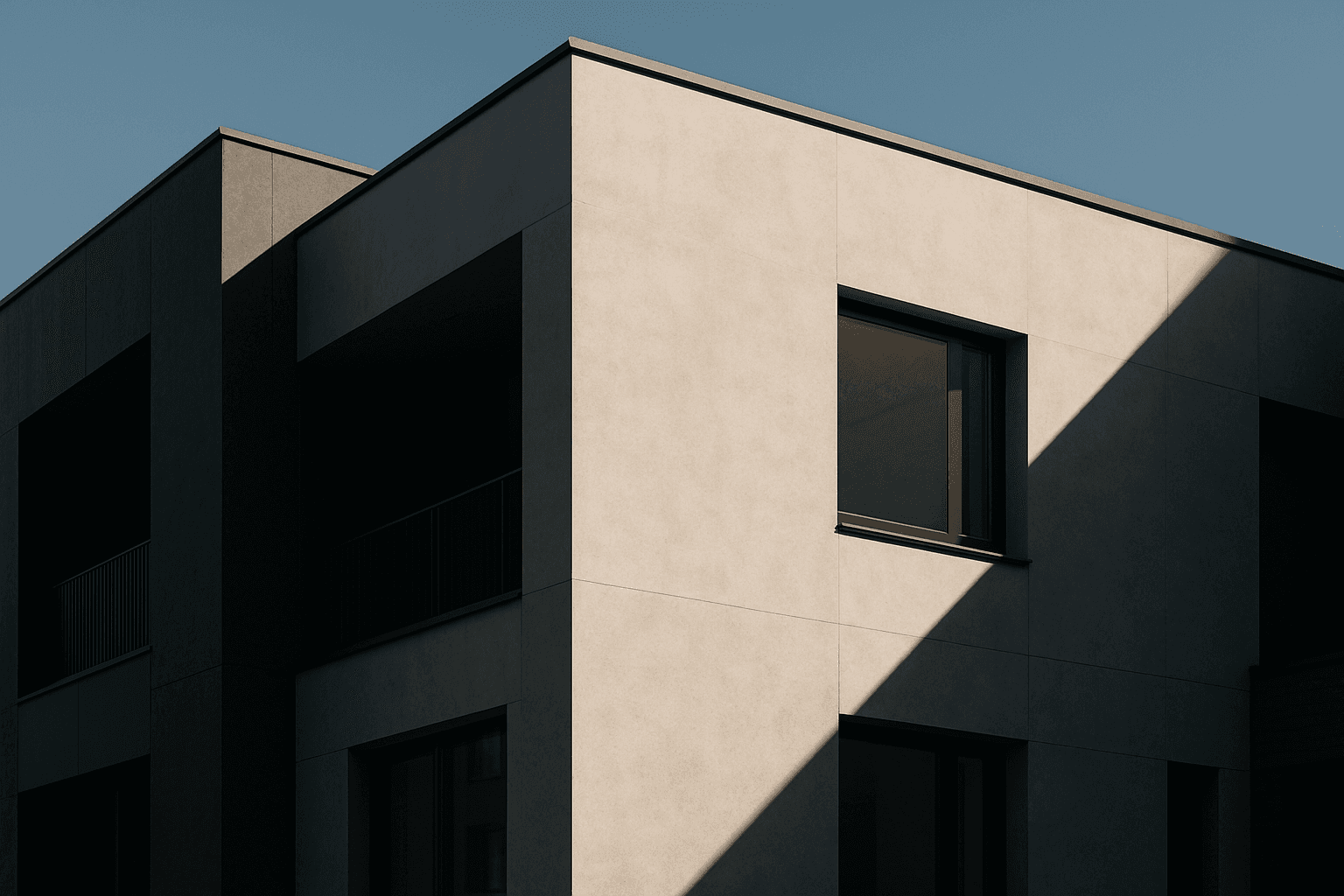
Tonal Contrast Palette
Using a Tonal Contrast Palette in AI image generation helps create compositions with clear differentiation of light and dark areas, which emphasizes structure and mood. This approach intensifies the visual impact by focusing on brightness contrasts rather than just color hues, enabling images with dramatic or refined atmospheres. As a color keyword, it guides AI models to adjust tone values cohesively, producing images that feel dynamic and balanced at once.
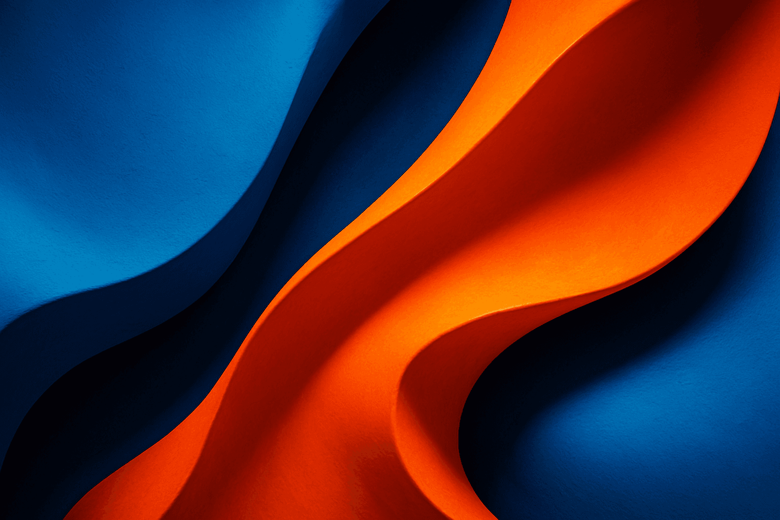
Bold Contrasting Color Scheme
The Bold Contrasting Color Scheme keyword in AI prompts leverages vivid, sharply opposing colors to produce striking, high-impact visuals. This style harnesses color theory principles such as complementary and triadic schemes to make images pop with energy and clarity. It is widely used in graphic design, marketing, and digital art, where capturing attention quickly is essential. Utilizing this approach in AI image generation leads to photographs, illustrations, or digital compositions that feel fresh, modern, and aesthetically bold. The resulting images often feature intense colors side-by-side with strong differentiation, which guides viewer focus and enhances visual storytelling.