Tonal Contrast Palette
Using a Tonal Contrast Palette in AI image generation helps create compositions with clear differentiation of light and dark areas, which emphasizes structure and mood. This approach intensifies the visual impact by focusing on brightness contrasts rather than just color hues, enabling images with dramatic or refined atmospheres. As a color keyword, it guides AI models to adjust tone values cohesively, producing images that feel dynamic and balanced at once.
Definition
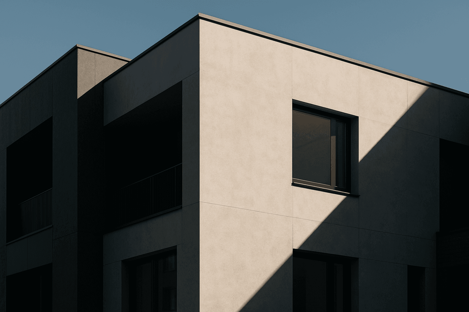
A Tonal Contrast Palette is a color approach in AI image prompts that focuses on using a strong range of light and dark tones to create depth and drama. Instead of just using vibrant colors, this palette emphasizes how brightness levels contrast across the image to highlight shapes and textures, affecting the mood and perceived dimensionality.
Visual Characteristics
- Clear separation between highlights and shadows creating depth
- Balanced use of light and dark tones enhancing dimensionality
- Moodful atmospheres resulting from tonal interplay
Prompt Formula
To build prompts using the Tonal Contrast Palette, combine lighting and color descriptions that prioritize tone differences. Example formulas include:
- <subject> with tonal contrast palette highlighting shadows and light
- <scene> rendered in a tonal contrast palette with deep shadows and bright highlights
- <object> portrayed using a tonal contrast palette emphasizing form and texture
Best Use Cases
- Architectural imagery where shadows define structure
- Portraits requiring enhanced facial depth and mood
- Product photography focusing on texture and material detail
Model-Specific Tips
For modern AI image models, pair the Tonal Contrast Palette keyword with precise lighting descriptors such as “dramatic lighting” or “soft shadows” to refine tonal effects. Avoid overly complex color instructions, as tonal contrast relies mainly on brightness variation rather than saturation. Experiment with ranges of light intensity to achieve a balanced look without losing naturalness. Use neutral or monochrome color hints to strengthen the tonal emphasis without color distraction.
FAQ
What does a Tonal Contrast Palette do in AI image prompts?
It guides the AI to emphasize contrasts between light and dark tones, creating depth, defining shapes, and enhancing mood through balanced brightness differences.
Is the Tonal Contrast Palette suitable for colorful images?
Yes, but it mainly focuses on the variation of lightness and darkness, so colors may be subdued to maintain strong tonal contrasts rather than vivid saturation.
Continue Exploring
Related Prompts

Duochrome Contrast Palette
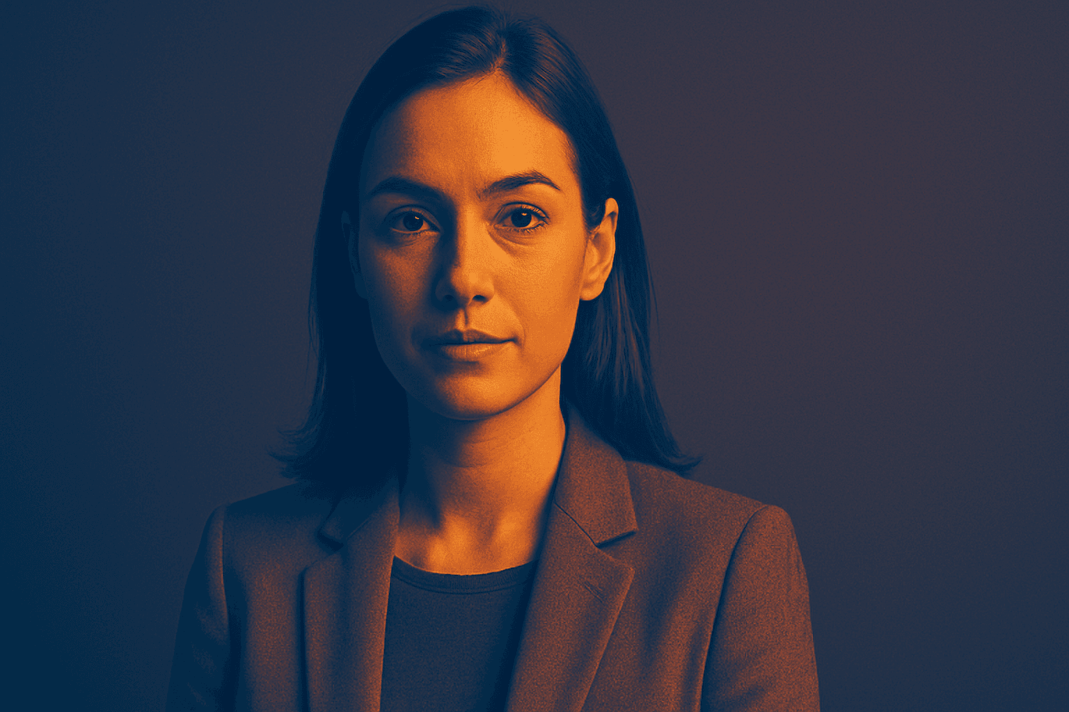
Using a Duochrome Contrast Palette in AI-generated images involves combining two distinct contrasting colors to produce lively, attention-grabbing visuals. This method enhances compositions by providing a harmonious yet striking balance between two hues, often playing with differences in saturation, brightness, or temperature to add depth and vibrancy. Ideal for editorial designs, product renders, and artistic portraits, this palette style helps images stand out with refined color clarity and intensity, evoking strong mood and atmosphere.
Duotone Contrast Palette
The Duotone Contrast Palette is a contemporary color technique often used in digital art, photography, and graphic design to create visually compelling images. By focusing on two contrasting colors, designers and AI image generators produce striking visuals that enhance mood and emphasize subject contours. This technique simplifies the color landscape, providing boldness and clarity, which is especially effective for editorial images, advertising, or brand messaging. Incorporating it as a prompt keyword guides AI models to generate images that leverage strong color contrasts, appealing to modern aesthetics with a clean, polished finish.
High Contrast Color Palette
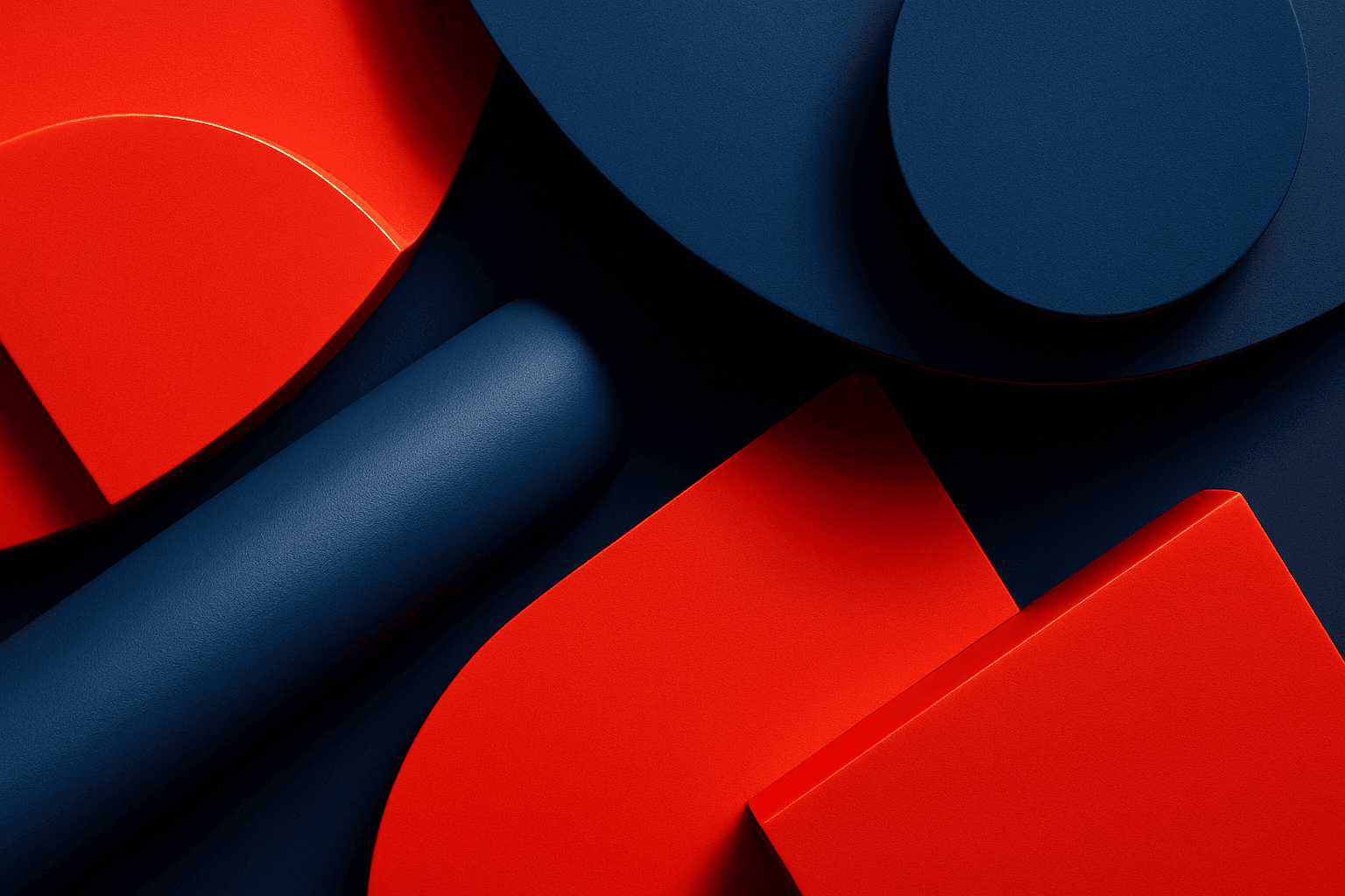
A high contrast color palette significantly influences the mood and readability of visual content by emphasizing sharp differences between colors. This palette amplifies distinctions in tones and hues, resulting in images that feel vibrant, bold, and attention-grabbing. In AI image generation, specifying this keyword encourages models to produce compositions that highlight color differences, rather than blending or muted schemes. This enhances subject prominence and can evoke emotional responses or create memorable visuals, essential in advertising, editorial design, and digital art.
Vibrant Contrast Colors
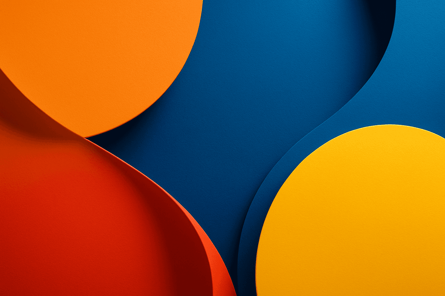
Using vibrant contrast colors in AI-generated images dramatically amplifies visual impact by pairing bright, intense hues that stand out against each other. This technique can create striking, memorable images with pronounced depth and energy. By incorporating this keyword into prompts, artists and designers can achieve images where colors pop distinctly, guiding the viewer's eye and enhancing compositional clarity. It is particularly valuable in designs aiming to convey excitement, energy, or modernity. The result is a colorful, lively composition that avoids dullness and monotony by leveraging color theory for maximum vibrancy.
Monochromatic Red Tones
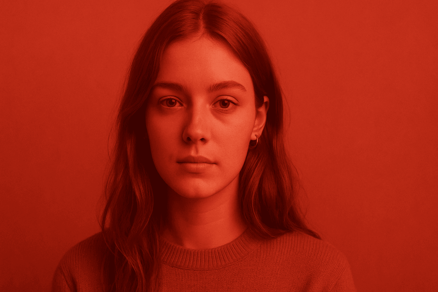
Monochromatic Red Tones is a powerful color approach in AI image generation that emphasizes various shades, tints, and tones of red exclusively. This technique reinforces emotional impact, typically evoking passion, warmth, or intensity, depending on the red variations used. By focusing on a single color family, it simplifies the visual narrative and heightens composition cohesion. Designers and creators leverage this color scheme to create striking editorial images, fashion visuals, or conceptual art where red's symbolic power is essential. Using Monochromatic Red Tones in AI prompts helps achieve images with a unified palette that feels refined and emotionally charged.
Rich Jewel Tone Palette
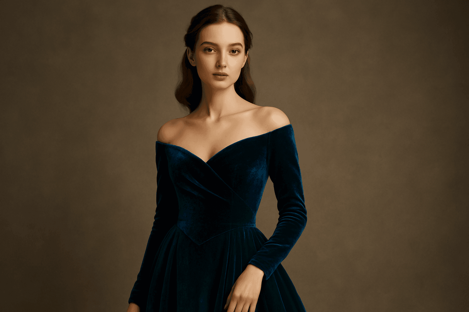
Using the Rich Jewel Tone Palette in AI image generation significantly influences the aesthetic by introducing highly saturated, gemstone-inspired colors. These tones create images that appear luxurious and visually striking, elevating compositions beyond simple color schemes. The palette often brings a sense of refinement and depth to scenes or subjects, making it a perfect choice for designs requiring rich, bold visual impact. Applying this palette modifies lighting and material perception to simulate the luminous qualities of jewels, enhancing realism and allure in the final output.