Vibrant Contrast Colors
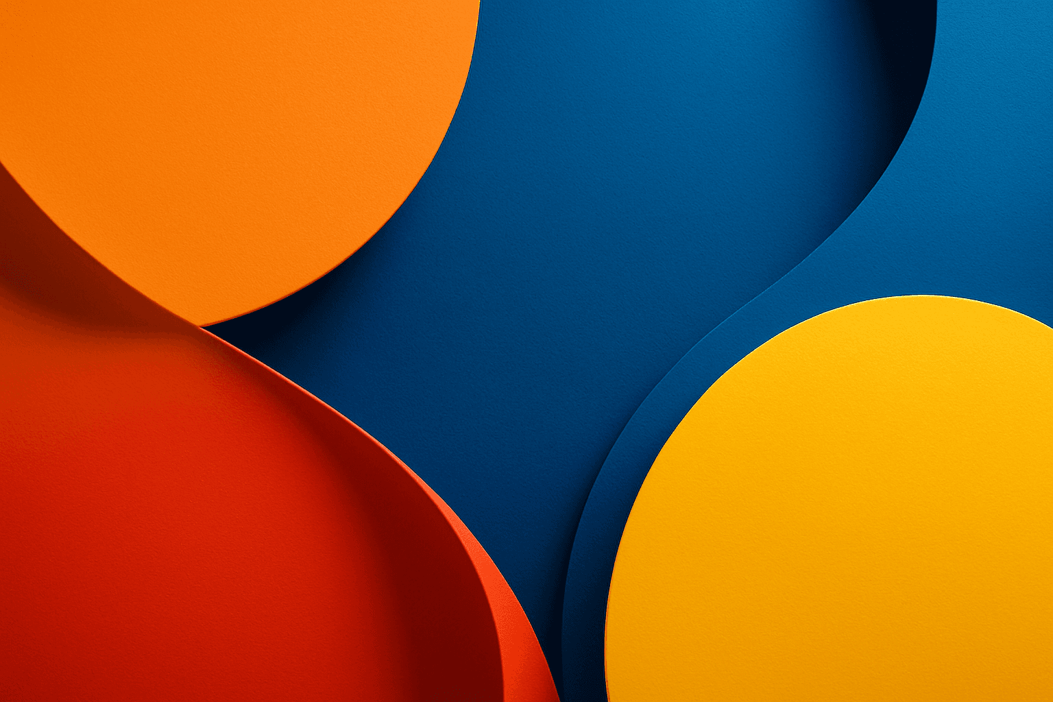
Using vibrant contrast colors in AI-generated images dramatically amplifies visual impact by pairing bright, intense hues that stand out against each other. This technique can create striking, memorable images with pronounced depth and energy. By incorporating this keyword into prompts, artists and designers can achieve images where colors pop distinctly, guiding the viewer's eye and enhancing compositional clarity. It is particularly valuable in designs aiming to convey excitement, energy, or modernity. The result is a colorful, lively composition that avoids dullness and monotony by leveraging color theory for maximum vibrancy.
Definition
Vibrant contrast colors describe the use of bright, saturated hues that are positioned opposite or far apart on the color wheel, creating strong visual differentiation and energy. In AI prompt writing, including this keyword guides the model to emphasize such color dynamics, enhancing the image’s liveliness and depth. This contributes to visuals that grab attention through bold color interplay, avoiding dull or muted color palettes.
Prompt Formula
To effectively incorporate vibrant contrast colors, structure prompts to include descriptions of color relationships and visual effects. For example: "[subject] with vibrant contrast colors, high saturation, complementary hues, refined lighting, and subtle shadows." Combining terms like 'vibrant,' 'contrast,' 'saturation,' and specifying color pairs (e.g., blue and orange) helps achieve the desired effect.
- Vibrant contrast colors
- High saturation complementary hues
- Refined lighting with subtle shadows
- Dynamic color interplay
- Bright, glossy materials
Best Use Cases
- Eye-catching advertising visuals that require strong color emphasis
- Editorial images with dynamic color energy for hero sections
- Ecommerce product shots that highlight vivid color details
Industry Applications
Vibrant contrast colors are widely used across various commercial domains. In advertising, they attract immediate attention and communicate energy. Editorials utilize these colors to create compelling hero images that engage readers at a glance. Ecommerce benefits as vibrant contrasts accurately showcase products with clarity and appeal, enhancing the shopper’s experience. Additionally, interior design visualizations can use such palettes for showcasing bold, modern spaces.
- Advertising: capturing viewer attention with bold colors
- Editorial: dynamic visuals for featured articles
- Ecommerce: highlighting product color vibrancy and quality
Common Mistakes
One common mistake is over-saturating colors to the point where they appear unrealistic or visually overwhelming. Another is using contrasting colors without consideration for harmony, resulting in clashing, uncomfortable images. Also, lacking appropriate lighting and material details can make vibrant colors look flat or synthetic. To avoid these, balance saturation levels, choose harmonious complementary colors, and include lighting/reflection details in prompts.
- Over-saturation causing unnatural colors
- Ignoring color harmony leading to clashing visuals
- Neglecting lighting and texture details making colors flat
- Using generic terms without specificity on color pairs
Advanced Techniques
Experienced prompt writers can combine vibrant contrast colors with modifiers like 'ambient occlusion' or 'cinematic lighting' to enhance depth. Introducing specific color pairs (e.g., teal and coral) sharpens the palette. Using constraints such as 'avoid oversaturation' or 'preserve natural skin tones' ensures realism. Layering texture keywords like 'matte versus glossy' can subtly shift color perception. These refinements yield sophisticated and polished results.
- Specify exact contrasting color pairs
- Add lighting constraints: cinematic, soft shadows
- Include saturation limits to avoid excess
- Combine with texture modifiers (glossy, matte)
- Use ambient occlusion to enhance depth
Professional Workflow
Begin with a clear brief defining the color mood, target audience, and application. Craft prompts incorporating vibrant contrast colors with supporting descriptors for lighting and materials. Generate batches of images, then review selections for color vibrancy, balance, and composition. Refine prompts using iterative feedback to adjust saturation and harmony. Finally, retouch or composite selected images as needed for final use.
- Define color goals and application context
- Compose detailed prompts highlighting vibrant contrast colors
- Generate multiple variants to compare outputs
- Select images with optimal color balance and composition
- Iteratively refine prompts and apply post-processing
Related Styles
- Color Saturation Enhancement
- High Contrast Lighting
- Dynamic Color Palette
- Bold Graphic Design
- Modern Editorial Aesthetic
FAQ
How do vibrant contrast colors affect the mood of an image?
Vibrant contrast colors create energetic, lively moods by emphasizing brightness and opposing hues, making images appear more dynamic and engaging.
Can vibrant contrast colors be used for portrait images?
Yes, when used carefully, they can highlight details and add artistic flair, but skin tones should remain natural to avoid unrealistic appearances.
Continue Exploring
Related Prompts
Vibrant Contrast Hues
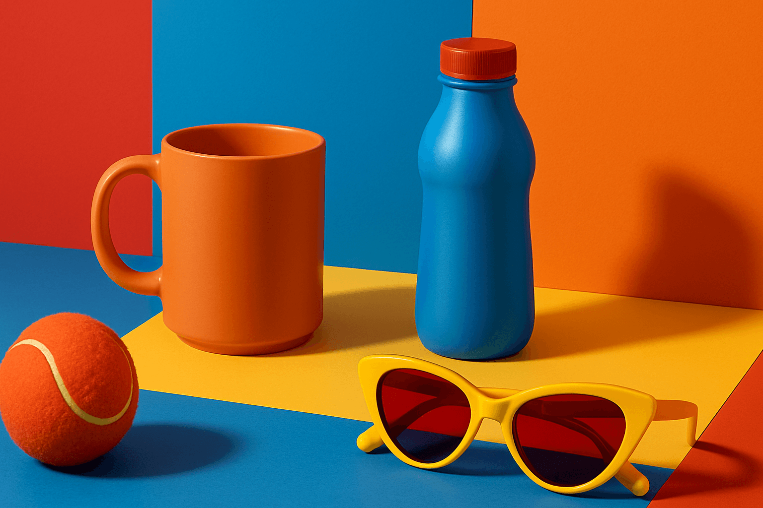
Vibrant Contrast Hues represent an essential color strategy in AI-generated imagery where vivid and complementary colors are juxtaposed to maximize visual appeal. Applying this concept in prompts leads to images with heightened energy and attention-grabbing qualities, often preferred in marketing materials, editorial photography, and creative digital art. The technique manipulates color relationships to create mood and focus, making elements within the frame more prominent and memorable. Integrating vibrant contrast hues can transform an ordinary image into a visually compelling composition that draws the eye and communicates with clarity and boldness.

Duochrome Contrast Palette
Using a Duochrome Contrast Palette in AI-generated images involves combining two distinct contrasting colors to produce lively, attention-grabbing visuals. This method enhances compositions by providing a harmonious yet striking balance between two hues, often playing with differences in saturation, brightness, or temperature to add depth and vibrancy. Ideal for editorial designs, product renders, and artistic portraits, this palette style helps images stand out with refined color clarity and intensity, evoking strong mood and atmosphere.
Tonal Contrast Palette
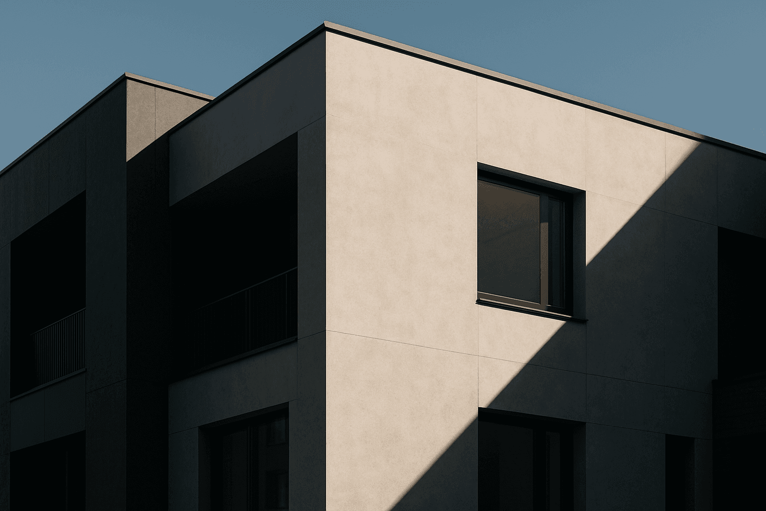
Using a Tonal Contrast Palette in AI image generation helps create compositions with clear differentiation of light and dark areas, which emphasizes structure and mood. This approach intensifies the visual impact by focusing on brightness contrasts rather than just color hues, enabling images with dramatic or refined atmospheres. As a color keyword, it guides AI models to adjust tone values cohesively, producing images that feel dynamic and balanced at once.

Bright Primary Colors Palette
Using a Bright Primary Colors Palette in AI image generation emphasizes strong, pure colors—red, blue, and yellow—that are fundamental to color theory. This palette brings a dynamic, energetic feel to images, making them instantly attention-grabbing and easily distinguishable. It's ideal for designs aiming to evoke simplicity with power, evoke nostalgia for classic color schemes, or highlight specific elements through contrast. When integrated thoughtfully, it balances vibrancy with clarity, avoiding muddiness or oversaturation. This approach is especially popular in editorial, advertising, and graphic design work where visual directness is key.

High Saturation Color Palette
Utilizing a High Saturation Color Palette in AI image generation transforms visuals into bold, lively compositions that capture attention instantly. This approach amplifies the color intensity beyond natural or muted levels, creating a vivid scene bursting with hues that feel powerful and immersive. Often chosen for marketing materials, modern art visuals, and stylized photography, artworks generated with high saturation evoke energetic and emotional responses. When combined thoughtfully with lighting, texture, and composition, it creates a striking balance of vibrancy and clarity, making it ideal for covers, header images, and creative projects needing dynamic coloring.

Vibrant Accent Color Palette
Utilizing a vibrant accent color palette in AI image prompts transforms ordinary visuals into striking compositions by introducing bright, focused colors that highlight important elements. This technique leverages contrast and saturation to guide viewers' eyes toward key areas, adding energy and visual interest. When combined with modern design principles—such as clean layouts, realistic materials, and refined lighting—these palettes elevate the quality of AI-generated images, making them ideal for editorial designs, marketing materials, and digital art projects.