Bright Primary Colors Palette
Using a Bright Primary Colors Palette in AI image generation emphasizes strong, pure colors—red, blue, and yellow—that are fundamental to color theory. This palette brings a dynamic, energetic feel to images, making them instantly attention-grabbing and easily distinguishable. It's ideal for designs aiming to evoke simplicity with power, evoke nostalgia for classic color schemes, or highlight specific elements through contrast. When integrated thoughtfully, it balances vibrancy with clarity, avoiding muddiness or oversaturation. This approach is especially popular in editorial, advertising, and graphic design work where visual directness is key.

Definition
The Bright Primary Colors Palette is a prompt feature that directs AI models to use the fundamental, highly saturated colors of red, blue, and yellow predominantly in the image. Adding this keyword or phrase to your prompt shifts the AI’s color choices towards these vivid, pure hues, resulting in bold and energetic visuals. This adjustment is especially valuable for achieving designs with clear, impactful color schemes that stand out and communicate effectively.
Visual Characteristics
- Dominance of vivid reds, blues, and yellows without muted tones
- Strong contrasts with minimal blending for crisp edges
- Clean, bold color blocks producing a vibrant appearance
Prompt Formula
To achieve an effective Bright Primary Colors Palette in AI image prompts, combine descriptive phrases that emphasize vividness and purity of primary colors with style or lighting cues. Here are reusable patterns: - "[Subject] rendered in bright primary colors palette, vivid red, blue, and yellow, clean shapes" - "High contrast image with a bright primary colors palette, smooth lighting, realistic materials" - "Illustration emphasizing saturated primary red, blue, and yellow hues, minimal shading, bold design"
Best Use Cases
- Creating engaging marketing and product visuals that demand attention
- Designing children-friendly illustrations with clear, bright color separation
- Producing graphic layouts or editorial covers that benefit from bold, simple color usage
Creative Variations
To avoid repetitiveness when using the Bright Primary Colors Palette, you can introduce variations by altering style and composition. Try these approaches: - Combine bright primary colors with subtle gradients or textures for a tactile feel. - Play with lighting — from flat graphic styles to softly glowing or sharp directional light. - Incorporate secondary colors sparingly to highlight key details while keeping primaries dominant. - Experiment with different subject focuses, such as abstract geometries versus detailed objects. - Use asymmetrical or dynamic compositions to add energy beyond the color scheme.
Model-Specific Tips
When prompting AI models for images using a Bright Primary Colors Palette, prioritize clear color adjectives like “vivid,” “saturated,” and “pure” alongside the phrase “primary colors palette” to guide color choices effectively. Limit complex color mixing instructions which may dilute primary hues. Adjust style modifiers such as “clean,” “bold,” or “graphic” to help the model maintain sharp color boundaries. Testing prompt variations across different models may be necessary since each handles color saturation and blending uniquely, but sticking to direct color references ensures portability across platforms.
FAQ
How do bright primary colors affect the mood of an image?
Bright primary colors typically evoke feelings of energy, optimism, and simplicity. They can make images feel lively, playful, and attention-grabbing, which is why they're often used in marketing and children’s media.
Can I mix bright primary colors with other colors in AI prompts?
Yes, you can mix them, but to maintain the bright primary colors’ impact, keep them dominant and use other colors sparingly as accents. This preserves the palette’s vibrancy and clarity.
Continue Exploring
Related Prompts
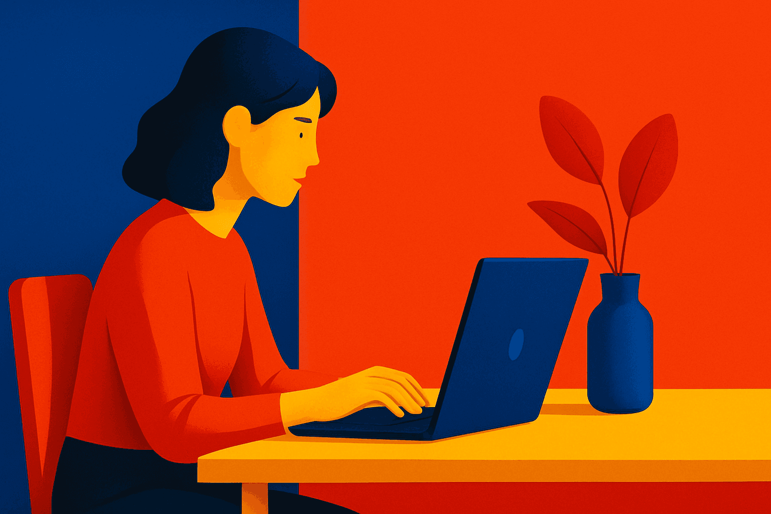
Saturated Primary Palette
When you specify a saturated primary palette in AI image generation, you instruct the model to focus on vivid, pure red, blue, and yellow colors. This color scheme creates bold, energetic images with strong visual impact, often evoking feelings of playfulness or modern graphic design. Saturated primaries traditionally appear in pop art, children’s media, or minimalistic art with a color-blocking approach. Using this palette helps direct the AI to avoid washed-out, mixed, or complex color schemes, generating images that are visually striking and clean.
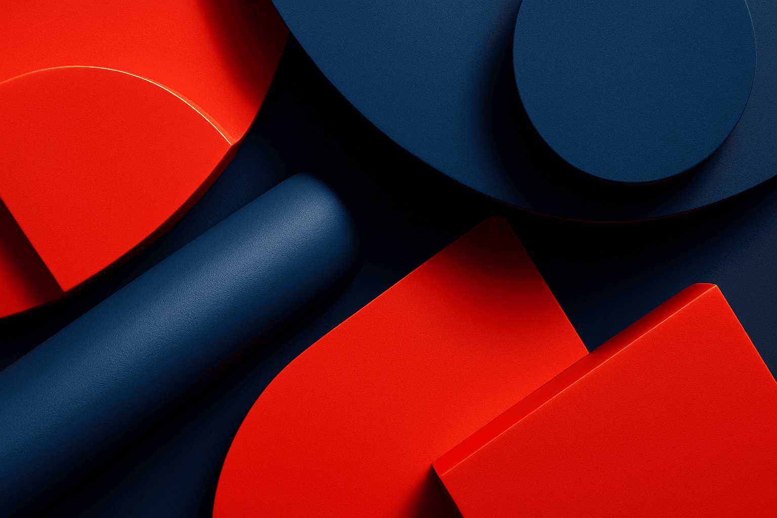
High Contrast Color Palette
A high contrast color palette significantly influences the mood and readability of visual content by emphasizing sharp differences between colors. This palette amplifies distinctions in tones and hues, resulting in images that feel vibrant, bold, and attention-grabbing. In AI image generation, specifying this keyword encourages models to produce compositions that highlight color differences, rather than blending or muted schemes. This enhances subject prominence and can evoke emotional responses or create memorable visuals, essential in advertising, editorial design, and digital art.
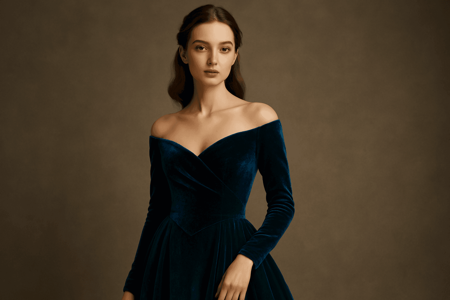
Rich Jewel Tone Palette
Using the Rich Jewel Tone Palette in AI image generation significantly influences the aesthetic by introducing highly saturated, gemstone-inspired colors. These tones create images that appear luxurious and visually striking, elevating compositions beyond simple color schemes. The palette often brings a sense of refinement and depth to scenes or subjects, making it a perfect choice for designs requiring rich, bold visual impact. Applying this palette modifies lighting and material perception to simulate the luminous qualities of jewels, enhancing realism and allure in the final output.

High Saturation Color Palette
Utilizing a High Saturation Color Palette in AI image generation transforms visuals into bold, lively compositions that capture attention instantly. This approach amplifies the color intensity beyond natural or muted levels, creating a vivid scene bursting with hues that feel powerful and immersive. Often chosen for marketing materials, modern art visuals, and stylized photography, artworks generated with high saturation evoke energetic and emotional responses. When combined thoughtfully with lighting, texture, and composition, it creates a striking balance of vibrancy and clarity, making it ideal for covers, header images, and creative projects needing dynamic coloring.
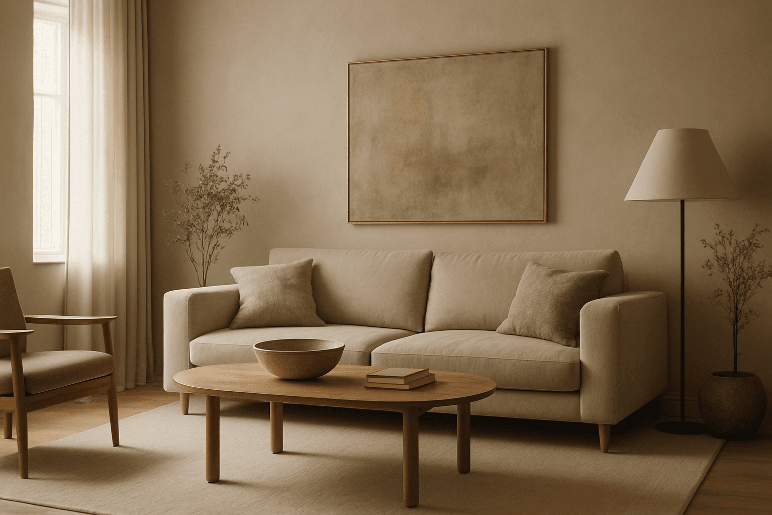
Muted Earth Tone Colors
Muted earth tone colors encapsulate a palette inspired by nature’s subtle and calming shades such as soft browns, gentle greens, warm ochres, and quiet grays. When integrated into AI image prompts, these colors help generate images that feel organic, grounded, and harmonious, making them ideal for designs seeking understated elegance or a natural aesthetic. This approach avoids harsh contrasts and bright tones, providing visuals that are soothing and visually balanced. Such color schemes are especially useful in editorial photography, interior design renderings, and lifestyle imagery, where authenticity and warmth are key. Utilizing these tones can transform generic visuals into cohesive, premium-feeling compositions that align with modern aesthetic trends.
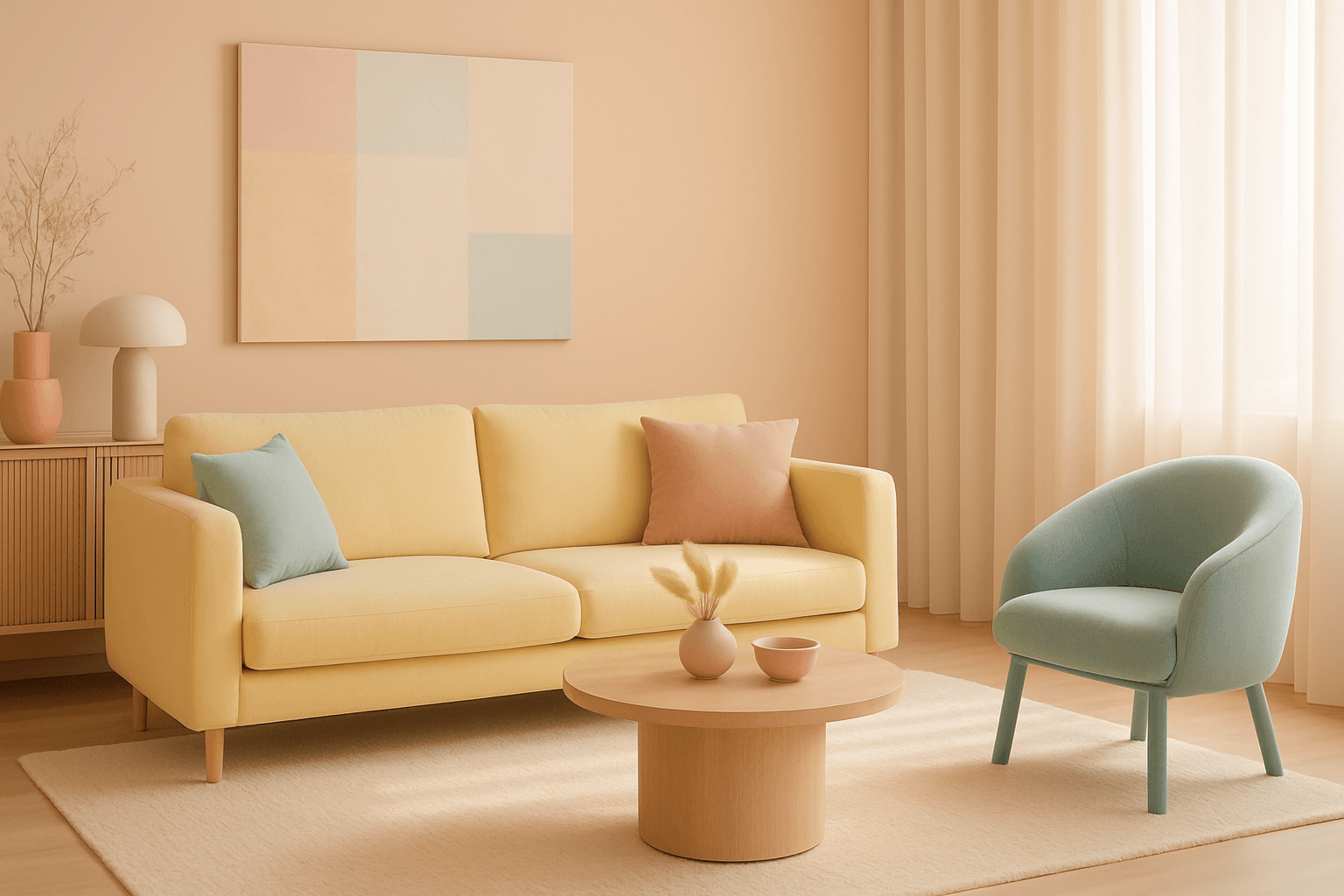
Bright Pastel Palette
The Bright Pastel Palette is a popular choice in AI-generated imagery for creating visuals that combine softness with energy. These palettes blend traditional pastels—colors with low saturation and high lightness—with increased brightness to keep the colors gentle yet eye-catching. This balance serves to evoke feelings of calmness infused with optimism, making the color scheme widely favored in advertising, editorial spreads, and social media visuals. When used in AI image prompts, it steers the model to generate harmonious color compositions that are neither dull nor harsh, ideal for modern and clean aesthetics.