Muted Earth Tone Colors
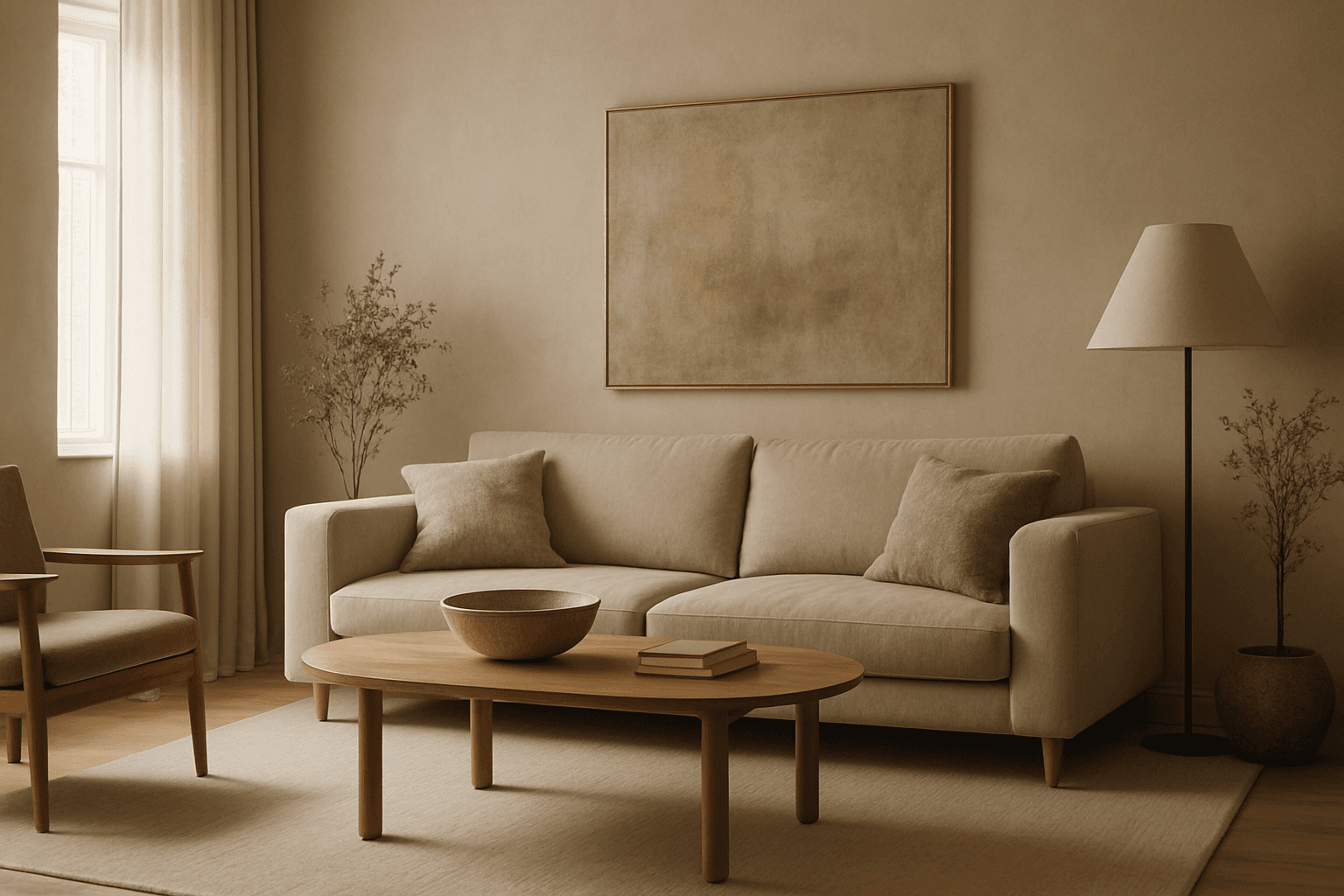
Muted earth tone colors encapsulate a palette inspired by nature’s subtle and calming shades such as soft browns, gentle greens, warm ochres, and quiet grays. When integrated into AI image prompts, these colors help generate images that feel organic, grounded, and harmonious, making them ideal for designs seeking understated elegance or a natural aesthetic. This approach avoids harsh contrasts and bright tones, providing visuals that are soothing and visually balanced. Such color schemes are especially useful in editorial photography, interior design renderings, and lifestyle imagery, where authenticity and warmth are key. Utilizing these tones can transform generic visuals into cohesive, premium-feeling compositions that align with modern aesthetic trends.
Definition
Muted earth tone colors are a set of subdued, natural hues inspired by soil, clay, foliage, and stone. Unlike bright or saturated colors, these tones provide calm, understated palettes with soft browns, greens, ochres, and grays. In AI image prompts, including this keyword guides models to apply these gentle colors, enhancing realism and warmth in the generated visuals.
- Subdued colors from natural elements
- Soft saturation and warm-cool neutrals
- Invokes organic and grounded atmospheres
Prompt Formula
Use structured prompt phrases to reliably incorporate muted earth tone colors:
- "[Subject] with muted earth tone colors, soft lighting, natural textures"
- "scene in muted earth tone colors, warm ambient light, subtle shadows"
- "[object] styled using muted earth tone colors, realistic materials, low saturation"]},{
- type
- bestUseCases
Best Use Cases
This keyword excels in a variety of visual contexts that benefit from subtle and natural color schemes. Consider these applications:
- Editorial backgrounds of natural landscapes or interiors
- Cozy, stylish interior design visualizations
- Lifestyle portraits emphasizing authenticity and calm moods
Common Mistakes
Avoid these pitfalls when using muted earth tone colors in prompts:
- Using vague terms like "earth tones" without 'muted' leads to overly saturated images
- Overloading the prompt with unrelated bright colors that disrupt the palette
- Neglecting lighting details that help colors feel realistic and warm
Advanced Techniques
Elevate your prompt results by combining muted earth tone colors with other constraints:
- Pair with 'soft natural light' or 'golden hour glow' to enhance warmth
- Add material descriptors like 'matte', 'linen', or 'weathered wood' for texture
- Use 'subtle color grading' or 'film grain' to achieve organic finishes
Professional Workflow
A streamlined approach to generating images with muted earth tone colors:
- Start with a clear subject and include 'muted earth tone colors' in the description
- Iterate variations adjusting lighting and texture phrases to refine mood
- Select images that exhibit natural color harmony, soft contrasts, and authentic materials
- Post-process to subtly enhance color balance while preserving softness
Related Styles
These adjacent styles complement muted earth tone colors and can enrich your prompts:
- Warm Neutral Tones — emphasizing cozy beiges and taupes
- Organic Textures — adding tactile surfaces like wood and stone
- Natural Color Palettes — broader sets inspired by flora and fauna
Model-Specific Tips
To optimize outputs across AI image models:
- Explicitly mention 'muted earth tone colors' rather than just 'earth tones' for clarity
- Combine color specification with lighting and material details to guide rendering
- Avoid overly complex syntax; use clear, natural language for best compatibility
FAQ
What are muted earth tone colors in AI prompts?
They are soft, desaturated colors inspired by natural elements like soil and foliage, used to create subtle and realistic color palettes in AI-generated images.
How do muted earth tone colors affect image mood?
They create calm, warm, and organic atmospheres by avoiding bright or saturated hues, fostering a grounded and natural feel.
Can I combine muted earth tone colors with bright accents?
Yes, but use sparingly and with care to maintain the overall subtlety and cohesiveness of the color palette.
Continue Exploring
Related Prompts

Muted Earth Tone Palette
The Muted Earth Tone Palette is a popular color approach in AI image generation that emphasizes soft, natural hues inspired by the earth. These colors include warm browns, olive greens, beiges, and greys, all presented in subdued saturation levels to avoid overly bright or intense visuals. Using this palette creates images that feel organic, calm, and stylish, making it ideal for modern editorial content, lifestyle photography, and interior design renders. By focusing on muted tones, the images exude refinement and subtlety, appealing to viewers seeking sophistication without harsh contrasts. Incorporating this palette into your AI prompts helps generate visuals with a cohesive and naturalistic color balance.

Soft Muted Color Palette
Using a Soft Muted Color Palette in AI-generated imagery influences the mood and style by incorporating subdued and delicate colors. This approach conveys sophistication, tranquility, and natural beauty, making visuals suitable for subtle branding, lifestyle photography, and editorial contexts. It avoids bright or saturated colors, instead emphasizing nuance and refinement. Artists and designers use it to evoke feelings of warmth, nostalgia, or modern minimalism, enhancing the visual narrative through controlled color harmony and soft contrasts.
Warm Neutral Palette
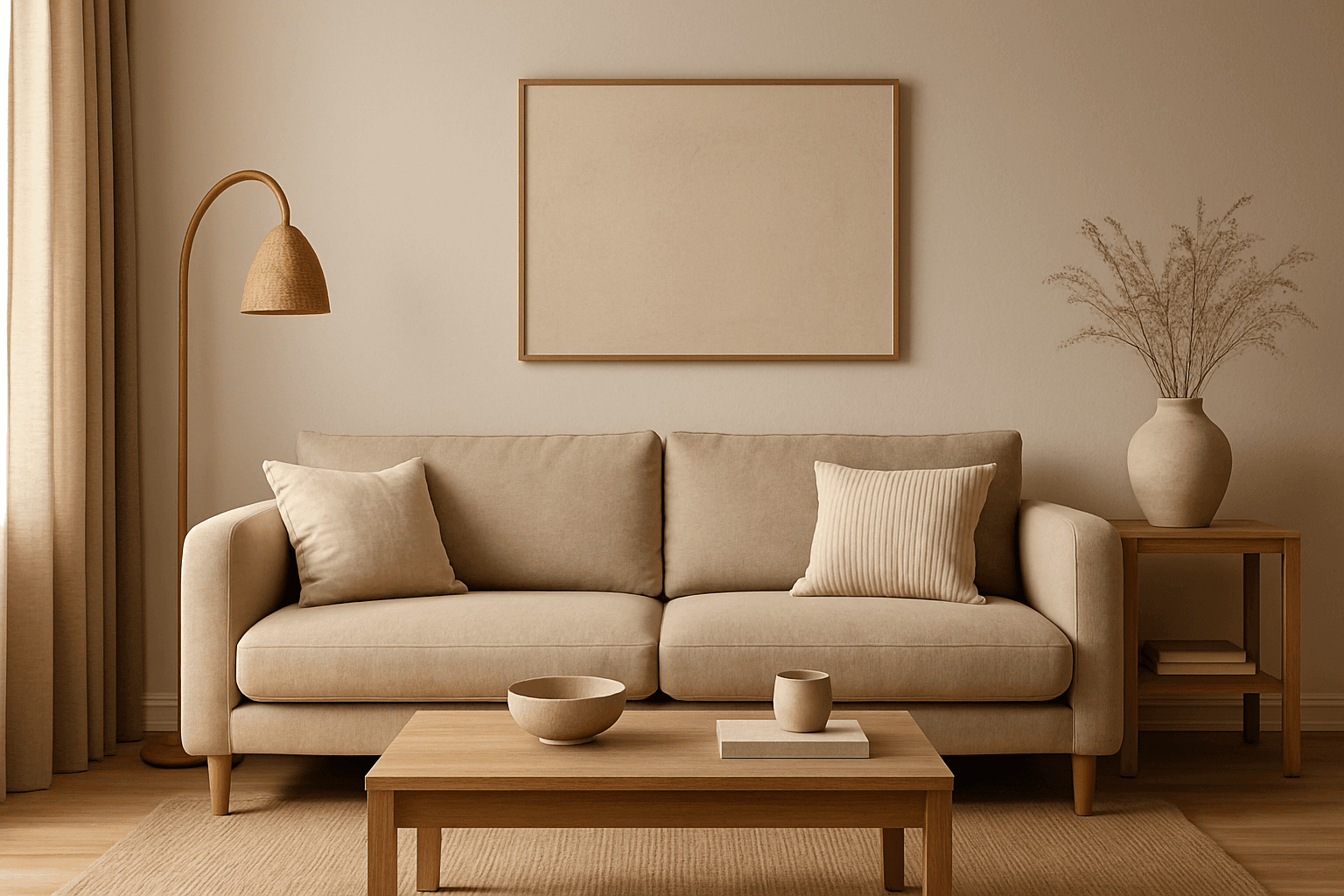
The Warm Neutral Palette is a popular color scheme choice in design and AI-generated imagery for its timeless and soothing qualities. This palette combines warm earthy tones with soft neutrals, producing images that feel natural and approachable. Incorporating warm neutrals can enhance mood by bringing subtle warmth and comfort to visuals without overpowering them. When added to AI prompts, it guides the model to emphasize harmonious colors that evoke calmness and sophistication. The palette works well across various genres, including lifestyle, interiors, fashion, and nature themes, helping create polished and refined visuals suitable for editorial or commercial use.
Earth Tone Colors
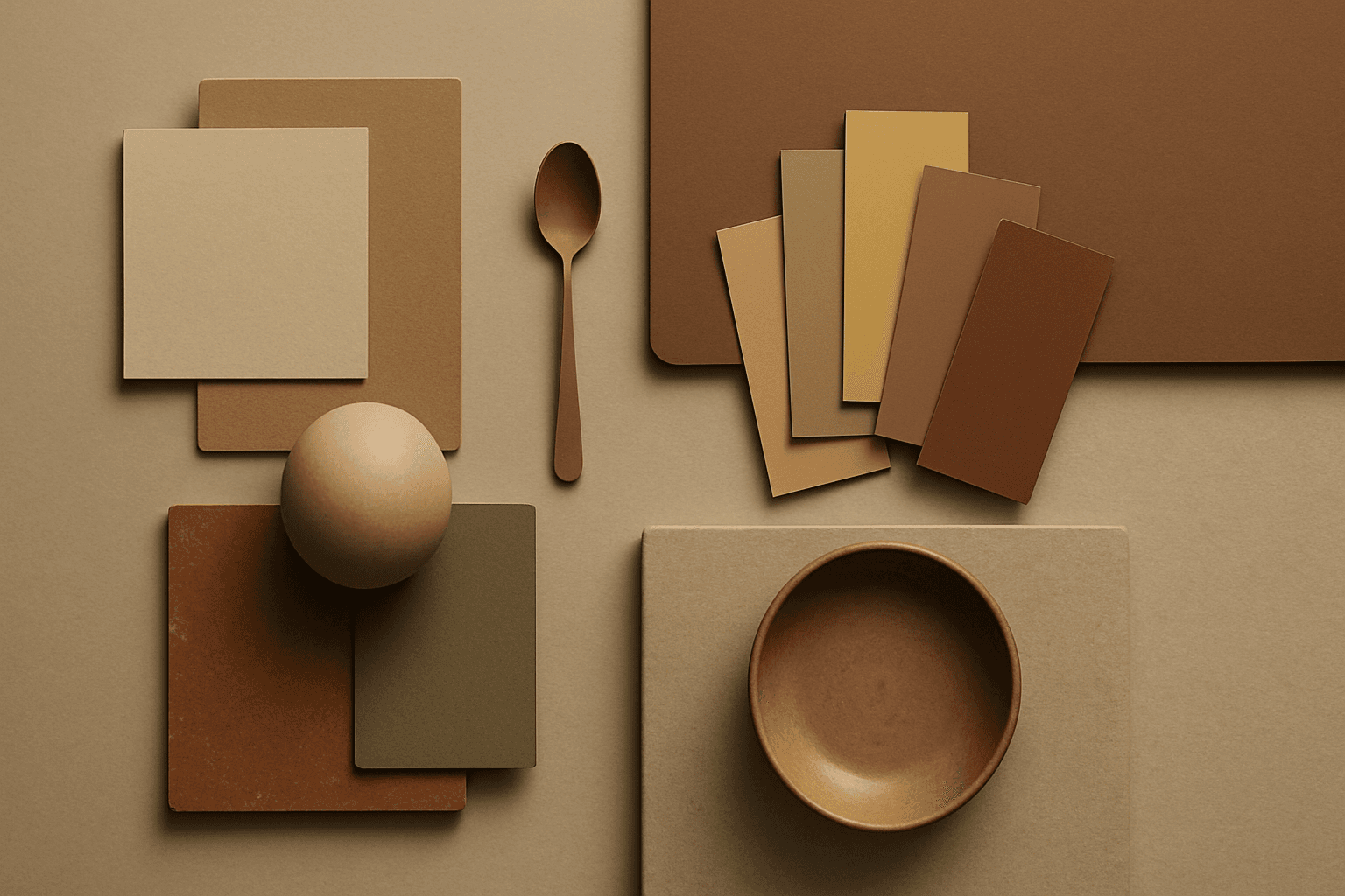
Earth Tone Colors are useful for creating grounded, organic, and commercially current AI images. They are common in wellness branding, sustainable packaging, interiors, handmade products, food, outdoor lifestyle, and natural beauty campaigns. For stock creators, earth tones can communicate authenticity and trust without needing obvious eco symbols. They also work well in minimalist layouts because the palette is calm but still warm.
Earthy Warm Color Scheme
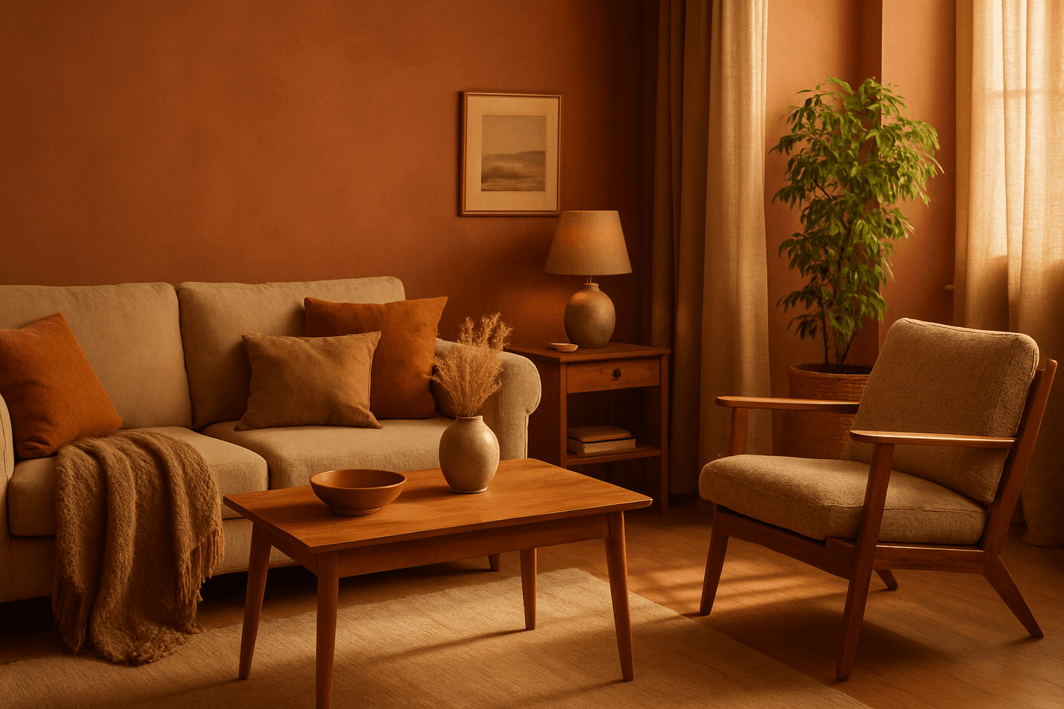
The Earthy Warm Color Scheme is a popular choice for artists and designers aiming to create images that feel natural, comforting, and connected to the environment. By focusing on warm, muted earth tones, this scheme lends a timeless aesthetic suited for a variety of subjects, including landscapes, portraits, interiors, and product shots. Using this palette in AI image prompts can help achieve visuals that emphasize quiet warmth and natural beauty, often evoking rustic charm or bohemian moods. It's well-suited for editorial photography, lifestyle branding, and environmental themes, enhancing images with a sophisticated yet approachable mood.
Earthy Warm Tones
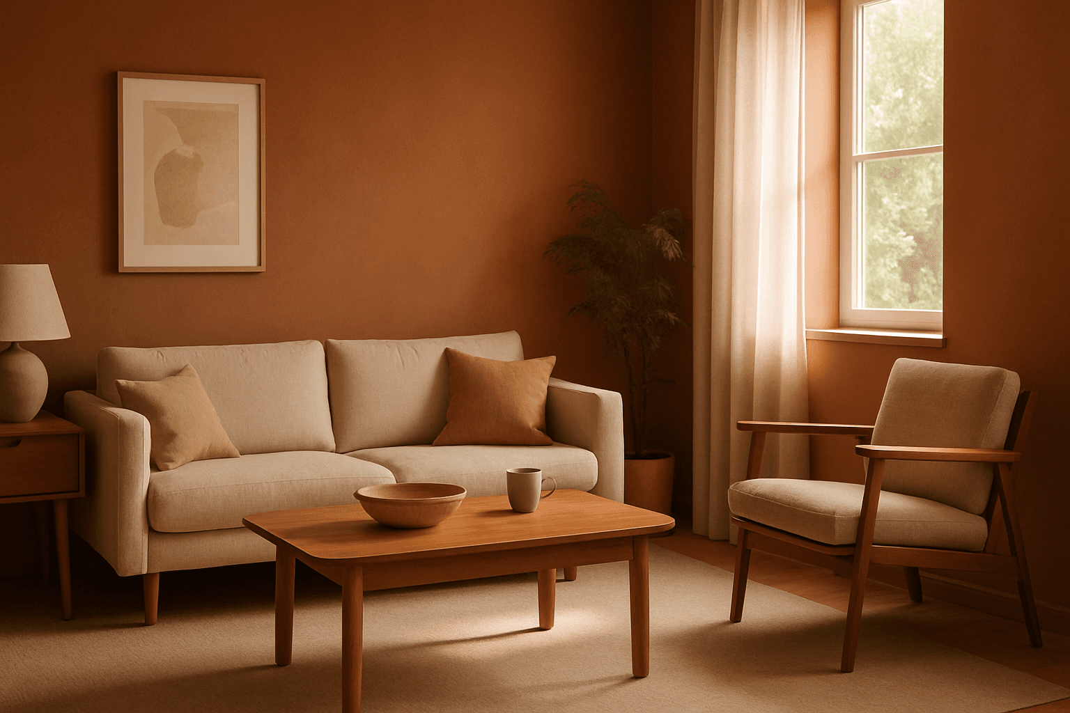
Using Earthy Warm Tones in AI image generation brings a cozy and organic aesthetic to your visuals. This color keyword shifts the palette toward natural and muted warm colors that recall the earth's rich textures, often creating a calm and inviting mood. Ideal for images that require realistic materials and depth, these tones lend a premium, editorial polish without harsh contrasts. When combined with refined lighting and subtle depth, images gain a tactile, authentic feel, suitable for editorial hero imagery or sophisticated product presentations.