Soft Muted Color Palette
Using a Soft Muted Color Palette in AI-generated imagery influences the mood and style by incorporating subdued and delicate colors. This approach conveys sophistication, tranquility, and natural beauty, making visuals suitable for subtle branding, lifestyle photography, and editorial contexts. It avoids bright or saturated colors, instead emphasizing nuance and refinement. Artists and designers use it to evoke feelings of warmth, nostalgia, or modern minimalism, enhancing the visual narrative through controlled color harmony and soft contrasts.

Definition
A Soft Muted Color Palette in AI image generation describes colors that are low in saturation and intensity, yielding gentle and understated visuals. Adding this keyword to prompts instructs the AI to avoid vivid or high-contrast colors, aiming instead for subtle hues that evoke calmness and elegance. This adjustment changes how the colors interact within the scene, favoring softness over vibrancy.
- Colors are desaturated and toned down
- Emphasis on soft, pastel-like hues
- Creates a calm and peaceful mood
Prompt Formula
To incorporate a Soft Muted Color Palette effectively, combine descriptive phrases emphasizing low saturation and softness with your subject. Use patterns like 'subject with soft muted color palette,' 'scene in gentle and desaturated tones,' or 'image featuring subdued pastel colors and balanced lighting.' These combinations guide the AI to prioritize a muted palette while keeping details crisp.
- "[Subject] with soft muted color palette, natural lighting"
- "[Scene] in gentle, desaturated tones, subtle contrasts"
- "[Object] featuring pastel colors, muted highlights, and soft shadows"
Best Use Cases
Soft Muted Color Palette suits images that benefit from subtlety and refinement. It's ideal for lifestyle photography where natural and relaxed moods are desired, product imagery requiring an elegant or eco-conscious vibe, and editorial content that emphasizes quiet sophistication. This palette helps unify visuals in branding and social media where softness is preferable to boldness.
- Lifestyle photography with natural, calm ambiance
- Product shots for boutique or sustainable brands
- Editorial spreads requiring understated elegance
Common Mistakes
A frequent error is over-desaturating, which leads to flat or lifeless images lacking vibrancy. Another is mixing muted colors with overly bright elements, causing inconsistency and visual conflict. Avoid vague terms like 'soft colors' without specifying muted or desaturated, as this can produce unpredictable results. Ensuring balanced light and avoiding excessive blur maintains clarity within the muted aesthetic.
- Over-desaturation resulting in dull images
- Combining muted colors with vivid details
- Unclear prompts lacking specificity about 'muted' or 'soft'
Advanced Techniques
Experienced users refine the soft muted palette by controlling color temperature—balancing warm and cool muted hues for mood shifts. Combining the palette with texture descriptions like "matte finish" or "velvet fabric" enhances depth. Specifying light diffusion or volumetric lighting can add subtle dimensionality. Layering muted tones with selective color highlights creates focal points without disturbing harmony.
- Balance warm and cool muted hues to shift mood
- Add texture cues like 'matte' or 'soft velvet'
- Use diffused or volumetric lighting for subtle depth
- Introduce selective muted highlights as focal points
Professional Workflow
Start by precisely defining the visual mood and confirming the need for a soft muted palette. Construct prompts integrating subject details with palette keywords to generate initial image sets. Evaluate outputs for color harmony and tone accuracy, selecting images that best evoke subtlety and calmness. Refine selected images through further prompt tweaks focusing on lighting and texture, then finalize images through post-processing if needed to maintain muted aesthetics and professional polish.
- Define mood and confirm muted palette usage
- Create detailed, palette-focused prompts
- Generate and review images for tone and harmony
- Refine prompts for lighting and texture nuances
- Post-process to maintain subtle color balance
FAQ
How does using a Soft Muted Color Palette affect AI image realism?
A Soft Muted Color Palette often enhances realism by replicating the subtle color variations found in natural and controlled lighting environments, making images appear more natural and visually pleasing without harsh or unnatural colors.
Can I combine Soft Muted Color Palette with bold elements in a prompt?
While possible, combining muted colors with bold elements can create visual tension. It requires careful balance in prompts to avoid clashing aesthetics—often by specifying which parts of an image should be muted and which should be vivid.
Continue Exploring
Related Prompts
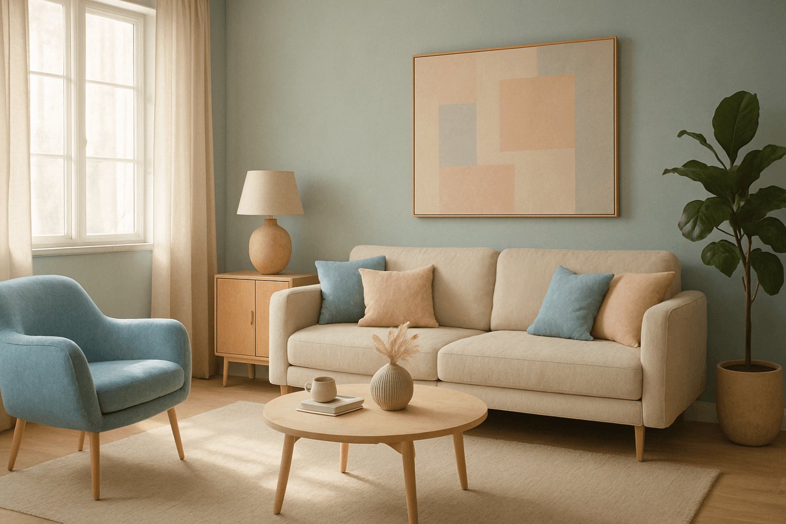
Muted Pastel Color Palette
The muted pastel color palette blends the gentle softness of pastel tones with a restrained saturation level, resulting in colors that evoke tranquility and refinement. When integrated into AI image generation, these colors provide a versatile aesthetic that suits a variety of creative and commercial needs. This palette can transform images into visually soothing experiences, often appearing in editorial designs, fashion imagery, and lifestyle branding. It avoids the brightness and intensity typical of standard pastels, offering a more mature and elegant atmosphere. The muted pastels produce harmonious compositions by pairing subdued colors, ideal for designs requiring subtlety, sophistication, and approachability.

Muted Earth Tone Palette
The Muted Earth Tone Palette is a popular color approach in AI image generation that emphasizes soft, natural hues inspired by the earth. These colors include warm browns, olive greens, beiges, and greys, all presented in subdued saturation levels to avoid overly bright or intense visuals. Using this palette creates images that feel organic, calm, and stylish, making it ideal for modern editorial content, lifestyle photography, and interior design renders. By focusing on muted tones, the images exude refinement and subtlety, appealing to viewers seeking sophistication without harsh contrasts. Incorporating this palette into your AI prompts helps generate visuals with a cohesive and naturalistic color balance.

Muted Pastel Color Scheme
The muted pastel color scheme is popular in digital art and design for its delicate, understated quality. Unlike vibrant pastels, muted pastels involve desaturation and slight grey undertones, delivering a refined and peaceful visual experience. When included in AI image prompts, it guides models to focus on gentle colors that evoke softness and subtlety, making the images feel airy and inviting rather than vivid or loud. This approach works well for lifestyle, fashion, illustration, and branding content that aims to be modern, approachable, and aesthetically pleasing while maintaining elegance.
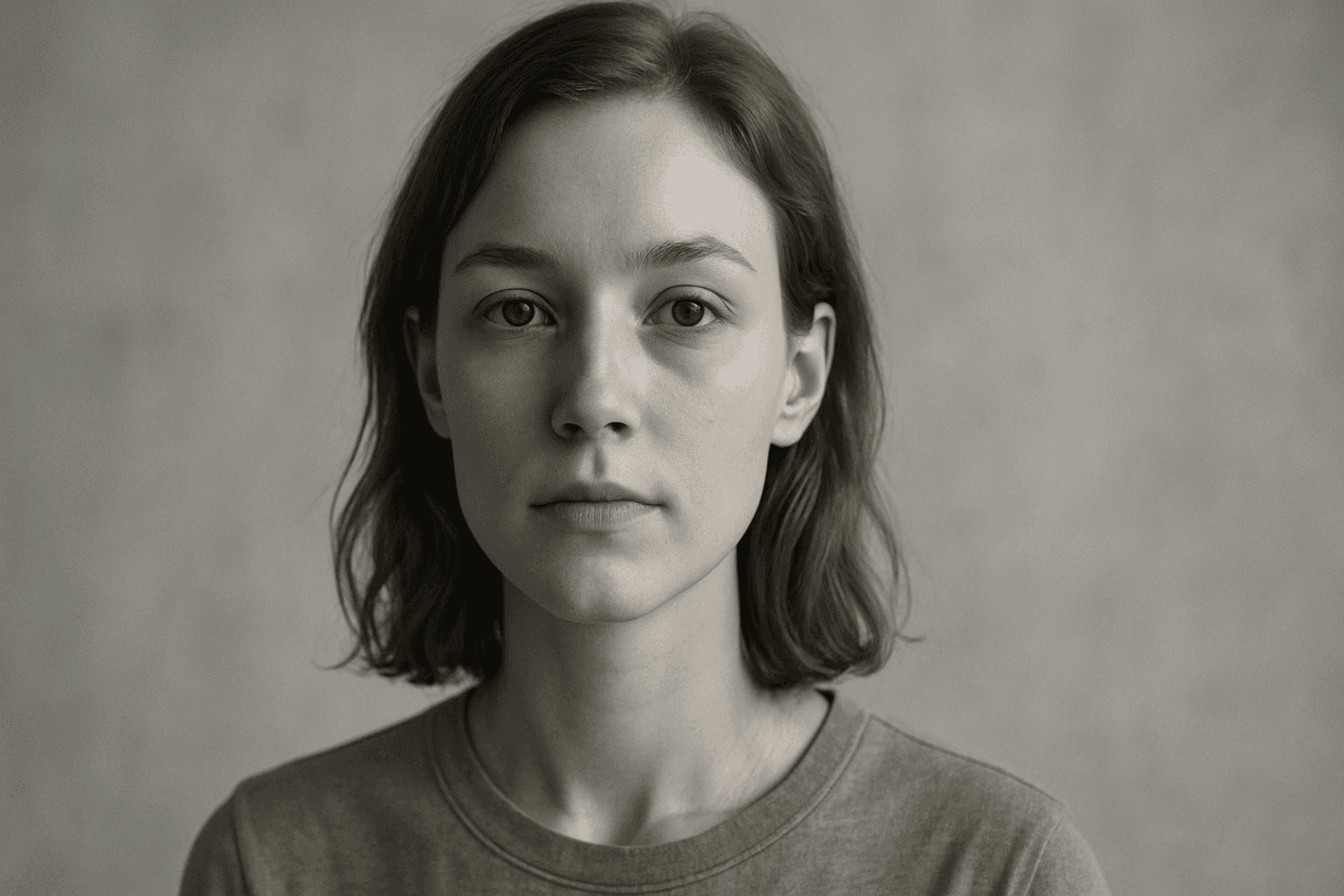
Desaturated Colors
In AI image generation, 'desaturated colors' guide models to produce images with toned-down color intensity, resulting in a muted and understated appearance. This technique is valuable for conveying moods such as tranquility, nostalgia, or elegance by avoiding overly bright or saturated colors. Using desaturated colors can help shift the focus to composition, texture, and lighting rather than vivid color contrasts, making images more versatile for editorial content, fashion, or natural scenes. It balances realism and artistic subtlety, especially when paired with refined lighting and soft shadows to emphasize material qualities and depth.

Monochrome Color Palette
Employing a monochrome color palette in AI-generated images allows for creating minimalistic yet striking visuals. By constraining colors to one hue family, creators can convey mood and style consistently while focusing on composition and detail. This technique excels in editorial photography, product presentations, and artistic portraits, where color distraction is minimized and storytelling through form and light is enhanced. Using monochrome prompts guides the AI to simulate realistic materials and subtle depth through nuanced shading, resulting in premium, polished images suitable for professional use.
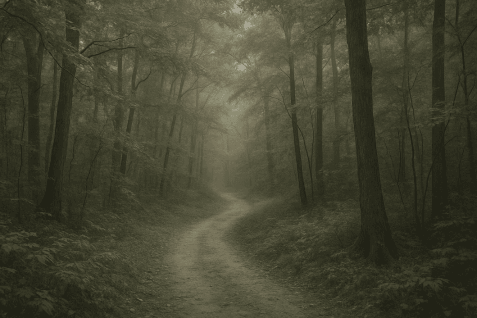
Soft Desaturated Palette
In AI-generated imagery, color palettes significantly influence the mood and visual impact of the final output. The Soft Desaturated Palette keyword directs AI models to render images with subdued colors by lowering saturation and brightness levels. This approach creates an image that feels gentle to the eye, with a natural yet understated aesthetic. By avoiding vibrant hues and opting for soft tones, this palette supports designs requiring subtlety and sophistication. It is particularly beneficial when the goal is to communicate calmness, nostalgia, or elegance, making the image appropriate for editorial layouts, fashion shoots, interior designs, and social media visuals.