Muted Pastel Color Scheme
The muted pastel color scheme is popular in digital art and design for its delicate, understated quality. Unlike vibrant pastels, muted pastels involve desaturation and slight grey undertones, delivering a refined and peaceful visual experience. When included in AI image prompts, it guides models to focus on gentle colors that evoke softness and subtlety, making the images feel airy and inviting rather than vivid or loud. This approach works well for lifestyle, fashion, illustration, and branding content that aims to be modern, approachable, and aesthetically pleasing while maintaining elegance.

Definition
Muted pastel color scheme consists of colors that are both light and soft like pastels but toned down through desaturation, resulting in gentle, understated hues. In AI prompts, including this phrase directs the model to use these subdued light colors rather than vivid or highly saturated ones, influencing the overall mood to be calm and elegant. This is particularly useful for beginners wanting a delicate aesthetic without strong or harsh colors.
- Combines pastel softness with low saturation
- Creates subtle, gentle color tones
- Shapes a calm, elegant visual atmosphere
Prompt Formula
To incorporate a muted pastel color scheme effectively, use phrase patterns within your prompts that emphasize soft, subdued colors and avoid brightness or saturation. Examples include:
- “muted pastel color scheme”
- “soft, desaturated pastel hues”
- “light pastel tones with low contrast”
- “gentle, pastel color palette with muted saturation”
Best Use Cases
This color scheme excels in contexts requiring subtlety and softness. Utilize it when needing images that communicate calmness, sophistication, or nostalgia. It works well in:
- Lifestyle and fashion photography emphasizing tranquility
- Branding for wellness, beauty, and lifestyle products
- Illustrations and editorial content for gentle storytelling
Advanced Techniques
For experienced users, layering the muted pastel color scheme with lighting and composition prompts can refine results further. Consider:
- Combine with soft natural or diffused lighting for enhanced mood
- Add constraints like “desaturated, low contrast background” to isolate foreground elements
- Pair with terms like “vintage” or “film photography aesthetic” to enrich atmosphere
- Use complementary muted palettes to create harmonious compositions
Professional Workflow
A streamlined approach to utilize muted pastel color schemes effectively includes:
- Brief: Define the desired mood and select muted pastels as a key aesthetic
- Generate: Use standardized prompt formulas incorporating the keyword
- Select: Review outputs for color balance and mood consistency
- Refine: Adjust lighting, saturation, and texture prompts iteratively for polish
- Finalize: Choose images that align with brand or project tone and export
Related Styles
Muted pastel colors often complement or overlap with several visual styles. Adjacent or related keywords that can enhance or vary the aesthetic include:
- Soft Lighting – enhances gentle shadows and mood
- Desaturated Palette – emphasizes subdued coloration
- Subtle Texture – adds visual interest without strong contrasts
Model-Specific Tips
When prompting various AI image models, keep these universal tips in mind to depict a muted pastel color scheme effectively:
- Explicitly mention “muted” or “desaturated” alongside “pastel” to reduce color intensity
- Avoid terms that imply brightness or high saturation which can override muted effect
- Use comparative descriptors like “soft pastel, not bright” to clarify intent
- Combine color scheme mentions with lighting conditions such as “soft lighting” for natural appearance
FAQ
How do muted pastels differ from regular pastels in AI prompts?
Muted pastels are less saturated and have a subdued tone compared to regular pastels, which are brighter. Specifying “muted” in prompts guides AI to generate softer, more understated colors.
Can muted pastel color schemes be applied to any subject?
Yes, but they work best with themes requiring softness and subtlety, such as portraits, lifestyle settings, or product designs, rather than high-energy or vibrant scenes.
Continue Exploring
Related Prompts
Muted Pastel Color Palette
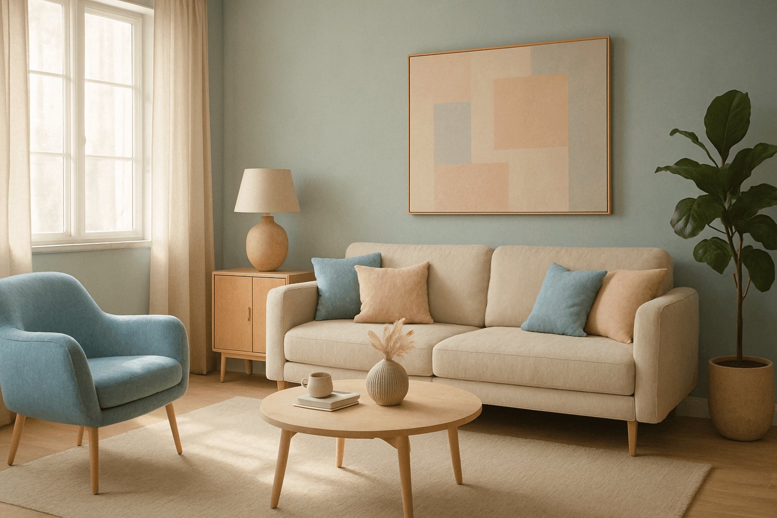
The muted pastel color palette blends the gentle softness of pastel tones with a restrained saturation level, resulting in colors that evoke tranquility and refinement. When integrated into AI image generation, these colors provide a versatile aesthetic that suits a variety of creative and commercial needs. This palette can transform images into visually soothing experiences, often appearing in editorial designs, fashion imagery, and lifestyle branding. It avoids the brightness and intensity typical of standard pastels, offering a more mature and elegant atmosphere. The muted pastels produce harmonious compositions by pairing subdued colors, ideal for designs requiring subtlety, sophistication, and approachability.
Pastel Color Harmony
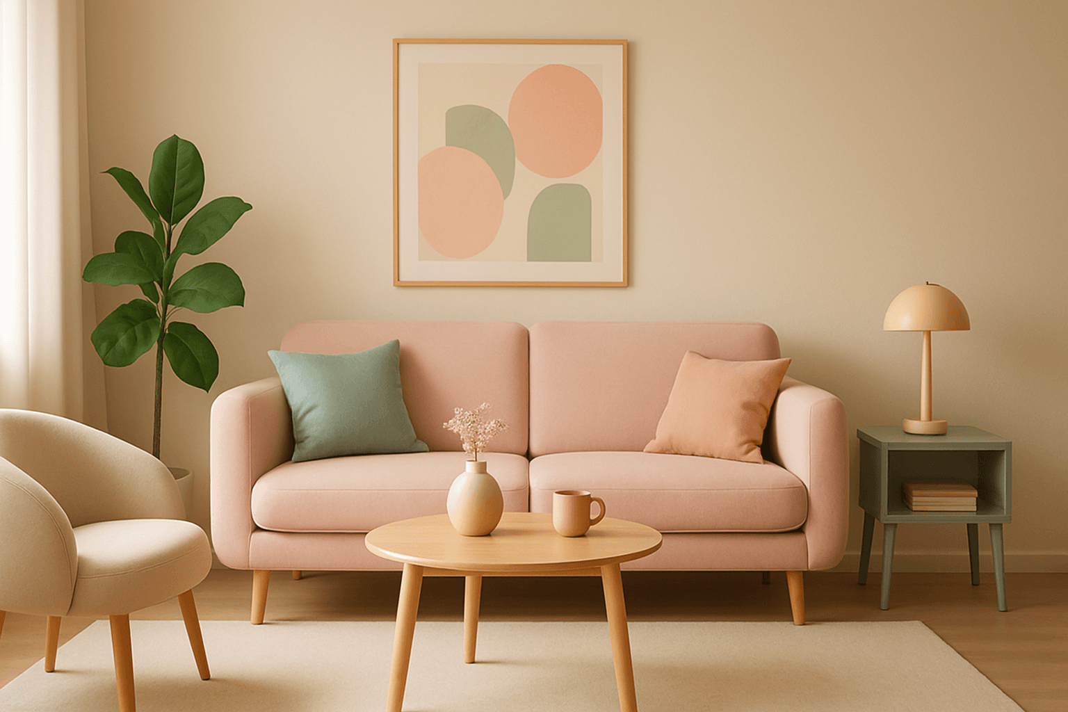
Pastel color harmony is a visually appealing approach that uses pale and muted colors to evoke feelings of softness, tranquility, and sophistication. By incorporating pastel tones, AI-generated images achieve a delicate balance that feels inviting and elegant without overwhelming the viewer. This makes pastel harmonies ideal for designs that require a gentle atmosphere or a subtle emotional impact. When included in AI prompts, the model focuses on blending compatible pastel shades to create coherent color schemes that look naturally integrated and aesthetically calming.

Pastel Color Harmonies
Pastel Color Harmonies are essential for creating gentle and visually pleasing images that emphasize softness and subtlety in color. Using pastel palettes, AI-generated images gain a delicate aesthetic often associated with calm, elegance, and modern minimalism. This approach mitigates harsh contrasts and intense hues, producing visuals ideal for editorial content, branding, and art that need a serene or sophisticated vibe. Incorporating pastel harmonies into AI prompts modifies the image’s overall mood, making scenes feel airy and inviting while maintaining a coherent and balanced color distribution.

Pastel Gradient Color Scheme
The pastel gradient color scheme is popular in AI-generated art for its serene and inviting aesthetic. It involves the blending of light, desaturated pastel tones in gradual transitions, which can add depth and softness to visuals without overwhelming details. Using this keyword in prompts helps create backgrounds, themes, or focal areas that evoke feelings of calmness and subtle sophistication. This scheme often suits digital art, branding visuals, and UI elements where gentle color progression supports readability and aesthetic appeal. Its balanced and harmonious style enhances mood and focuses attention, making it a versatile choice in many design contexts.

Soft Muted Color Palette
Using a Soft Muted Color Palette in AI-generated imagery influences the mood and style by incorporating subdued and delicate colors. This approach conveys sophistication, tranquility, and natural beauty, making visuals suitable for subtle branding, lifestyle photography, and editorial contexts. It avoids bright or saturated colors, instead emphasizing nuance and refinement. Artists and designers use it to evoke feelings of warmth, nostalgia, or modern minimalism, enhancing the visual narrative through controlled color harmony and soft contrasts.
Soft Pastel Color Palette
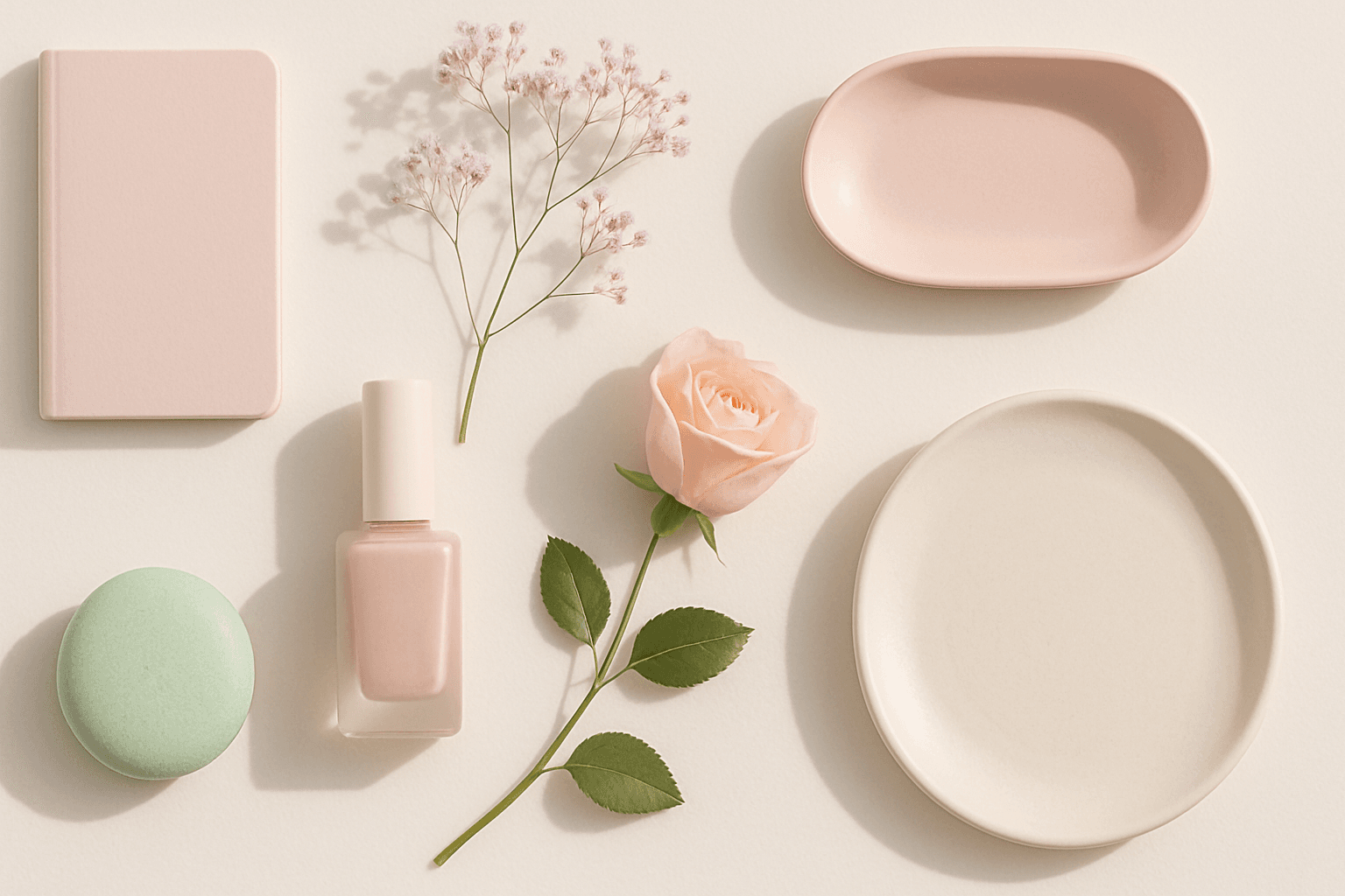
Soft Pastel Color Palette embodies a range of delicate and subdued colors that convey tranquility and subtlety. When directing AI models, mentioning this palette guides the generation toward gentle gradations and harmonious blends of pale pinks, blues, lavenders, and creams. This palette is often employed to produce images with a dreamy, refined aesthetic, fitting for designs needing understated elegance or a nostalgic feel. The softness reduces visual noise and enhances compositions focused on mood rather than bold contrasts.