Pastel Gradient Color Scheme
The pastel gradient color scheme is popular in AI-generated art for its serene and inviting aesthetic. It involves the blending of light, desaturated pastel tones in gradual transitions, which can add depth and softness to visuals without overwhelming details. Using this keyword in prompts helps create backgrounds, themes, or focal areas that evoke feelings of calmness and subtle sophistication. This scheme often suits digital art, branding visuals, and UI elements where gentle color progression supports readability and aesthetic appeal. Its balanced and harmonious style enhances mood and focuses attention, making it a versatile choice in many design contexts.

Definition
A pastel gradient color scheme describes a smooth and subtle blending of multiple pale and muted pastel tones in an image. In AI imaging, it changes a prompt by instructing the model to integrate gentle color transitions rather than distinct blocks or bold colors. This results in an effect where one pastel shade slowly shifts into another, creating a harmonious and calming visual experience suitable for backgrounds, artistic effects, or thematic color treatments.
Prompt Formula
Use the following prompt structures to incorporate a pastel gradient color scheme: - "[subject] with a pastel gradient color scheme of [color1], [color2], and [color3] softly blending" - "background featuring a smooth pastel gradient transitioning from [colorA] to [colorB]" - "illustration using a soft pastel gradient palette including [colorX] and [colorY]" Replace placeholders with desired pastel hues like lavender, mint, peach, or baby blue for tailored results.
- [subject] with a pastel gradient color scheme of [soft pastel colors] blending smoothly
- background featuring a smooth pastel gradient transitioning from [color1] to [color2]
- illustration using a soft pastel gradient palette including [multiple pastel hues]
Best Use Cases
- Creating gentle and attractive backgrounds for web and app designs
- Developing calm, friendly branding visuals in wellness or beauty sectors
- Generating dreamy, soft-hued digital art where color harmony is key
Common Mistakes
A frequent error is specifying vague color instructions leading to muddy or flat gradients. Avoid overloading prompts with too many pastel colors, which can clutter the gradient and reduce its harmony. Another mistake is mixing pastel gradients with harsh or saturated colors in the same prompt, causing discordant results. To prevent unrealistic or generic outputs, clearly define the number and names of pastel colors, and request smooth transitions or subtle blending specifically.
- Using too many pastel colors causing muddy gradients
- Mixing harsh saturated colors with pastels in gradients
- Vague color descriptions without specifying softness or blending
Advanced Techniques
Enhance pastel gradient prompts with lighting and material descriptors for more nuanced images. For example, combine pastel gradients with descriptions like "soft diffuse light" or "matte texture" to refine mood and depth. Introduce directional gradient constraints such as "horizontal pastel gradient" or "radial gradient blending peach and mint." Consider layering pastel gradients with other subtle patterns or textures (e.g., bokeh, watercolor) to increase visual complexity without losing harmony.
- Combine pastel gradient with soft diffuse lighting or subtle shadows
- Specify gradient direction: horizontal, vertical, radial
- Layer pastel gradients with delicate textures like watercolor or bokeh effects
Professional Workflow
Start by briefing the image purpose, identifying the need for gentle coloration and specifying pastel gradient properties. When generating images, use iterative prompt refinement focusing on color hues, gradient smoothness, and lighting effects. Review outputs selecting images with visually pleasing color transitions and adequate softness. Finally, apply post-processing as needed to enhance gradient smoothness or correct any color imbalance, ensuring the image meets client or project standards for calm and harmonious visuals.
- Define project goals emphasizing soft, pastel color transitions
- Craft initial prompts specifying exact pastel colors and gradient type
- Generate multiple outputs and select best for color harmony and softness
- Refine prompt or apply subtle post-processing to perfect gradients
FAQ
What colors are typically included in a pastel gradient color scheme?
Pastel gradients usually include soft, muted colors like pale pink, lavender, mint green, baby blue, peach, and light yellow, all with low saturation and high brightness.
How can I avoid muddy colors when using pastel gradients in AI prompts?
Specify a limited set of pastel colors and ask for smooth, soft transitions to prevent color mixing that creates muddy results. Avoid mixing saturated or dark colors with pastels in the same gradient.
Can pastel gradient color schemes be used for professional branding?
Yes, they are often used in wellness, beauty, and tech branding to convey calmness, friendliness, and approachability, making them suitable for professional applications.
Continue Exploring
Related Prompts

Muted Pastel Color Scheme
The muted pastel color scheme is popular in digital art and design for its delicate, understated quality. Unlike vibrant pastels, muted pastels involve desaturation and slight grey undertones, delivering a refined and peaceful visual experience. When included in AI image prompts, it guides models to focus on gentle colors that evoke softness and subtlety, making the images feel airy and inviting rather than vivid or loud. This approach works well for lifestyle, fashion, illustration, and branding content that aims to be modern, approachable, and aesthetically pleasing while maintaining elegance.

Pastel Color Harmonies
Pastel Color Harmonies are essential for creating gentle and visually pleasing images that emphasize softness and subtlety in color. Using pastel palettes, AI-generated images gain a delicate aesthetic often associated with calm, elegance, and modern minimalism. This approach mitigates harsh contrasts and intense hues, producing visuals ideal for editorial content, branding, and art that need a serene or sophisticated vibe. Incorporating pastel harmonies into AI prompts modifies the image’s overall mood, making scenes feel airy and inviting while maintaining a coherent and balanced color distribution.

Subtle Gradient Color Blends
Subtle Gradient Color Blends are an essential visual technique in AI-generated imagery that enhance the overall composition and mood by incorporating gentle shifts between hues. These blends create a polished, professional look by avoiding abrupt color changes and enabling a seamless flow that can simulate natural lighting, shadows, or material surfaces. Using subtle gradients in prompts encourages AI models to produce images with refined color transitions that elevate the realism and elegance, making them perfect for backgrounds, product visualization, or editorial illustrations. Incorporating subtle color gradients helps establish depth while maintaining a clean and sophisticated style, highly valued in modern design and digital art.
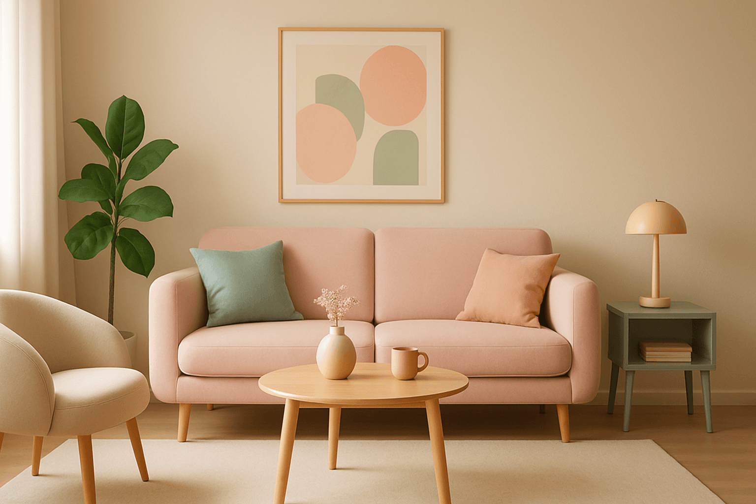
Pastel Color Harmony
Pastel color harmony is a visually appealing approach that uses pale and muted colors to evoke feelings of softness, tranquility, and sophistication. By incorporating pastel tones, AI-generated images achieve a delicate balance that feels inviting and elegant without overwhelming the viewer. This makes pastel harmonies ideal for designs that require a gentle atmosphere or a subtle emotional impact. When included in AI prompts, the model focuses on blending compatible pastel shades to create coherent color schemes that look naturally integrated and aesthetically calming.
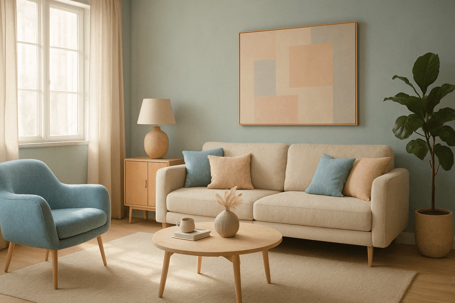
Muted Pastel Color Palette
The muted pastel color palette blends the gentle softness of pastel tones with a restrained saturation level, resulting in colors that evoke tranquility and refinement. When integrated into AI image generation, these colors provide a versatile aesthetic that suits a variety of creative and commercial needs. This palette can transform images into visually soothing experiences, often appearing in editorial designs, fashion imagery, and lifestyle branding. It avoids the brightness and intensity typical of standard pastels, offering a more mature and elegant atmosphere. The muted pastels produce harmonious compositions by pairing subdued colors, ideal for designs requiring subtlety, sophistication, and approachability.

Analogous Warm Color Scheme
Analogous Warm Color Schemes employ colors adjacent on the color wheel within warm tones—reds, oranges, and yellows—to produce harmonious, vibrant images. In AI-generated art, specifying this scheme guides the model to focus on these related colors, resulting in visuals that feel unified and energetic. This scheme evokes warmth, comfort, and optimism, excellent for compositions needing a welcoming or lively mood. Using it strategically in prompts helps artists and designers achieve balanced, naturally blended color palettes that enhance emotional impact without overwhelming the viewer.