Muted Pastel Color Palette
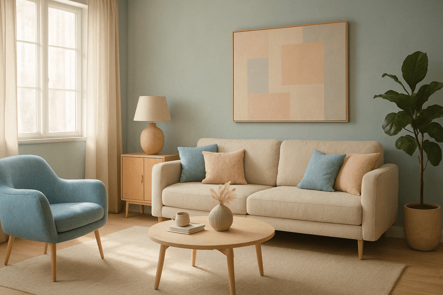
The muted pastel color palette blends the gentle softness of pastel tones with a restrained saturation level, resulting in colors that evoke tranquility and refinement. When integrated into AI image generation, these colors provide a versatile aesthetic that suits a variety of creative and commercial needs. This palette can transform images into visually soothing experiences, often appearing in editorial designs, fashion imagery, and lifestyle branding. It avoids the brightness and intensity typical of standard pastels, offering a more mature and elegant atmosphere. The muted pastels produce harmonious compositions by pairing subdued colors, ideal for designs requiring subtlety, sophistication, and approachability.
Definition
The muted pastel color palette is a collection of light colors with reduced saturation, combining the softness of pastels with a restrained vibrancy. In AI prompts, specifying this palette guides the algorithm to generate images with delicate, understated hues, creating a tranquil and sophisticated visual tone suitable for a broad range of subjects.
- Soft, low-saturation pastels
- Calm and elegant hues
- Gentle transitions between colors
Prompt Formula
To achieve the muted pastel color palette in AI-generated images, structure prompts with these patterns to ensure subtle coloring:
- [Subject] with muted pastel color palette, soft lighting, minimal shadows
- [Scene] rendered in muted pastel tones, desaturated colors, gentle gradients
- [Object] styled using muted pastels, low contrast, refined textures
Best Use Cases
Muted pastel palettes excel in visual contexts where calmness and subtlety are desired. Use cases include:
- Editorial lifestyle photography emphasizing relaxed moods
- Interior design concepts focusing on warm and inviting atmospheres
- Fashion lookbooks highlighting refined, understated apparel colors
Advanced Techniques
Experienced prompt writers can enhance the muted pastel effect by combining specific elements and constraints:
- Pair muted pastels with soft natural or diffuse lighting for atmospheric depth
- Introduce selective focus to emphasize textures without overpowering colors
- Use modifiers like 'dusty', 'powdery', or 'vintage fade' to subtly shift palette character
Professional Workflow
For optimal results using the muted pastel palette in AI image creation, follow this efficient workflow:
- Begin with a clear brief outlining the mood and color constraints
- Craft prompts emphasizing 'muted pastel color palette' alongside desired subject and lighting
- Generate multiple variants to explore different compositional balances
- Select images with the most harmonious and soft color distribution
- Refine chosen images by adjusting saturation or contrast if the tool permits
FAQ
What does 'muted pastel color palette' mean in AI image generation?
It means using soft, lightly saturated colors that are less vibrant than typical pastels, creating calm and understated visuals.
How do I specify muted pastels in an AI prompt?
Include the phrase 'muted pastel color palette' or add descriptive terms like 'desaturated', 'soft', or 'dusty pastel colors' to guide the AI.
Continue Exploring
Related Prompts

Muted Earth Tone Palette
The Muted Earth Tone Palette is a popular color approach in AI image generation that emphasizes soft, natural hues inspired by the earth. These colors include warm browns, olive greens, beiges, and greys, all presented in subdued saturation levels to avoid overly bright or intense visuals. Using this palette creates images that feel organic, calm, and stylish, making it ideal for modern editorial content, lifestyle photography, and interior design renders. By focusing on muted tones, the images exude refinement and subtlety, appealing to viewers seeking sophistication without harsh contrasts. Incorporating this palette into your AI prompts helps generate visuals with a cohesive and naturalistic color balance.

Muted Pastel Color Scheme
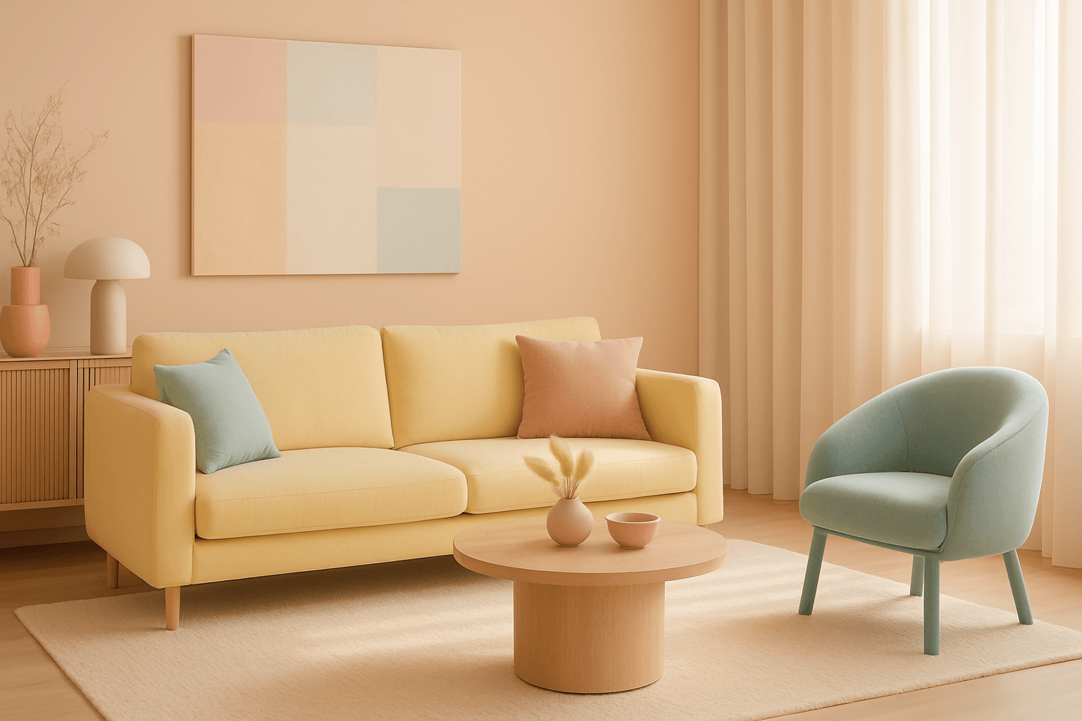
The muted pastel color scheme is popular in digital art and design for its delicate, understated quality. Unlike vibrant pastels, muted pastels involve desaturation and slight grey undertones, delivering a refined and peaceful visual experience. When included in AI image prompts, it guides models to focus on gentle colors that evoke softness and subtlety, making the images feel airy and inviting rather than vivid or loud. This approach works well for lifestyle, fashion, illustration, and branding content that aims to be modern, approachable, and aesthetically pleasing while maintaining elegance.
Bright Pastel Palette
The Bright Pastel Palette is a popular choice in AI-generated imagery for creating visuals that combine softness with energy. These palettes blend traditional pastels—colors with low saturation and high lightness—with increased brightness to keep the colors gentle yet eye-catching. This balance serves to evoke feelings of calmness infused with optimism, making the color scheme widely favored in advertising, editorial spreads, and social media visuals. When used in AI image prompts, it steers the model to generate harmonious color compositions that are neither dull nor harsh, ideal for modern and clean aesthetics.
Soft Pastel Color Palette
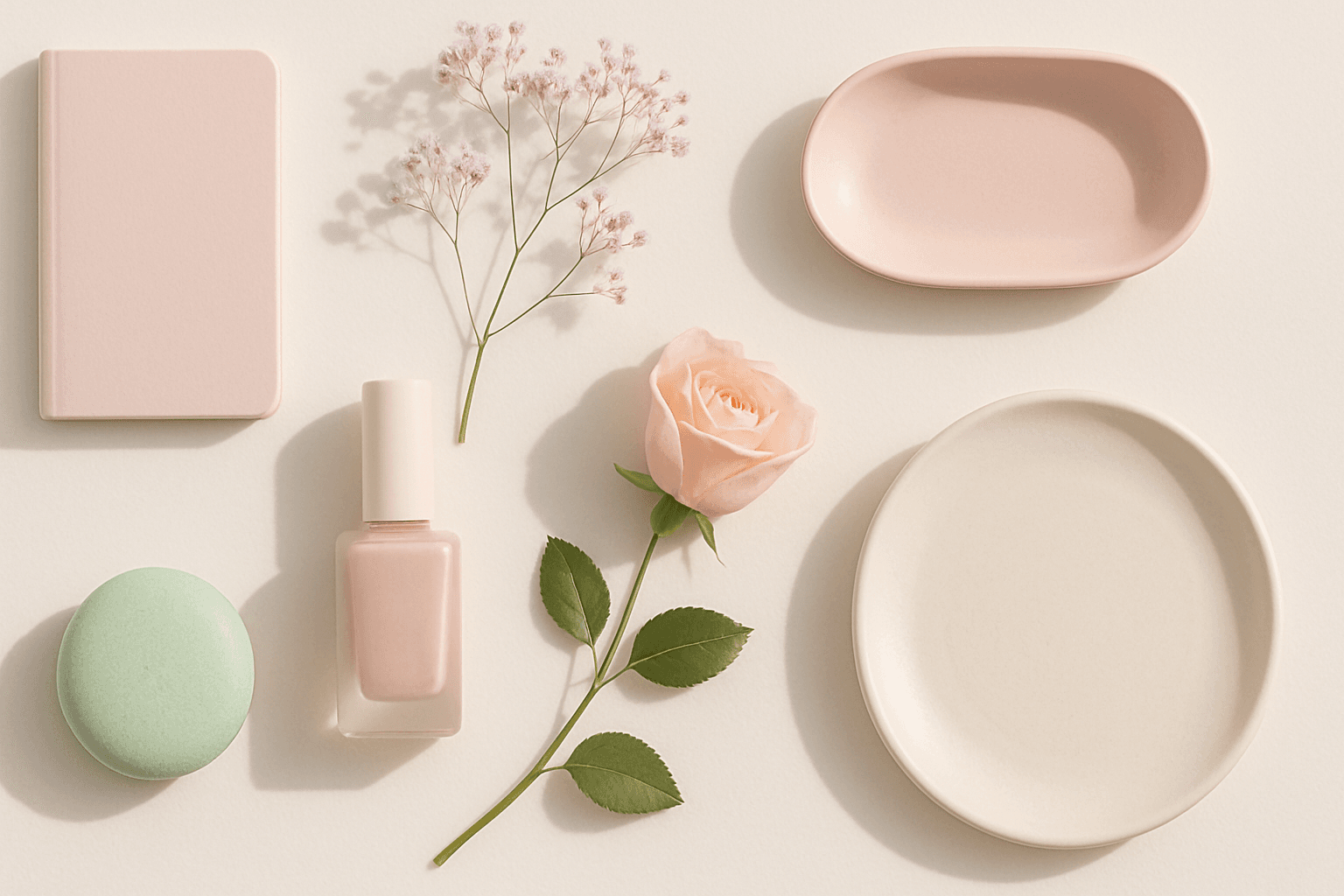
Soft Pastel Color Palette embodies a range of delicate and subdued colors that convey tranquility and subtlety. When directing AI models, mentioning this palette guides the generation toward gentle gradations and harmonious blends of pale pinks, blues, lavenders, and creams. This palette is often employed to produce images with a dreamy, refined aesthetic, fitting for designs needing understated elegance or a nostalgic feel. The softness reduces visual noise and enhances compositions focused on mood rather than bold contrasts.
Muted Neutral Palette
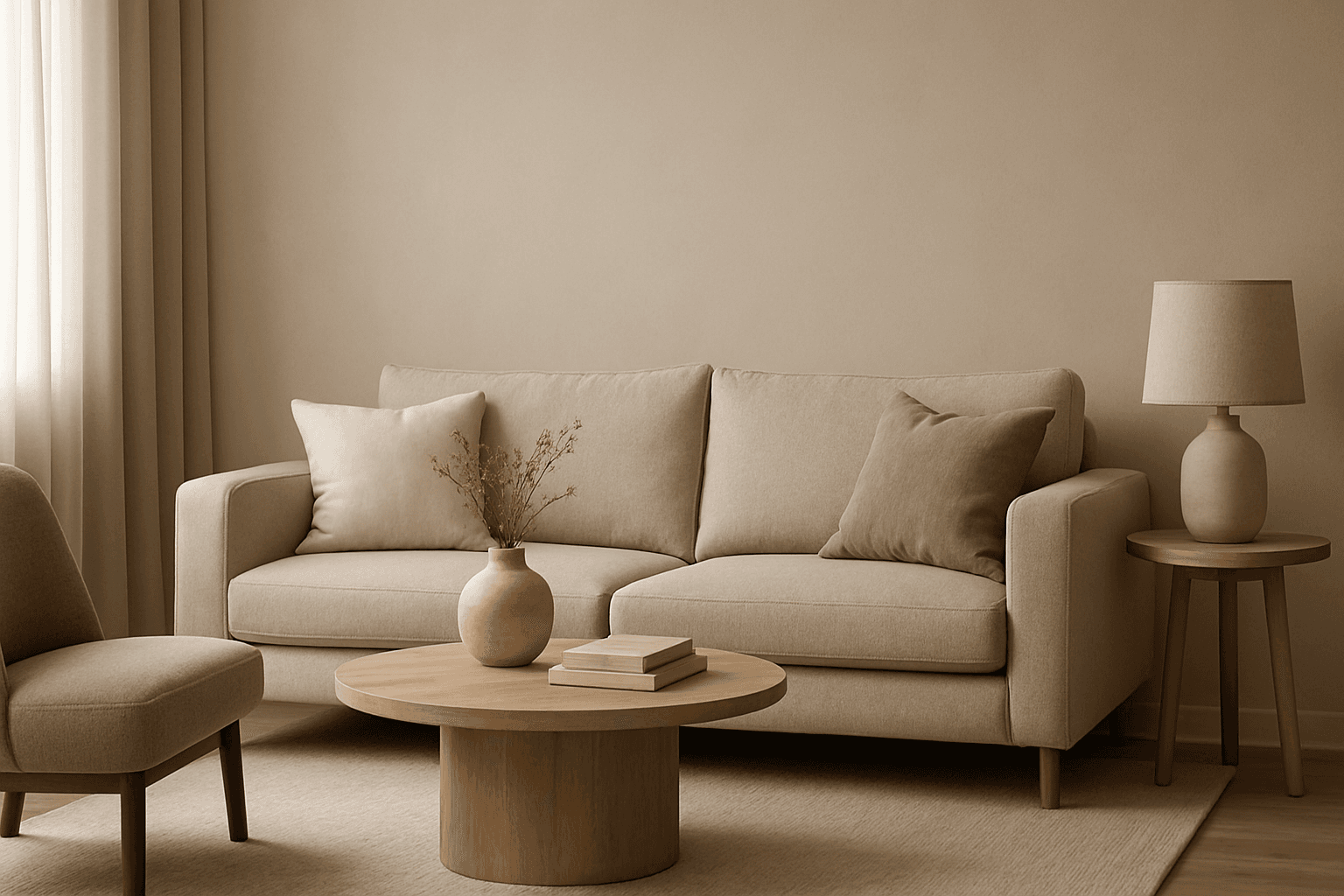
The Muted Neutral Palette is an essential color theme used widely in design, photography, and digital imagery to produce a subtle, refined look. These colors lack vivid saturation and strong contrasts, resulting in images that feel calm, natural, and versatile. In AI-driven image generation, specifying a Muted Neutral Palette guides the model to avoid vibrant, saturated colors, focusing on softness and timelessness. It supports creating visuals that blend seamlessly in editorial, fashion, interior, and product contexts where sophistication and neutrality are paramount. This palette is particularly suited for minimalist compositions where color draws attention without overwhelming the scene.

Soft Muted Color Palette
Using a Soft Muted Color Palette in AI-generated imagery influences the mood and style by incorporating subdued and delicate colors. This approach conveys sophistication, tranquility, and natural beauty, making visuals suitable for subtle branding, lifestyle photography, and editorial contexts. It avoids bright or saturated colors, instead emphasizing nuance and refinement. Artists and designers use it to evoke feelings of warmth, nostalgia, or modern minimalism, enhancing the visual narrative through controlled color harmony and soft contrasts.