Bright Pastel Palette
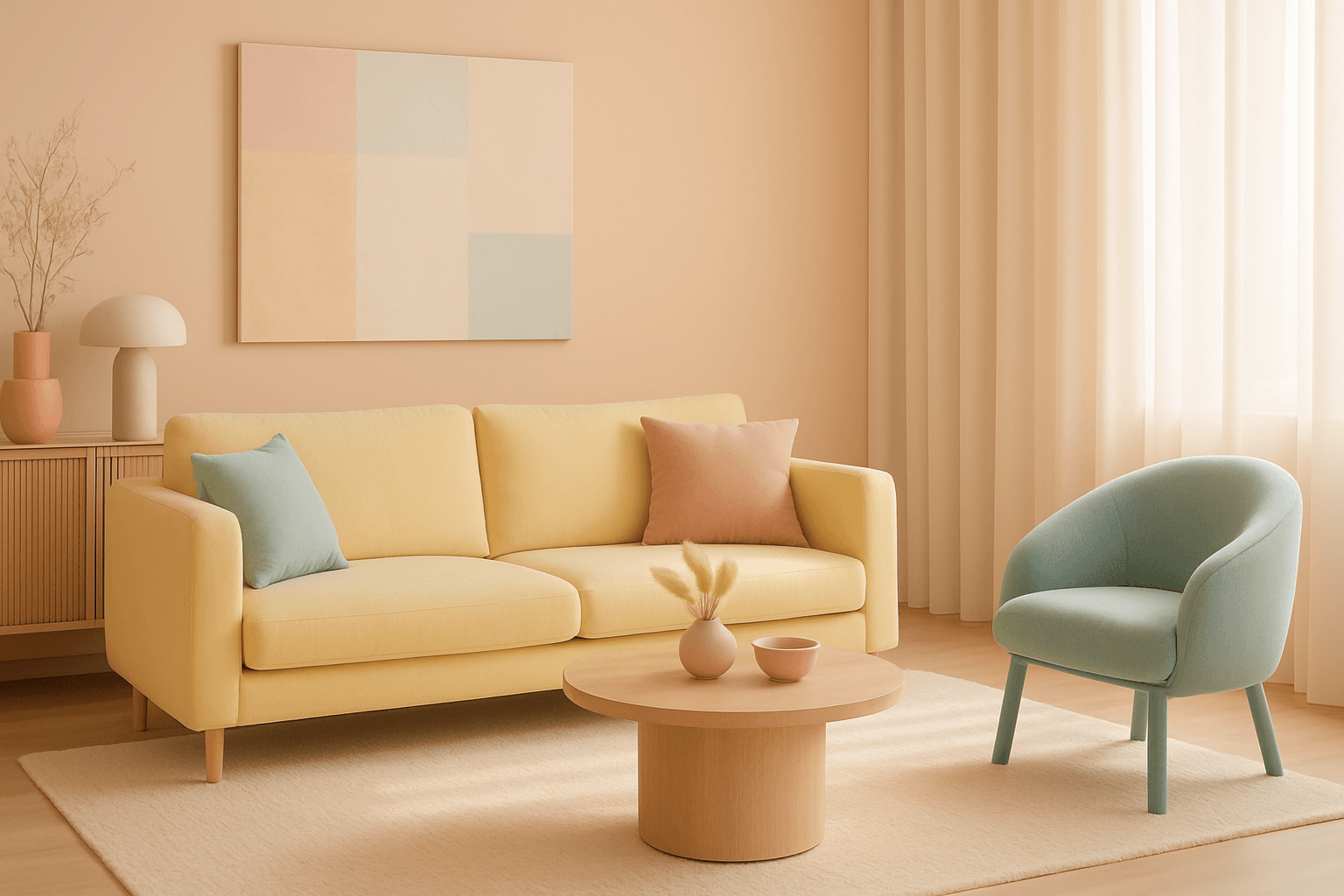
The Bright Pastel Palette is a popular choice in AI-generated imagery for creating visuals that combine softness with energy. These palettes blend traditional pastels—colors with low saturation and high lightness—with increased brightness to keep the colors gentle yet eye-catching. This balance serves to evoke feelings of calmness infused with optimism, making the color scheme widely favored in advertising, editorial spreads, and social media visuals. When used in AI image prompts, it steers the model to generate harmonious color compositions that are neither dull nor harsh, ideal for modern and clean aesthetics.
Definition
The Bright Pastel Palette describes a color approach in AI prompts where traditional pastel colors are enhanced with increased brightness and subtle saturation boosts. This combination produces hues that are soft and gentle but more lively and glowing compared to standard pastels. Using this keyword influences the AI to focus on this particular balance, blending calmness with energetic vibrancy. It’s an effective way to create images with a fresh and inviting look without overpowering the viewer.
- Soft pastel colors with increased brightness
- Subtle saturation boosts for vibrancy
- Gentle, uplifting mood settings
Prompt Formula
To effectively use the Bright Pastel Palette in AI image prompts, combine it with lighting and thematic descriptors that reinforce mood and style. Here are example structures:
- "[subject] in bright pastel palette, soft natural lighting, clean composition"
- "[scene or object], vibrant soft pastels, subtle glow effect, airy mood"
- "[art style], bright pastel palette, diffused light, gentle shadows"
Best Use Cases
The Bright Pastel Palette excels for images needing a gentle yet energizing color story. This includes:
- Wellness and beauty branding where softness meets vitality
- Illustrations for children’s media requiring cheerful but delicate hues
- Lifestyle visuals on social platforms to evoke freshness and optimism
Industry Applications
Commercially, the Bright Pastel Palette finds uses across diverse fields:
- Advertising for health, beauty, and personal care, emphasizing purity and brightness
- Editorial content in fashion and lifestyle magazines to suggest modern softness
- Ecommerce product photos and packaging to attract audiences with light, appealing colors
Common Mistakes
When prompting for a Bright Pastel Palette, AI users sometimes produce:
- Colors that are too muted or dull, losing the 'bright' aspect
- Overly saturated pastels appearing unnatural or harsh
- Flat lighting that removes subtle color depth and softness
Advanced Techniques
Experienced prompt engineers refine the Bright Pastel Palette effect by:
- Adding modifiers like 'diffused lighting' or 'soft rim light' to enhance brightness and depth
- Combining with textures such as 'silky fabric' or 'smooth surfaces' to complement the palette
- Using constraints like 'avoid oversaturation' or 'maintain pastel harmony' to fine-tune outputs
Professional Workflow
A streamlined process for generating images with this palette includes:
- Define the image subject and style alongside the Bright Pastel Palette keyword
- Generate multiple samples emphasizing light and saturation adjustments
- Select images with balanced vibrancy and softness, discarding flat or harsh results
- Iterate with refined prompts adding lighting or texture modifiers for polish
Related Styles
Complementary or similar styles to Bright Pastel Palette are:
- Soft Pastel Colors emphasizing gentle hues with less brightness
- Vibrant Color Schemes focusing on higher saturation and contrast
- Light and Airy style prioritizing bright, clean light effects and open compositions
FAQ
How does Bright Pastel Palette differ from standard pastel colors?
Bright Pastel Palette boosts the brightness and slightly increases saturation of standard pastels, resulting in softer colors with more vividness and a lively feel, whereas standard pastels tend to be more muted and low contrast.
Can I use Bright Pastel Palette for dark or moody images?
This palette is best suited for light, fresh, and uplifting visuals. For dark or moody images, other palettes with deeper tones would be more appropriate.
Continue Exploring
Related Prompts

Muted Pastel Color Scheme
The muted pastel color scheme is popular in digital art and design for its delicate, understated quality. Unlike vibrant pastels, muted pastels involve desaturation and slight grey undertones, delivering a refined and peaceful visual experience. When included in AI image prompts, it guides models to focus on gentle colors that evoke softness and subtlety, making the images feel airy and inviting rather than vivid or loud. This approach works well for lifestyle, fashion, illustration, and branding content that aims to be modern, approachable, and aesthetically pleasing while maintaining elegance.

Pastel Gradient Color Scheme
The pastel gradient color scheme is popular in AI-generated art for its serene and inviting aesthetic. It involves the blending of light, desaturated pastel tones in gradual transitions, which can add depth and softness to visuals without overwhelming details. Using this keyword in prompts helps create backgrounds, themes, or focal areas that evoke feelings of calmness and subtle sophistication. This scheme often suits digital art, branding visuals, and UI elements where gentle color progression supports readability and aesthetic appeal. Its balanced and harmonious style enhances mood and focuses attention, making it a versatile choice in many design contexts.

High Saturation Color Palette
Utilizing a High Saturation Color Palette in AI image generation transforms visuals into bold, lively compositions that capture attention instantly. This approach amplifies the color intensity beyond natural or muted levels, creating a vivid scene bursting with hues that feel powerful and immersive. Often chosen for marketing materials, modern art visuals, and stylized photography, artworks generated with high saturation evoke energetic and emotional responses. When combined thoughtfully with lighting, texture, and composition, it creates a striking balance of vibrancy and clarity, making it ideal for covers, header images, and creative projects needing dynamic coloring.
Soft Pastel Color Palette
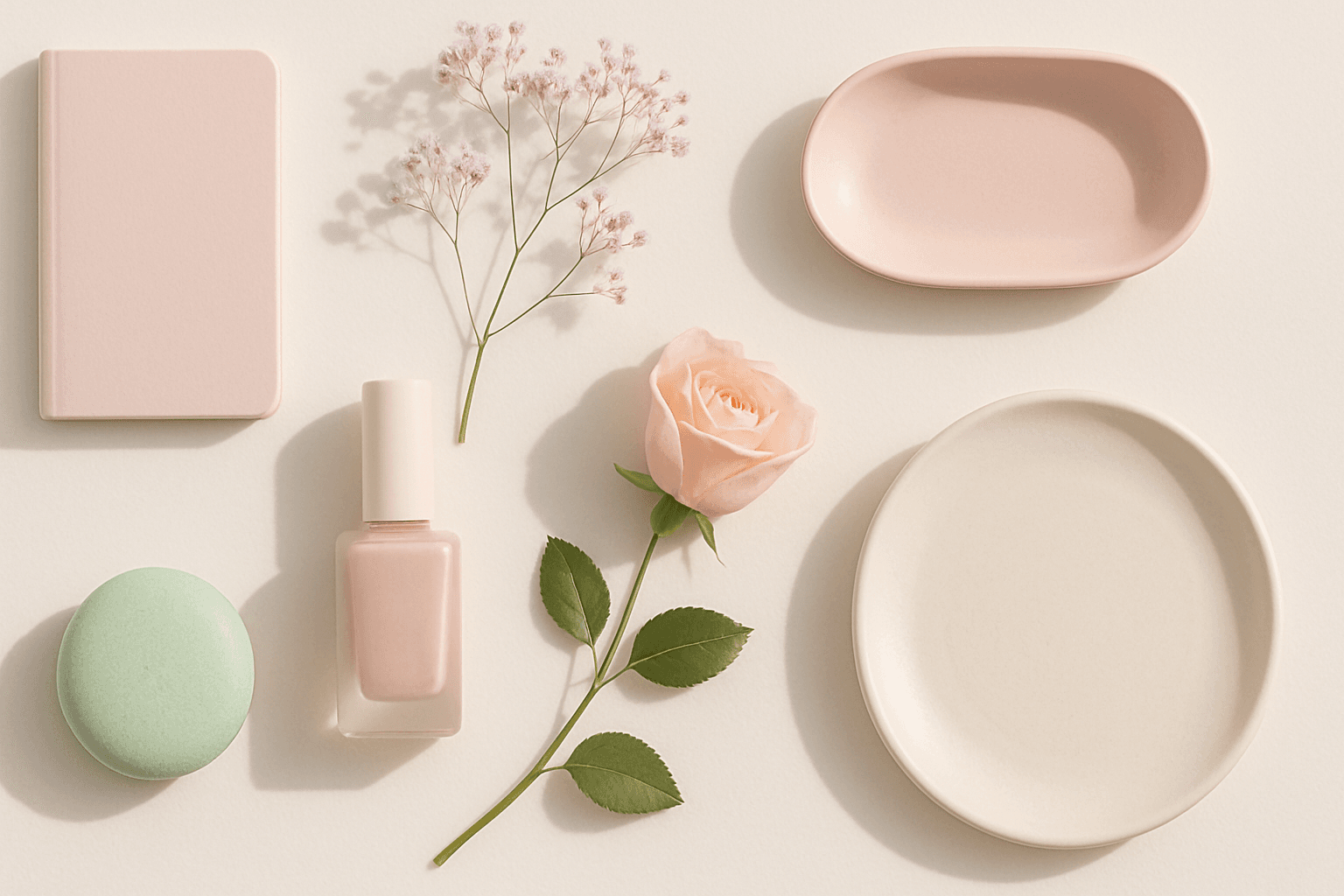
Soft Pastel Color Palette embodies a range of delicate and subdued colors that convey tranquility and subtlety. When directing AI models, mentioning this palette guides the generation toward gentle gradations and harmonious blends of pale pinks, blues, lavenders, and creams. This palette is often employed to produce images with a dreamy, refined aesthetic, fitting for designs needing understated elegance or a nostalgic feel. The softness reduces visual noise and enhances compositions focused on mood rather than bold contrasts.

Bright Primary Colors Palette
Using a Bright Primary Colors Palette in AI image generation emphasizes strong, pure colors—red, blue, and yellow—that are fundamental to color theory. This palette brings a dynamic, energetic feel to images, making them instantly attention-grabbing and easily distinguishable. It's ideal for designs aiming to evoke simplicity with power, evoke nostalgia for classic color schemes, or highlight specific elements through contrast. When integrated thoughtfully, it balances vibrancy with clarity, avoiding muddiness or oversaturation. This approach is especially popular in editorial, advertising, and graphic design work where visual directness is key.

Pastel Color Harmonies
Pastel Color Harmonies are essential for creating gentle and visually pleasing images that emphasize softness and subtlety in color. Using pastel palettes, AI-generated images gain a delicate aesthetic often associated with calm, elegance, and modern minimalism. This approach mitigates harsh contrasts and intense hues, producing visuals ideal for editorial content, branding, and art that need a serene or sophisticated vibe. Incorporating pastel harmonies into AI prompts modifies the image’s overall mood, making scenes feel airy and inviting while maintaining a coherent and balanced color distribution.