Soft Pastel Color Palette
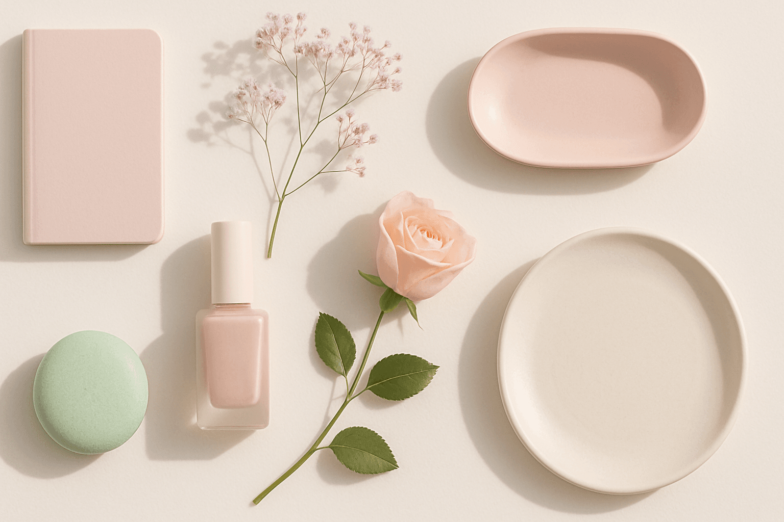
Soft Pastel Color Palette embodies a range of delicate and subdued colors that convey tranquility and subtlety. When directing AI models, mentioning this palette guides the generation toward gentle gradations and harmonious blends of pale pinks, blues, lavenders, and creams. This palette is often employed to produce images with a dreamy, refined aesthetic, fitting for designs needing understated elegance or a nostalgic feel. The softness reduces visual noise and enhances compositions focused on mood rather than bold contrasts.
Definition
The Soft Pastel Color Palette describes a group of muted, low-saturation colors often featuring pale pinks, light blues, gentle greens, and creamy yellows. In AI prompts, invoking this palette prompts the model to produce images with delicate, softly blended colors that evoke tranquility and subtlety. It shifts imagery away from vivid or vibrant palettes, favoring a more refined and calm visual atmosphere.
Prompt Formula
Use this flexible template to incorporate the Soft Pastel Color Palette effectively: - Start with your subject or scene description. - Add descriptive modifiers like "soft lighting", "minimalist", or "dreamy atmosphere". - Specify "soft pastel color palette" to steer colors. - Optionally include style references such as "editorial photography" or "flat lay". Example structure: "[Subject] in soft lighting, [style], soft pastel color palette, clean composition".
- Subject description
- Modifiers (e.g. soft lighting, dreamy atmosphere)
- "soft pastel color palette"
- Optional style references
Best Use Cases
- Editorial lifestyle photos emphasizing softness and mood
- Springtime or baby-themed illustrations seeking gentle tones
- Minimalist product photography requiring an elegant, clean look
Professional Workflow
When using the Soft Pastel Color Palette in AI-generated imagery within a professional workflow, begin by crafting a clear and detailed brief that incorporates the palette keyword alongside your subject and style details. Generate multiple variations to explore subtle differences in color balance and light. Carefully review outputs for color harmony and softness, selecting options that best fit the intended emotional tone. Refine selected images through upscaling or slight color adjustments to ensure polished, usable results for commercial or editorial use.
Related Styles
- Muting Tone: further limits vividness for a faded effect
- Dreamy Lighting: soft focus and gentle glow complements pastel hues
- Minimalist Composition: clean layouts enhance subtle pastel colors
Model-Specific Tips
Soft Pastel Color Palette is broadly supported across AI image models but benefits from gentle, descriptive adjectives to reinforce intent. Use phrases like "soft and muted colors" or "delicate color transitions" alongside direct mentions of the palette to improve interpretability. Avoid mixing contradictory terms like "vibrant" or "neon". Testing prompt variations with different word orders helps optimize results, as models can interpret keywords variably based on syntax and context.
FAQ
Can I combine Soft Pastel Color Palette with vibrant colors in prompts?
Combining soft pastel colors with vibrant tones can create conflicting color moods, often leading to less cohesive images. For best results, keep your palette consistent; if you want vibrancy, use keywords aligned with bright or saturated palettes separately.
Does the Soft Pastel Color Palette work well for dark-themed images?
Soft pastel colors typically convey lightness and calm, which contrasts with dark themes. While you can experiment, generally pastel palettes suit bright or neutral moods better than moody, dark scenes.
Continue Exploring
Related Prompts
Muted Pastel Color Palette
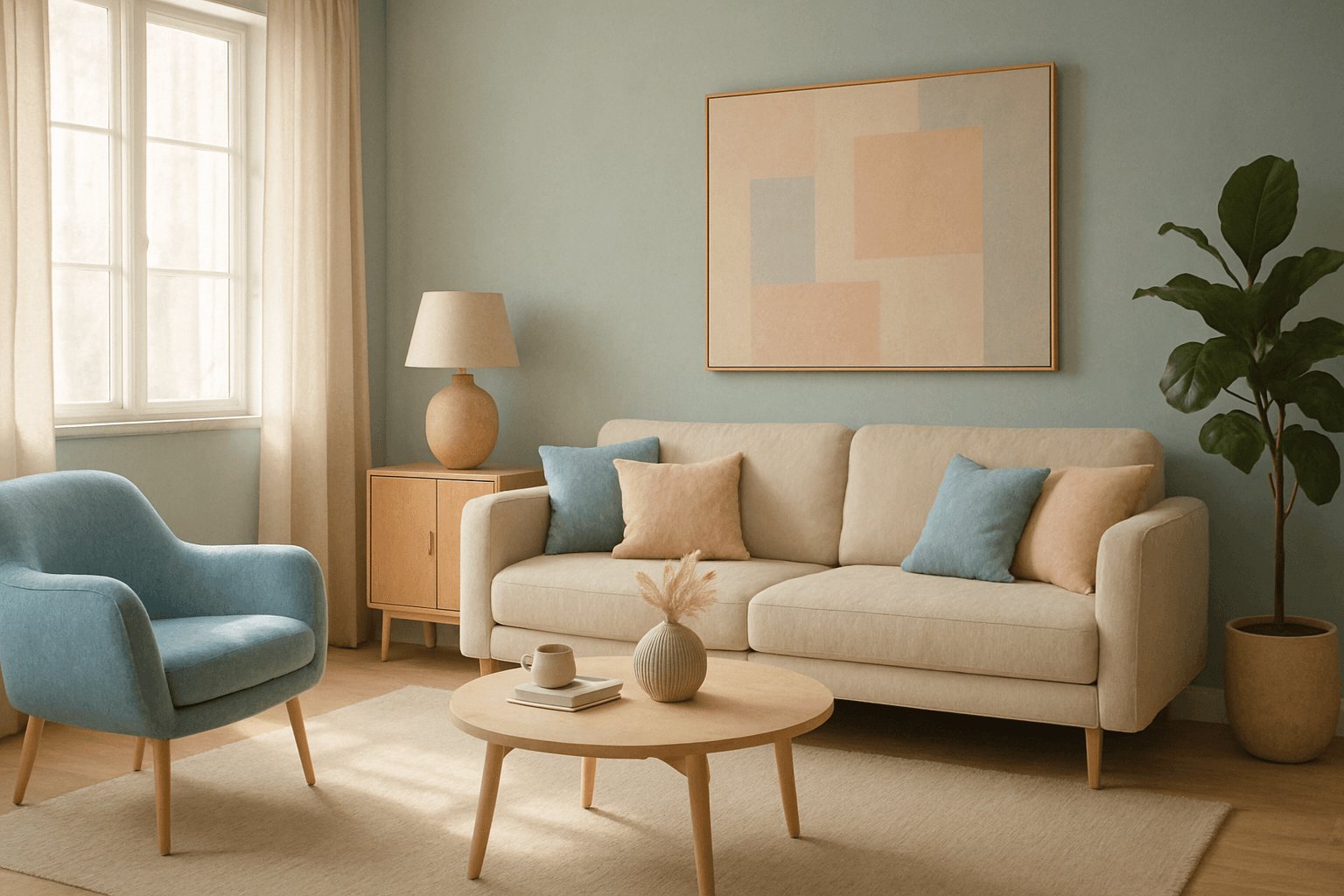
The muted pastel color palette blends the gentle softness of pastel tones with a restrained saturation level, resulting in colors that evoke tranquility and refinement. When integrated into AI image generation, these colors provide a versatile aesthetic that suits a variety of creative and commercial needs. This palette can transform images into visually soothing experiences, often appearing in editorial designs, fashion imagery, and lifestyle branding. It avoids the brightness and intensity typical of standard pastels, offering a more mature and elegant atmosphere. The muted pastels produce harmonious compositions by pairing subdued colors, ideal for designs requiring subtlety, sophistication, and approachability.

Muted Pastel Color Scheme
The muted pastel color scheme is popular in digital art and design for its delicate, understated quality. Unlike vibrant pastels, muted pastels involve desaturation and slight grey undertones, delivering a refined and peaceful visual experience. When included in AI image prompts, it guides models to focus on gentle colors that evoke softness and subtlety, making the images feel airy and inviting rather than vivid or loud. This approach works well for lifestyle, fashion, illustration, and branding content that aims to be modern, approachable, and aesthetically pleasing while maintaining elegance.

Soft Muted Color Palette
Using a Soft Muted Color Palette in AI-generated imagery influences the mood and style by incorporating subdued and delicate colors. This approach conveys sophistication, tranquility, and natural beauty, making visuals suitable for subtle branding, lifestyle photography, and editorial contexts. It avoids bright or saturated colors, instead emphasizing nuance and refinement. Artists and designers use it to evoke feelings of warmth, nostalgia, or modern minimalism, enhancing the visual narrative through controlled color harmony and soft contrasts.
Soft Desaturated Palette
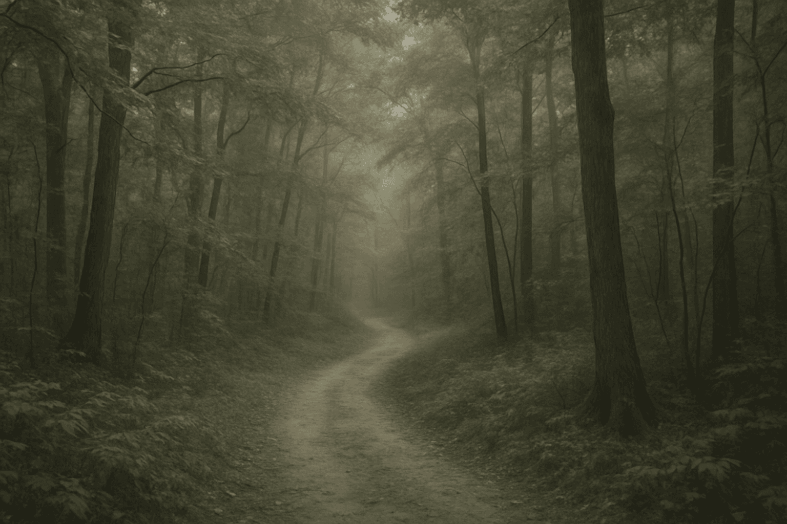
In AI-generated imagery, color palettes significantly influence the mood and visual impact of the final output. The Soft Desaturated Palette keyword directs AI models to render images with subdued colors by lowering saturation and brightness levels. This approach creates an image that feels gentle to the eye, with a natural yet understated aesthetic. By avoiding vibrant hues and opting for soft tones, this palette supports designs requiring subtlety and sophistication. It is particularly beneficial when the goal is to communicate calmness, nostalgia, or elegance, making the image appropriate for editorial layouts, fashion shoots, interior designs, and social media visuals.

Pastel Color Harmonies
Pastel Color Harmonies are essential for creating gentle and visually pleasing images that emphasize softness and subtlety in color. Using pastel palettes, AI-generated images gain a delicate aesthetic often associated with calm, elegance, and modern minimalism. This approach mitigates harsh contrasts and intense hues, producing visuals ideal for editorial content, branding, and art that need a serene or sophisticated vibe. Incorporating pastel harmonies into AI prompts modifies the image’s overall mood, making scenes feel airy and inviting while maintaining a coherent and balanced color distribution.
Warm Neutral Palette
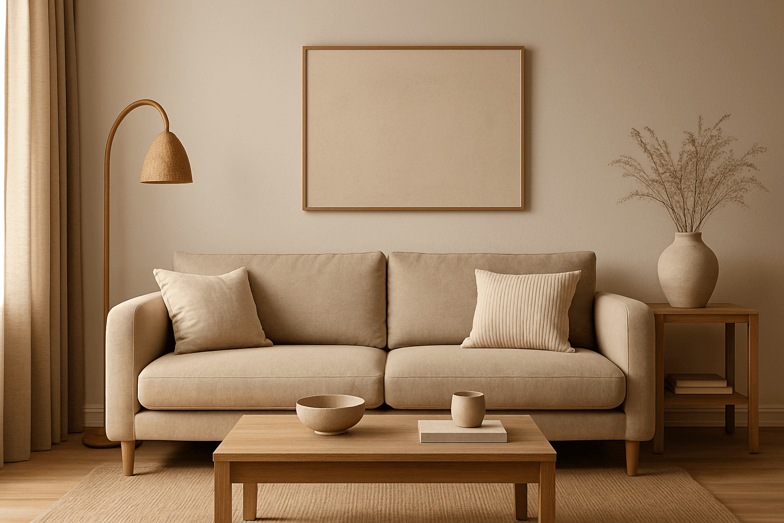
The Warm Neutral Palette is a popular color scheme choice in design and AI-generated imagery for its timeless and soothing qualities. This palette combines warm earthy tones with soft neutrals, producing images that feel natural and approachable. Incorporating warm neutrals can enhance mood by bringing subtle warmth and comfort to visuals without overpowering them. When added to AI prompts, it guides the model to emphasize harmonious colors that evoke calmness and sophistication. The palette works well across various genres, including lifestyle, interiors, fashion, and nature themes, helping create polished and refined visuals suitable for editorial or commercial use.