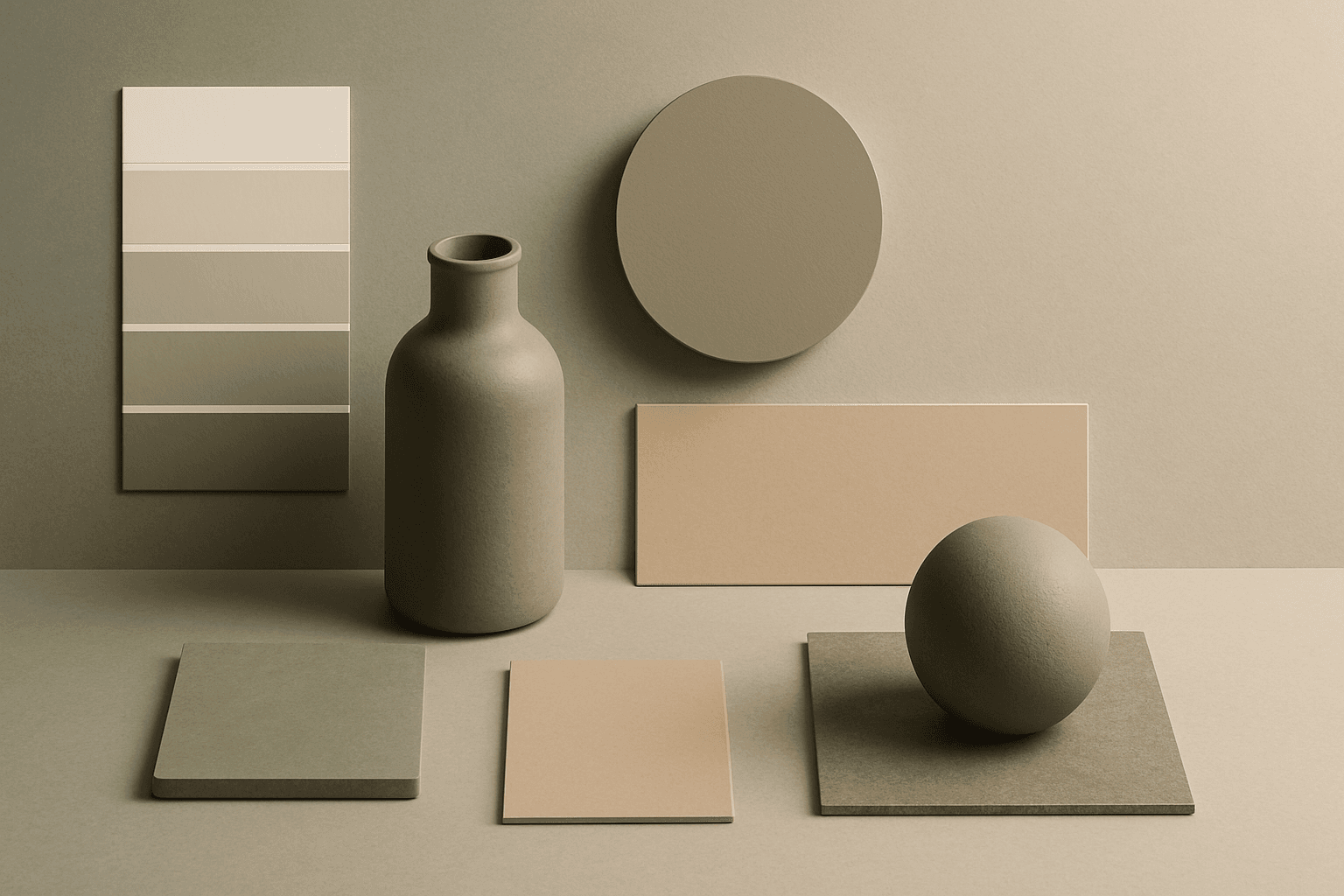
Warm Neutral Palette
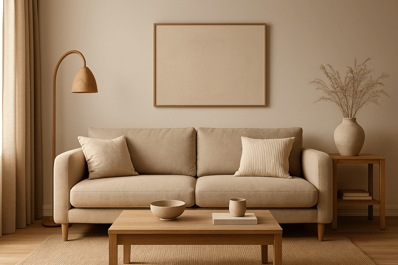
The Warm Neutral Palette is a popular color scheme choice in design and AI-generated imagery for its timeless and soothing qualities. This palette combines warm earthy tones with soft neutrals, producing images that feel natural and approachable. Incorporating warm neutrals can enhance mood by bringing subtle warmth and comfort to visuals without overpowering them. When added to AI prompts, it guides the model to emphasize harmonious colors that evoke calmness and sophistication. The palette works well across various genres, including lifestyle, interiors, fashion, and nature themes, helping create polished and refined visuals suitable for editorial or commercial use.
Definition
A Warm Neutral Palette in AI art prompts refers to a targeted color scheme that integrates soft, earthy tones like creams, beiges, tans, and mild warm grays. Including this keyword steers the AI model to generate images with a gentle warmth and muted brightness, creating cozy and harmonious visuals free from stark, cold colors.
Visual Characteristics
- Predominantly soft earthy tones such as creamy beige, warm browns, and muted tans
- Balanced low-contrast color depth with gentle gradations
- Warmth-infused ambiance evoking comfort and subtle elegance
Prompt Formula
To effectively incorporate the Warm Neutral Palette in your AI prompts, combine color descriptors with environment or subject details. For example: "[subject], warm neutral palette, soft warm lighting, natural textures, subdued contrasts." This formula ensures the model emphasizes earthy warm tones and a cozy mood in compositions.
- [subject], warm neutral palette, soft lighting
- [scene], warm neutral palette, natural textures, subtle shadows
- [object], warm neutral palette, muted colors, gentle gradients
Best Use Cases
- Lifestyle product shoots with natural materials and textures
- Interior design imagery featuring inviting, warm atmospheres
- Editorial portraits emphasizing subtle earth-tone clothing and backgrounds
Creative Variations
To avoid repetitive outputs when using the Warm Neutral Palette, experiment with different lighting conditions, such as golden hour or soft overcast light, and vary texture details like fabrics or ceramics. Adjust compositions by incorporating organic elements or minimalist layouts to explore fresh interpretations of warmth and neutrality.
- Use golden hour lighting for enhanced warmth
- Incorporate natural materials like wood, linen, or clay
- Try minimalist versus detailed textured compositions
Industry Applications
The Warm Neutral Palette is highly applicable in industries prioritizing authentic, approachable aesthetics. In home decor and interiors, it highlights comfort and timeless style. Fashion retailers use it for casual and elegant collections, while editorial projects leverage its natural appeal for lifestyle and wellness stories.
- Home decor and interior design branding
- Fashion lookbooks and casual wear campaigns
- Lifestyle and wellness editorial content
Model-Specific Tips
When prompting modern AI models, pair the 'warm neutral palette' keyword with explicit color references to increase consistency across outputs. Using modifiers like 'soft,' 'natural,' or 'muted' alongside lighting terms enhances the palette's visual fidelity. Avoid overloading prompts to keep focus on the warm neutral effect while letting the model interpret subtle tonal nuances naturally.
- Combine with adjectives: soft, muted, natural
- Add lighting styles: warm natural light, soft shadows
- Keep prompts focused and avoid too many competing color terms
FAQ
What colors make up a warm neutral palette?
Warm neutral palettes typically include beige, cream, soft browns, tan, warm grays, and sometimes olive or muted terra cotta tones—all blending to create warmth without strong saturation.
Can I use warm neutral palettes for vibrant subjects?
Yes, but the color emphasis will be subdued. To retain vibrancy, balance warm neutrals with selective pops of color or enhanced lighting in your prompt.
Continue Exploring
Related Prompts
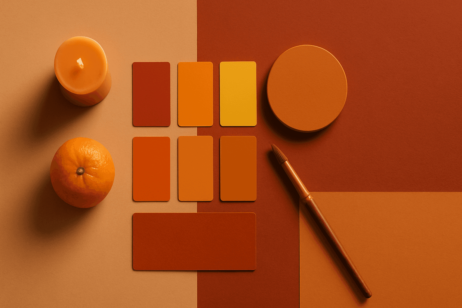
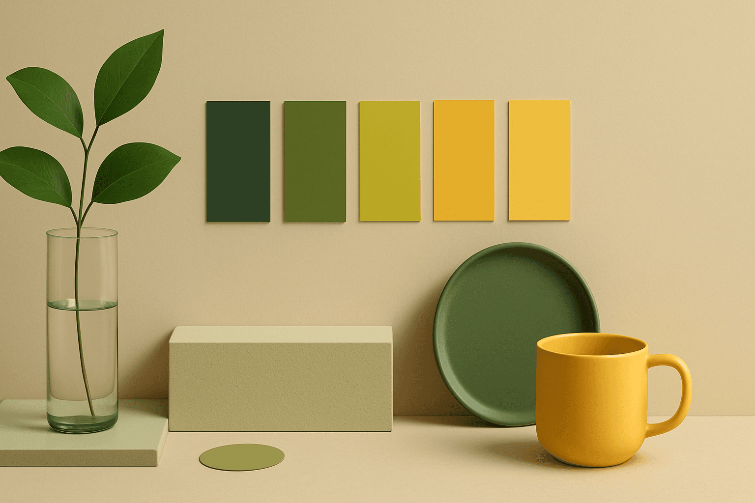
Warm Color Palette
Warm Color Palette is a practical keyword for guiding emotional tone. It can make a breakfast scene feel cozy, a travel image feel sunny, or a brand visual feel more approachable. Warm palettes are strong for commercial images because they connect quickly with themes like comfort, care, family, food, hospitality, wellness, and optimism. For beginners, this keyword is easier to control than listing many individual colors.
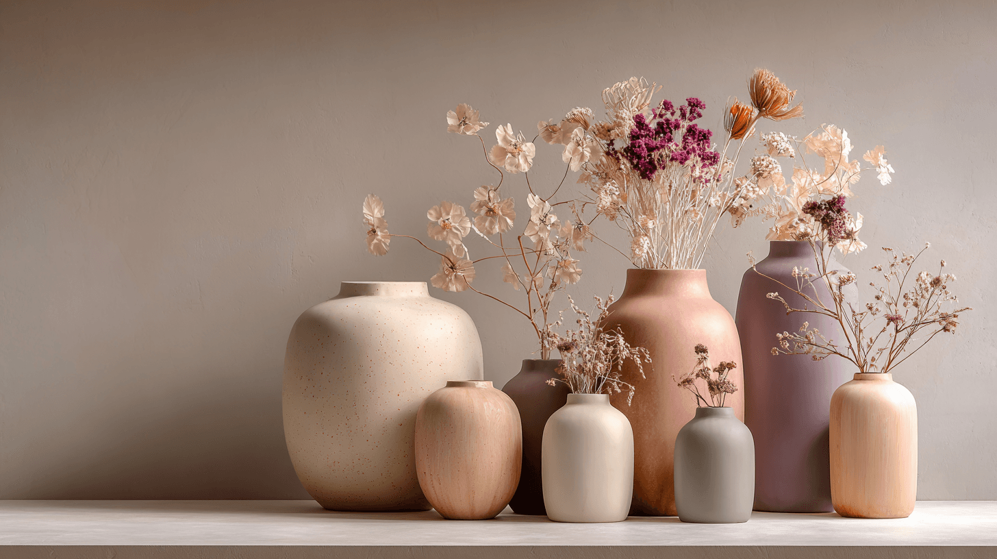
Morandi Palette
Morandi Palette is a color keyword inspired by the quiet, dusty tones associated with painter Giorgio Morandi. In AI image prompts, it usually points the model toward muted, low-saturation colors such as dusty rose, warm gray, clay, sage, beige, soft blue, faded mauve, and stone. The effect is refined, calm, and slightly editorial. This palette is useful when you want an image to feel sophisticated without becoming cold or overly minimal. For beginners, Morandi Palette is a practical way to control color harmony. It can make a scene feel more tasteful, cohesive, and brand-ready, especially when default AI colors look too bright or artificial.
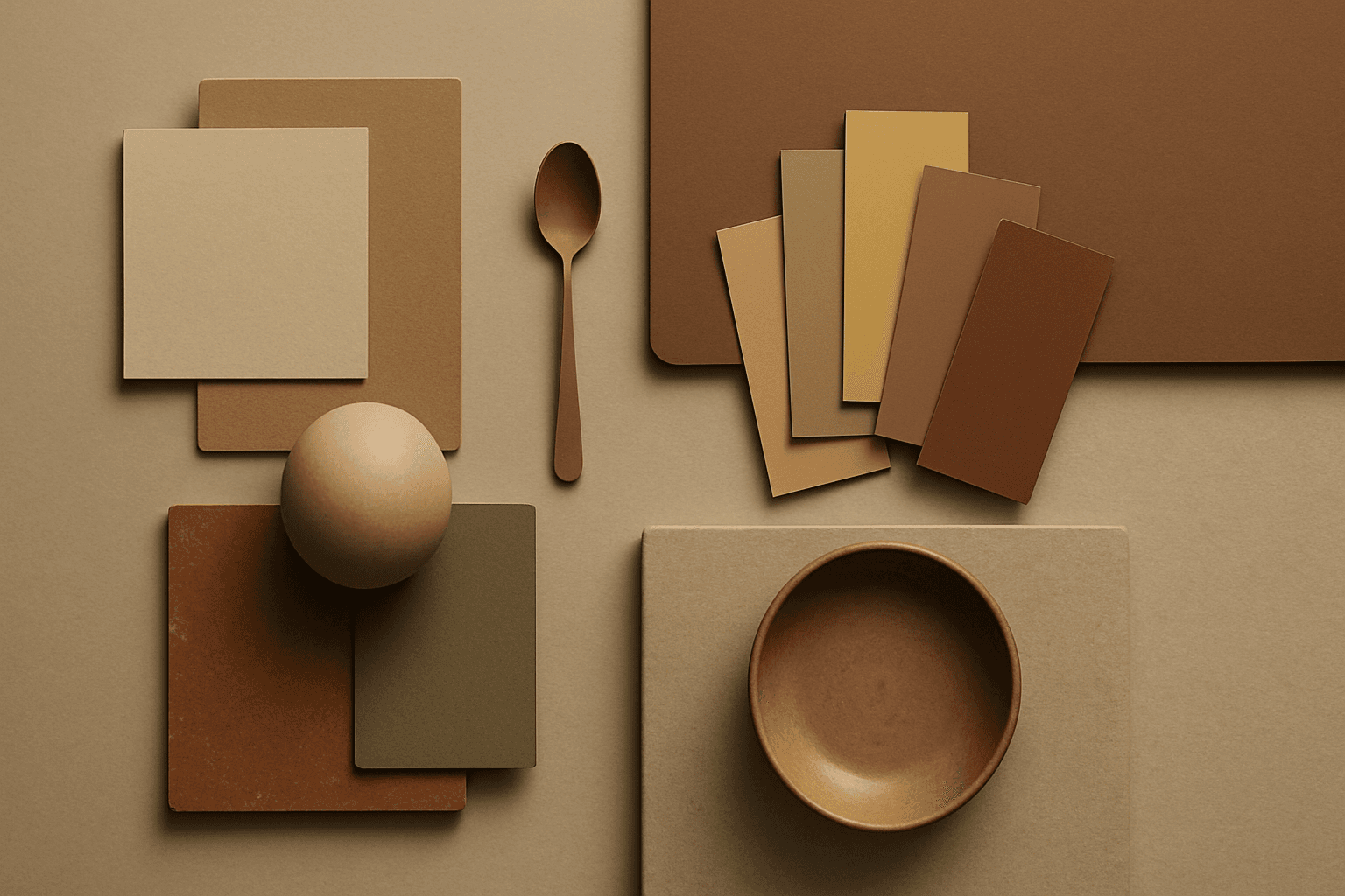
Earth Tone Colors
Earth Tone Colors are useful for creating grounded, organic, and commercially current AI images. They are common in wellness branding, sustainable packaging, interiors, handmade products, food, outdoor lifestyle, and natural beauty campaigns. For stock creators, earth tones can communicate authenticity and trust without needing obvious eco symbols. They also work well in minimalist layouts because the palette is calm but still warm.
Muted Colors
Muted Colors are useful when you want AI-generated images to feel sophisticated instead of loud. They are common in interiors, lifestyle photography, fashion editorials, packaging, wellness brands, and business imagery. For stock creators, muted palettes can make images more flexible because they do not overpower text or brand elements. They also help avoid the overly saturated look that many AI images produce by default.
Analogous Colors
Analogous Colors are useful when you want an AI image to feel harmonious and easy to look at. Because the colors are related, the image often feels more cohesive and less visually jarring. This makes the keyword helpful for interior design, nature scenes, wellness branding, beauty campaigns, fashion styling, and editorial backgrounds. For beginners, Analogous Colors are easier to control than complex palettes because the colors naturally belong together.
Desaturated Colors
In AI image generation, 'desaturated colors' guide models to produce images with toned-down color intensity, resulting in a muted and understated appearance. This technique is valuable for conveying moods such as tranquility, nostalgia, or elegance by avoiding overly bright or saturated colors. Using desaturated colors can help shift the focus to composition, texture, and lighting rather than vivid color contrasts, making images more versatile for editorial content, fashion, or natural scenes. It balances realism and artistic subtlety, especially when paired with refined lighting and soft shadows to emphasize material qualities and depth.