Muted Neutral Palette
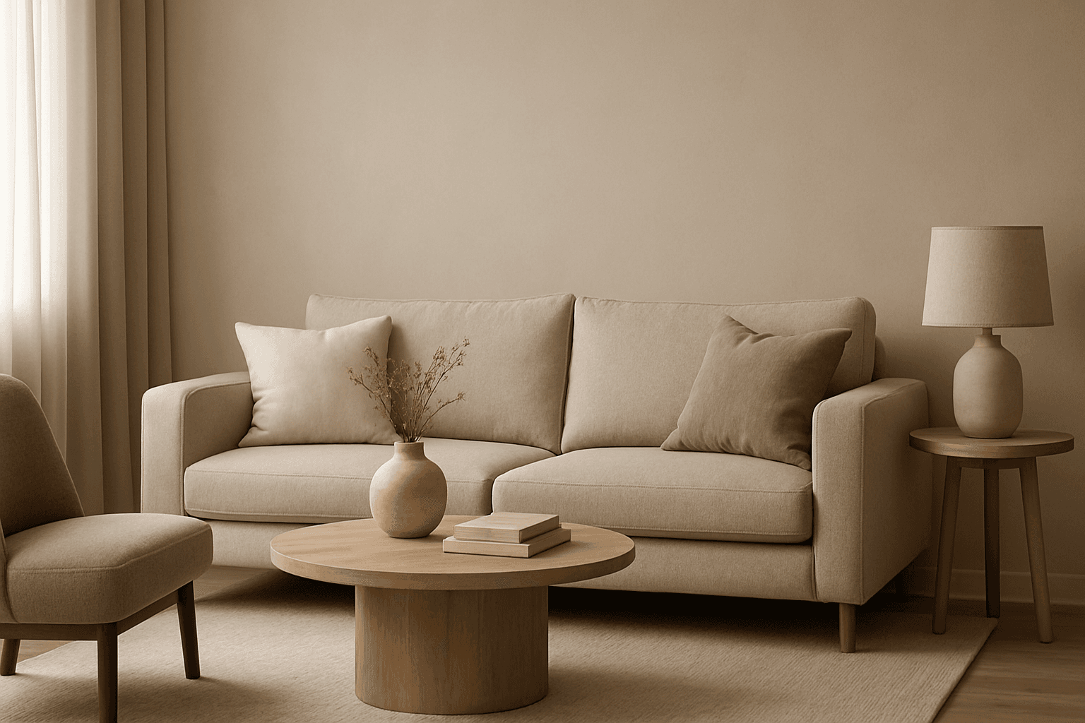
The Muted Neutral Palette is an essential color theme used widely in design, photography, and digital imagery to produce a subtle, refined look. These colors lack vivid saturation and strong contrasts, resulting in images that feel calm, natural, and versatile. In AI-driven image generation, specifying a Muted Neutral Palette guides the model to avoid vibrant, saturated colors, focusing on softness and timelessness. It supports creating visuals that blend seamlessly in editorial, fashion, interior, and product contexts where sophistication and neutrality are paramount. This palette is particularly suited for minimalist compositions where color draws attention without overwhelming the scene.
Definition
The Muted Neutral Palette is a color scheme characterized by soft, desaturated hues like beige, taupe, cream, and gentle grays. It reduces the intensity of colors to create subtle and elegant imagery. Adding this keyword to your AI image prompt signals the model to use these understated shades, generating visuals that feel calm and sophisticated—ideal for minimalistic and timeless design aesthetics.
- Subdued, low saturation tones
- Colors include soft beige, cream, taupe, gray
- Creates a calm and elegant atmosphere
Prompt Formula
Here are reusable prompt patterns incorporating the Muted Neutral Palette to craft images with understated elegance:
- '<subject>, muted neutral palette, soft lighting, minimal shadows'
- '<environment> with muted neutral palette, natural textures, subtle depth'
- '<fashion style>, muted neutral palette, gentle contrast, realistic materials'
- 'Editorial style portrait, muted neutral palette, shallow focus, natural background'
Best Use Cases
The Muted Neutral Palette excels in scenarios where soft, refined visuals are desired. It showcases beauty through subtlety, making it ideal for:
- Interior design concepts in minimalist or Scandinavian styles
- Fashion photography emphasizing natural tones and fabric textures
- Product presentations requiring a calm, neutral backdrop
Professional Workflow
A streamlined process to create polished images with a Muted Neutral Palette includes:
- Brief the AI with clear subject and add 'muted neutral palette' for color guidance
- Generate multiple options to explore variations in lighting and composition
- Select images exhibiting balanced, soft tones and appropriate texture detail
- Refine selected images by enhancing subtle shadows or highlights while maintaining color muteness
- Use output in editorial layouts or marketing materials needing understated elegance
Related Styles
Complementary or adjacent visual directions and keywords to combine or explore alongside the Muted Neutral Palette include:
- Soft Pastel Palette – introduces gentle color accents with muted softness
- Earth Tone Palette – emphasizes natural browns and greens in similar muted styles
- Minimalist Color Scheme – focuses on simplicity with restrained use of color
FAQ
How does the Muted Neutral Palette affect the mood of an image?
This palette creates a calm, understated, and elegant mood by using low saturation colors that avoid strong contrasts, making images feel timeless and refined.
Can I combine Muted Neutral Palette with vibrant colors in AI prompts?
Yes, but blending muted neutrals with vibrant colors can shift the overall mood. For a cohesive look, use vibrant accents sparingly within a primarily muted neutral scheme.
Continue Exploring
Related Prompts

Muted Earth Tone Palette
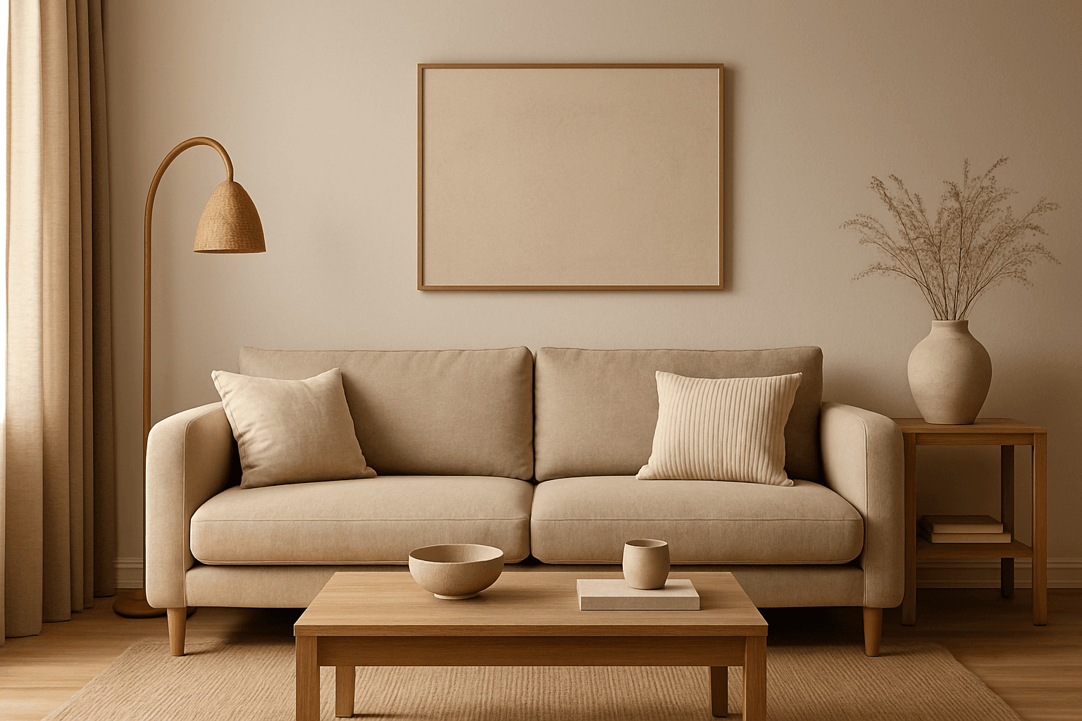
The Muted Earth Tone Palette is a popular color approach in AI image generation that emphasizes soft, natural hues inspired by the earth. These colors include warm browns, olive greens, beiges, and greys, all presented in subdued saturation levels to avoid overly bright or intense visuals. Using this palette creates images that feel organic, calm, and stylish, making it ideal for modern editorial content, lifestyle photography, and interior design renders. By focusing on muted tones, the images exude refinement and subtlety, appealing to viewers seeking sophistication without harsh contrasts. Incorporating this palette into your AI prompts helps generate visuals with a cohesive and naturalistic color balance.
Warm Neutral Palette
The Warm Neutral Palette is a popular color scheme choice in design and AI-generated imagery for its timeless and soothing qualities. This palette combines warm earthy tones with soft neutrals, producing images that feel natural and approachable. Incorporating warm neutrals can enhance mood by bringing subtle warmth and comfort to visuals without overpowering them. When added to AI prompts, it guides the model to emphasize harmonious colors that evoke calmness and sophistication. The palette works well across various genres, including lifestyle, interiors, fashion, and nature themes, helping create polished and refined visuals suitable for editorial or commercial use.

Muted Pastel Color Scheme
The muted pastel color scheme is popular in digital art and design for its delicate, understated quality. Unlike vibrant pastels, muted pastels involve desaturation and slight grey undertones, delivering a refined and peaceful visual experience. When included in AI image prompts, it guides models to focus on gentle colors that evoke softness and subtlety, making the images feel airy and inviting rather than vivid or loud. This approach works well for lifestyle, fashion, illustration, and branding content that aims to be modern, approachable, and aesthetically pleasing while maintaining elegance.
Monotone Blue Palette
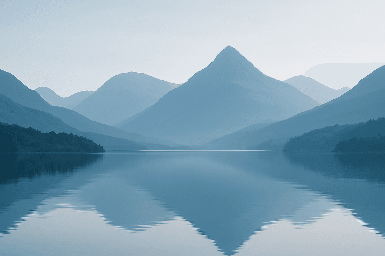
The Monotone Blue Palette is a specialized coloring style used in AI-generated imagery that embraces blue tones exclusively, from pale icy blues to deep navy. This approach simplifies color complexity while adding a sophisticated, calming atmosphere to an image. It is ideal for creative projects necessitating mood-driven visuals or stylistic consistency. Incorporating this palette into prompts helps artists, designers, and marketers create images that evoke tranquility, stability, and trustworthiness. The technique fits a variety of themes including landscapes, portraits, and abstract compositions, providing a modern, refined aesthetic that stands out due to its monochromatic elegance.
Muted Earth Tone Colors
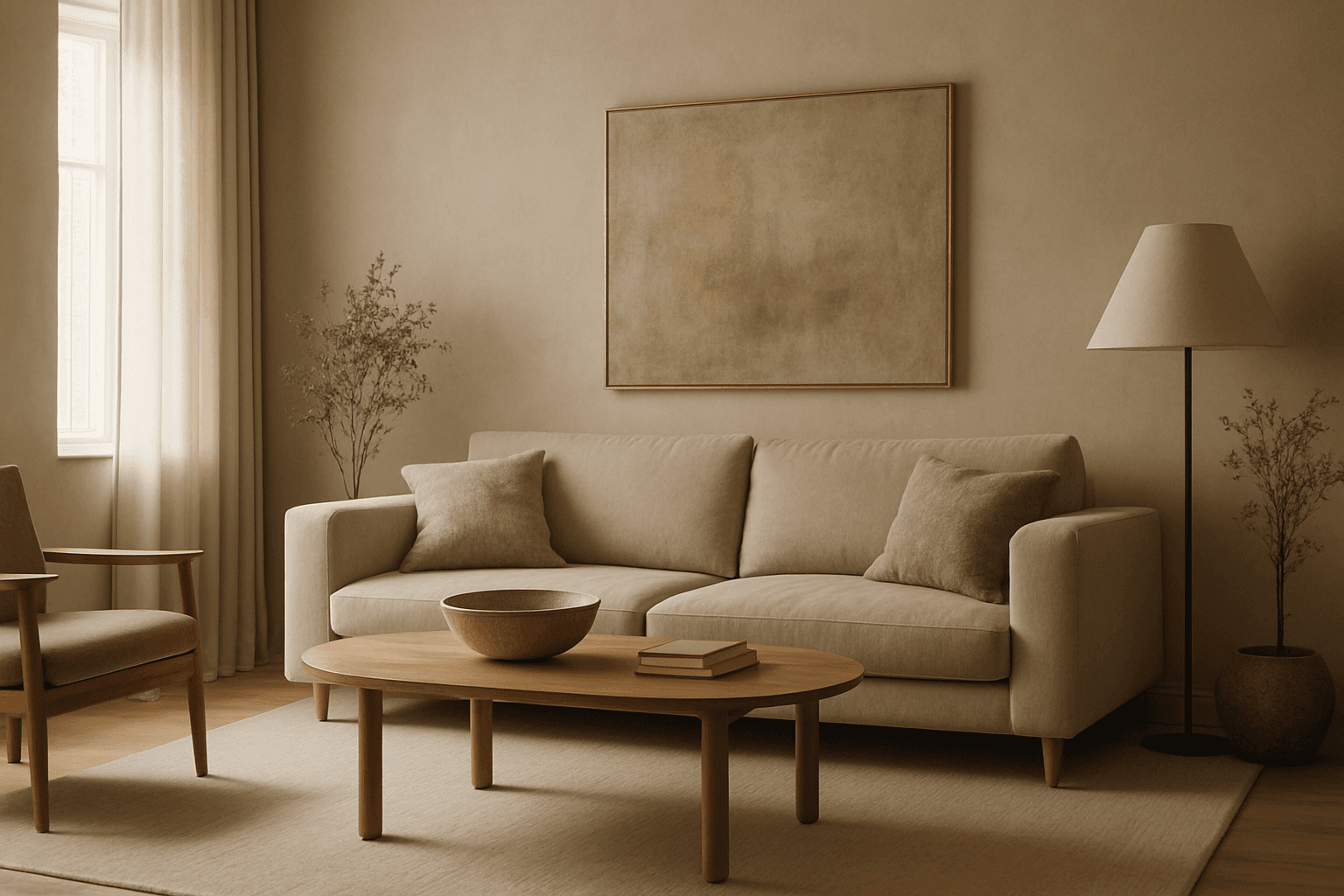
Muted earth tone colors encapsulate a palette inspired by nature’s subtle and calming shades such as soft browns, gentle greens, warm ochres, and quiet grays. When integrated into AI image prompts, these colors help generate images that feel organic, grounded, and harmonious, making them ideal for designs seeking understated elegance or a natural aesthetic. This approach avoids harsh contrasts and bright tones, providing visuals that are soothing and visually balanced. Such color schemes are especially useful in editorial photography, interior design renderings, and lifestyle imagery, where authenticity and warmth are key. Utilizing these tones can transform generic visuals into cohesive, premium-feeling compositions that align with modern aesthetic trends.

High Saturation Color Palette
Utilizing a High Saturation Color Palette in AI image generation transforms visuals into bold, lively compositions that capture attention instantly. This approach amplifies the color intensity beyond natural or muted levels, creating a vivid scene bursting with hues that feel powerful and immersive. Often chosen for marketing materials, modern art visuals, and stylized photography, artworks generated with high saturation evoke energetic and emotional responses. When combined thoughtfully with lighting, texture, and composition, it creates a striking balance of vibrancy and clarity, making it ideal for covers, header images, and creative projects needing dynamic coloring.