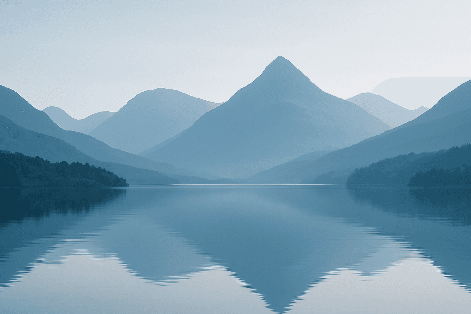
Monotone Blue Palette
The Monotone Blue Palette is a specialized coloring style used in AI-generated imagery that embraces blue tones exclusively, from pale icy blues to deep navy. This approach simplifies color complexity while adding a sophisticated, calming atmosphere to an image. It is ideal for creative projects necessitating mood-driven visuals or stylistic consistency. Incorporating this palette into prompts helps artists, designers, and marketers create images that evoke tranquility, stability, and trustworthiness. The technique fits a variety of themes including landscapes, portraits, and abstract compositions, providing a modern, refined aesthetic that stands out due to its monochromatic elegance.
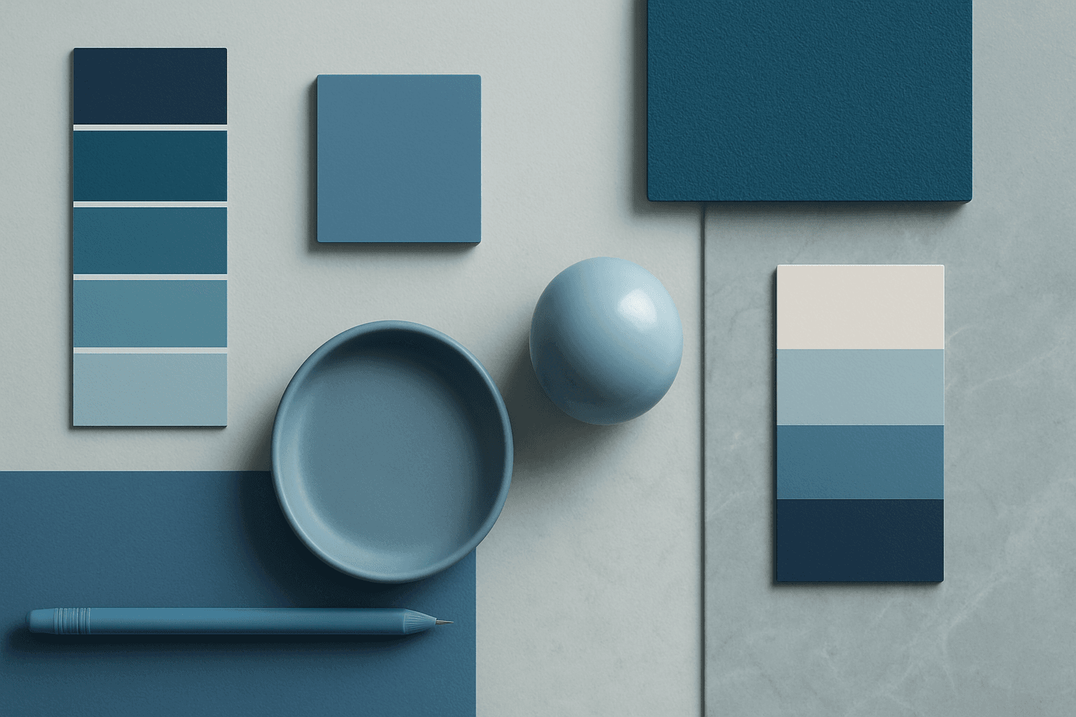
Definition
The Monotone Blue Palette keyword directs AI image generators to create visuals primarily using blue shades. This results in images where color harmony is maintained through blue tints and tones, eliminating competing hues for a coherent and tranquil effect. It is a simple but powerful way to alter the atmosphere and style of generated art by restricting the color palette.
Visual Characteristics
- Predominance of blue tones ranging from pale to deep navy
- Consistent tonal shading with subtle gradients
- Minimal contrasts or additional color distractions
Prompt Formula
To employ the Monotone Blue Palette effectively, incorporate descriptive color and lighting terms aligned with blue tones. Use phrase structures that emphasize monochromatic blues along with style or lighting styles for nuanced effects.
- <subject> in a monotone blue palette, soft diffuse lighting, photorealistic
- <scene> rendered with monotone blue palette, dramatic shadows, cinematic mood
- Abstract composition using monotone blue palette, clean lines, minimal background
Best Use Cases
- Creating brand images that evoke calmness and reliability
- Designing editorial content emphasizing mood and tonality
- Producing minimalist and abstract artwork with color cohesion
Creative Variations
To avoid repetitive visuals using the Monotone Blue Palette, experiment with different lighting setups such as soft natural light or harsh shadows. Vary subject matter, from portraits to landscapes to abstract shapes. Combine this palette with textures or reflections to add depth. Introducing slight gradients or selective desaturation within the blue hues can also diversify outputs while maintaining overall monochromatic harmony.
- Change lighting: soft, harsh, or spotlight effects
- Vary composition: close-up portraits, wide landscape shots, or abstract forms
- Add texture: smooth, rough, or reflective surfaces
Industry Applications
- Corporate branding, emphasizing professionalism and trust
- Editorial imagery conveying calm and sophistication
- Ecommerce product visuals requiring a clean and modern look
FAQ
How does the Monotone Blue Palette affect image mood?
It creates a calm, serene, and stable atmosphere by using blue tones exclusively, which psychologically convey trust and relaxation.
Can I combine Monotone Blue Palette with other colors?
Typically, this palette restricts colors to blue tones for coherence, but subtle complementary accents can be introduced carefully to enhance interest without breaking the monotone effect.
Continue Exploring
Related Prompts
Warm Neutral Palette
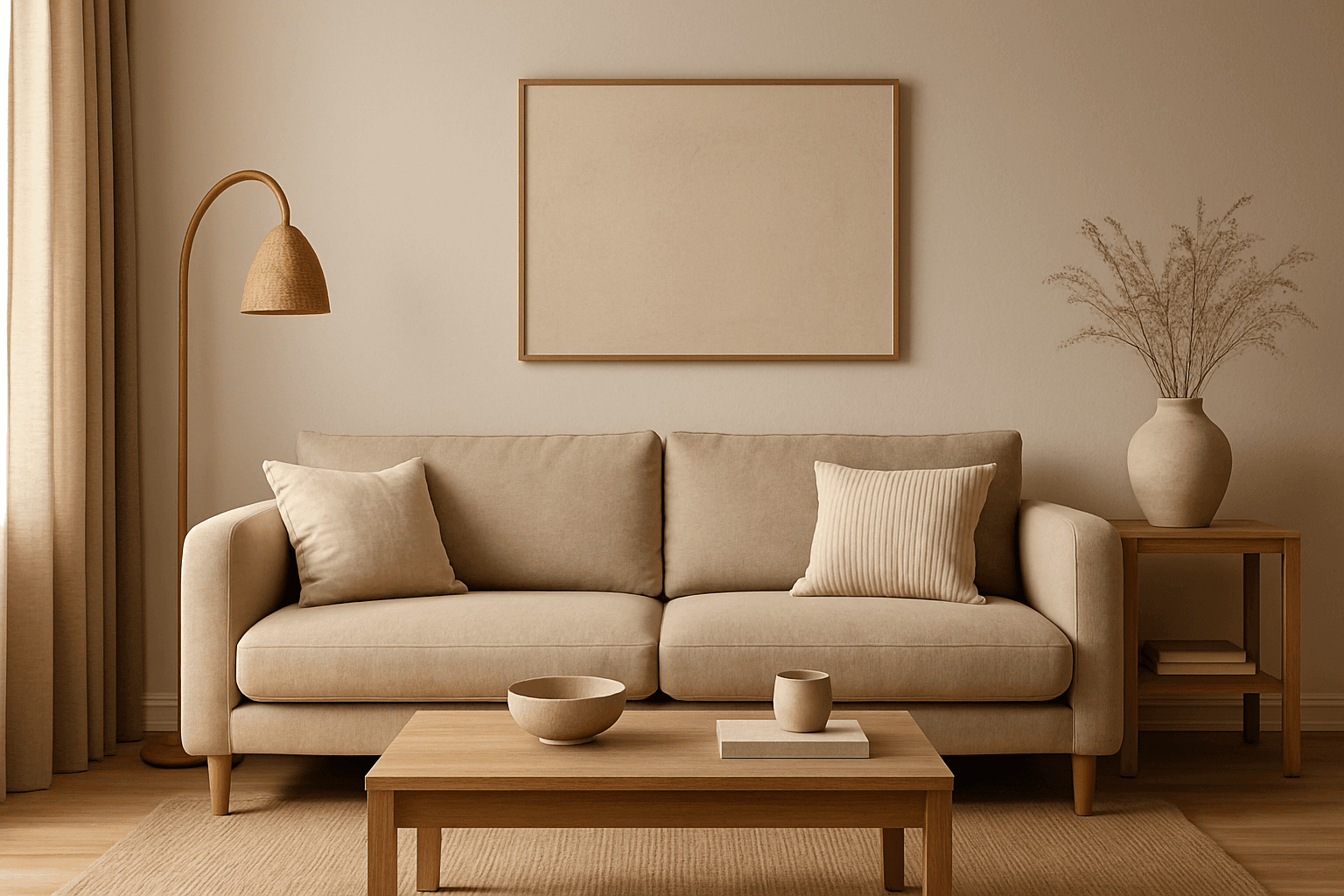
The Warm Neutral Palette is a popular color scheme choice in design and AI-generated imagery for its timeless and soothing qualities. This palette combines warm earthy tones with soft neutrals, producing images that feel natural and approachable. Incorporating warm neutrals can enhance mood by bringing subtle warmth and comfort to visuals without overpowering them. When added to AI prompts, it guides the model to emphasize harmonious colors that evoke calmness and sophistication. The palette works well across various genres, including lifestyle, interiors, fashion, and nature themes, helping create polished and refined visuals suitable for editorial or commercial use.
Morandi Palette
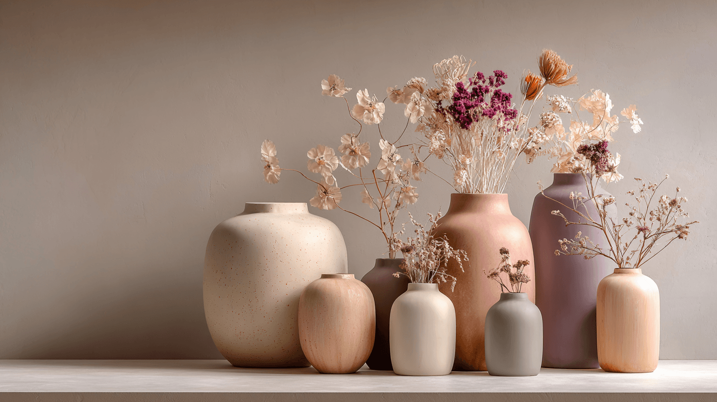
Morandi Palette is a color keyword inspired by the quiet, dusty tones associated with painter Giorgio Morandi. In AI image prompts, it usually points the model toward muted, low-saturation colors such as dusty rose, warm gray, clay, sage, beige, soft blue, faded mauve, and stone. The effect is refined, calm, and slightly editorial. This palette is useful when you want an image to feel sophisticated without becoming cold or overly minimal. For beginners, Morandi Palette is a practical way to control color harmony. It can make a scene feel more tasteful, cohesive, and brand-ready, especially when default AI colors look too bright or artificial.
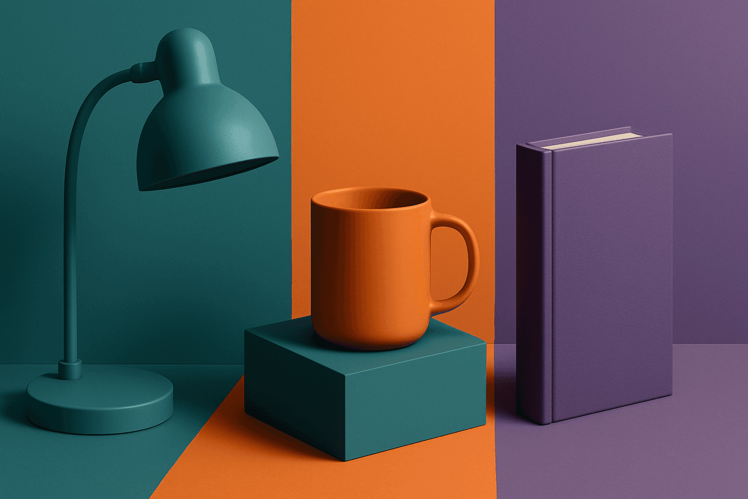
Triadic Color Scheme
The triadic color scheme is a classic color theory concept widely used in art and design, characterized by choosing three colors equally spaced around the color wheel, such as red, yellow, and blue. This approach produces vibrant, balanced images that are visually stimulating yet cohesive. When integrated into AI image generation prompts, directing the model to use a triadic palette influences the overall color composition, encouraging distinct color blocks or gradients that harmonize well. This can be particularly useful for achieving dynamic but balanced aesthetics, making compositions stand out while maintaining visual unity. Triadic schemes often evoke a lively, engaging mood, suitable for varied creative fields including branding, illustration, and editorial design.

Black and Gold Palette
The Black and Gold Palette is a timeless color combination used widely across design, fashion, and branding to convey luxury, exclusivity, and elegance. The deep black background serves as a solid, grounding base that enhances the rich, lustrous tone of metallic gold accents. This pairing is versatile enough to appear in editorial layouts, product packaging, and digital art, offering a premium and refined visual appeal. The interplay between matte black and reflective gold elements creates subtle depth and sophisticated contrast, drawing viewers' attention effectively. Its association with opulence and tradition makes it a popular choice for high-end projects seeking a polished and stylish aesthetic.

Duotone Colors
Duotone colors combine two distinct hues—often contrasting—to produce visually impactful images that balance simplicity and dynamism. This technique became popular in photography and graphic design where it adds a modern, artistic touch by emphasizing shadows and highlights through just two colors. Duotone visuals work well in various media including digital art, branding, and advertising. By limiting the color scheme, duotone designs offer clarity and a bold aesthetic that can communicate emotion effectively. With advances in AI image generation and editing, creating duotone visuals has become straightforward, allowing designers to experiment with color combinations and achieve stylized imagery that stands out.
Cool Color Palette
Cool Color Palette is useful when you want an image to feel clear, composed, and modern. It is common in healthcare, technology, finance, architecture, SaaS, clean beauty, and wellness visuals. The palette can reduce emotional heat and make a design feel more trustworthy or focused. For AI creators, this keyword is helpful when a scene needs professionalism or calm rather than warmth and intimacy.