Monochromatic Blue Palette
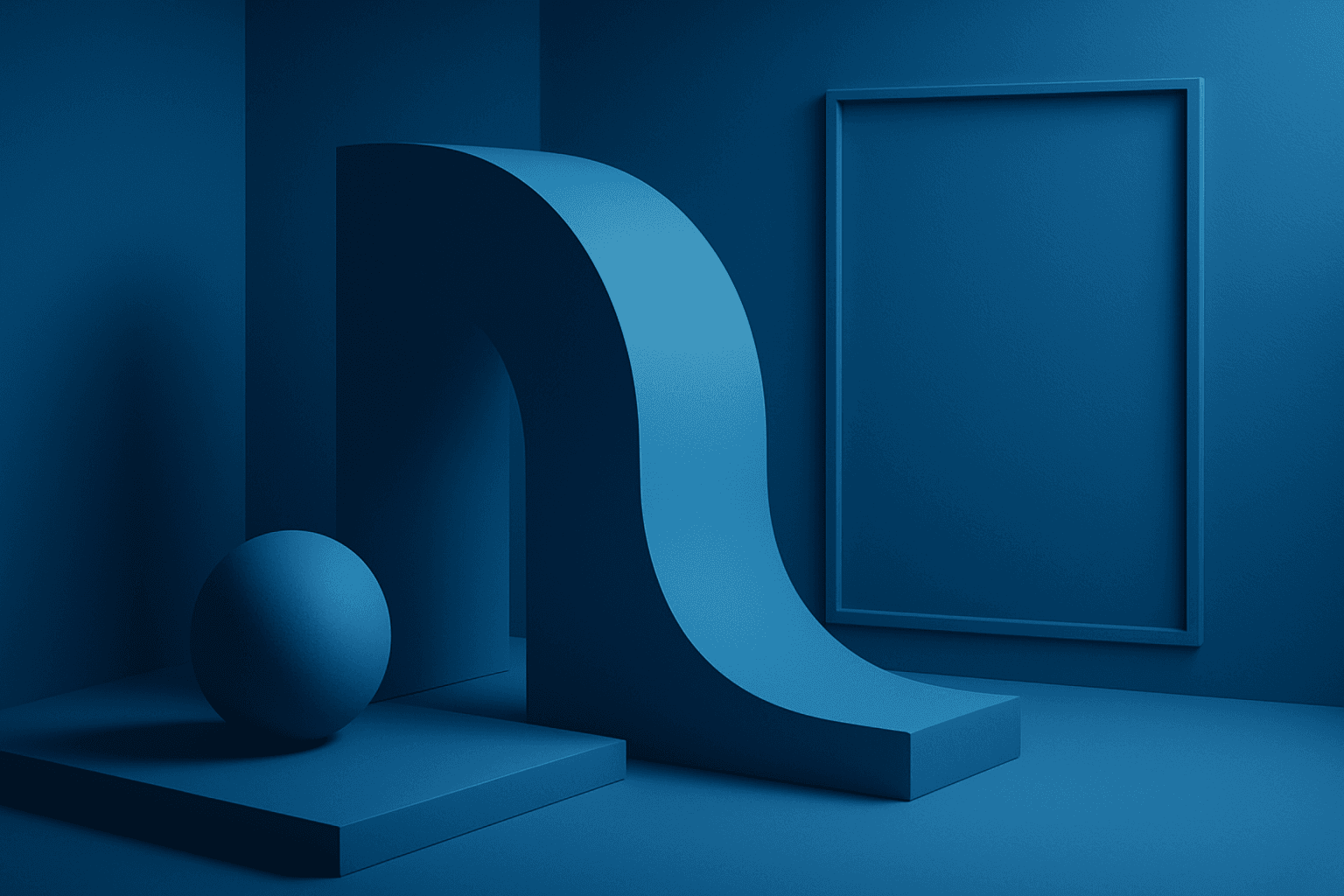
Using a Monochromatic Blue Palette in AI image generation focuses on deploying only blue hues within the composition. This technique results in images that appear cohesive and unified, emphasizing mood and atmosphere through color consistency. Blue tones evoke calm, trust, and professionalism, making this palette versatile for numerous visual contexts. By instructing AI prompts to apply this palette, designers gain refined control over color ambiance, ensuring that the final image communicates desired emotional undertones or branding colors effectively.
Definition
A Monochromatic Blue Palette is a focused color scheme in AI image prompts that uses exclusively blue hues and their variations—from the lightest sky blues to deep navy tones. Specifying this palette in prompts ensures that generated images maintain a unified color theme, which influences the mood, depth, and aesthetic cohesion of the artwork. For beginners, adding this keyword simplifies color choices and enhances visual harmony.
Visual Characteristics
- Various blue shades ranging from light, pastel blues to saturated indigo and navy
- Smooth tonal gradations within the blue spectrum to emphasize depth and form
- Consistent blue-based shadows and highlights that unify the lighting scheme
Prompt Formula
To effectively employ the Monochromatic Blue Palette in AI prompt crafting, combine descriptive elements with explicit color guidance. Example formulas include: - "{subject} in a monochromatic blue palette, soft natural lighting, subtle shadows" - "{scene} rendered with exclusive blue hues, high contrast monochromatic blue palette" - "{style} style artwork with monochromatic blue palette, minimalistic composition"
Best Use Cases
- Corporate branding imagery where blue tones convey professionalism and trust
- Editorial content illustrations needing a calm or reflective visual atmosphere
- User interface backgrounds and web designs that benefit from consistent and clean coloration
Creative Variations
While maintaining a Monochromatic Blue Palette, varying composition and lighting styles enhances uniqueness and reduces repetition. Experiment with bright daylight blues for a fresh feel or moody navy tones for dramatic effect. Combining the palette with reflective materials or incorporating subtle textures can add complexity. Alternative compositions like minimalistic close-ups or wide landscapes promote diverse interpretations within the blue theme.
- Use high-key lighting with pale blue tones for airy compositions
- Apply low-key lighting emphasizing deep blues and shadows for drama
- Introduce glossy or metallic textures reflecting blue hues
- Shift from abstract to realistic subjects within the blue range
- Vary depth of field focusing on blue-dominated elements
Industry Applications
- Advertising campaigns for technology or finance sectors using trust-inducing blue hues
- Editorial magazines focusing on wellness or environment featuring calm monochromatic visuals
- Ecommerce platforms presenting minimalist product photos with a clean blue color story
FAQ
What effect does using a Monochromatic Blue Palette have on AI-generated images?
It constrains the image colors to blue tones, creating harmonic and cohesive visuals that evoke mood and atmosphere related to the color blue.
Can the Monochromatic Blue Palette be combined with other color styles?
Typically, it is used alone for consistency, but creative variations can incorporate blue with very subtle complementary hues if carefully controlled to maintain harmony.
Continue Exploring
Related Prompts
Monotone Blue Palette
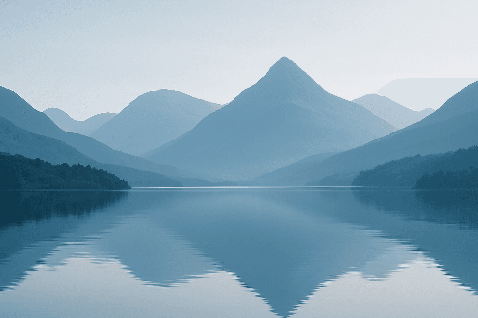
The Monotone Blue Palette is a specialized coloring style used in AI-generated imagery that embraces blue tones exclusively, from pale icy blues to deep navy. This approach simplifies color complexity while adding a sophisticated, calming atmosphere to an image. It is ideal for creative projects necessitating mood-driven visuals or stylistic consistency. Incorporating this palette into prompts helps artists, designers, and marketers create images that evoke tranquility, stability, and trustworthiness. The technique fits a variety of themes including landscapes, portraits, and abstract compositions, providing a modern, refined aesthetic that stands out due to its monochromatic elegance.

Bright Primary Colors Palette
Using a Bright Primary Colors Palette in AI image generation emphasizes strong, pure colors—red, blue, and yellow—that are fundamental to color theory. This palette brings a dynamic, energetic feel to images, making them instantly attention-grabbing and easily distinguishable. It's ideal for designs aiming to evoke simplicity with power, evoke nostalgia for classic color schemes, or highlight specific elements through contrast. When integrated thoughtfully, it balances vibrancy with clarity, avoiding muddiness or oversaturation. This approach is especially popular in editorial, advertising, and graphic design work where visual directness is key.
Monochromatic Red Tones
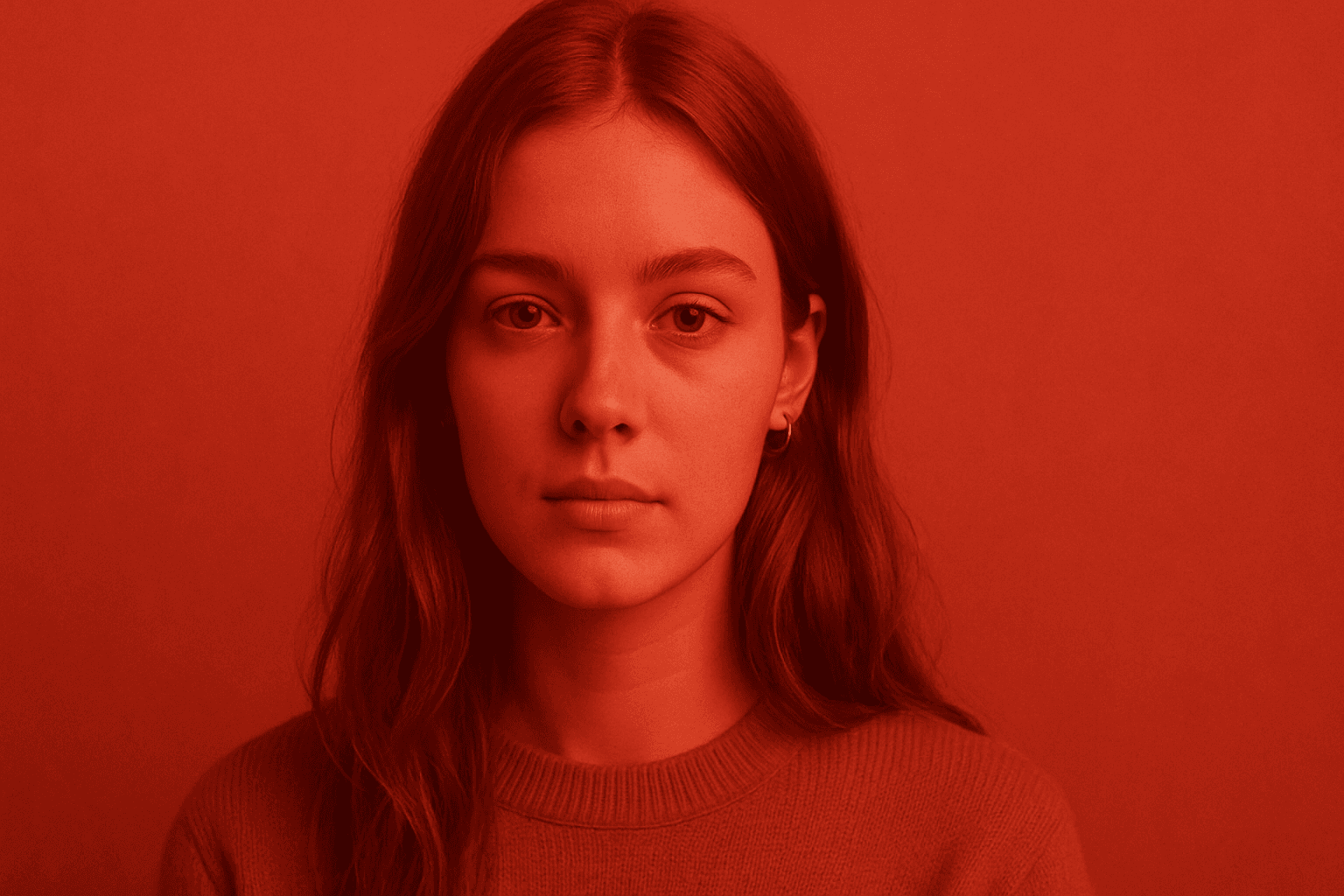
Monochromatic Red Tones is a powerful color approach in AI image generation that emphasizes various shades, tints, and tones of red exclusively. This technique reinforces emotional impact, typically evoking passion, warmth, or intensity, depending on the red variations used. By focusing on a single color family, it simplifies the visual narrative and heightens composition cohesion. Designers and creators leverage this color scheme to create striking editorial images, fashion visuals, or conceptual art where red's symbolic power is essential. Using Monochromatic Red Tones in AI prompts helps achieve images with a unified palette that feels refined and emotionally charged.
Rich Jewel Tone Palette
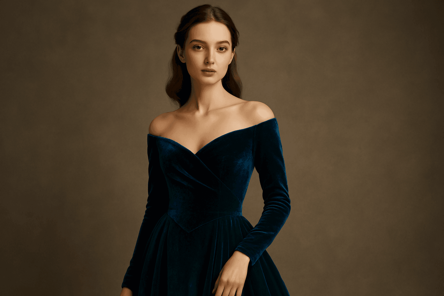
Using the Rich Jewel Tone Palette in AI image generation significantly influences the aesthetic by introducing highly saturated, gemstone-inspired colors. These tones create images that appear luxurious and visually striking, elevating compositions beyond simple color schemes. The palette often brings a sense of refinement and depth to scenes or subjects, making it a perfect choice for designs requiring rich, bold visual impact. Applying this palette modifies lighting and material perception to simulate the luminous qualities of jewels, enhancing realism and allure in the final output.

Soft Muted Color Palette
Using a Soft Muted Color Palette in AI-generated imagery influences the mood and style by incorporating subdued and delicate colors. This approach conveys sophistication, tranquility, and natural beauty, making visuals suitable for subtle branding, lifestyle photography, and editorial contexts. It avoids bright or saturated colors, instead emphasizing nuance and refinement. Artists and designers use it to evoke feelings of warmth, nostalgia, or modern minimalism, enhancing the visual narrative through controlled color harmony and soft contrasts.

Muted Earth Tone Palette
The Muted Earth Tone Palette is a popular color approach in AI image generation that emphasizes soft, natural hues inspired by the earth. These colors include warm browns, olive greens, beiges, and greys, all presented in subdued saturation levels to avoid overly bright or intense visuals. Using this palette creates images that feel organic, calm, and stylish, making it ideal for modern editorial content, lifestyle photography, and interior design renders. By focusing on muted tones, the images exude refinement and subtlety, appealing to viewers seeking sophistication without harsh contrasts. Incorporating this palette into your AI prompts helps generate visuals with a cohesive and naturalistic color balance.