Monochromatic Red Tones
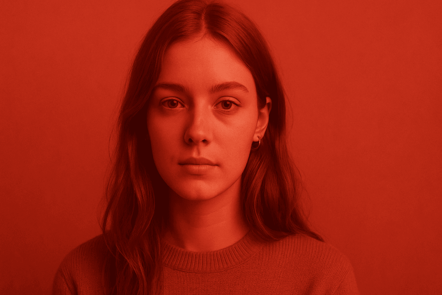
Monochromatic Red Tones is a powerful color approach in AI image generation that emphasizes various shades, tints, and tones of red exclusively. This technique reinforces emotional impact, typically evoking passion, warmth, or intensity, depending on the red variations used. By focusing on a single color family, it simplifies the visual narrative and heightens composition cohesion. Designers and creators leverage this color scheme to create striking editorial images, fashion visuals, or conceptual art where red's symbolic power is essential. Using Monochromatic Red Tones in AI prompts helps achieve images with a unified palette that feels refined and emotionally charged.
Definition
Monochromatic Red Tones in AI image prompts means specifying a color scheme made up exclusively of red hues. This involves using multiple shades, tints, and intensities of red to create a unified color composition. Including this keyword guides AI models to limit their palette to reds, delivering a cohesive and focused visual effect ideal for emphasizing mood and thematic content related to passion, energy, or warmth.
Visual Characteristics
- Strong presence of red shades spanning from bright scarlet to dark burgundy
- Uniform color harmony with minimal color distractions outside the red spectrum
- Dynamic contrast achieved by varying lightness and saturation within red tones
Prompt Formula
To incorporate Monochromatic Red Tones effectively, build prompts combining descriptive imagery with color-focused phrases. Start with the subject and style, then layer the color specification to emphasize tone and mood:
- [Subject] in monochromatic red tones, soft lighting, high detail
- [Scene] rendered entirely using red shades, dramatic shadows, minimalist composition
- [Object or person] illuminated with varying red tints and shades, cinematic atmosphere
- Add mood descriptors like passionate, intense, warm to enhance red tone effect
Best Use Cases
- Editorial fashion photography emphasizing emotion and drama
- Brand visuals needing consistent red color branding
- Artistic portraits or still lifes highlighting mood through color unity
Creative Variations
To keep your Monochromatic Red Tones prompts fresh and avoid repetitive outputs, experiment with variations in style, lighting, and composition. Combining these variations can unlock unique results while keeping the red palette consistent.
- Switch from soft ambient lighting to harsh, directional light to alter mood
- Change compositions from minimalistic close-ups to complex layered scenes
- Introduce texture changes like matte, glossy, or fabric materials within red hues
- Blend subject matter from organic (flowers, portraits) to architectural or abstract forms
Industry Applications
Monochromatic Red Tones find high utility across several commercial fields. In advertising, they evoke strong brand emotions tied to passion or urgency. Editorial content employs them for striking visual narratives. Ecommerce benefits from coherent, powerful branding visuals, while social media uses them for consistent color identity and emotional engagement.
- Luxury or fashion brand advertising to convey passion and elegance
- Magazine editorial spreads focusing on mood and theme
- Online ecommerce showcases for products with red-centric branding
Model-Specific Tips
When using Monochromatic Red Tones across different AI models, keep prompts clear and focused on the color aspect. Avoid ambiguous wording and pair the term with direct lighting, mood, and detail descriptors. Experiment with synonyms for 'red' shades (crimson, scarlet) to adjust subtleties and leverage recent model updates that improve color fidelity and lighting realism.
- Explicitly state 'monochromatic red tones' or 'red shades only' to enforce color limitation
- Use specific red color names to fine-tune hue outputs
- Combine with lighting and mood adjectives to guide ambiance
- Test prompt permutations across models to find best color saturation and contrast
FAQ
What does 'Monochromatic Red Tones' mean in AI image prompts?
It means generating images using only various shades and tints of red, creating a unified red color scheme that enhances mood and visual cohesion.
Can I use Monochromatic Red Tones for different styles?
Yes, you can apply it across styles from realistic to abstract by adjusting lighting, composition, and descriptive details within the red color spectrum.
Continue Exploring
Related Prompts
Tonal Contrast Palette
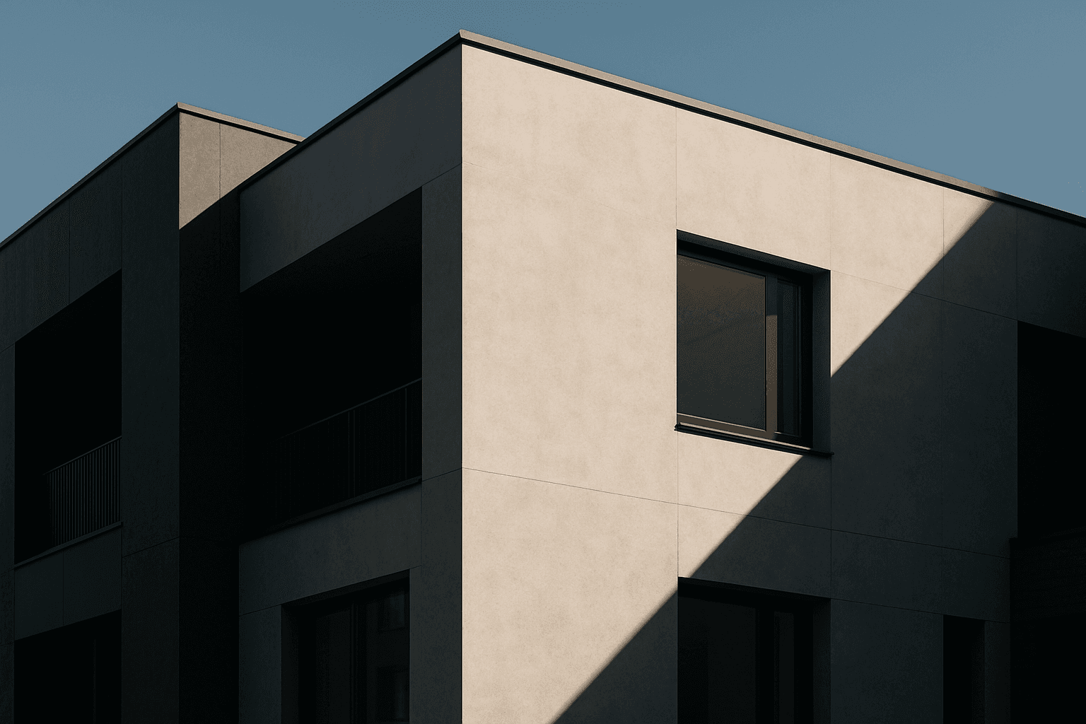
Using a Tonal Contrast Palette in AI image generation helps create compositions with clear differentiation of light and dark areas, which emphasizes structure and mood. This approach intensifies the visual impact by focusing on brightness contrasts rather than just color hues, enabling images with dramatic or refined atmospheres. As a color keyword, it guides AI models to adjust tone values cohesively, producing images that feel dynamic and balanced at once.
Warm Color Palette
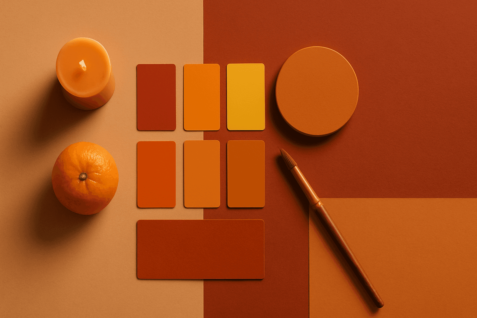
Warm Color Palette is a practical keyword for guiding emotional tone. It can make a breakfast scene feel cozy, a travel image feel sunny, or a brand visual feel more approachable. Warm palettes are strong for commercial images because they connect quickly with themes like comfort, care, family, food, hospitality, wellness, and optimism. For beginners, this keyword is easier to control than listing many individual colors.
Earthy Warm Color Scheme
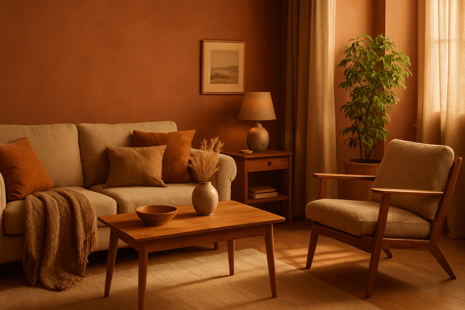
The Earthy Warm Color Scheme is a popular choice for artists and designers aiming to create images that feel natural, comforting, and connected to the environment. By focusing on warm, muted earth tones, this scheme lends a timeless aesthetic suited for a variety of subjects, including landscapes, portraits, interiors, and product shots. Using this palette in AI image prompts can help achieve visuals that emphasize quiet warmth and natural beauty, often evoking rustic charm or bohemian moods. It's well-suited for editorial photography, lifestyle branding, and environmental themes, enhancing images with a sophisticated yet approachable mood.
Monochromatic Blue Palette
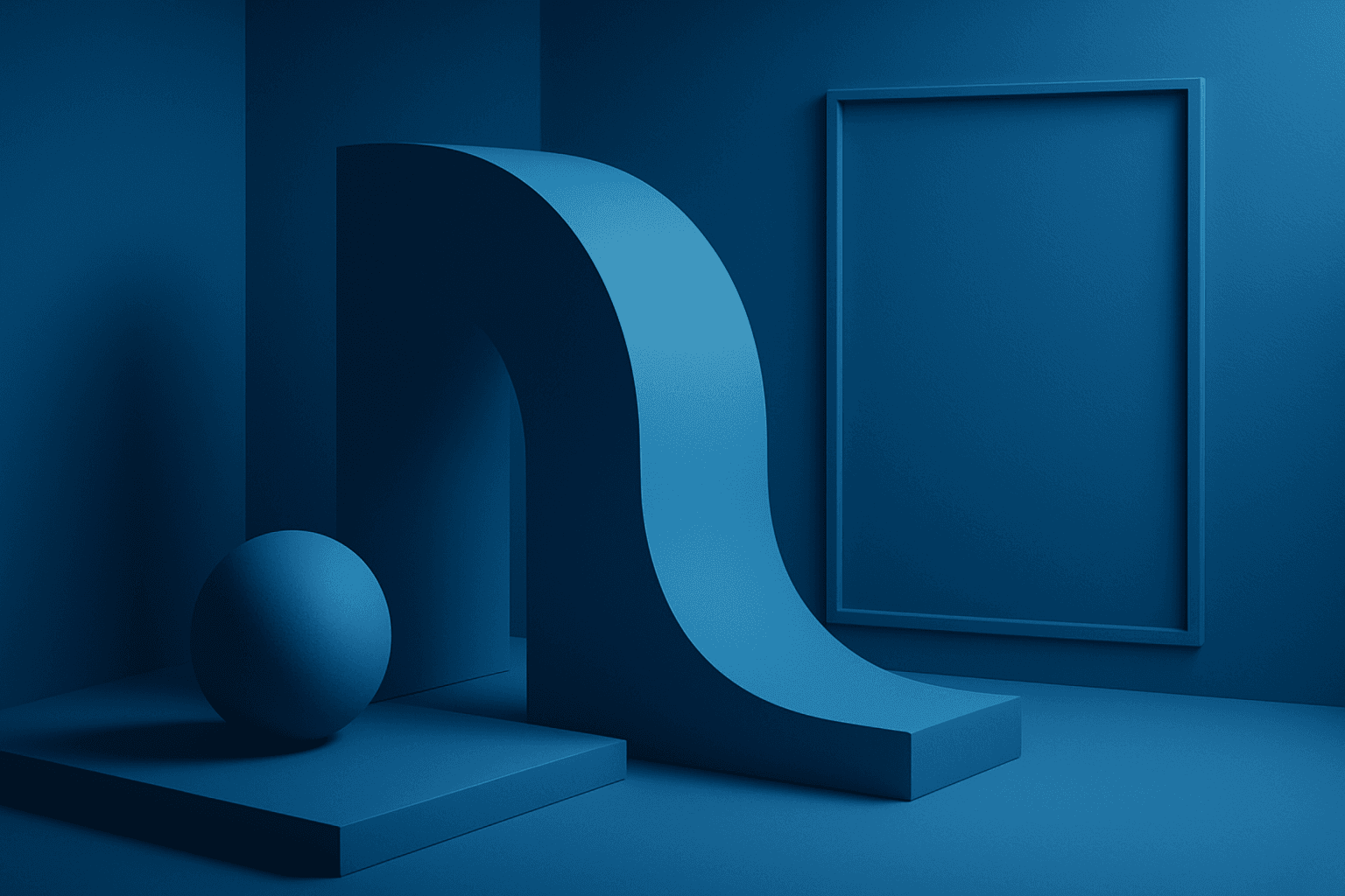
Using a Monochromatic Blue Palette in AI image generation focuses on deploying only blue hues within the composition. This technique results in images that appear cohesive and unified, emphasizing mood and atmosphere through color consistency. Blue tones evoke calm, trust, and professionalism, making this palette versatile for numerous visual contexts. By instructing AI prompts to apply this palette, designers gain refined control over color ambiance, ensuring that the final image communicates desired emotional undertones or branding colors effectively.

Monochrome Color Palette
Employing a monochrome color palette in AI-generated images allows for creating minimalistic yet striking visuals. By constraining colors to one hue family, creators can convey mood and style consistently while focusing on composition and detail. This technique excels in editorial photography, product presentations, and artistic portraits, where color distraction is minimized and storytelling through form and light is enhanced. Using monochrome prompts guides the AI to simulate realistic materials and subtle depth through nuanced shading, resulting in premium, polished images suitable for professional use.

Duochrome Contrast Palette
Using a Duochrome Contrast Palette in AI-generated images involves combining two distinct contrasting colors to produce lively, attention-grabbing visuals. This method enhances compositions by providing a harmonious yet striking balance between two hues, often playing with differences in saturation, brightness, or temperature to add depth and vibrancy. Ideal for editorial designs, product renders, and artistic portraits, this palette style helps images stand out with refined color clarity and intensity, evoking strong mood and atmosphere.