Monochromatic Color Scheme
Monochromatic color schemes leverage variations of one hue, combined with black or white, to build visually appealing images that convey mood and cohesiveness. This approach simplifies color interactions, allowing AI-generated artworks to focus on texture, lighting, and detail without distraction from multiple colors. In prompt engineering, adding this keyword helps produce images with elegant color unity often favored in editorial, fashion, and product photography. It aids in evoking specific emotions like calmness, sophistication, or minimalism by restricting the palette and accentuating tonal relationships.

Definition
A monochromatic color scheme in AI image generation means focusing on one color hue and using its variations through different shades, tints, and tones. This creates images with unified color harmony, reducing visual complexity and emphasizing mood. When you add this concept in prompts, the AI limits colors accordingly, producing cohesive and elegant visuals suitable for many artistic and commercial purposes.
Prompt Formula
Use these reusable patterns to integrate a monochromatic color scheme in your AI prompts:
- Include phrases like “monochromatic color scheme of [color]” or “shades and tints of [color]”
- Combine with lighting descriptors: “soft lighting, high contrast” to enhance depth
- Specify material or texture to emphasize tonal variation: “silky fabric with monochromatic tones”
- Add mood or style: “calm atmosphere with a monochromatic palette”
- Use terms such as “limited palette,” “single-tone colors,” or “harmonious color scheme”
Best Use Cases
Monochromatic color schemes excel in contexts where visual harmony and mood coherence are paramount. They reduce distractions by limiting color range, making the subject or concept the main focus. This approach is ideal for editorial photos, architecture presentations, and product imagery that benefits from refined aesthetics and emotional impact.
- Minimalist editorial photography to strengthen brand colors
- Architectural visualizations focusing on form and lighting
- Product shots demanding mood consistency and premium look
Professional Workflow
To efficiently use the monochromatic color scheme keyword when producing AI images:
- 1. Begin by briefing with a specific base color aligned to project or brand needs
- 2. Craft prompts incorporating monochromatic terms and relevant lighting or style details
- 3. Generate a batch of images, reviewing for tonal consistency and mood
- 4. Select best candidates emphasizing texture and depth despite limited palette
- 5. Refine selected images by adjusting prompts or applying post-processing for perfect tonality
Related Styles
Monochromatic color scheme closely relates to other color-based styles that manage palette complexity. Compatible styles and keywords enrich prompt flexibility and design outcomes by exploring nearby visual directions.
- Duotone color scheme: uses two contrasting colors for dramatic effect
- Analogous color scheme: combines adjacent hues for subtle variation
- Minimalist photography: emphasizes simplicity and often uses limited color palettes
FAQ
What does a monochromatic color scheme mean in AI image prompts?
It directs the AI to create visuals using different shades, tints, and tones of a single color, ensuring color harmony and focused mood.
Can monochromatic schemes work with any color?
Yes, you can choose any base color; the AI will generate its variations to maintain the monochromatic effect.
Continue Exploring
Related Prompts

Analogous Warm Color Scheme
Analogous Warm Color Schemes employ colors adjacent on the color wheel within warm tones—reds, oranges, and yellows—to produce harmonious, vibrant images. In AI-generated art, specifying this scheme guides the model to focus on these related colors, resulting in visuals that feel unified and energetic. This scheme evokes warmth, comfort, and optimism, excellent for compositions needing a welcoming or lively mood. Using it strategically in prompts helps artists and designers achieve balanced, naturally blended color palettes that enhance emotional impact without overwhelming the viewer.
Triadic Color Scheme
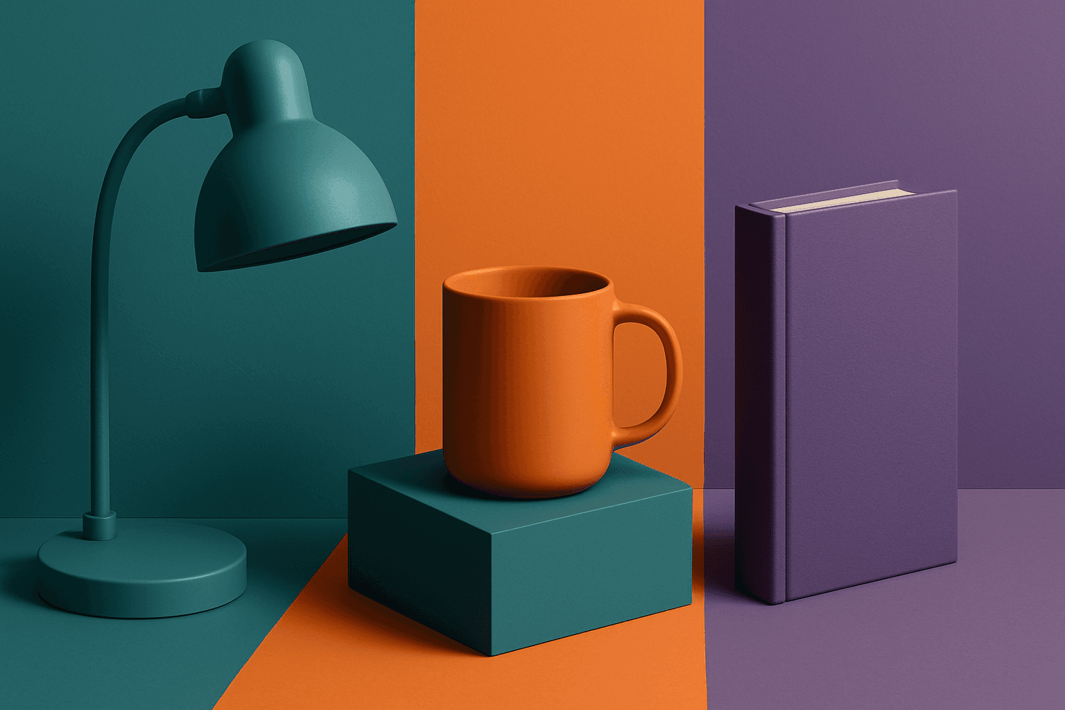
The triadic color scheme is a classic color theory concept widely used in art and design, characterized by choosing three colors equally spaced around the color wheel, such as red, yellow, and blue. This approach produces vibrant, balanced images that are visually stimulating yet cohesive. When integrated into AI image generation prompts, directing the model to use a triadic palette influences the overall color composition, encouraging distinct color blocks or gradients that harmonize well. This can be particularly useful for achieving dynamic but balanced aesthetics, making compositions stand out while maintaining visual unity. Triadic schemes often evoke a lively, engaging mood, suitable for varied creative fields including branding, illustration, and editorial design.

Muted Pastel Color Scheme
The muted pastel color scheme is popular in digital art and design for its delicate, understated quality. Unlike vibrant pastels, muted pastels involve desaturation and slight grey undertones, delivering a refined and peaceful visual experience. When included in AI image prompts, it guides models to focus on gentle colors that evoke softness and subtlety, making the images feel airy and inviting rather than vivid or loud. This approach works well for lifestyle, fashion, illustration, and branding content that aims to be modern, approachable, and aesthetically pleasing while maintaining elegance.
Monochromatic Red Tones
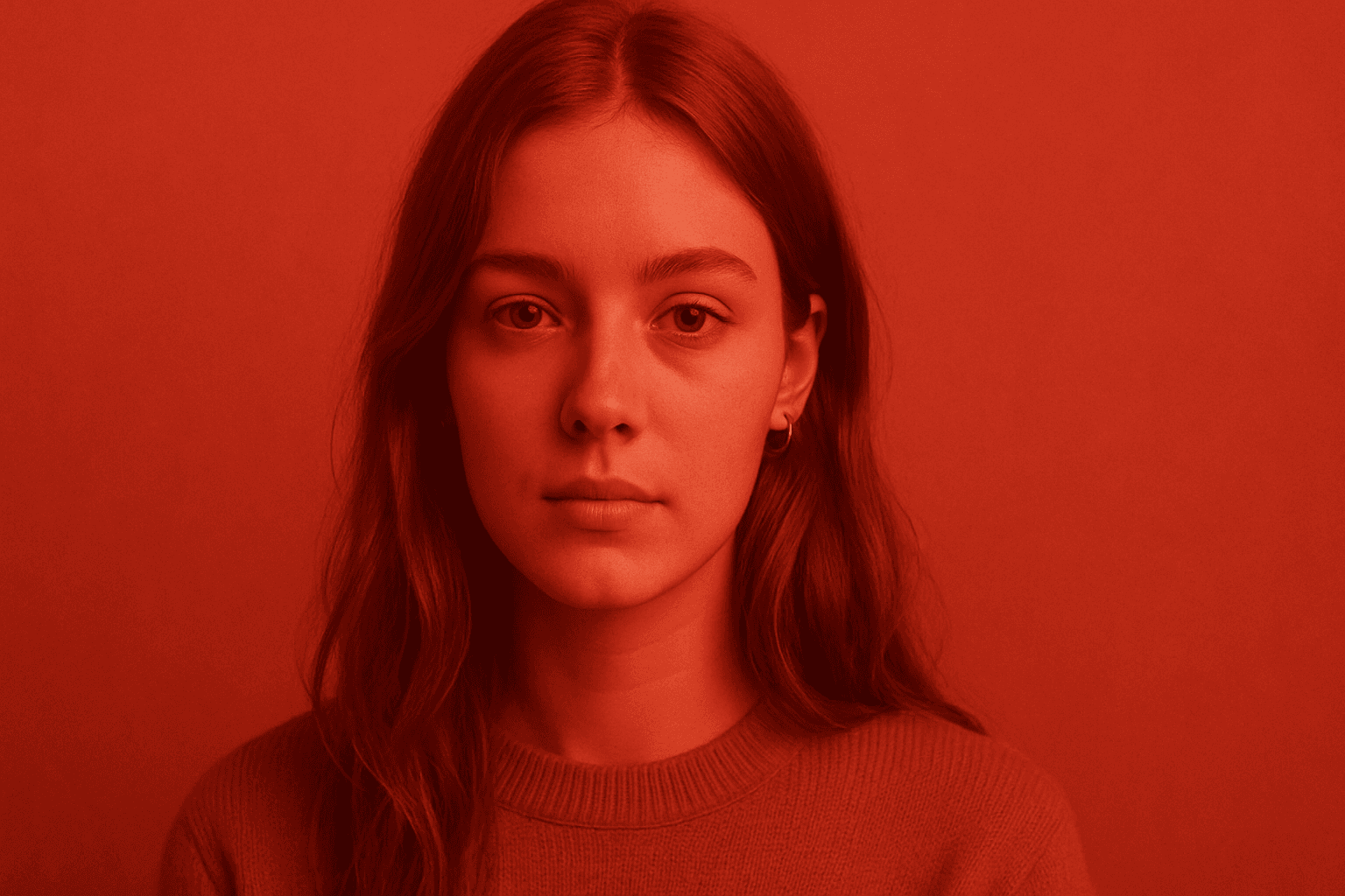
Monochromatic Red Tones is a powerful color approach in AI image generation that emphasizes various shades, tints, and tones of red exclusively. This technique reinforces emotional impact, typically evoking passion, warmth, or intensity, depending on the red variations used. By focusing on a single color family, it simplifies the visual narrative and heightens composition cohesion. Designers and creators leverage this color scheme to create striking editorial images, fashion visuals, or conceptual art where red's symbolic power is essential. Using Monochromatic Red Tones in AI prompts helps achieve images with a unified palette that feels refined and emotionally charged.
Earthy Warm Color Scheme
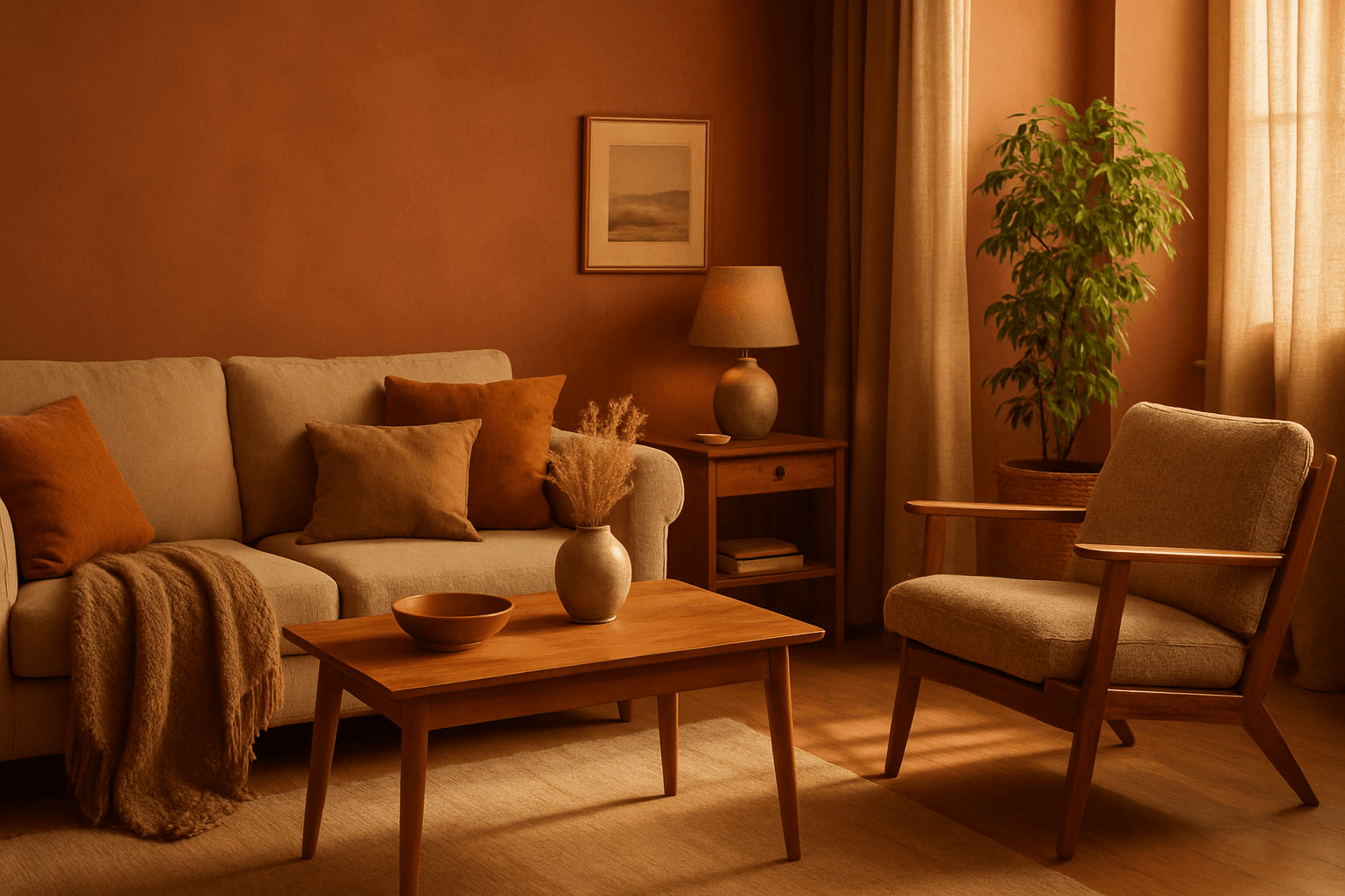
The Earthy Warm Color Scheme is a popular choice for artists and designers aiming to create images that feel natural, comforting, and connected to the environment. By focusing on warm, muted earth tones, this scheme lends a timeless aesthetic suited for a variety of subjects, including landscapes, portraits, interiors, and product shots. Using this palette in AI image prompts can help achieve visuals that emphasize quiet warmth and natural beauty, often evoking rustic charm or bohemian moods. It's well-suited for editorial photography, lifestyle branding, and environmental themes, enhancing images with a sophisticated yet approachable mood.

Monochrome Color Palette
Employing a monochrome color palette in AI-generated images allows for creating minimalistic yet striking visuals. By constraining colors to one hue family, creators can convey mood and style consistently while focusing on composition and detail. This technique excels in editorial photography, product presentations, and artistic portraits, where color distraction is minimized and storytelling through form and light is enhanced. Using monochrome prompts guides the AI to simulate realistic materials and subtle depth through nuanced shading, resulting in premium, polished images suitable for professional use.