Earthy Warm Color Scheme
The Earthy Warm Color Scheme is a popular choice for artists and designers aiming to create images that feel natural, comforting, and connected to the environment. By focusing on warm, muted earth tones, this scheme lends a timeless aesthetic suited for a variety of subjects, including landscapes, portraits, interiors, and product shots. Using this palette in AI image prompts can help achieve visuals that emphasize quiet warmth and natural beauty, often evoking rustic charm or bohemian moods. It's well-suited for editorial photography, lifestyle branding, and environmental themes, enhancing images with a sophisticated yet approachable mood.
Definition
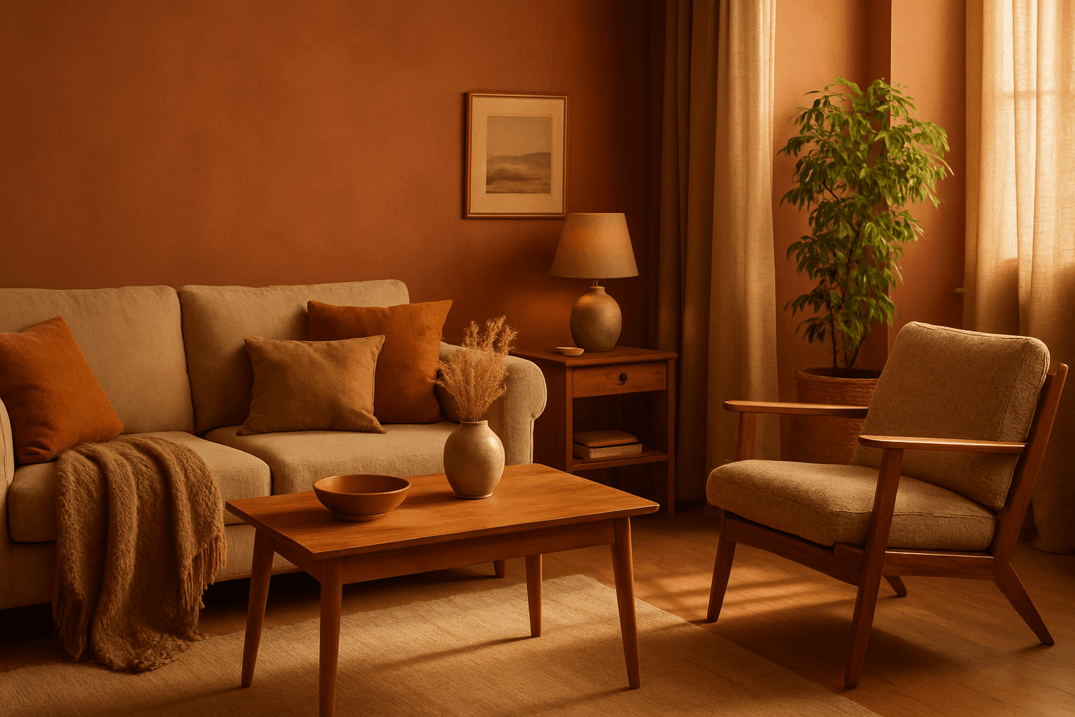
The Earthy Warm Color Scheme is characterized by a selection of muted warm colors inspired by nature—like terracotta, ochre, burnt sienna, and warm browns. This scheme directs AI models to create images with a cozy, organic mood, evoking a grounded natural feel. Adding this phrase to a prompt changes the image's overall tonality to reflect warmth, subtlety, and the charm of natural materials and environments.
Prompt Formula
Effective prompt-building patterns for this keyword combine descriptors of color and atmosphere. Typical combinations include specifying the scheme alongside lighting and material details to enhance realism and mood.
- earthy warm color scheme, soft natural light, textured organic materials
- warm earthy tones palette, rustic setting, gentle shadows
- earthy warm color scheme, cozy ambience, natural fabrics, muted highlights
Best Use Cases
- Lifestyle interior photography emphasizing cozy, rustic spaces
- Portraits with natural backdrops and warm ambient lighting
- Still life compositions featuring organic, handcrafted objects
Advanced Techniques
For more nuanced AI prompts, combine the Earthy Warm Color Scheme with detailed material descriptions and environment settings to achieve specific moods. Use constraints to moderate color saturation and light intensity, or pair with complementary palettes for dynamic yet harmonious visuals.
- Pair with 'soft diffuse lighting' to enhance warmth without harsh shadows
- Use alongside materials terms like 'raw wood', 'linen', or 'clay' for texture depth
- Add constraints like 'muted saturation' or 'warm shadows' to refine color intensity
Professional Workflow
Begin by briefing with target mood and style referencing the Earthy Warm Color Scheme. Generate initial images using concise prompts with color and lighting details. Select variants emphasizing natural warmth and texture. Refine outputs by iterating on saturation and material descriptors, ensuring images suit client needs or stock platforms.
- Specify scheme and atmosphere clearly in initial prompt
- Generate diverse samples adjusting lighting and textures
- Select best matches with warm tonal harmony
- Refine saturation and material descriptors for realism
- Finalize images with subtle post-processing to enhance natural warmth
Related Styles
This color scheme pairs well with complementary warm palettes and rustic aesthetics. Adjacent PromptAtlas keywords include "Warm Rustic Palette" focusing on deeper wood tones, "Terracotta Hues" emphasizing reds and oranges, and "Natural Brown Tones" for neutral earth bases.
- Warm Rustic Palette
- Terracotta Hues
- Natural Brown Tones
Model-Specific Tips
When working with different AI models, maintain simple color scheme phrasing like "earthy warm color scheme" without overly complex syntax to ensure consistent interpretation. Emphasize lighting and natural materials to guide models effectively. Avoid jargon or ambiguous color names for best results.
- Use clear straightforward phrases rather than uncommon color terminology
- Complement the scheme with lighting and texture descriptors
- Test prompt variations to confirm color balance across models
FAQ
What colors are included in the Earthy Warm Color Scheme?
It typically includes muted warm tones like terracotta, ochre, burnt sienna, deep browns, and dusty oranges that evoke a natural and cozy feeling.
How does specifying this color scheme affect AI-generated images?
It influences the AI to emphasize warm, organic colors and lighting, creating images with a grounded, natural atmosphere and subtle warmth.
Can Earthy Warm Color Scheme work for all image types?
While it suits many subjects, it is especially effective for lifestyle, portrait, interior, and product images that benefit from natural warmth and rustic charm.
Continue Exploring
Related Prompts

Analogous Warm Color Scheme
Analogous Warm Color Schemes employ colors adjacent on the color wheel within warm tones—reds, oranges, and yellows—to produce harmonious, vibrant images. In AI-generated art, specifying this scheme guides the model to focus on these related colors, resulting in visuals that feel unified and energetic. This scheme evokes warmth, comfort, and optimism, excellent for compositions needing a welcoming or lively mood. Using it strategically in prompts helps artists and designers achieve balanced, naturally blended color palettes that enhance emotional impact without overwhelming the viewer.
Earthy Warm Tones
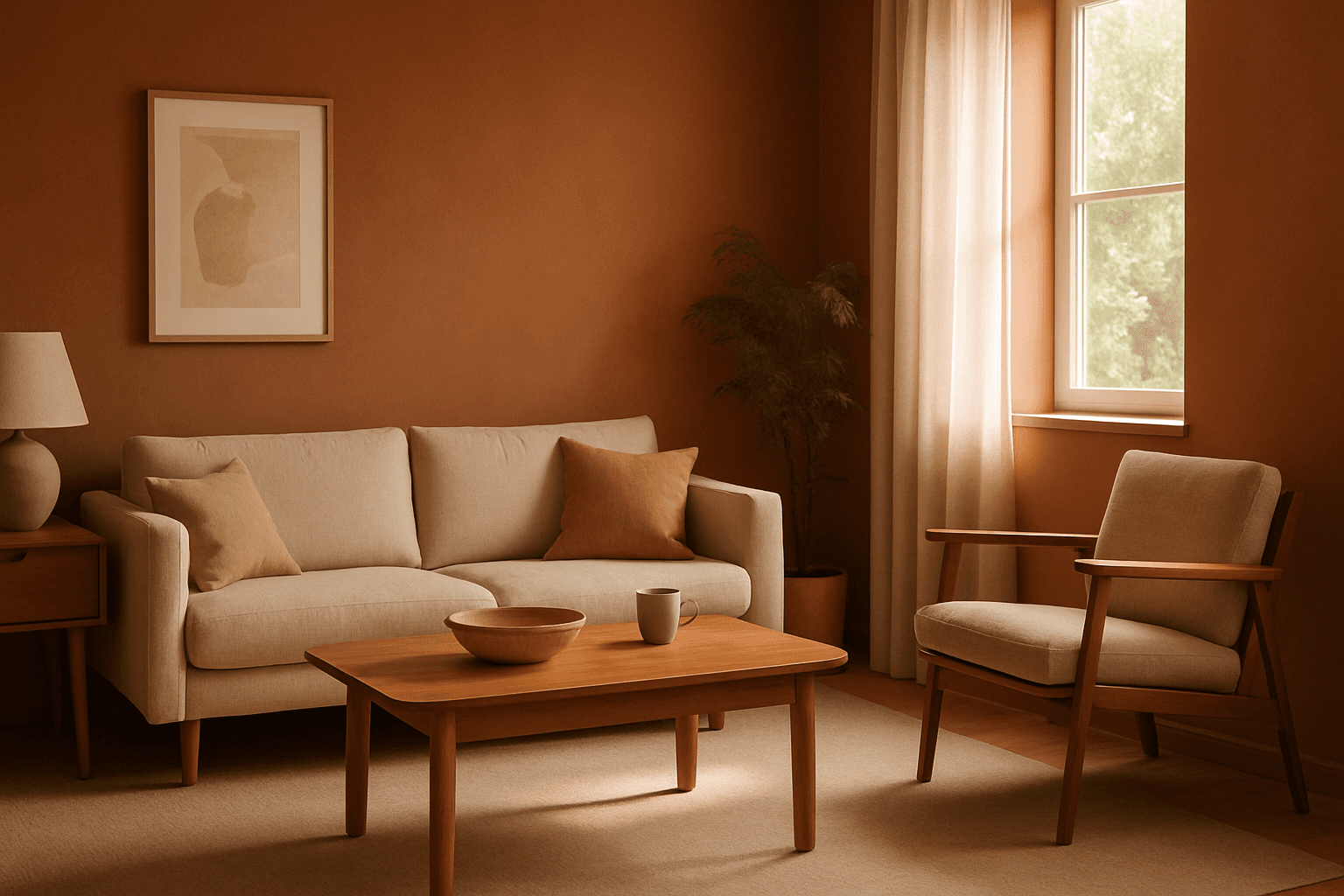
Using Earthy Warm Tones in AI image generation brings a cozy and organic aesthetic to your visuals. This color keyword shifts the palette toward natural and muted warm colors that recall the earth's rich textures, often creating a calm and inviting mood. Ideal for images that require realistic materials and depth, these tones lend a premium, editorial polish without harsh contrasts. When combined with refined lighting and subtle depth, images gain a tactile, authentic feel, suitable for editorial hero imagery or sophisticated product presentations.
Warm Neutral Palette
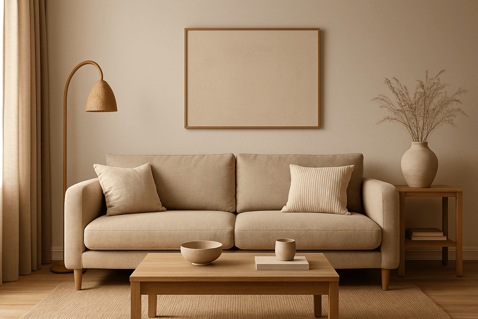
The Warm Neutral Palette is a popular color scheme choice in design and AI-generated imagery for its timeless and soothing qualities. This palette combines warm earthy tones with soft neutrals, producing images that feel natural and approachable. Incorporating warm neutrals can enhance mood by bringing subtle warmth and comfort to visuals without overpowering them. When added to AI prompts, it guides the model to emphasize harmonious colors that evoke calmness and sophistication. The palette works well across various genres, including lifestyle, interiors, fashion, and nature themes, helping create polished and refined visuals suitable for editorial or commercial use.

Muted Pastel Color Scheme
The muted pastel color scheme is popular in digital art and design for its delicate, understated quality. Unlike vibrant pastels, muted pastels involve desaturation and slight grey undertones, delivering a refined and peaceful visual experience. When included in AI image prompts, it guides models to focus on gentle colors that evoke softness and subtlety, making the images feel airy and inviting rather than vivid or loud. This approach works well for lifestyle, fashion, illustration, and branding content that aims to be modern, approachable, and aesthetically pleasing while maintaining elegance.

Soft Muted Color Palette
Using a Soft Muted Color Palette in AI-generated imagery influences the mood and style by incorporating subdued and delicate colors. This approach conveys sophistication, tranquility, and natural beauty, making visuals suitable for subtle branding, lifestyle photography, and editorial contexts. It avoids bright or saturated colors, instead emphasizing nuance and refinement. Artists and designers use it to evoke feelings of warmth, nostalgia, or modern minimalism, enhancing the visual narrative through controlled color harmony and soft contrasts.
Warm Earth Tone Palette
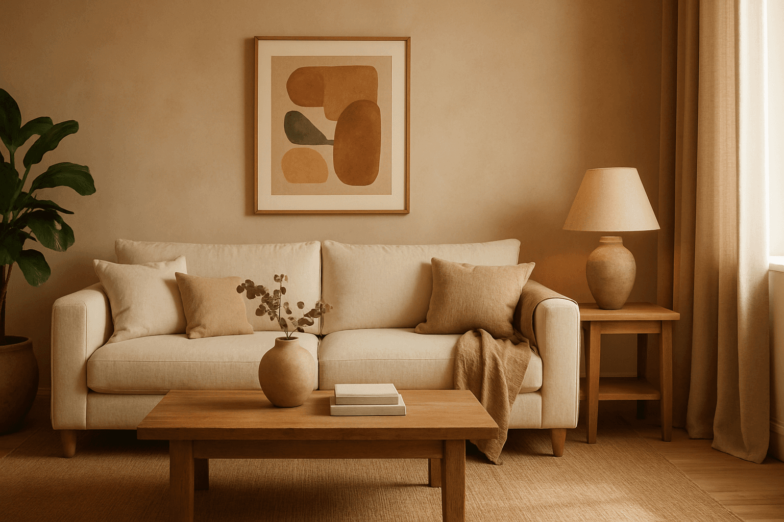
Using a Warm Earth Tone Palette in AI image generation brings a natural and inviting atmosphere to visuals. These tones emulate colors found in nature, such as clay, autumn leaves, and sunbaked earth, providing a grounded and calming aesthetic. Incorporating this palette into prompts encourages AI models to generate images that feel organic and warm, which is ideal for themes involving nature, rustic settings, comfort, and heritage. It helps create harmonious compositions that appear authentic and emotionally resonant, making the images suitable for lifestyle, interior design, and environmental storytelling.