Warm Earth Tone Palette
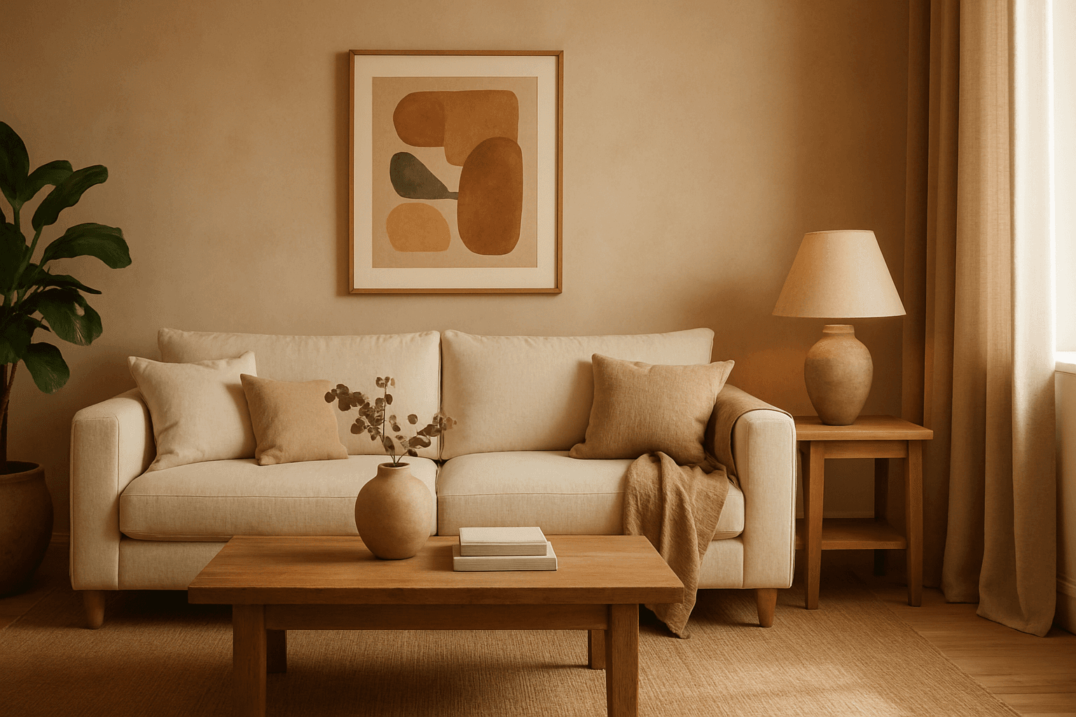
Using a Warm Earth Tone Palette in AI image generation brings a natural and inviting atmosphere to visuals. These tones emulate colors found in nature, such as clay, autumn leaves, and sunbaked earth, providing a grounded and calming aesthetic. Incorporating this palette into prompts encourages AI models to generate images that feel organic and warm, which is ideal for themes involving nature, rustic settings, comfort, and heritage. It helps create harmonious compositions that appear authentic and emotionally resonant, making the images suitable for lifestyle, interior design, and environmental storytelling.
Definition
The Warm Earth Tone Palette describes color choices inspired by natural elements such as soil, wood, and clay. It includes rich browns, burnt oranges, muted reds, and warm beige hues. This palette adjusts AI image prompts to generate visuals with cozy, organic colors that evoke feelings of warmth and nature.
- Colors inspired by soil, clay, wood
- Includes browns, oranges, muted reds
- Produces warm, natural atmosphere
Prompt Formula
To incorporate the Warm Earth Tone Palette effectively, use phrase combinations that specify this color range and mood. The formula combines subject description with palette mention, lighting style, and material texture for enhanced realism.
- [Subject] with warm earth tone palette
- Include natural materials like wood, clay
- Add refined lighting, soft shadows
- Specify realistic textures and cozy ambiance
Best Use Cases
- Interior design and architecture visualizations with rustic or boho style.
- Lifestyle imagery capturing autumn or outdoor scenes.
- Marketing materials for eco-friendly or organic products.
Related Styles
The Warm Earth Tone Palette pairs well with several adjacent visual and stylistic directions that share organic and natural qualities. Complementary keywords emphasize rustic and natural aesthetics for expanded creative applications.
- Rustic Color Palette
- Autumn Color Scheme
- Natural Material Textures
Model-Specific Tips
When working with modern AI image models, including clear mention of the Warm Earth Tone Palette helps guide color choices without needing exact hex codes or overly technical syntax. Pair these mentions with environment or material descriptors to ensure the palette influences lighting and texture. Avoid vague color descriptions to retain warm natural consistency.
- Clearly specify 'warm earth tone palette' to influence color range.
- Combine palette with natural material and lighting descriptions.
- Use adjectives like 'cozy', 'organic', 'muted' to enhance mood.
- Avoid overly broad terms like 'brown' alone for precise tone control.
FAQ
What colors are included in a Warm Earth Tone Palette?
It generally includes rich browns, burnt oranges, muted reds, warm beiges, and clay-inspired hues reflecting natural earth materials.
How does specifying a Warm Earth Tone Palette affect AI image generation?
It guides the AI to render images using warm, natural colors that evoke a cozy and organic atmosphere, influencing lighting and texture rendering accordingly.
Continue Exploring
Related Prompts
Muted Earth Tone Colors
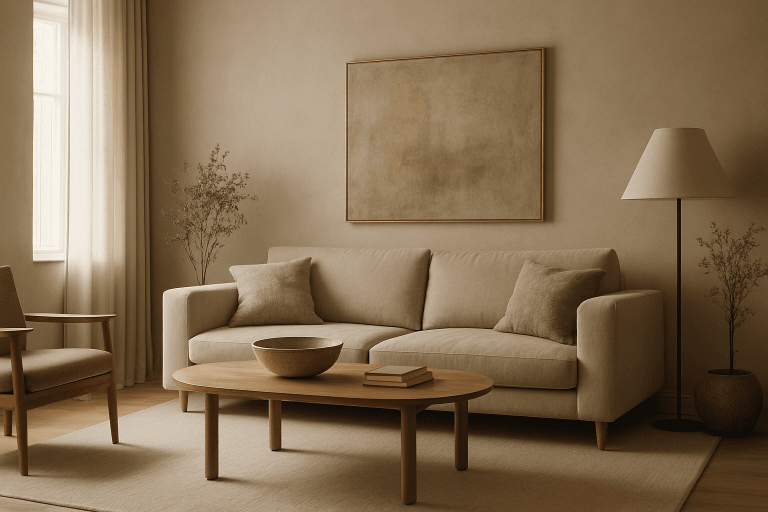
Muted earth tone colors encapsulate a palette inspired by nature’s subtle and calming shades such as soft browns, gentle greens, warm ochres, and quiet grays. When integrated into AI image prompts, these colors help generate images that feel organic, grounded, and harmonious, making them ideal for designs seeking understated elegance or a natural aesthetic. This approach avoids harsh contrasts and bright tones, providing visuals that are soothing and visually balanced. Such color schemes are especially useful in editorial photography, interior design renderings, and lifestyle imagery, where authenticity and warmth are key. Utilizing these tones can transform generic visuals into cohesive, premium-feeling compositions that align with modern aesthetic trends.

Muted Earth Tone Palette
The Muted Earth Tone Palette is a popular color approach in AI image generation that emphasizes soft, natural hues inspired by the earth. These colors include warm browns, olive greens, beiges, and greys, all presented in subdued saturation levels to avoid overly bright or intense visuals. Using this palette creates images that feel organic, calm, and stylish, making it ideal for modern editorial content, lifestyle photography, and interior design renders. By focusing on muted tones, the images exude refinement and subtlety, appealing to viewers seeking sophistication without harsh contrasts. Incorporating this palette into your AI prompts helps generate visuals with a cohesive and naturalistic color balance.
Warm Neutral Palette
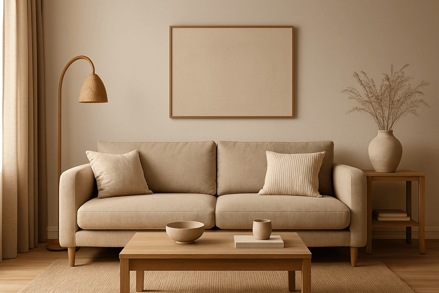
The Warm Neutral Palette is a popular color scheme choice in design and AI-generated imagery for its timeless and soothing qualities. This palette combines warm earthy tones with soft neutrals, producing images that feel natural and approachable. Incorporating warm neutrals can enhance mood by bringing subtle warmth and comfort to visuals without overpowering them. When added to AI prompts, it guides the model to emphasize harmonious colors that evoke calmness and sophistication. The palette works well across various genres, including lifestyle, interiors, fashion, and nature themes, helping create polished and refined visuals suitable for editorial or commercial use.
Earthy Warm Tones
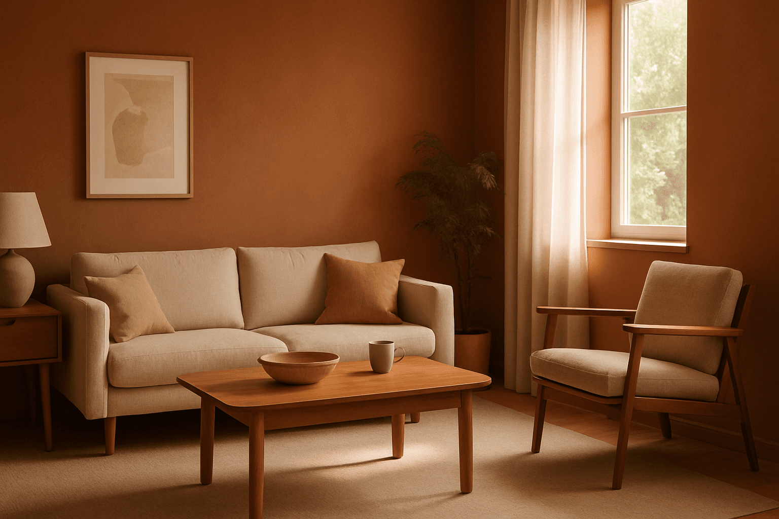
Using Earthy Warm Tones in AI image generation brings a cozy and organic aesthetic to your visuals. This color keyword shifts the palette toward natural and muted warm colors that recall the earth's rich textures, often creating a calm and inviting mood. Ideal for images that require realistic materials and depth, these tones lend a premium, editorial polish without harsh contrasts. When combined with refined lighting and subtle depth, images gain a tactile, authentic feel, suitable for editorial hero imagery or sophisticated product presentations.
Earthy Warm Color Scheme
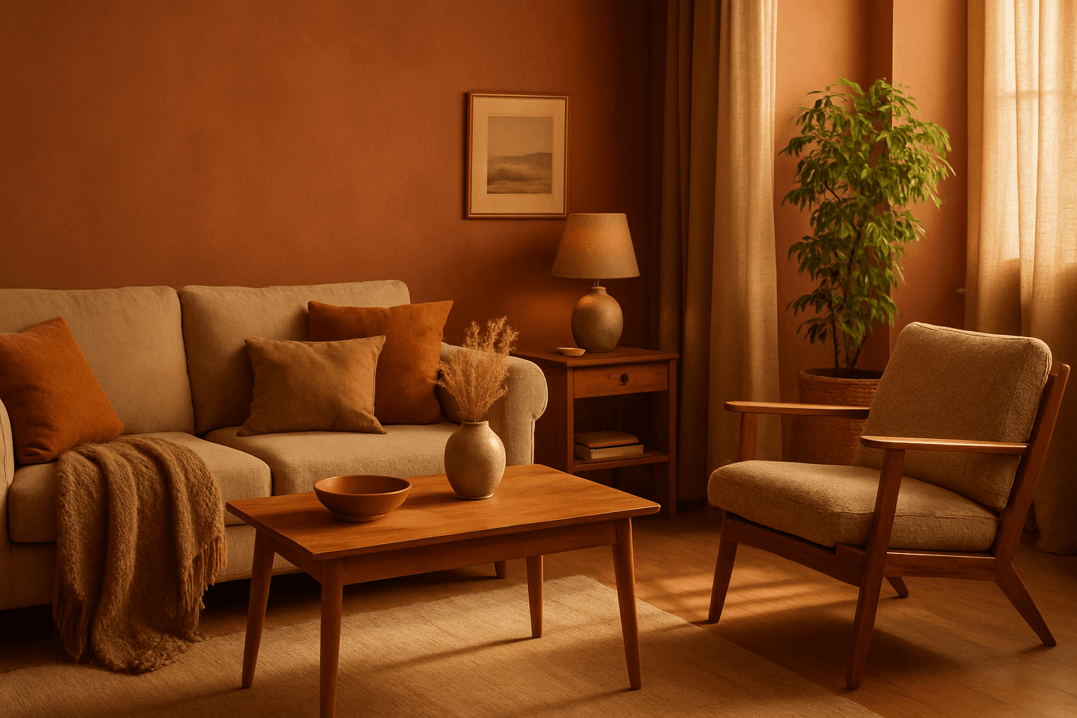
The Earthy Warm Color Scheme is a popular choice for artists and designers aiming to create images that feel natural, comforting, and connected to the environment. By focusing on warm, muted earth tones, this scheme lends a timeless aesthetic suited for a variety of subjects, including landscapes, portraits, interiors, and product shots. Using this palette in AI image prompts can help achieve visuals that emphasize quiet warmth and natural beauty, often evoking rustic charm or bohemian moods. It's well-suited for editorial photography, lifestyle branding, and environmental themes, enhancing images with a sophisticated yet approachable mood.
Monochrome Warm Palette
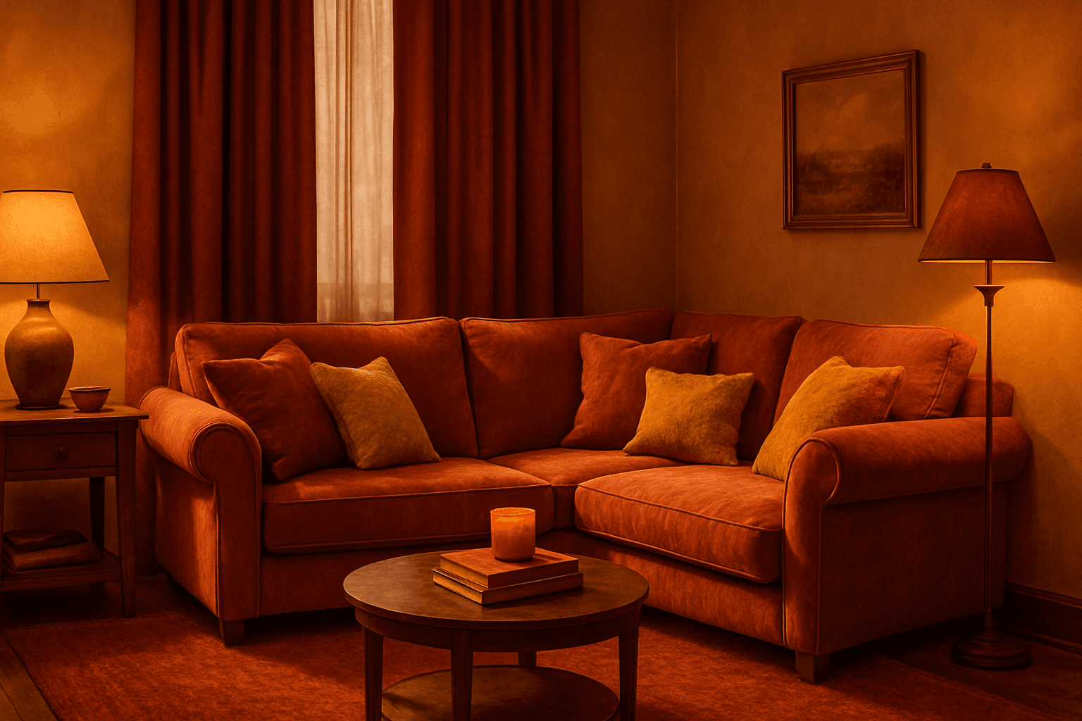
Applying a Monochrome Warm Palette in AI-generated images sets a unified, warm tone that evokes feelings of comfort, energy, and passion. This approach simplifies the color scheme by utilizing only warm colors that range from muted tans and terracottas to vibrant oranges and reds. It directs the AI image generation to avoid cool colors, keeping the visuals coherent and emotionally resonant. The result is a natural, aesthetically pleasing image with subtle depth, ideal for modern editorial designs or lifestyle photography that seeks to communicate warmth and intimacy without overwhelming complexity.