Monochrome Warm Palette
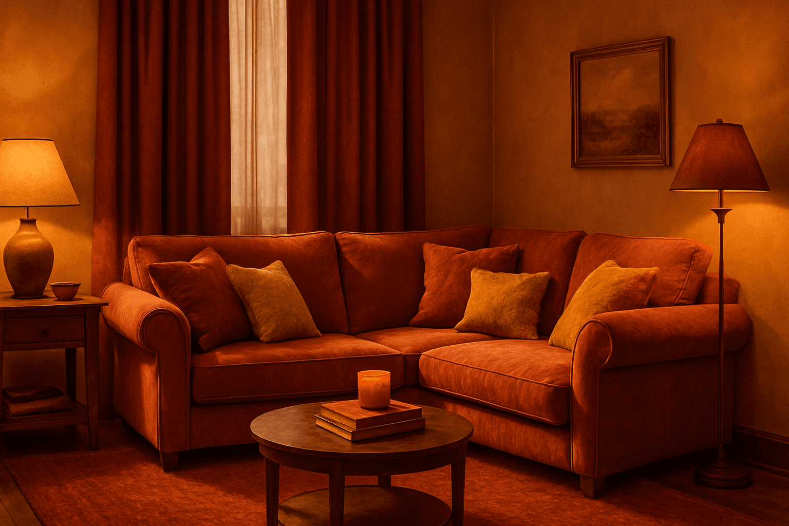
Applying a Monochrome Warm Palette in AI-generated images sets a unified, warm tone that evokes feelings of comfort, energy, and passion. This approach simplifies the color scheme by utilizing only warm colors that range from muted tans and terracottas to vibrant oranges and reds. It directs the AI image generation to avoid cool colors, keeping the visuals coherent and emotionally resonant. The result is a natural, aesthetically pleasing image with subtle depth, ideal for modern editorial designs or lifestyle photography that seeks to communicate warmth and intimacy without overwhelming complexity.
Definition
The Monochrome Warm Palette specifies an AI prompt inclusion that directs the model to generate images using exclusively warm hues ranging from soft yellows to deep reds. This keyword sets the tone for color harmony by limiting the color spectrum to warm tones, fostering unified and emotionally evocative images. It primarily affects the overall mood and aesthetic by enhancing warmth and depth, avoiding cold colors that could disrupt visual cohesion.
Prompt Formula
To effectively use the Monochrome Warm Palette in AI prompts, combine descriptive elements emphasizing warmth, texture, and light:
- <subject> bathed in monochrome warm palette tones, including deep reds, oranges, and golden yellows
- Highlight soft lighting such as golden hour, warm ambient glow, or candlelight
- Specify material textures that complement warmth like wood, leather, or fabric in warm hues
- Include style cues such as 'editorial style,' 'ultra-realistic,' and 'subtle depth' to refine quality
Best Use Cases
- Creating intimate lifestyle or portrait photography with inviting lighting
- Editorial visuals that require a nostalgic or cozy atmosphere
- Product images highlighting warm seasonal palettes, like autumn or summer collections
Common Mistakes
A frequent pitfall when using the Monochrome Warm Palette is inadvertently mixing cool color accents, which breaks the uniform warm feel. Another issue is over-saturating colors, leading to unnatural or harsh visuals. Additionally, neglecting lighting details can result in flat images lacking depth and warmth. To avoid these, maintain strict color tone consistency, control saturation levels, and specify warm light conditions to achieve rich yet subtle visuals.
- Avoid introducing blues or greens that conflict with warm tones
- Do not oversaturate; use balanced, harmonious warm shades
- Specify warm lighting conditions to enhance depth and natural shadows
Advanced Techniques
Experienced prompt writers can elevate the Monochrome Warm Palette effect by combining it with nuanced lighting scenarios such as dusk or candlelight to deepen mood. Adding texture descriptors like weathered wood or brushed metal in warm shades amplifies material realism. Layering the palette with thematic concepts—like autumn harvest or desert landscapes—can create complex narratives. Finally, integrating depth cues such as selective focus helps maintain visual interest within a constrained color range.
- Pair monochrome warm palette with dusk or candlelit lighting for richer atmosphere
- Incorporate tactile textures in warm tones for material authenticity
- Combine with thematic cues, e.g., autumn or desert, for storytelling depth
- Use depth of field and shadow play to avoid flatness
FAQ
What does Monochrome Warm Palette mean in AI image generation?
It means generating images using only warm color tones such as reds, oranges, and yellows to create a unified warm color scheme with emotional impact.
Can I combine Monochrome Warm Palette with other color palettes?
Typically, combining it with cool palettes contradicts the concept. However, subtle warm highlights alongside a neutral background can be effective if carefully balanced.
How to avoid flat-looking images when using Monochrome Warm Palette?
Use lighting descriptors like golden hour or soft shadows and add texture details to give depth and dimension despite the limited color range.
Continue Exploring
Related Prompts
Warm Neutral Palette
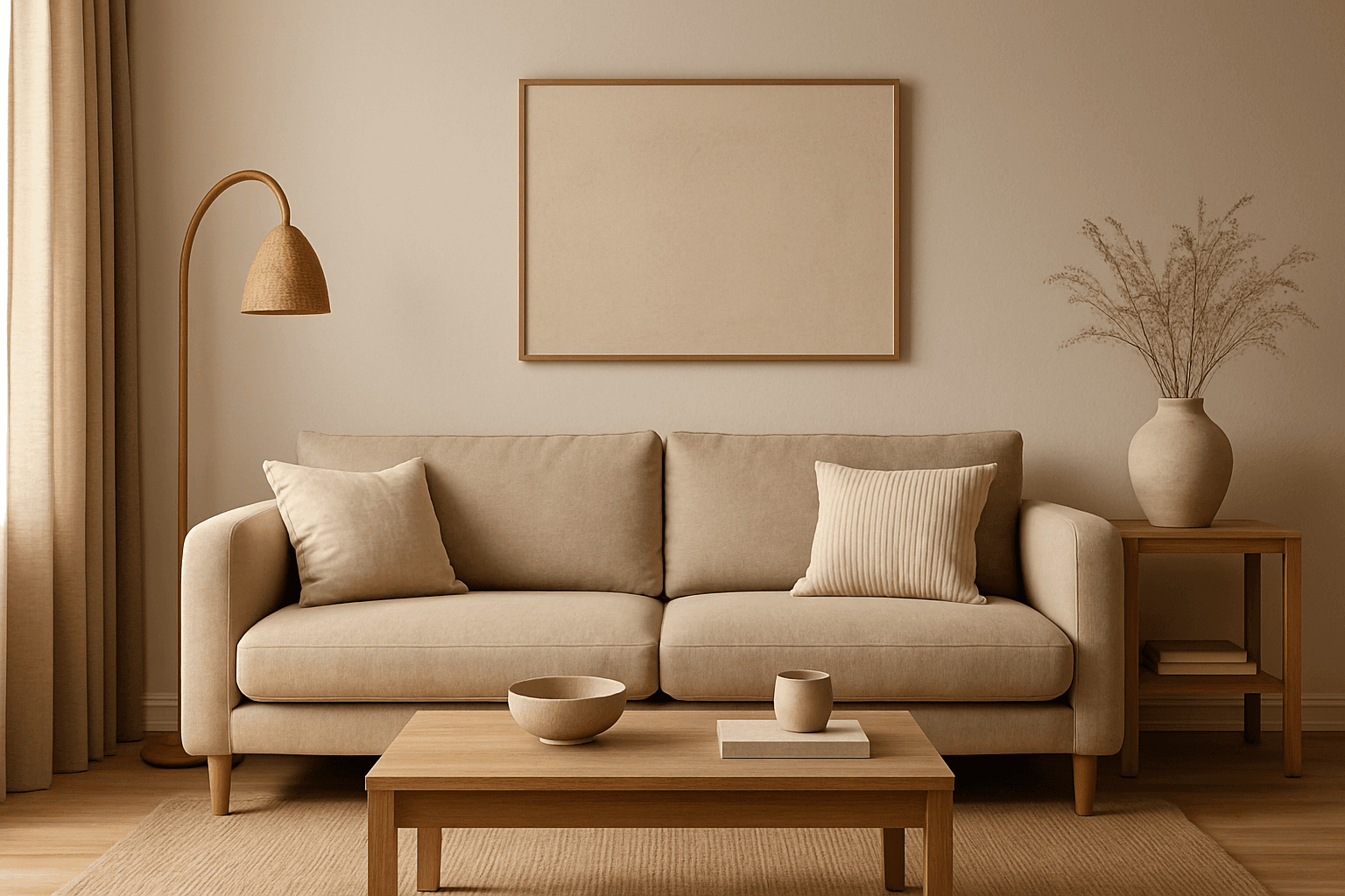
The Warm Neutral Palette is a popular color scheme choice in design and AI-generated imagery for its timeless and soothing qualities. This palette combines warm earthy tones with soft neutrals, producing images that feel natural and approachable. Incorporating warm neutrals can enhance mood by bringing subtle warmth and comfort to visuals without overpowering them. When added to AI prompts, it guides the model to emphasize harmonious colors that evoke calmness and sophistication. The palette works well across various genres, including lifestyle, interiors, fashion, and nature themes, helping create polished and refined visuals suitable for editorial or commercial use.

Monochrome Color Palette
Employing a monochrome color palette in AI-generated images allows for creating minimalistic yet striking visuals. By constraining colors to one hue family, creators can convey mood and style consistently while focusing on composition and detail. This technique excels in editorial photography, product presentations, and artistic portraits, where color distraction is minimized and storytelling through form and light is enhanced. Using monochrome prompts guides the AI to simulate realistic materials and subtle depth through nuanced shading, resulting in premium, polished images suitable for professional use.
Warm Color Palette
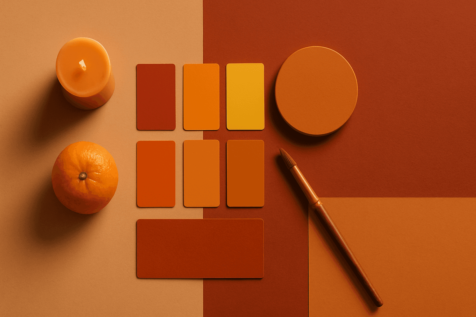
Warm Color Palette is a practical keyword for guiding emotional tone. It can make a breakfast scene feel cozy, a travel image feel sunny, or a brand visual feel more approachable. Warm palettes are strong for commercial images because they connect quickly with themes like comfort, care, family, food, hospitality, wellness, and optimism. For beginners, this keyword is easier to control than listing many individual colors.
Earthy Warm Color Scheme
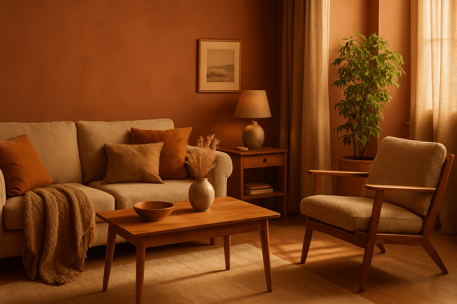
The Earthy Warm Color Scheme is a popular choice for artists and designers aiming to create images that feel natural, comforting, and connected to the environment. By focusing on warm, muted earth tones, this scheme lends a timeless aesthetic suited for a variety of subjects, including landscapes, portraits, interiors, and product shots. Using this palette in AI image prompts can help achieve visuals that emphasize quiet warmth and natural beauty, often evoking rustic charm or bohemian moods. It's well-suited for editorial photography, lifestyle branding, and environmental themes, enhancing images with a sophisticated yet approachable mood.
Earthy Warm Tones
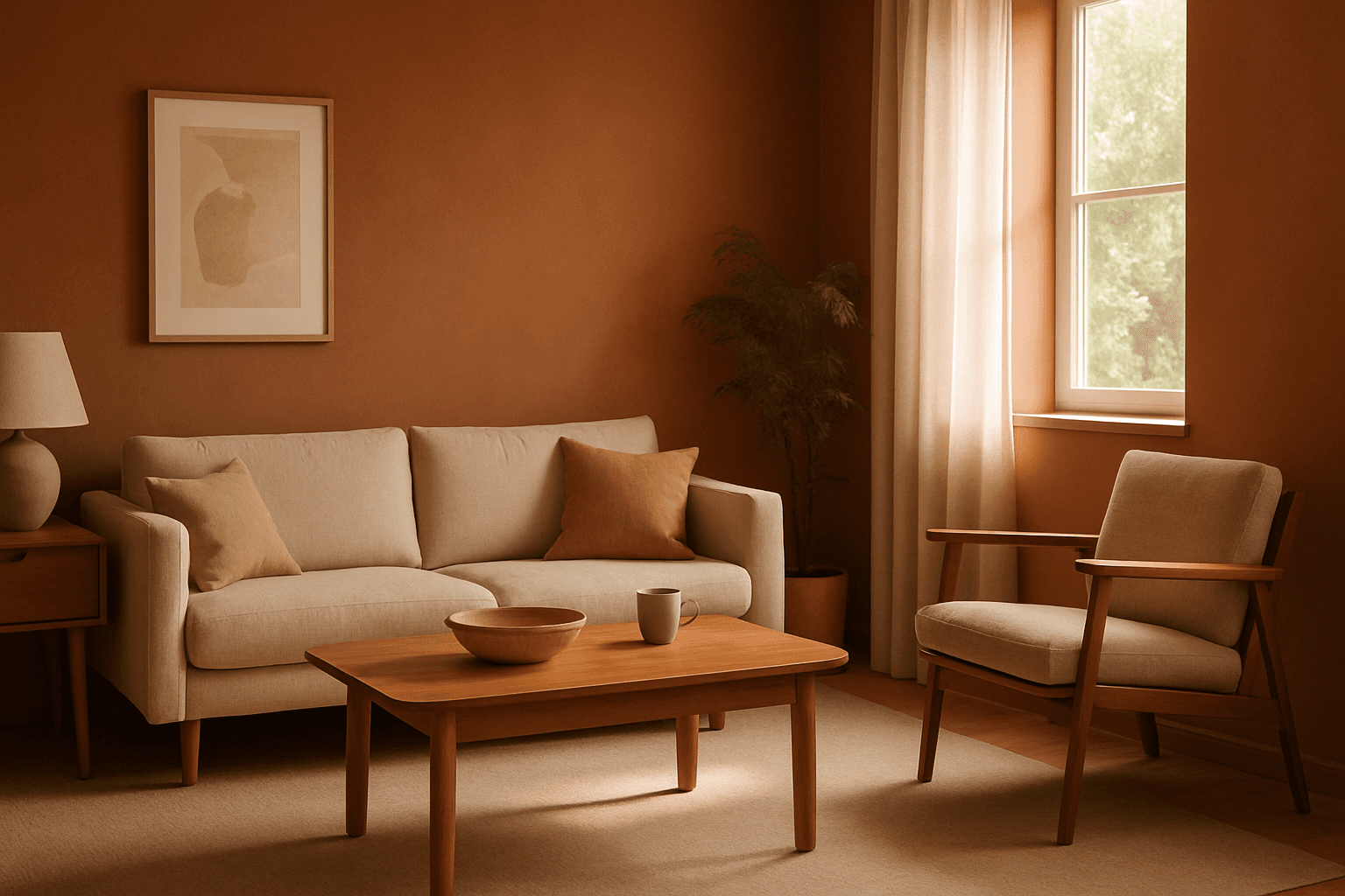
Using Earthy Warm Tones in AI image generation brings a cozy and organic aesthetic to your visuals. This color keyword shifts the palette toward natural and muted warm colors that recall the earth's rich textures, often creating a calm and inviting mood. Ideal for images that require realistic materials and depth, these tones lend a premium, editorial polish without harsh contrasts. When combined with refined lighting and subtle depth, images gain a tactile, authentic feel, suitable for editorial hero imagery or sophisticated product presentations.
Muted Neutral Palette
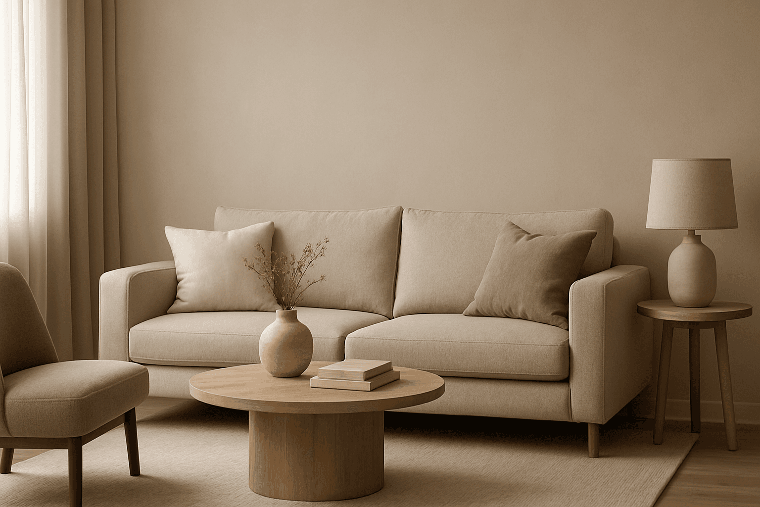
The Muted Neutral Palette is an essential color theme used widely in design, photography, and digital imagery to produce a subtle, refined look. These colors lack vivid saturation and strong contrasts, resulting in images that feel calm, natural, and versatile. In AI-driven image generation, specifying a Muted Neutral Palette guides the model to avoid vibrant, saturated colors, focusing on softness and timelessness. It supports creating visuals that blend seamlessly in editorial, fashion, interior, and product contexts where sophistication and neutrality are paramount. This palette is particularly suited for minimalist compositions where color draws attention without overwhelming the scene.