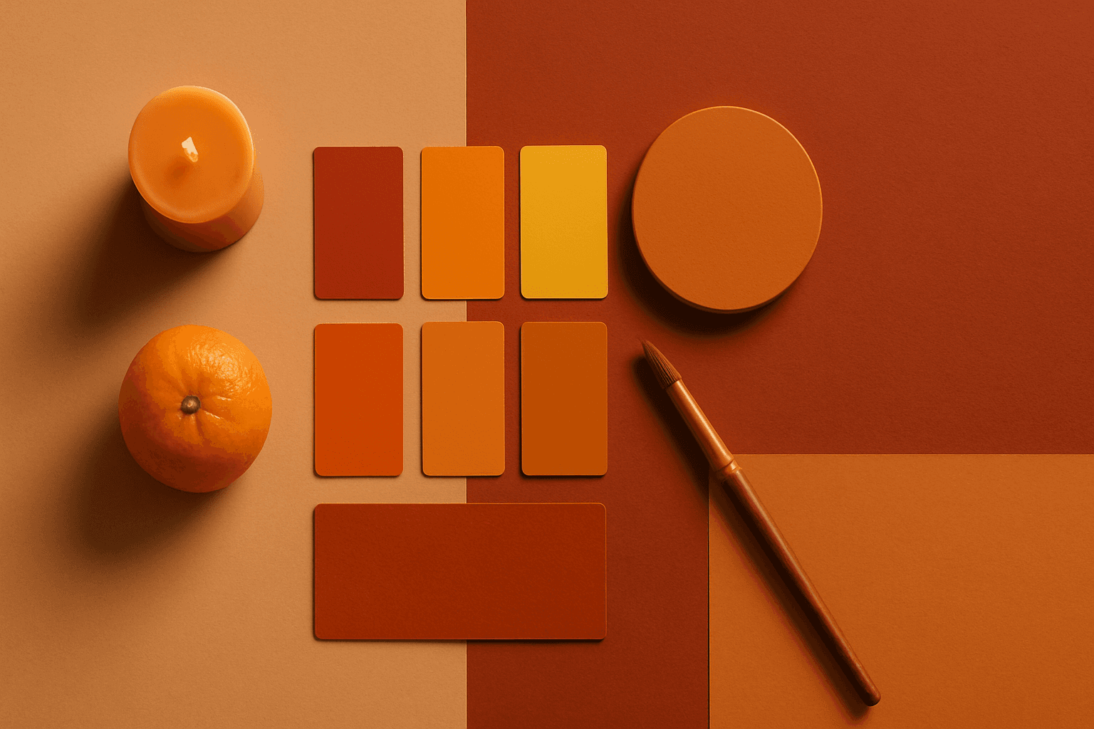
Warm Color Palette
Warm Color Palette is a practical keyword for guiding emotional tone. It can make a breakfast scene feel cozy, a travel image feel sunny, or a brand visual feel more approachable. Warm palettes are strong for commercial images because they connect quickly with themes like comfort, care, family, food, hospitality, wellness, and optimism. For beginners, this keyword is easier to control than listing many individual colors.
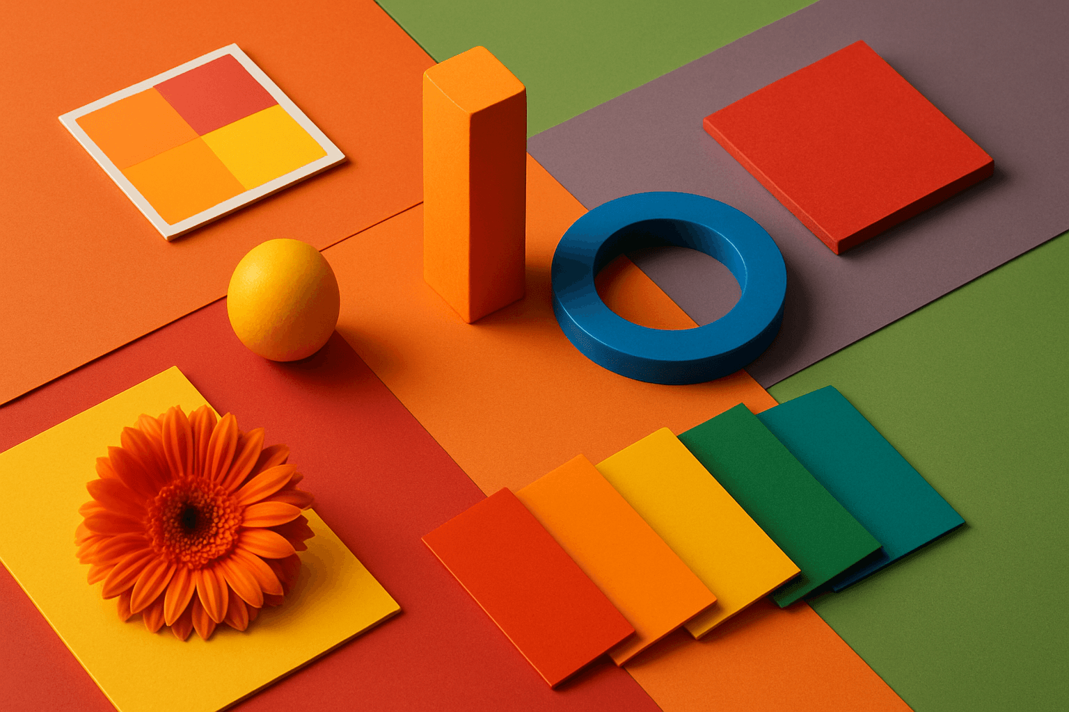
Definition
A Warm Color Palette uses colors associated with warmth, such as red, orange, yellow, terracotta, peach, amber, cream, and warm brown. In AI prompts, it creates images that feel welcoming, energetic, cozy, optimistic, or human.
Visual Characteristics
- Golden, orange, red, peach, tan, cream, clay, or warm brown color relationships.
- Often feels inviting, emotional, cozy, sunny, or energetic.
- Pairs naturally with Golden Hour, Soft Light, food styling, hospitality, and lifestyle imagery.
Best Use Cases
- Food, coffee, restaurants, hospitality, travel, and home lifestyle imagery.
- Wellness, family, seasonal campaigns, handmade products, and cozy interiors.
- Stock visuals about optimism, comfort, creativity, care, and connection.
Prompt Examples
- A warm color palette kitchen interior with terracotta tiles, cream walls, and golden sunlight.
- A warm palette travel photo of a quiet street at sunset, editorial composition, copy space.
- A warm color product image for handmade candles, soft shadows, clay and cream tones.
Adobe Stock Potential
Warm Color Palette has strong stock potential because warm visuals are emotionally accessible and commercially versatile. Keep colors balanced so the image remains realistic and usable for many buyers.
FAQ
What moods do warm palettes create?
They often suggest comfort, optimism, energy, care, hospitality, and natural sunlight.
How do I avoid overly orange images?
Ask for balanced whites, natural color grading, realistic skin tones, or subtle warm tones.
Continue Exploring
Related Prompts
Warm Tones
Warm Tones are colors with red, orange, yellow, peach, tan, clay, or golden undertones. They create comfort, optimism, energy, and human warmth.

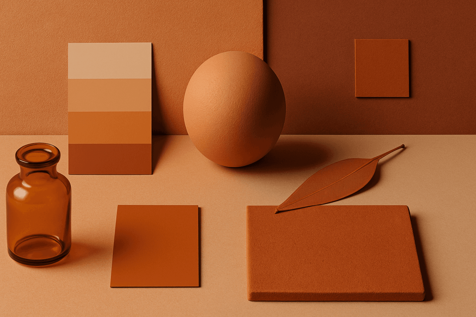
Earth Tone Colors
Earth Tone Colors are useful for creating grounded, organic, and commercially current AI images. They are common in wellness branding, sustainable packaging, interiors, handmade products, food, outdoor lifestyle, and natural beauty campaigns. For stock creators, earth tones can communicate authenticity and trust without needing obvious eco symbols. They also work well in minimalist layouts because the palette is calm but still warm.
Pastel Colors
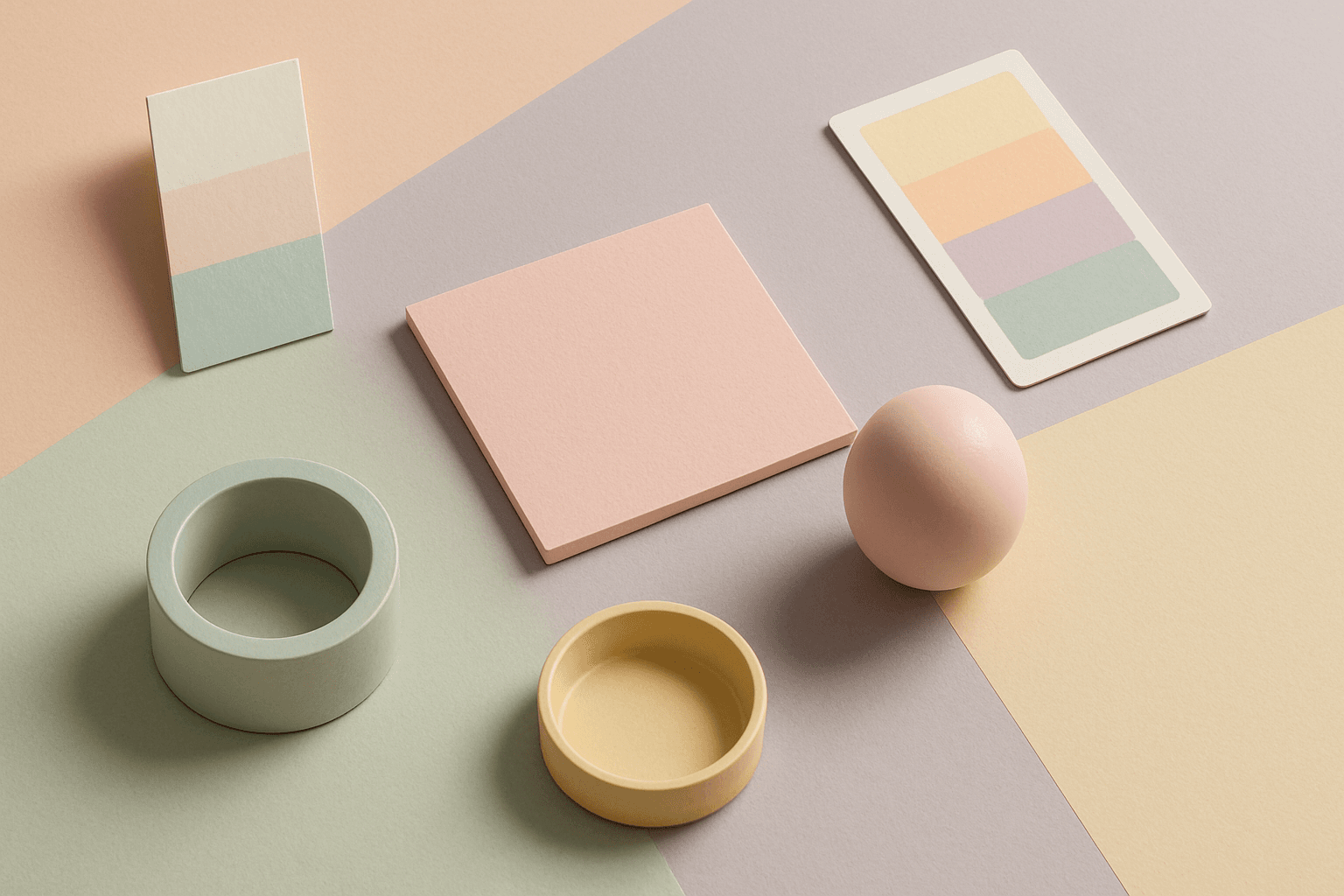
Pastel Colors are a beginner-friendly way to make AI images feel soft, clean, and emotionally light. They are especially helpful when default AI results look too saturated or visually loud. Pastels can make a product feel more approachable, an interior feel calm, or a social graphic feel cheerful without becoming aggressive. For stock image creators, this keyword works well because pastel images often support text overlays, seasonal campaigns, beauty brands, lifestyle blogs, and gentle product presentation.
Morandi Palette
Morandi Palette is a color keyword inspired by the quiet, dusty tones associated with painter Giorgio Morandi. In AI image prompts, it usually points the model toward muted, low-saturation colors such as dusty rose, warm gray, clay, sage, beige, soft blue, faded mauve, and stone. The effect is refined, calm, and slightly editorial. This palette is useful when you want an image to feel sophisticated without becoming cold or overly minimal. For beginners, Morandi Palette is a practical way to control color harmony. It can make a scene feel more tasteful, cohesive, and brand-ready, especially when default AI colors look too bright or artificial.
Vibrant Colors
Vibrant Colors are useful when you want an AI image to grab attention quickly. They can make products look exciting, posters feel energetic, and social content stand out in feeds. This keyword is powerful for commercial creators, but it needs control. Too many saturated colors can feel chaotic or cheap. The best vibrant images usually have a clear subject, strong composition, and a limited set of bold colors.

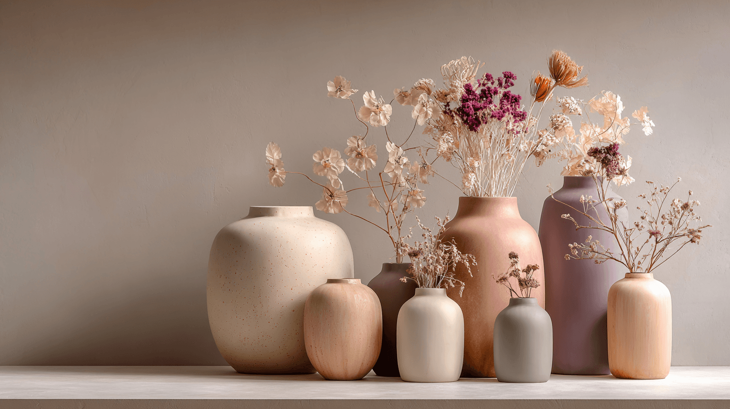
Warm Neutral Palette
The Warm Neutral Palette is a popular color scheme choice in design and AI-generated imagery for its timeless and soothing qualities. This palette combines warm earthy tones with soft neutrals, producing images that feel natural and approachable. Incorporating warm neutrals can enhance mood by bringing subtle warmth and comfort to visuals without overpowering them. When added to AI prompts, it guides the model to emphasize harmonious colors that evoke calmness and sophistication. The palette works well across various genres, including lifestyle, interiors, fashion, and nature themes, helping create polished and refined visuals suitable for editorial or commercial use.