Vibrant Colors
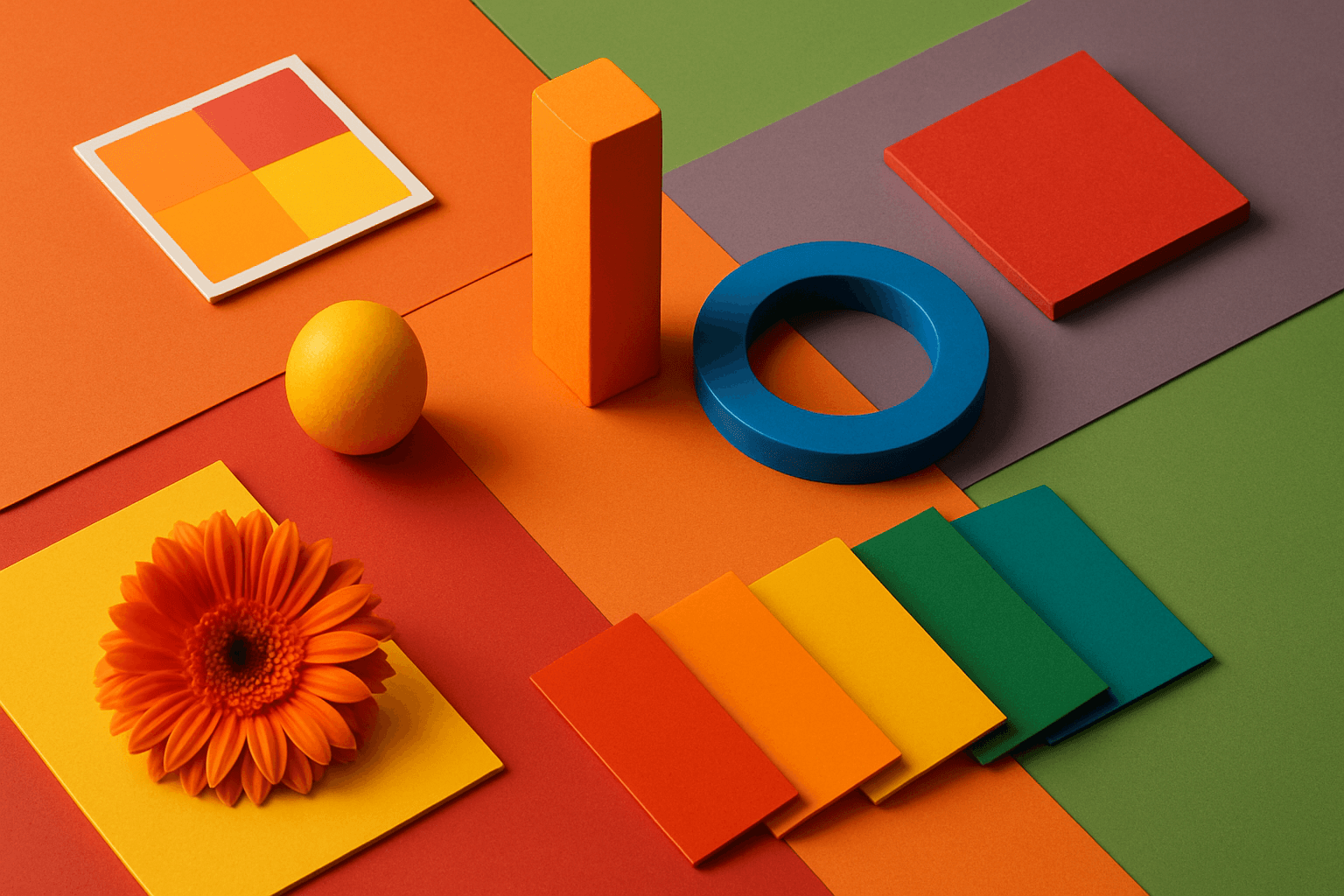
Vibrant Colors are useful when you want an AI image to grab attention quickly. They can make products look exciting, posters feel energetic, and social content stand out in feeds. This keyword is powerful for commercial creators, but it needs control. Too many saturated colors can feel chaotic or cheap. The best vibrant images usually have a clear subject, strong composition, and a limited set of bold colors.
Definition
Vibrant Colors are bright, saturated colors with strong visual presence. In AI prompts, they create energetic, playful, bold, youthful, or attention-grabbing images.
Visual Characteristics
- High saturation, strong hue contrast, and lively visual energy.
- Often feels modern, playful, optimistic, loud, or promotional.
- Works well for ads, social media, posters, fashion, entertainment, and product launches.
Best Use Cases
- Social media ads, event posters, music visuals, gaming art, fashion, and youth-oriented campaigns.
- Product launches, beverages, sports, tech accessories, toys, and promotional graphics.
- Stock concepts such as energy, creativity, celebration, innovation, summer, fun, and action.
Prompt Examples
- A vibrant colors fashion editorial with saturated pink and blue backdrop, studio lighting.
- A vibrant event poster background with bold orange, yellow, and cyan shapes, copy space.
- A vibrant colors product flat lay for tech accessories, clean shadows, playful composition.
Adobe Stock Potential
Vibrant Colors can perform well for promotional stock needs, especially social, event, entertainment, and youth-oriented visuals. The key is keeping the concept readable and commercially flexible.
FAQ
How do I keep vibrant colors from looking messy?
Limit the palette, use a clean background, and make one subject clearly dominant.
Are vibrant colors good for stock images?
Yes, especially for ads, social media, posters, entertainment, and seasonal campaigns.
Continue Exploring
Related Prompts
Complementary Colors
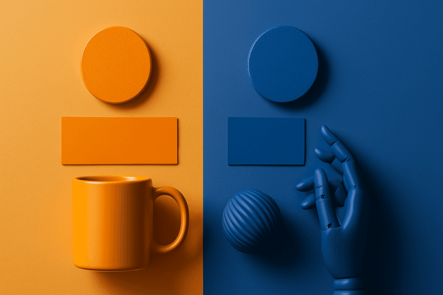
Complementary Colors are useful when an AI image needs to stand out quickly. The contrast can make a subject pop, create visual tension, and improve thumbnail impact. This keyword is common in movie posters, sports ads, product campaigns, music visuals, gaming art, and modern editorial imagery. For beginners, the key is balance: complementary palettes work best when one color leads and the opposite color supports it.
Pastel Colors
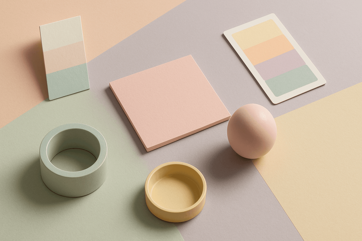
Pastel Colors are a beginner-friendly way to make AI images feel soft, clean, and emotionally light. They are especially helpful when default AI results look too saturated or visually loud. Pastels can make a product feel more approachable, an interior feel calm, or a social graphic feel cheerful without becoming aggressive. For stock image creators, this keyword works well because pastel images often support text overlays, seasonal campaigns, beauty brands, lifestyle blogs, and gentle product presentation.
High Contrast Colors
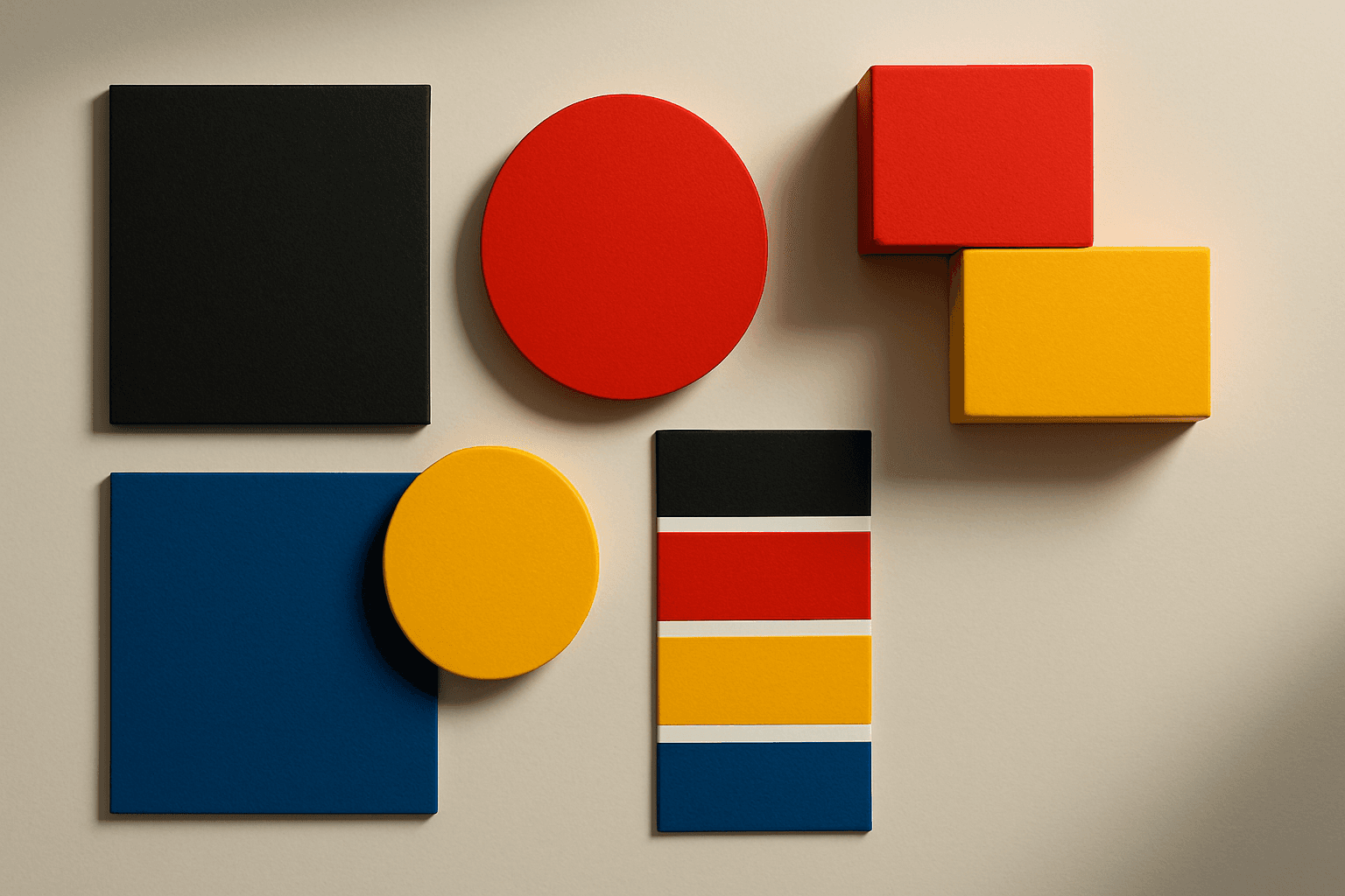
High Contrast Colors use strong differences in hue, value, or saturation to create visual impact. They help subjects stand out quickly.
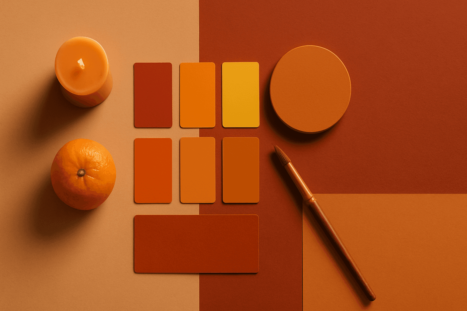
Warm Color Palette
Warm Color Palette is a practical keyword for guiding emotional tone. It can make a breakfast scene feel cozy, a travel image feel sunny, or a brand visual feel more approachable. Warm palettes are strong for commercial images because they connect quickly with themes like comfort, care, family, food, hospitality, wellness, and optimism. For beginners, this keyword is easier to control than listing many individual colors.
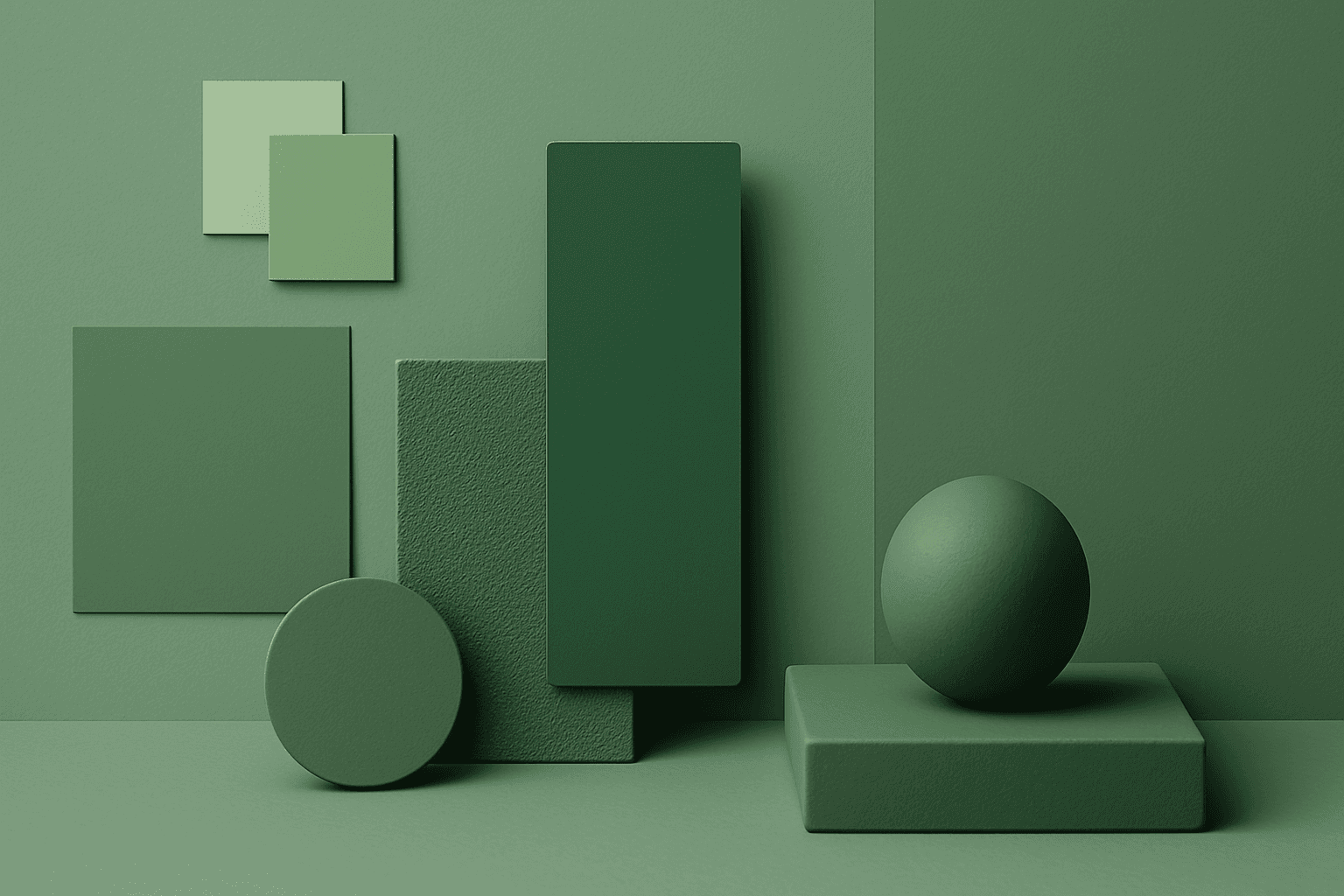
Monochromatic Colors
Monochromatic Colors are useful when an AI image needs strong cohesion and a design-led feel. Because the palette is limited, the viewer pays more attention to form, light, texture, and layout. This can make images feel editorial, premium, minimal, or graphic. For stock creators, monochromatic images can be useful for backgrounds, posters, fashion, architecture, product shots, and brand campaigns where color consistency matters.
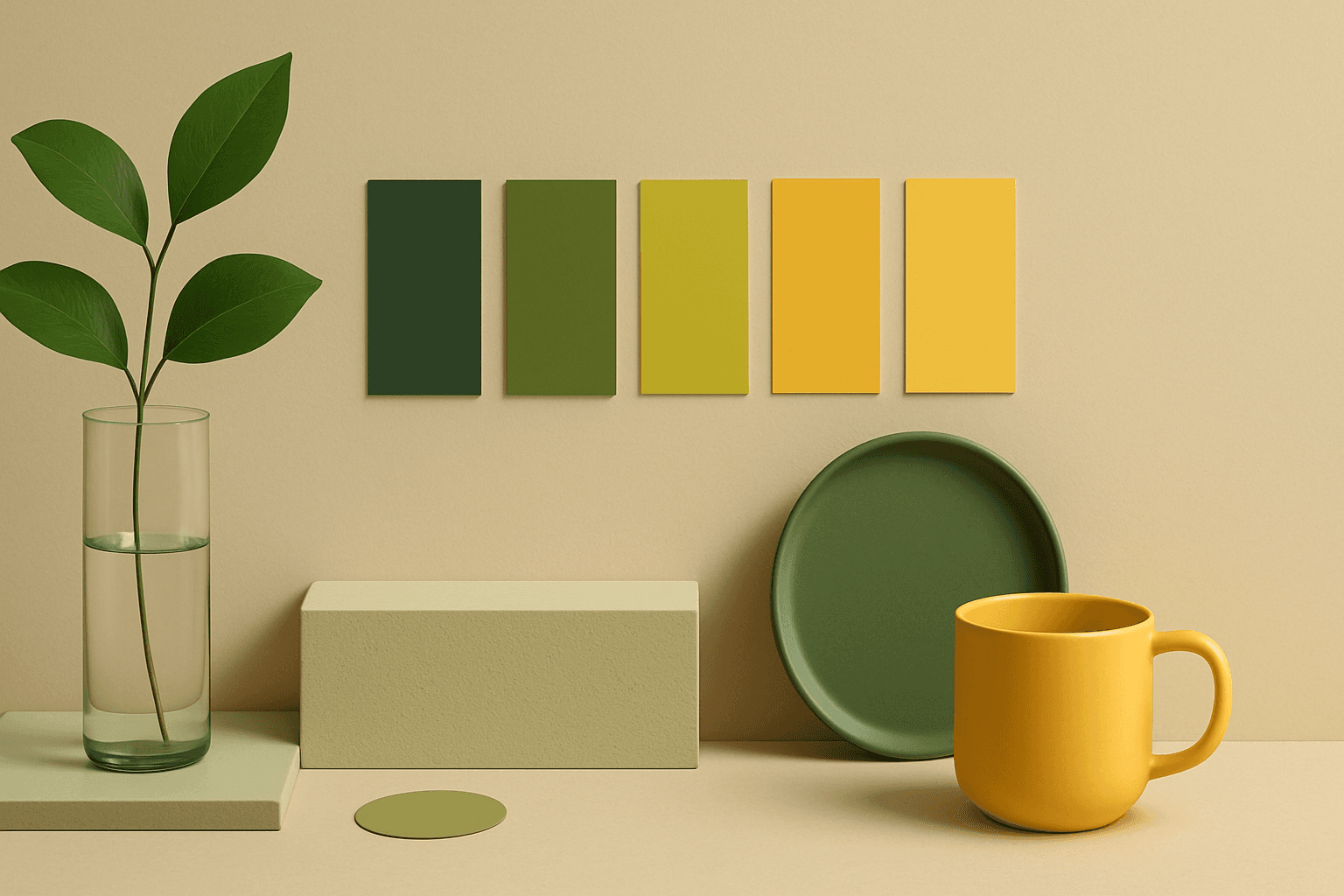
Analogous Colors
Analogous Colors are useful when you want an AI image to feel harmonious and easy to look at. Because the colors are related, the image often feels more cohesive and less visually jarring. This makes the keyword helpful for interior design, nature scenes, wellness branding, beauty campaigns, fashion styling, and editorial backgrounds. For beginners, Analogous Colors are easier to control than complex palettes because the colors naturally belong together.