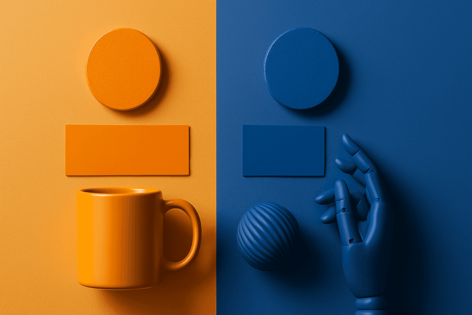
Complementary Colors
Complementary Colors are useful when an AI image needs to stand out quickly. The contrast can make a subject pop, create visual tension, and improve thumbnail impact. This keyword is common in movie posters, sports ads, product campaigns, music visuals, gaming art, and modern editorial imagery. For beginners, the key is balance: complementary palettes work best when one color leads and the opposite color supports it.
Definition
Complementary Colors are colors that sit opposite each other on the color wheel, such as blue and orange, red and green, or purple and yellow. In AI prompts, they create strong contrast and visual energy.
Visual Characteristics
- High color contrast between two opposing hue families.
- A bold and attention-grabbing look that can feel dynamic or cinematic.
- Works best when one color dominates and the other acts as an accent.
Best Use Cases
- Advertising, sports, entertainment, gaming, and product launch visuals.
- Posters, thumbnails, social ads, and campaign images that need fast visual impact.
- Stock concepts about energy, contrast, competition, innovation, action, and nightlife.
Prompt Examples
- A complementary colors movie poster concept with teal shadows and orange highlights.
- A red and green complementary product flat lay with controlled palette and clean background.
- A purple and yellow event graphic background with bold lighting and negative space.
Adobe Stock Potential
Complementary Colors are strong for high-impact stock images, especially when buyers need energy or contrast. Keep compositions clean so the palette feels intentional rather than chaotic.
FAQ
Which complementary pair is easiest to use?
Blue and orange is often easiest because it feels natural in cinematic lighting and travel imagery.
Can complementary colors be subtle?
Yes. Use muted complementary colors or make one hue a small accent.
Continue Exploring
Related Prompts
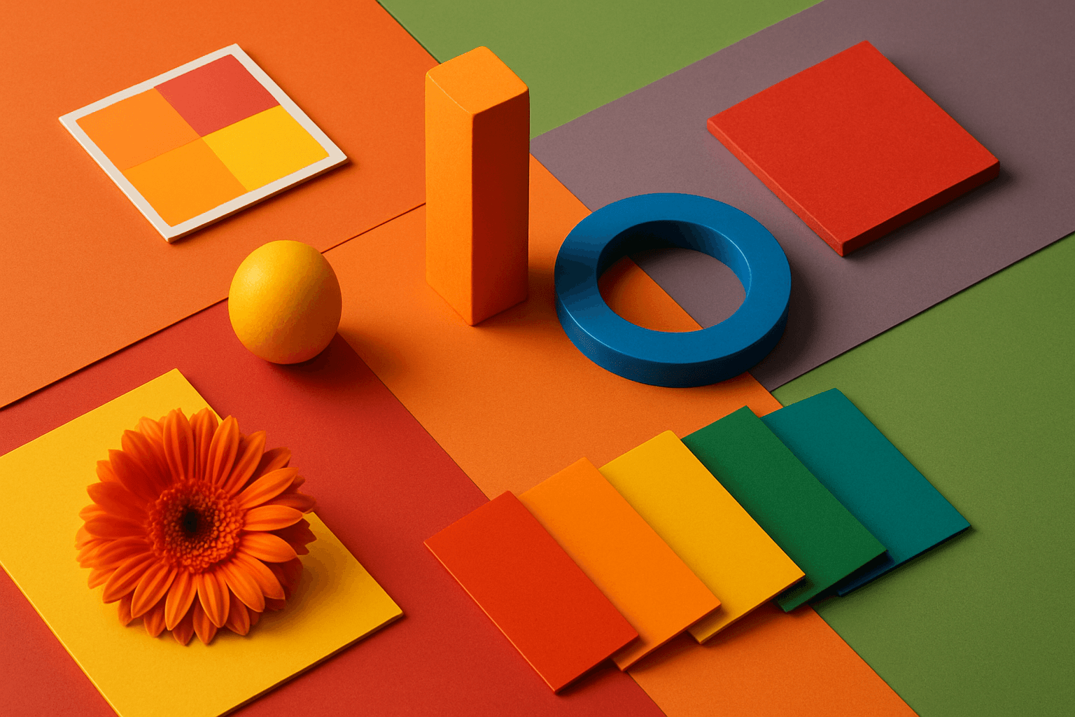
Vibrant Colors
Vibrant Colors are useful when you want an AI image to grab attention quickly. They can make products look exciting, posters feel energetic, and social content stand out in feeds. This keyword is powerful for commercial creators, but it needs control. Too many saturated colors can feel chaotic or cheap. The best vibrant images usually have a clear subject, strong composition, and a limited set of bold colors.
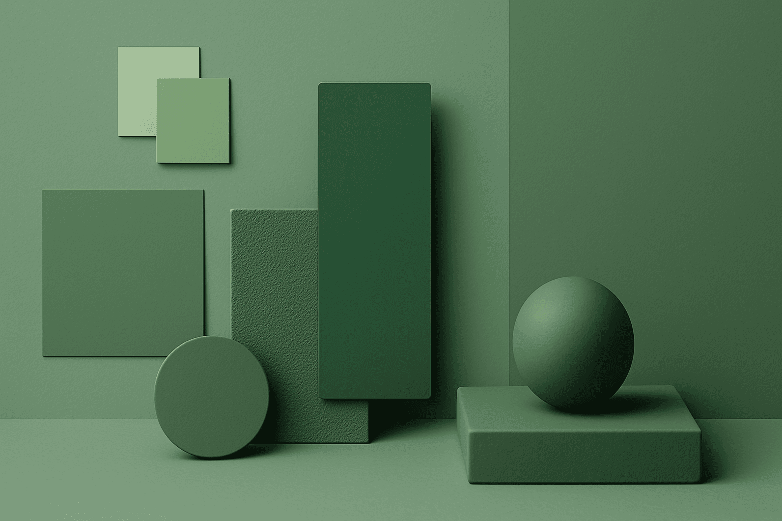
Monochromatic Colors
Monochromatic Colors are useful when an AI image needs strong cohesion and a design-led feel. Because the palette is limited, the viewer pays more attention to form, light, texture, and layout. This can make images feel editorial, premium, minimal, or graphic. For stock creators, monochromatic images can be useful for backgrounds, posters, fashion, architecture, product shots, and brand campaigns where color consistency matters.
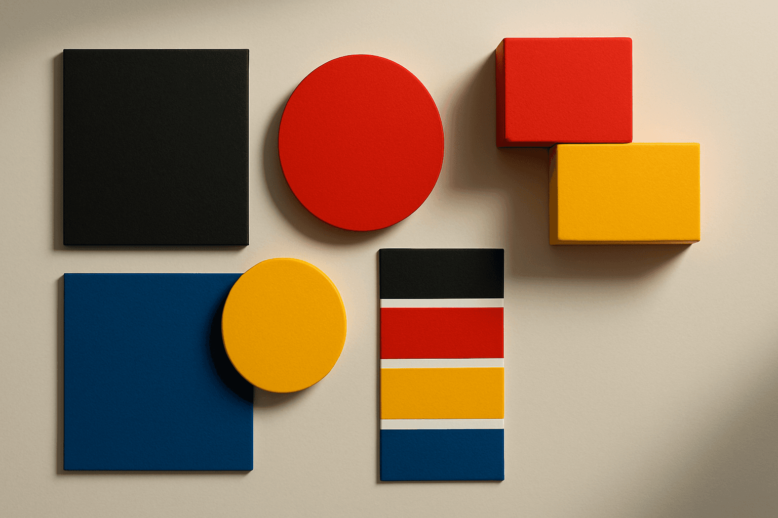
High Contrast Colors
High Contrast Colors use strong differences in hue, value, or saturation to create visual impact. They help subjects stand out quickly.
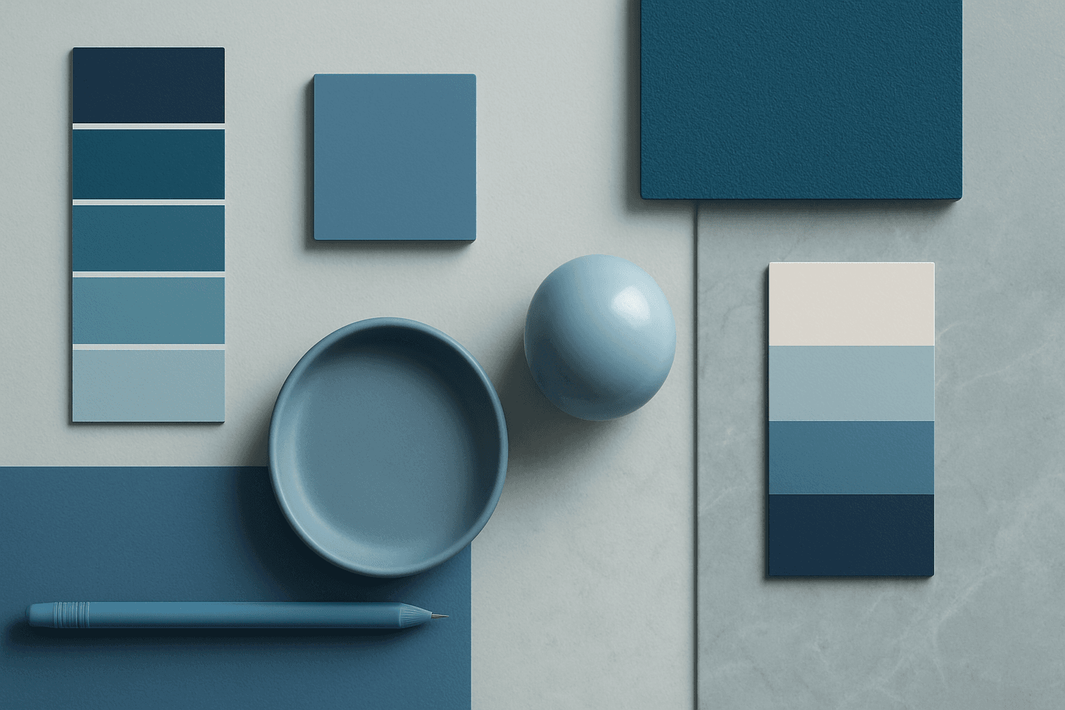
Cool Color Palette
Cool Color Palette is useful when you want an image to feel clear, composed, and modern. It is common in healthcare, technology, finance, architecture, SaaS, clean beauty, and wellness visuals. The palette can reduce emotional heat and make a design feel more trustworthy or focused. For AI creators, this keyword is helpful when a scene needs professionalism or calm rather than warmth and intimacy.
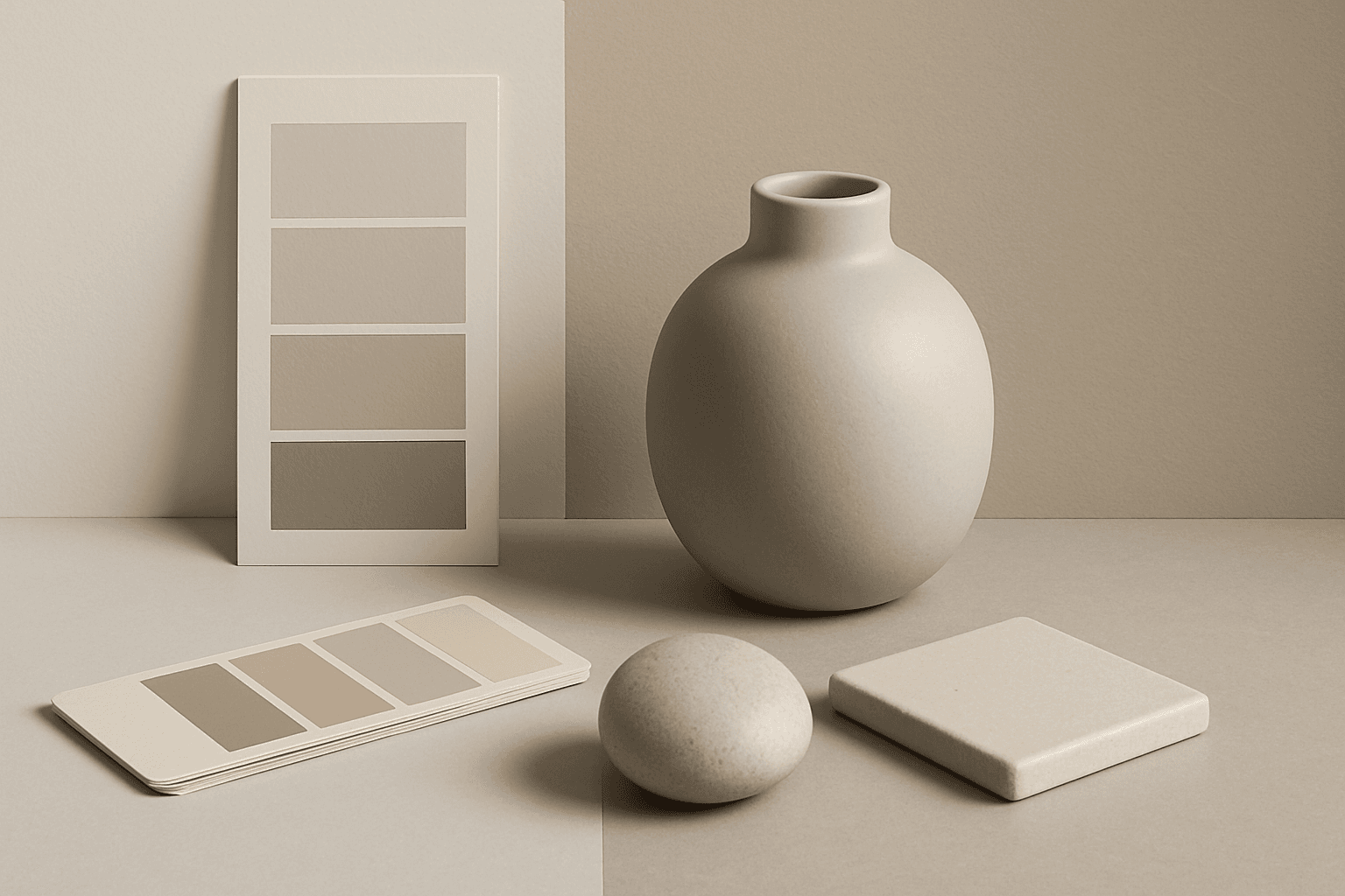
Neutral Colors
Neutral Colors are among the most commercially useful palette keywords. They help AI images feel clean, versatile, and layout-friendly. Neutral images can support text overlays, product packaging, editorial design, websites, and presentations without competing with brand colors. For stock creators, this is a practical keyword because buyers often need visuals that can blend into many design systems.
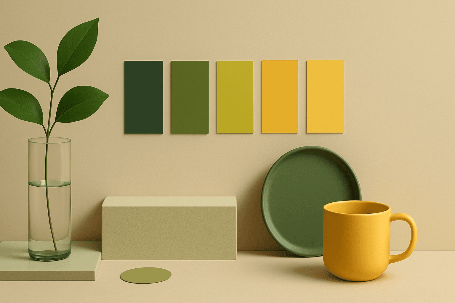
Analogous Colors
Analogous Colors are useful when you want an AI image to feel harmonious and easy to look at. Because the colors are related, the image often feels more cohesive and less visually jarring. This makes the keyword helpful for interior design, nature scenes, wellness branding, beauty campaigns, fashion styling, and editorial backgrounds. For beginners, Analogous Colors are easier to control than complex palettes because the colors naturally belong together.