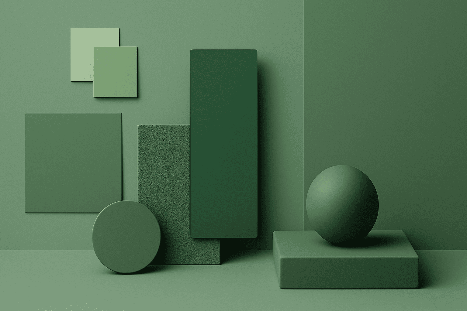
Monochromatic Colors
Monochromatic Colors are useful when an AI image needs strong cohesion and a design-led feel. Because the palette is limited, the viewer pays more attention to form, light, texture, and layout. This can make images feel editorial, premium, minimal, or graphic. For stock creators, monochromatic images can be useful for backgrounds, posters, fashion, architecture, product shots, and brand campaigns where color consistency matters.
Definition
Monochromatic Colors use one main hue across multiple values, tints, tones, and shades. The image may be blue monochrome, green monochrome, warm beige monochrome, or even black-and-white.
Visual Characteristics
- One dominant color family with variation in lightness and darkness.
- A cohesive, graphic, stylish look with strong visual unity.
- Works well when shape, texture, shadow, and composition need to stand out.
Best Use Cases
- Editorial fashion, architecture, product photography, and premium brand visuals.
- Abstract backgrounds, presentation covers, posters, and social media designs.
- Stock concepts where unity, focus, elegance, simplicity, or graphic impact matters.
Prompt Examples
- A monochromatic blue business background with glass shapes, soft gradients, and negative space.
- A monochromatic beige interior with linen, stone, and warm shadows.
- A black and white monochromatic fashion portrait with hard light and clean composition.
Adobe Stock Potential
Monochromatic Colors can perform well as design assets because they are easy to integrate into layouts. The strongest stock images have enough tonal contrast to remain readable at thumbnail size.
FAQ
Does monochromatic mean black and white?
It can, but it also means any image built mostly from one color family, such as blue, green, beige, or red.
How do I add interest to a monochromatic prompt?
Use texture, light direction, depth of field, strong shapes, or tonal contrast.
Continue Exploring
Related Prompts
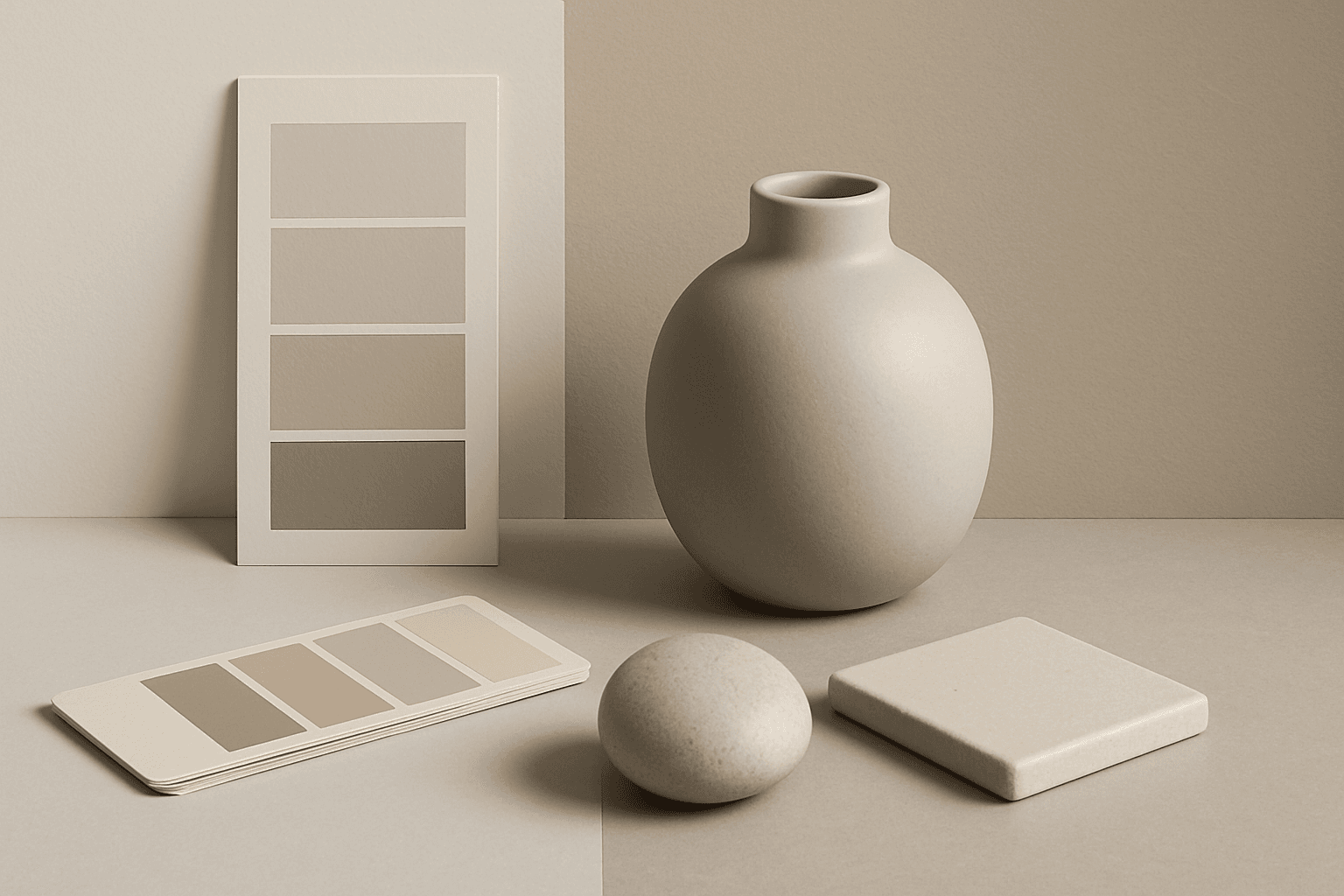
Neutral Colors
Neutral Colors are among the most commercially useful palette keywords. They help AI images feel clean, versatile, and layout-friendly. Neutral images can support text overlays, product packaging, editorial design, websites, and presentations without competing with brand colors. For stock creators, this is a practical keyword because buyers often need visuals that can blend into many design systems.
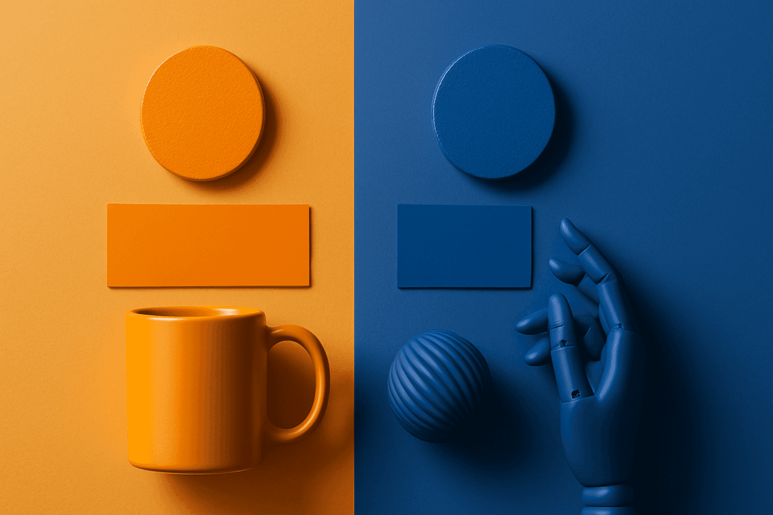
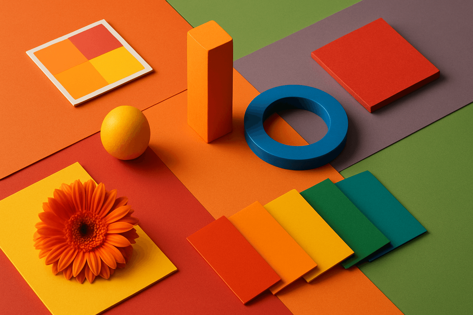
Complementary Colors
Complementary Colors are useful when an AI image needs to stand out quickly. The contrast can make a subject pop, create visual tension, and improve thumbnail impact. This keyword is common in movie posters, sports ads, product campaigns, music visuals, gaming art, and modern editorial imagery. For beginners, the key is balance: complementary palettes work best when one color leads and the opposite color supports it.
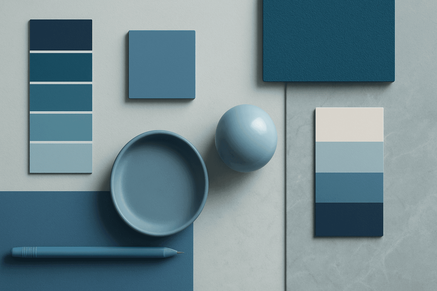
Cool Color Palette
Cool Color Palette is useful when you want an image to feel clear, composed, and modern. It is common in healthcare, technology, finance, architecture, SaaS, clean beauty, and wellness visuals. The palette can reduce emotional heat and make a design feel more trustworthy or focused. For AI creators, this keyword is helpful when a scene needs professionalism or calm rather than warmth and intimacy.
Vibrant Colors
Vibrant Colors are useful when you want an AI image to grab attention quickly. They can make products look exciting, posters feel energetic, and social content stand out in feeds. This keyword is powerful for commercial creators, but it needs control. Too many saturated colors can feel chaotic or cheap. The best vibrant images usually have a clear subject, strong composition, and a limited set of bold colors.
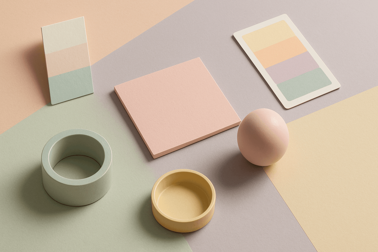
Pastel Colors
Pastel Colors are a beginner-friendly way to make AI images feel soft, clean, and emotionally light. They are especially helpful when default AI results look too saturated or visually loud. Pastels can make a product feel more approachable, an interior feel calm, or a social graphic feel cheerful without becoming aggressive. For stock image creators, this keyword works well because pastel images often support text overlays, seasonal campaigns, beauty brands, lifestyle blogs, and gentle product presentation.
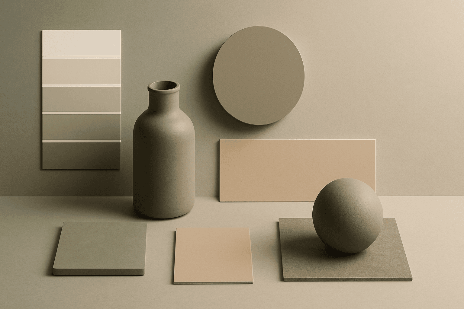
Muted Colors
Muted Colors are useful when you want AI-generated images to feel sophisticated instead of loud. They are common in interiors, lifestyle photography, fashion editorials, packaging, wellness brands, and business imagery. For stock creators, muted palettes can make images more flexible because they do not overpower text or brand elements. They also help avoid the overly saturated look that many AI images produce by default.