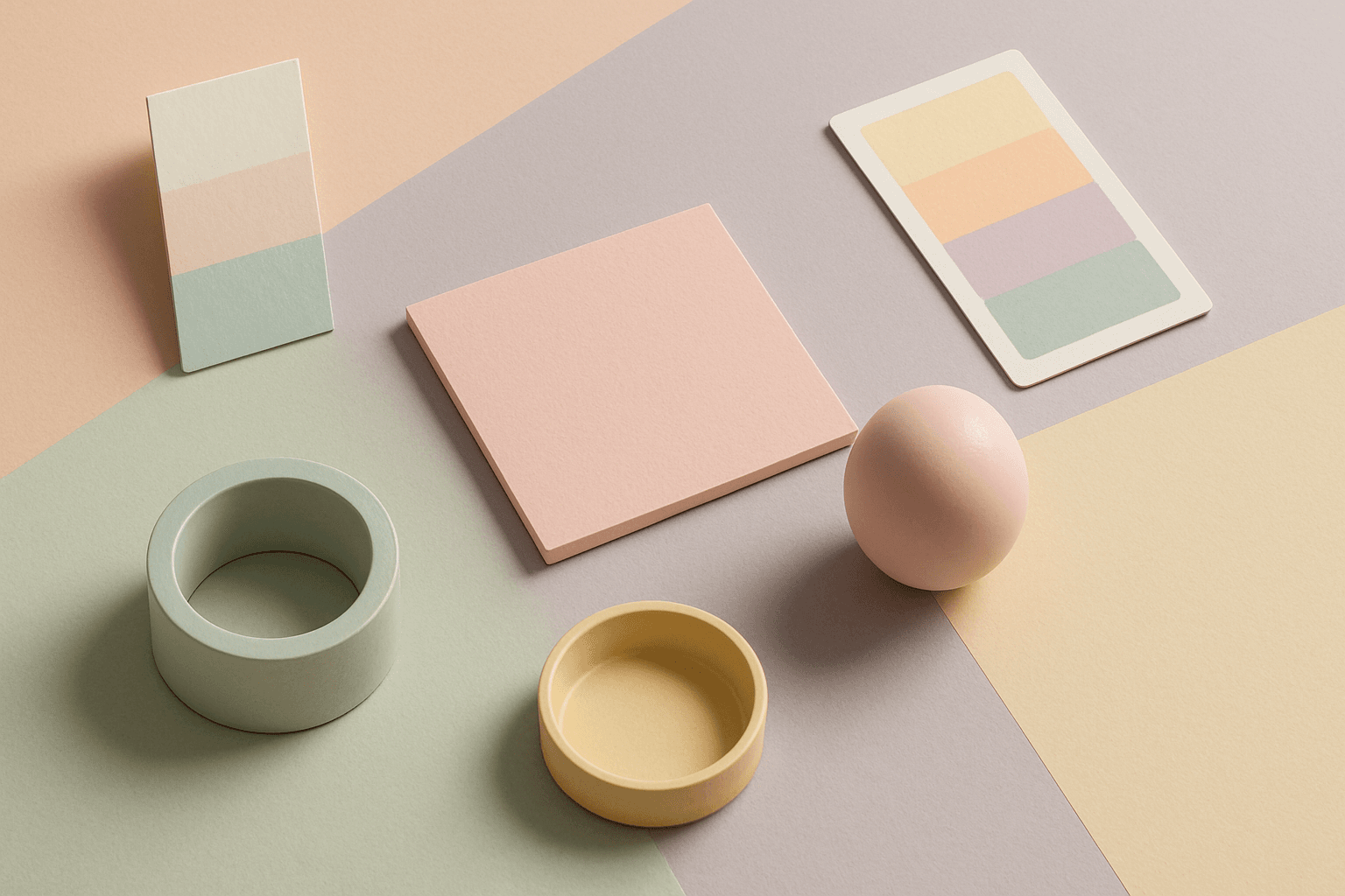
Pastel Colors
Pastel Colors are a beginner-friendly way to make AI images feel soft, clean, and emotionally light. They are especially helpful when default AI results look too saturated or visually loud. Pastels can make a product feel more approachable, an interior feel calm, or a social graphic feel cheerful without becoming aggressive. For stock image creators, this keyword works well because pastel images often support text overlays, seasonal campaigns, beauty brands, lifestyle blogs, and gentle product presentation.
Definition
Pastel Colors are pale, softened colors created by reducing saturation and adding lightness. In AI image prompts, the phrase usually signals a gentle palette of blush pink, baby blue, mint, lavender, pale yellow, peach, or cream. The keyword is useful when an image should feel friendly, airy, youthful, calm, or approachable.
Visual Characteristics
- Low saturation and high lightness, with colors that feel soft rather than intense.
- Gentle transitions between hues, especially when paired with soft light or minimal shadows.
- A friendly commercial tone that often suits beauty, wellness, stationery, spring, and lifestyle imagery.
Best Use Cases
- Beauty, skincare, wellness, and lifestyle product images that need a gentle brand feeling.
- Stationery, packaging, social media templates, spring campaigns, and flat lays.
- Backgrounds for websites, presentations, ads, and ecommerce where text readability matters.
Prompt Examples
- A pastel color stationery desk scene with soft light, negative space, and clean modern styling.
- A pastel colors spring campaign image with pale pink flowers, cream background, and airy composition.
- A pastel product photo for a ceramic mug, soft shadows, high key lighting, simple ecommerce layout.
Adobe Stock Potential
Pastel Colors have strong Adobe Stock potential for beauty, wellness, stationery, lifestyle, family, spring, and social media assets. Buyers often need soft visuals that feel cheerful but not distracting. Keep the subject clear and avoid overly busy decorative elements.
FAQ
Are pastel colors the same as muted colors?
Not exactly. Pastel colors are usually light and soft, while muted colors can be darker or dustier with lower saturation.
How do I keep pastel images from looking too childish?
Add phrases like refined styling, editorial composition, premium materials, or muted pastel palette.
Continue Exploring
Related Prompts
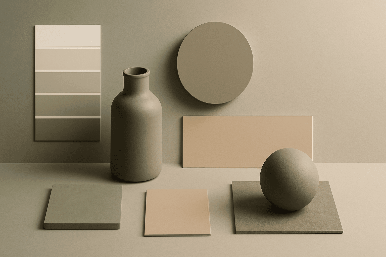
Muted Colors
Muted Colors are useful when you want AI-generated images to feel sophisticated instead of loud. They are common in interiors, lifestyle photography, fashion editorials, packaging, wellness brands, and business imagery. For stock creators, muted palettes can make images more flexible because they do not overpower text or brand elements. They also help avoid the overly saturated look that many AI images produce by default.
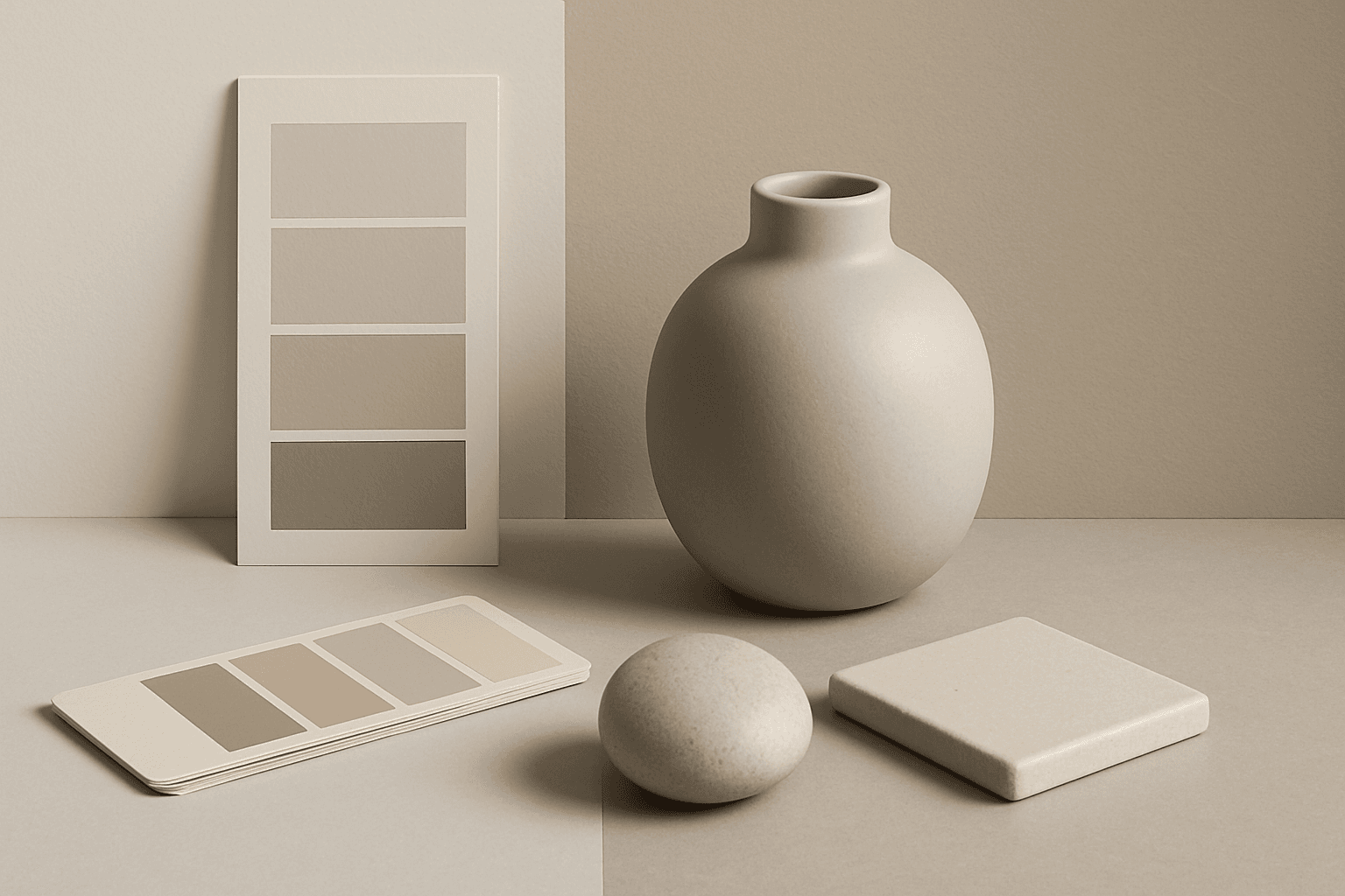
Neutral Colors
Neutral Colors are among the most commercially useful palette keywords. They help AI images feel clean, versatile, and layout-friendly. Neutral images can support text overlays, product packaging, editorial design, websites, and presentations without competing with brand colors. For stock creators, this is a practical keyword because buyers often need visuals that can blend into many design systems.
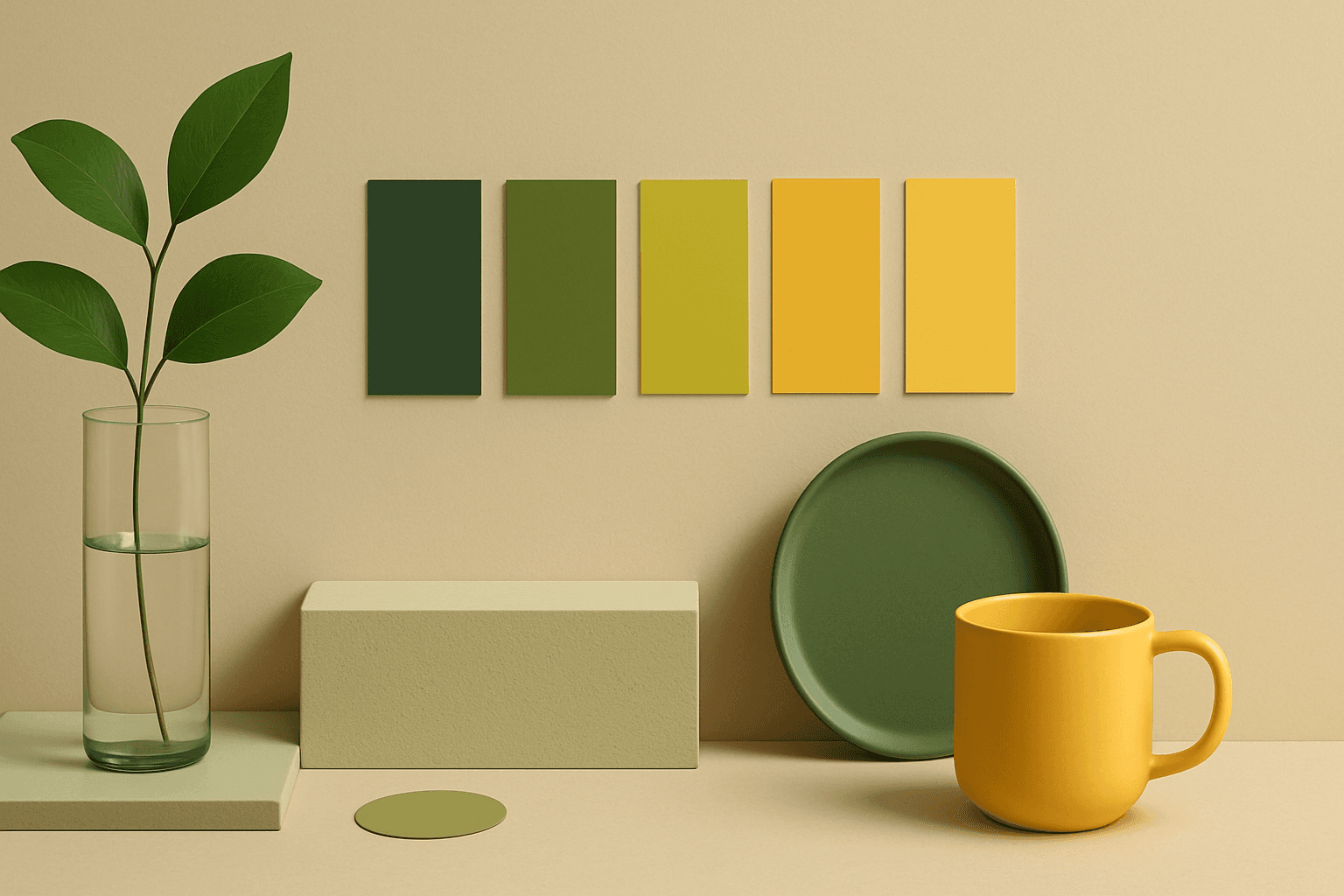
Analogous Colors
Analogous Colors are useful when you want an AI image to feel harmonious and easy to look at. Because the colors are related, the image often feels more cohesive and less visually jarring. This makes the keyword helpful for interior design, nature scenes, wellness branding, beauty campaigns, fashion styling, and editorial backgrounds. For beginners, Analogous Colors are easier to control than complex palettes because the colors naturally belong together.
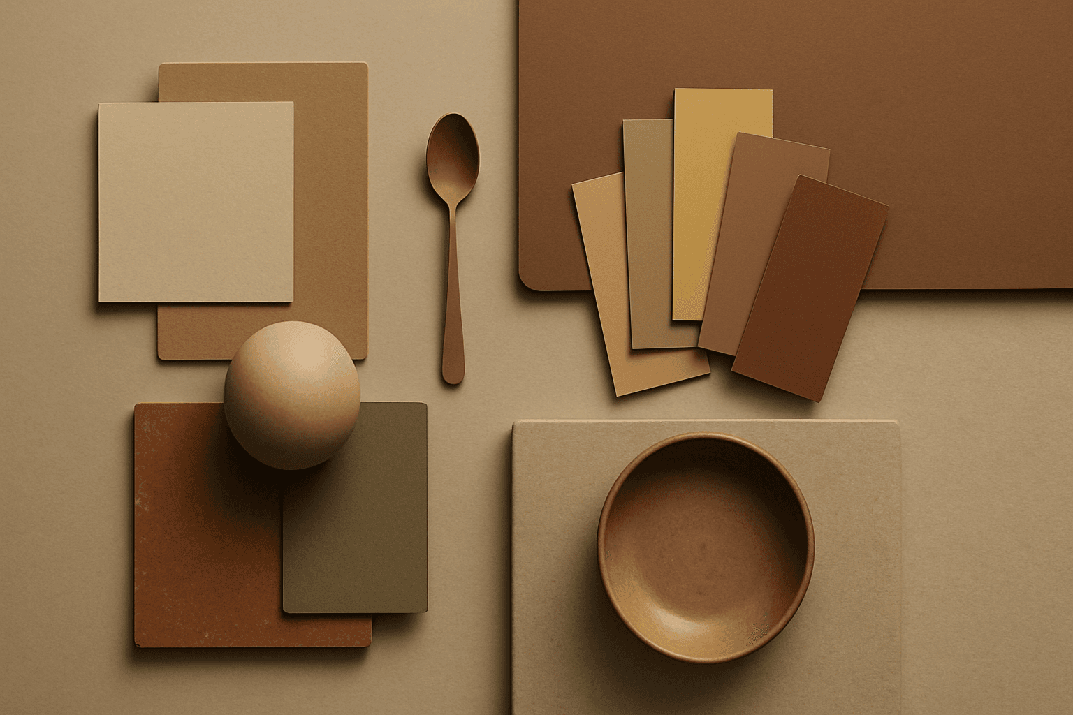
Earth Tone Colors
Earth Tone Colors are useful for creating grounded, organic, and commercially current AI images. They are common in wellness branding, sustainable packaging, interiors, handmade products, food, outdoor lifestyle, and natural beauty campaigns. For stock creators, earth tones can communicate authenticity and trust without needing obvious eco symbols. They also work well in minimalist layouts because the palette is calm but still warm.
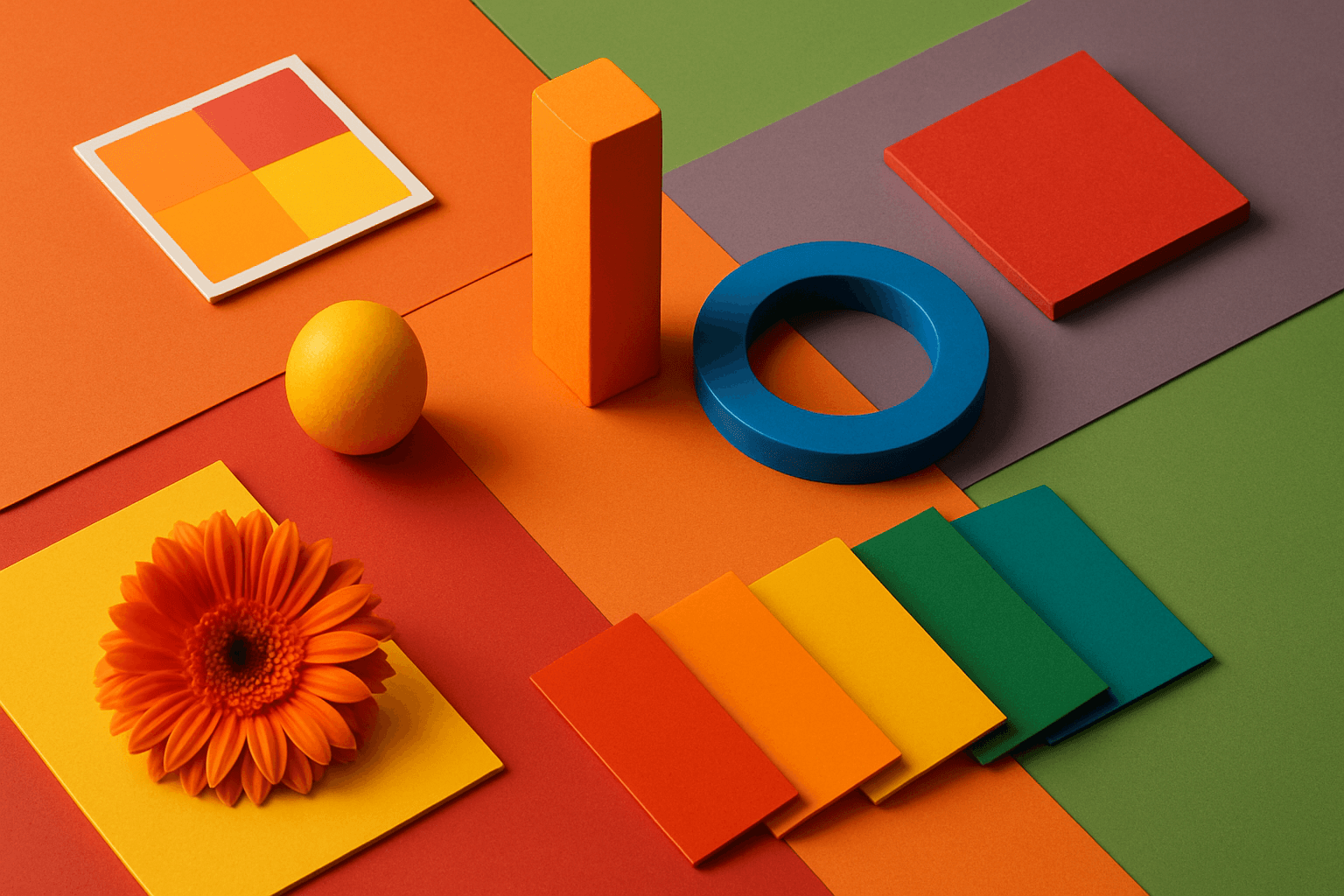
Vibrant Colors
Vibrant Colors are useful when you want an AI image to grab attention quickly. They can make products look exciting, posters feel energetic, and social content stand out in feeds. This keyword is powerful for commercial creators, but it needs control. Too many saturated colors can feel chaotic or cheap. The best vibrant images usually have a clear subject, strong composition, and a limited set of bold colors.
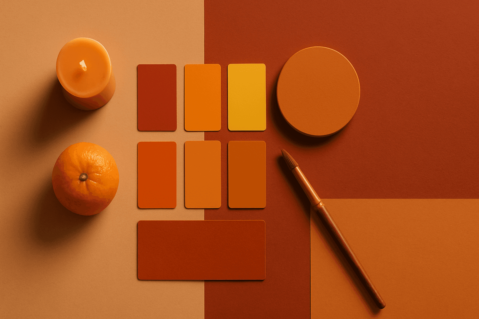
Warm Color Palette
Warm Color Palette is a practical keyword for guiding emotional tone. It can make a breakfast scene feel cozy, a travel image feel sunny, or a brand visual feel more approachable. Warm palettes are strong for commercial images because they connect quickly with themes like comfort, care, family, food, hospitality, wellness, and optimism. For beginners, this keyword is easier to control than listing many individual colors.