Monochrome Color Palette
Employing a monochrome color palette in AI-generated images allows for creating minimalistic yet striking visuals. By constraining colors to one hue family, creators can convey mood and style consistently while focusing on composition and detail. This technique excels in editorial photography, product presentations, and artistic portraits, where color distraction is minimized and storytelling through form and light is enhanced. Using monochrome prompts guides the AI to simulate realistic materials and subtle depth through nuanced shading, resulting in premium, polished images suitable for professional use.

Definition
A monochrome color palette is a design and artistic approach that involves using different shades, tints, and tones of a single base hue. In AI image prompts, it directs the model to limit colors to this range, creating a unified and harmonious appearance. This technique simplifies the image's visual complexity, emphasizing mood, texture, and form rather than diverse colors, making it ideal for focused compositional storytelling.
Prompt Formula
To incorporate a monochrome color palette in your AI prompts effectively, use phrases that specify the base color and encourage variations within that hue. Combine with lighting and texture descriptors for richness. Examples include:
- monochrome [color] palette, shades and tints
- using only variations of [color]
- single-hue color scheme with light and dark [color] tones
Best Use Cases
Monochrome palettes excel when imposing a strong stylistic or emotional tone. Ideal scenarios include:
- Minimalist editorial portraits emphasizing atmosphere and mood
- Product photography to highlight sleek design and brand colors
- Artistic interior shots focusing on texture and light rather than color diversity
Common Mistakes
Typical errors that dilute the effectiveness of monochrome prompts include:
- Requesting monochrome without specifying base hue causing unpredictable colors
- Using harsh lighting that flattens texture, losing subtle shading
- Mixing unrelated colors that break monochrome unity
- Ignoring material reflections which can affect color purity
Advanced Techniques
Elevate your monochrome prompts by combining them with style modifiers and refined constraints:
- Pair monochrome with realistic material descriptors, e.g., 'velvet in monochrome emerald tones'
- Use modifiers like 'soft shadows' or 'gentle gradients' to add depth
- Combine with lighting styles such as 'cinematic low key' for mood
- Add environmental context e.g., 'monochrome foggy blue forest' for atmosphere
Professional Workflow
Create consistent, polished monochrome images by following these steps:
- Brief: Define the exact base color and style mood
- Generate: Use specific monochrome prompt formulas with lighting and texture details
- Select: Choose images with clear tonal variation and material realism
- Refine: Adjust prompts iteratively focusing on shadow softness and color harmony
- Finalize: Enhance images with subtle post-processing for balance
Related Styles
Monochrome palettes align well with and complement several visual styles and keywords:
- Duotone Color Palette for two-color harmonies
- Neutral Color Palette for understated, earthy tones
- Gradients and Tints emphasizing smooth color transitions
FAQ
What is the main benefit of using a monochrome color palette in AI image prompts?
It creates a harmonious and focused aesthetic by limiting the image to one color hue, which emphasizes mood, texture, and form without distraction from multiple colors.
Can I specify any color for a monochrome palette in AI prompts?
Yes, specifying the base color (e.g., blue, sepia, gray) is important to guide the AI and ensure the image remains consistent with your intended palette.
Continue Exploring
Related Prompts

Soft Muted Color Palette
Using a Soft Muted Color Palette in AI-generated imagery influences the mood and style by incorporating subdued and delicate colors. This approach conveys sophistication, tranquility, and natural beauty, making visuals suitable for subtle branding, lifestyle photography, and editorial contexts. It avoids bright or saturated colors, instead emphasizing nuance and refinement. Artists and designers use it to evoke feelings of warmth, nostalgia, or modern minimalism, enhancing the visual narrative through controlled color harmony and soft contrasts.

Subtle Gradient Color Blends
Subtle Gradient Color Blends are an essential visual technique in AI-generated imagery that enhance the overall composition and mood by incorporating gentle shifts between hues. These blends create a polished, professional look by avoiding abrupt color changes and enabling a seamless flow that can simulate natural lighting, shadows, or material surfaces. Using subtle gradients in prompts encourages AI models to produce images with refined color transitions that elevate the realism and elegance, making them perfect for backgrounds, product visualization, or editorial illustrations. Incorporating subtle color gradients helps establish depth while maintaining a clean and sophisticated style, highly valued in modern design and digital art.

Duochrome Contrast Palette
Using a Duochrome Contrast Palette in AI-generated images involves combining two distinct contrasting colors to produce lively, attention-grabbing visuals. This method enhances compositions by providing a harmonious yet striking balance between two hues, often playing with differences in saturation, brightness, or temperature to add depth and vibrancy. Ideal for editorial designs, product renders, and artistic portraits, this palette style helps images stand out with refined color clarity and intensity, evoking strong mood and atmosphere.
Monochrome Warm Palette
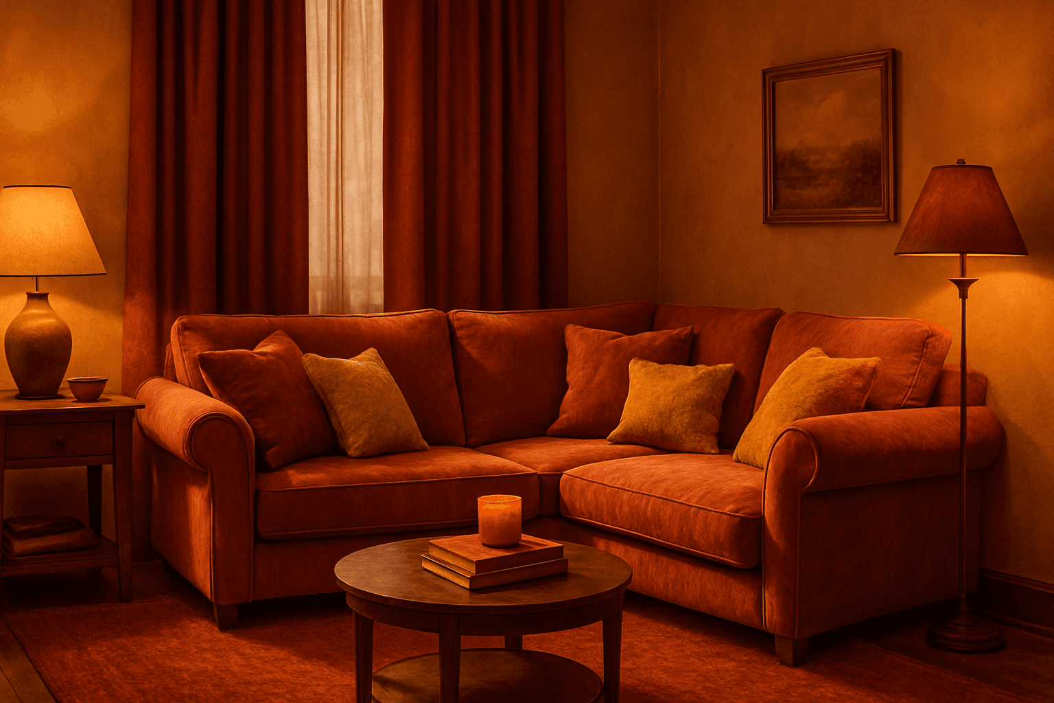
Applying a Monochrome Warm Palette in AI-generated images sets a unified, warm tone that evokes feelings of comfort, energy, and passion. This approach simplifies the color scheme by utilizing only warm colors that range from muted tans and terracottas to vibrant oranges and reds. It directs the AI image generation to avoid cool colors, keeping the visuals coherent and emotionally resonant. The result is a natural, aesthetically pleasing image with subtle depth, ideal for modern editorial designs or lifestyle photography that seeks to communicate warmth and intimacy without overwhelming complexity.
Muted Pastel Color Palette
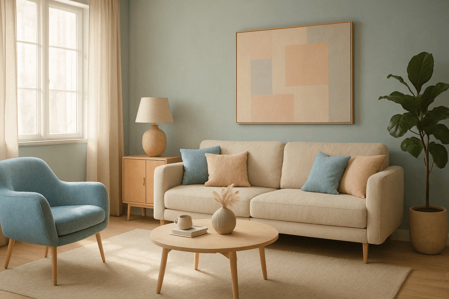
The muted pastel color palette blends the gentle softness of pastel tones with a restrained saturation level, resulting in colors that evoke tranquility and refinement. When integrated into AI image generation, these colors provide a versatile aesthetic that suits a variety of creative and commercial needs. This palette can transform images into visually soothing experiences, often appearing in editorial designs, fashion imagery, and lifestyle branding. It avoids the brightness and intensity typical of standard pastels, offering a more mature and elegant atmosphere. The muted pastels produce harmonious compositions by pairing subdued colors, ideal for designs requiring subtlety, sophistication, and approachability.

Vibrant Accent Color Palette
Utilizing a vibrant accent color palette in AI image prompts transforms ordinary visuals into striking compositions by introducing bright, focused colors that highlight important elements. This technique leverages contrast and saturation to guide viewers' eyes toward key areas, adding energy and visual interest. When combined with modern design principles—such as clean layouts, realistic materials, and refined lighting—these palettes elevate the quality of AI-generated images, making them ideal for editorial designs, marketing materials, and digital art projects.