Subtle Gradient Color Blends
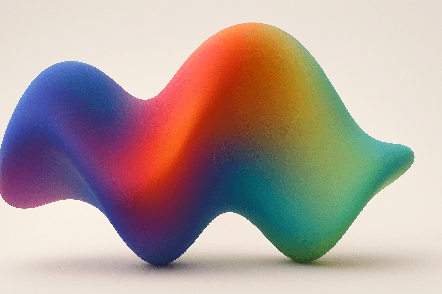
Subtle Gradient Color Blends are an essential visual technique in AI-generated imagery that enhance the overall composition and mood by incorporating gentle shifts between hues. These blends create a polished, professional look by avoiding abrupt color changes and enabling a seamless flow that can simulate natural lighting, shadows, or material surfaces. Using subtle gradients in prompts encourages AI models to produce images with refined color transitions that elevate the realism and elegance, making them perfect for backgrounds, product visualization, or editorial illustrations. Incorporating subtle color gradients helps establish depth while maintaining a clean and sophisticated style, highly valued in modern design and digital art.

Definition
Subtle Gradient Color Blends refer to gentle and gradual shifts between colors within an image, resulting in smooth transitions without abrupt changes. In AI image prompts, including this concept directs the model to produce softly blended hues that enhance depth and elegance, making images look more natural and sophisticated. This technique is especially valuable for backgrounds, lighting effects, and material renderings where refined color flow improves visual harmony.
Prompt Formula
To incorporate subtle gradient color blends effectively, combine descriptive color terms with modifier phrases that emphasize smooth transitions and softness. Use constructs such as "subtle gradient from [color1] to [color2]", "softly blended hues", or "gentle color transitions" alongside your subject. Enhancing with adjectives like "muted", "pastel", or "diffused light" helps refine the gradient's appearance.
- subtle gradient from [color1] to [color2]
- softly blended hues
- gentle color transitions
- muted pastel palette
- diffused ambient light
Best Use Cases
- Creating elegant background compositions for editorial and digital art
- Enhancing product renderings with natural-looking lighting gradients
- Designing UI elements and hero images with smooth color flows that convey sophistication
Advanced Techniques
Experienced prompt writers can refine subtle gradient color blends by integrating spatial or lighting constraints and layering multiple gradients for complex effects. Use directional cues like "horizontal subtle gradient" or "vertical soft color blend" to control flow. Combine with texture keywords such as "silky finish" or "matte surface" to affect material perception. Employ color harmony principles by specifying complementary or analogous colors, and constrain saturation and brightness for nuanced realism.
- Directional gradients: horizontal, vertical, radial
- Layering multiple gradients for depth
- Combining with texture descriptors: silky, matte, translucent
- Using color harmony: complementary or analogous colors
- Adjusting saturation and brightness levels
Professional Workflow
Begin by drafting a detailed creative brief describing the desired mood and color scheme. Experiment with prompts incorporating subtle gradient keywords and color pairs, generating multiple samples. Review outputs for smoothness and color harmony, selecting those with natural transitions and aesthetic balance. Refine prompts by specifying direction, saturation, or texture until the visual quality meets professional standards. Finally, post-process selected images if needed, ensuring color gradients maintain their subtlety and refinement across media.
Related Styles
- Muted Pastel Palettes
- Soft Light Diffusion Effects
- Seamless Color Transitions
Model-Specific Tips
When prompting modern AI image models, use clear, descriptive language emphasizing softness and smoothness rather than relying on technical jargon. Avoid overly complex gradient terms that may reduce output clarity. Incorporate color names recognized by most AI systems and specify gradient direction or blend style simply. Test prompt iterations and prefer modifiers like "softly blended" or "gentle transitions" to achieve subtlety consistently across models without dependency on specialized syntax.
FAQ
How do subtle gradient color blends improve AI image quality?
They create smooth and natural color transitions that enhance depth and realism, making images look more polished and visually appealing.
Can I use subtle gradient blends for any image subject?
Yes, especially effective for backgrounds, lighting, textures, and abstract compositions where smooth color flow adds sophistication.
What prompt modifiers help create subtle gradients?
Phrases like "softly blended hues," "gentle color transitions," and specifying colors with gradual shifts aid in producing subtle gradients.
Continue Exploring
Related Prompts

Pastel Gradient Color Scheme
The pastel gradient color scheme is popular in AI-generated art for its serene and inviting aesthetic. It involves the blending of light, desaturated pastel tones in gradual transitions, which can add depth and softness to visuals without overwhelming details. Using this keyword in prompts helps create backgrounds, themes, or focal areas that evoke feelings of calmness and subtle sophistication. This scheme often suits digital art, branding visuals, and UI elements where gentle color progression supports readability and aesthetic appeal. Its balanced and harmonious style enhances mood and focuses attention, making it a versatile choice in many design contexts.
Gradient Mesh Coloring
Gradient mesh coloring enriches AI-generated images by introducing smooth, multidirectional color blends that mimic real-life shading and lighting nuances. Unlike standard gradients, which follow linear or radial flows, gradient meshes form intricate color maps over an object's surface, allowing fine control over color shifts and highlights. When used in AI prompts, this keyword encourages the model to create images with sophisticated color depth, making visuals feel more natural and textured. This effect is especially powerful in subjects requiring realistic rendering of materials like fabric, skin, or liquid, as well as in abstract compositions demanding refined chromatic transitions.

Gradient Sky Colors
Incorporating Gradient Sky Colors into AI-generated images significantly enhances the atmospheric quality and visual depth of outdoor scenes. By blending multiple hues in a smooth, gradual fashion, these skies offer a natural yet captivating backdrop that supports various themes such as serenity, romance, or drama. This keyword is especially useful in settings featuring landscapes, cityscapes, or fantasy environments, enriching the emotional tone of an image. Using gradient skies in prompts allows creators to move beyond flat or uniform color skies, enabling more dynamic and mood-driven outputs that resonate well in editorial, advertising, and artistic contexts.

Monochrome Color Palette
Employing a monochrome color palette in AI-generated images allows for creating minimalistic yet striking visuals. By constraining colors to one hue family, creators can convey mood and style consistently while focusing on composition and detail. This technique excels in editorial photography, product presentations, and artistic portraits, where color distraction is minimized and storytelling through form and light is enhanced. Using monochrome prompts guides the AI to simulate realistic materials and subtle depth through nuanced shading, resulting in premium, polished images suitable for professional use.

Pastel Color Harmonies
Pastel Color Harmonies are essential for creating gentle and visually pleasing images that emphasize softness and subtlety in color. Using pastel palettes, AI-generated images gain a delicate aesthetic often associated with calm, elegance, and modern minimalism. This approach mitigates harsh contrasts and intense hues, producing visuals ideal for editorial content, branding, and art that need a serene or sophisticated vibe. Incorporating pastel harmonies into AI prompts modifies the image’s overall mood, making scenes feel airy and inviting while maintaining a coherent and balanced color distribution.

Soft Muted Color Palette
Using a Soft Muted Color Palette in AI-generated imagery influences the mood and style by incorporating subdued and delicate colors. This approach conveys sophistication, tranquility, and natural beauty, making visuals suitable for subtle branding, lifestyle photography, and editorial contexts. It avoids bright or saturated colors, instead emphasizing nuance and refinement. Artists and designers use it to evoke feelings of warmth, nostalgia, or modern minimalism, enhancing the visual narrative through controlled color harmony and soft contrasts.