Gradient Sky Colors
Incorporating Gradient Sky Colors into AI-generated images significantly enhances the atmospheric quality and visual depth of outdoor scenes. By blending multiple hues in a smooth, gradual fashion, these skies offer a natural yet captivating backdrop that supports various themes such as serenity, romance, or drama. This keyword is especially useful in settings featuring landscapes, cityscapes, or fantasy environments, enriching the emotional tone of an image. Using gradient skies in prompts allows creators to move beyond flat or uniform color skies, enabling more dynamic and mood-driven outputs that resonate well in editorial, advertising, and artistic contexts.

Definition
Gradient Sky Colors refer to the gradual blending of multiple hues across the sky area in an image, creating smooth color transitions that evoke natural or artistic lighting effects. When applied in AI image prompts, it directs the model to generate skies that change color fluidly, enhancing mood and atmospheric depth.
Visual Characteristics
- Seamless color transitions blending shades like blue, pink, orange, and purple
- Naturalistic or stylized gradation implying time of day such as dawn or dusk
- Atmospheric depth with subtle lighting shifts in the sky area
Prompt Formula
Use this template to incorporate Gradient Sky Colors effectively: "[subject] under a [time of day] sky with gradient sky colors blending [color1] to [color2] and [color3], soft lighting, realistic atmosphere". Examples include specifying moods or scenes like sunrise or twilight for natural gradient effects.
Best Use Cases
- Landscape photography or art emphasizing natural sky transitions
- Backgrounds for editorial or advertising visuals seeking mood enhancement
- Fantasy or concept art requiring vibrant and atmospheric skies
Creative Variations
To diversify images using Gradient Sky Colors, experiment with different styles such as photorealistic or painterly techniques. Vary lighting by simulating golden hour, twilight, or stormy skies. Change composition by framing with silhouettes, reflections on water, or expansive horizons. Color variations can explore pastel tones, intense sunsets, or cool dawn atmospheres, enriching prompt outcomes.
Industry Applications
- Advertising campaigns needing captivating and emotional outdoor scenes
- Editorial imagery for magazines focusing on nature, travel, and lifestyle
- Ecommerce product photography utilizing atmospheric backgrounds for enhanced appeal
Model-Specific Tips
When working with various AI image models, include 'gradient sky colors' with precise color descriptors and lighting conditions to maximize fidelity. Avoid ambiguous terms; instead, specify color transitions and times of day. Experiment with adding modifiers like 'photorealistic' or 'soft glow' to better guide models. Always iterate with small prompt tweaks to capture the desired gradient effect reliably.
FAQ
How do Gradient Sky Colors affect AI image generation?
They instruct the AI to create skies with smooth, natural or artistic color transitions, enhancing depth, mood, and visual appeal in generated images.
Can I specify exact colors for gradient skies in prompts?
Yes, including specific colors and transition directions helps the AI produce more accurate and customized gradient sky effects.
Continue Exploring
Related Prompts
Subtle Gradient Color Blends
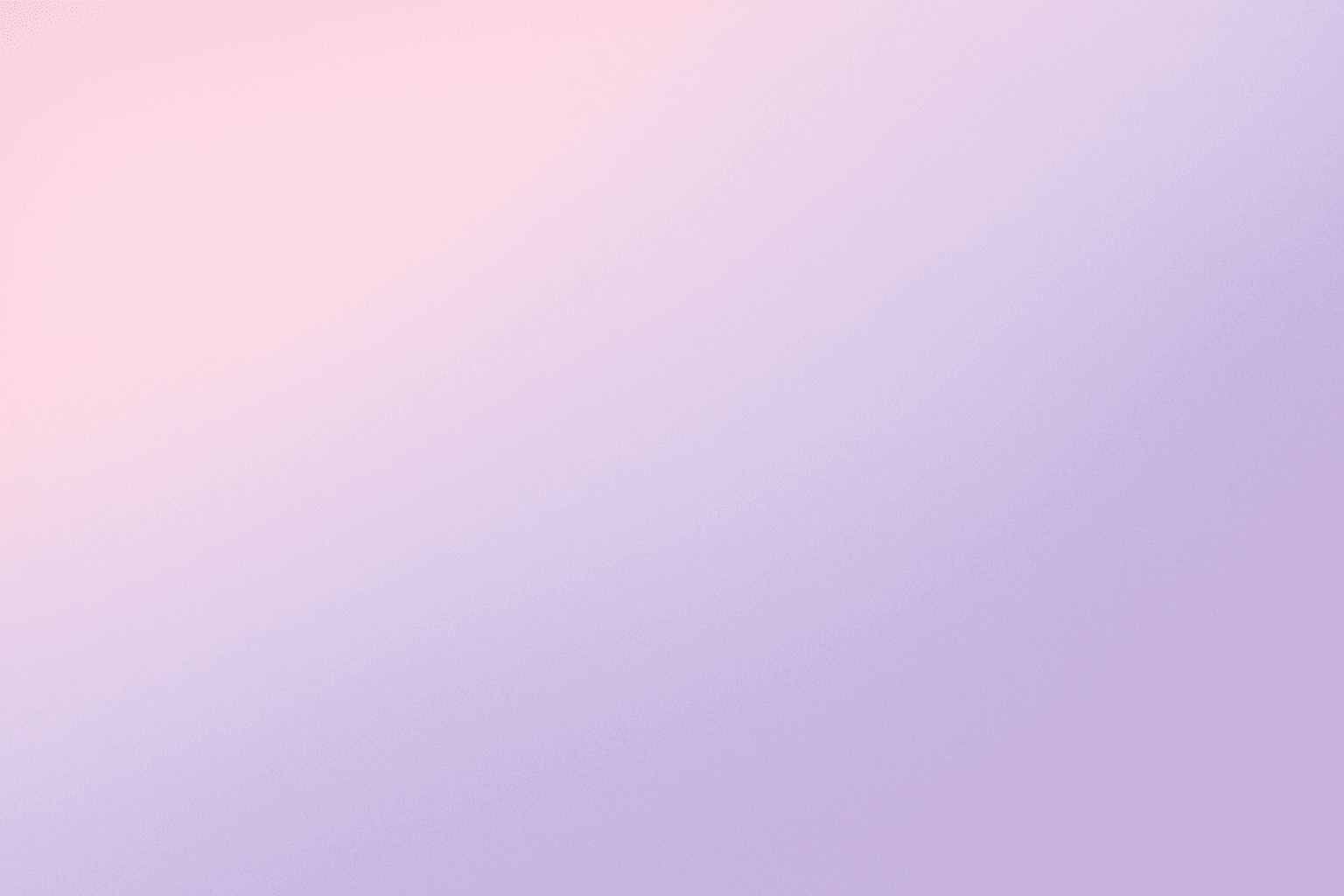
Subtle Gradient Color Blends are an essential visual technique in AI-generated imagery that enhance the overall composition and mood by incorporating gentle shifts between hues. These blends create a polished, professional look by avoiding abrupt color changes and enabling a seamless flow that can simulate natural lighting, shadows, or material surfaces. Using subtle gradients in prompts encourages AI models to produce images with refined color transitions that elevate the realism and elegance, making them perfect for backgrounds, product visualization, or editorial illustrations. Incorporating subtle color gradients helps establish depth while maintaining a clean and sophisticated style, highly valued in modern design and digital art.
Gradient Colors
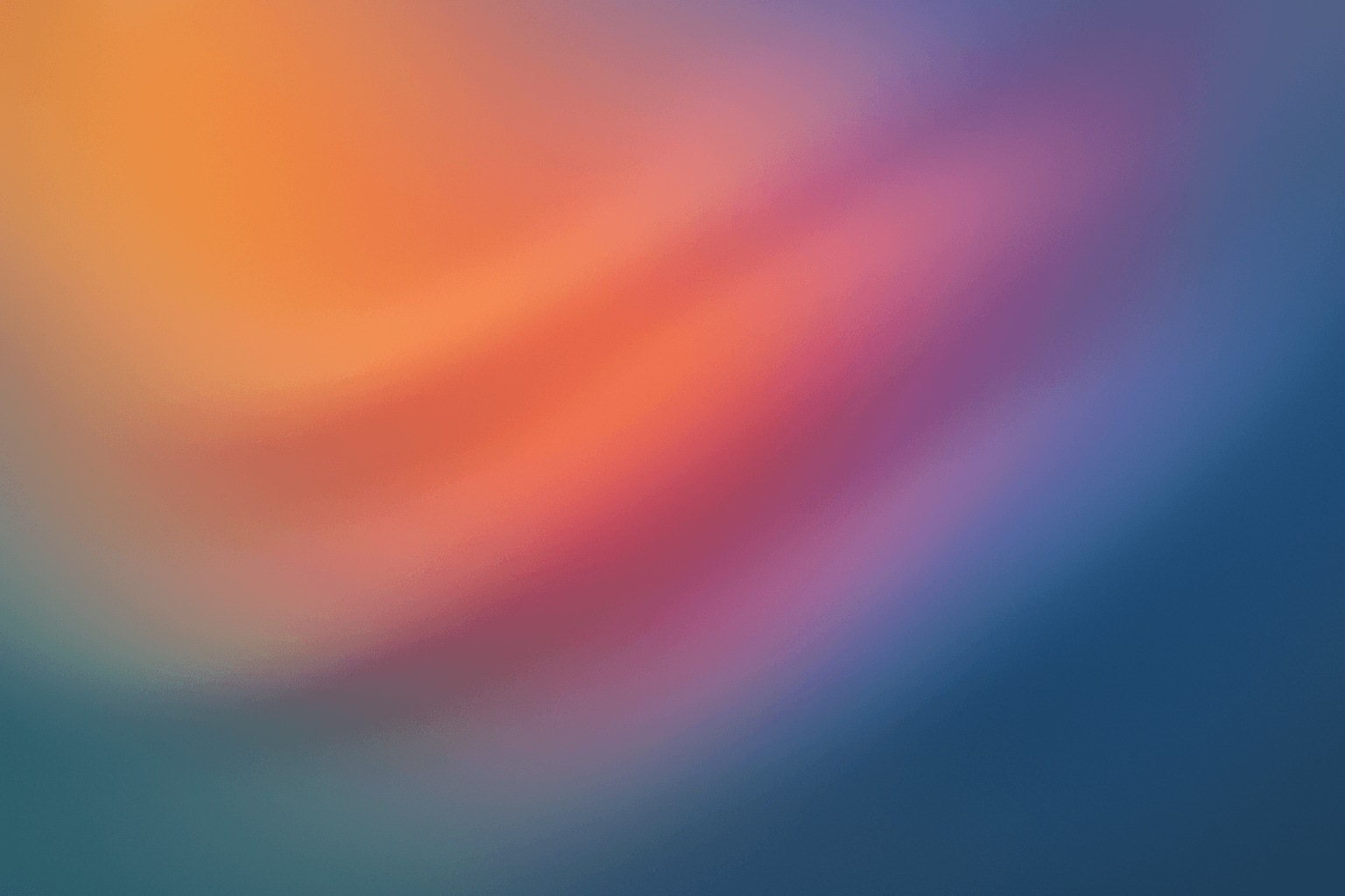
Gradient colors are a popular design element characterized by a seamless shift between two or more colors. They range from subtle transitions, such as a light blush to soft pink, to vibrant combinations like bright blue fading into emerald green. Used widely in digital design, web interfaces, branding, and art, gradients add visual interest and guide the viewer's eye across a composition. Modern tools allow designers to customize gradients with various styles — linear, radial, angular, or diamond-shaped — enhancing the flexibility and creative potential of this technique.

Pastel Gradient Color Scheme
The pastel gradient color scheme is popular in AI-generated art for its serene and inviting aesthetic. It involves the blending of light, desaturated pastel tones in gradual transitions, which can add depth and softness to visuals without overwhelming details. Using this keyword in prompts helps create backgrounds, themes, or focal areas that evoke feelings of calmness and subtle sophistication. This scheme often suits digital art, branding visuals, and UI elements where gentle color progression supports readability and aesthetic appeal. Its balanced and harmonious style enhances mood and focuses attention, making it a versatile choice in many design contexts.
Deep Jewel Tones
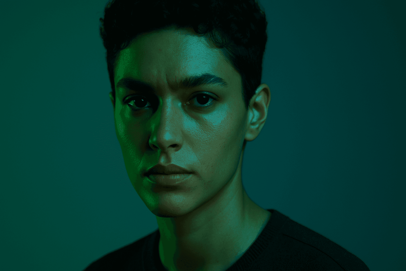
Deep jewel tones are a color category that draws inspiration from the vibrant and saturated hues of gemstones such as emeralds, sapphires, rubies, and amethysts. Using these colors in AI-generated images results in visuals that feel elegant, deep, and luxurious. The intense saturation combined with a natural richness adds emotional depth and visual interest without overwhelming the composition. This palette is especially effective for creating sophisticated editorial portraits, stylish fashion imagery, and premium product photography. By specifying 'deep jewel tones' in prompts, artists and creators can reliably evoke a refined atmosphere with distinctive, eye-catching colors.

High Saturation Color Palette
Utilizing a High Saturation Color Palette in AI image generation transforms visuals into bold, lively compositions that capture attention instantly. This approach amplifies the color intensity beyond natural or muted levels, creating a vivid scene bursting with hues that feel powerful and immersive. Often chosen for marketing materials, modern art visuals, and stylized photography, artworks generated with high saturation evoke energetic and emotional responses. When combined thoughtfully with lighting, texture, and composition, it creates a striking balance of vibrancy and clarity, making it ideal for covers, header images, and creative projects needing dynamic coloring.
Muted Earth Tone Colors
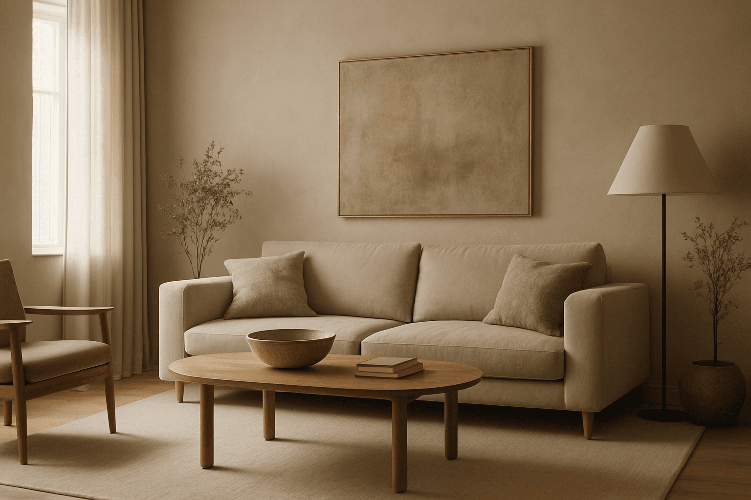
Muted earth tone colors encapsulate a palette inspired by nature’s subtle and calming shades such as soft browns, gentle greens, warm ochres, and quiet grays. When integrated into AI image prompts, these colors help generate images that feel organic, grounded, and harmonious, making them ideal for designs seeking understated elegance or a natural aesthetic. This approach avoids harsh contrasts and bright tones, providing visuals that are soothing and visually balanced. Such color schemes are especially useful in editorial photography, interior design renderings, and lifestyle imagery, where authenticity and warmth are key. Utilizing these tones can transform generic visuals into cohesive, premium-feeling compositions that align with modern aesthetic trends.