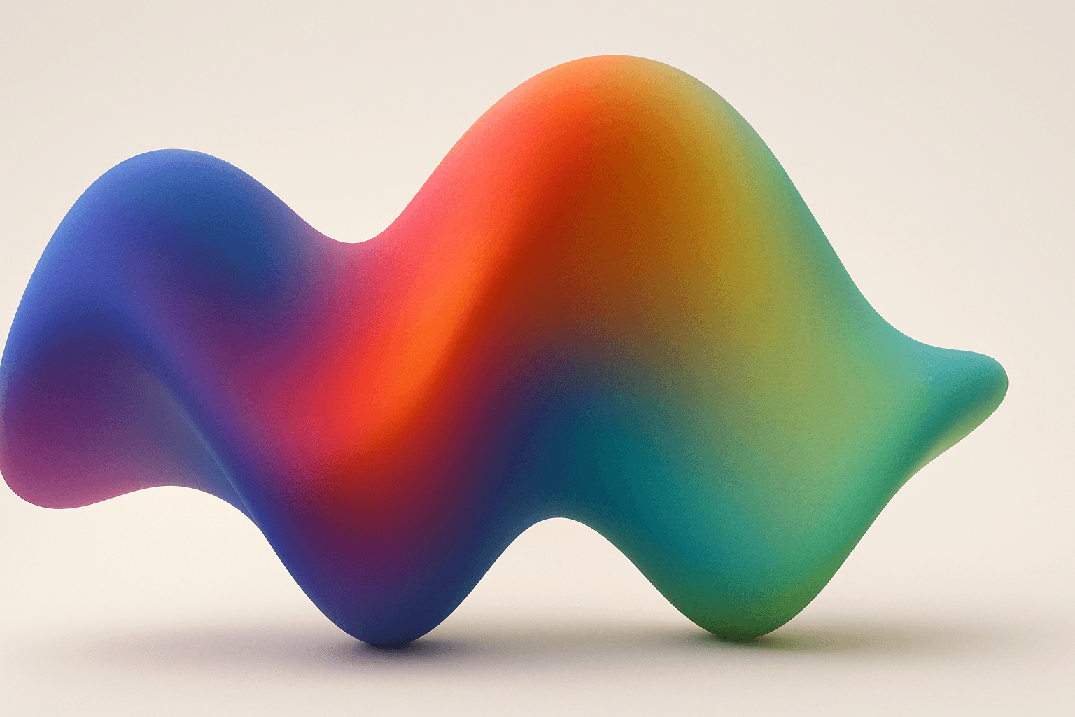
Gradient Mesh Coloring
Gradient mesh coloring enriches AI-generated images by introducing smooth, multidirectional color blends that mimic real-life shading and lighting nuances. Unlike standard gradients, which follow linear or radial flows, gradient meshes form intricate color maps over an object's surface, allowing fine control over color shifts and highlights. When used in AI prompts, this keyword encourages the model to create images with sophisticated color depth, making visuals feel more natural and textured. This effect is especially powerful in subjects requiring realistic rendering of materials like fabric, skin, or liquid, as well as in abstract compositions demanding refined chromatic transitions.
Definition
Gradient mesh coloring refers to a technique utilizing a grid of points overlaid on an image or shape, where colors at each mesh point blend smoothly across adjacent areas. This creates natural, multidirectional gradients, enhancing realism and depth. When included in AI image prompts, it signals the AI to generate color transitions that mimic this complex, soft shading style, elevating the visual richness compared to flat or linear gradients.
Prompt Formula
Construct prompts that combine subject descriptions with gradient mesh coloring to guide detailed color blending. Examples include specifying materials, lighting, and color transitions.
- [Subject] with gradient mesh coloring and natural light
- [Material] rendered with smooth gradient mesh shading
- Abstract background featuring intricate gradient mesh color transitions
Best Use Cases
- Hyperrealistic portraits needing natural skin tone transitions
- Product images capturing fine surface details and reflections
- Abstract or decorative art emphasizing complex, smooth color fades
Industry Applications
Gradient mesh coloring is valuable across commercial fields that demand realistic or elegant color manipulation. In advertising, it enhances product imagery by adding material authenticity. Editorial design benefits through visually engaging magazine covers or illustrations with subtle shading. E-commerce platforms use it to showcase products like textiles or cosmetics with lifelike color depth, improving buyer confidence and visual appeal.
- Advertising visuals for high-end products
- Editorial illustrations and fashion magazines
- E-commerce product photography and digital catalogs
Common Mistakes
Prompt users often overuse 'gradient' terms without specifying mesh-related complexity, leading to generic or flat transitions. Another pitfall is failing to pair gradient mesh coloring with lighting cues, which can result in unrealistic or muddy colors. Avoid vague color instructions; clarity in shades and blending style ensures the AI produces nuanced, clean gradations rather than harsh or inconsistent colors.
- Using only 'gradient' without 'mesh' distinction
- Omitting lighting or material context in prompts
- Vague color descriptions causing muddy blends
Advanced Techniques
Combine gradient mesh coloring with constraints like specific color palettes or directional light sources for greater control. Use modifiers such as 'soft shadows' or 'translucent surfaces' alongside to add realism. Experiment with hybrid styles by integrating gradient mesh with vector art or photorealistic textures, leveraging the AI’s ability to blend multiple elements seamlessly.
- Specify color palettes to direct hue transitions precisely
- Add lighting conditions like 'soft morning light'
- Combine with styles like 'vector shading' or 'photorealistic texture'
Professional Workflow
Start by defining the subject and color requirements clearly, adding 'gradient mesh coloring' to emphasize smooth, rich color blends. Generate multiple image variants with adjusted light or palette parameters. Curate selections focusing on color depth and natural gradations. Refine chosen images via minor prompt tweaks or post-generation editing to enhance subtlety and prevent color bleed.
- Brief with detailed color and lighting info plus gradient mesh coloring
- Generate diverse outputs with varying palettes or shadows
- Select images with smooth, natural color transitions
- Refine with prompt variations or minor digital edits
Related Styles
Gradient mesh coloring pairs well with styles emphasizing realism, such as photorealistic rendering, vector shading, and digital painting. Adjacent PromptAtlas keywords include 'Gradient Blending' for simpler color fades, 'Color Transition Mapping' focusing on controlled color flow, and 'Mesh Shading' which covers complex shadow and light nuances within meshes.
- Photorealistic Rendering
- Gradient Blending
- Mesh Shading
FAQ
What makes gradient mesh coloring different from regular gradients?
Gradient mesh coloring uses a network of points allowing multi-directional, subtle color blending across surfaces, unlike regular gradients that usually flow linearly or radially, resulting in more complex and realistic shading.
Can I use gradient mesh coloring for abstract designs?
Yes, gradient mesh coloring is excellent for abstract compositions where intricate, smooth color transitions enhance visual interest and provide vibrant, flowing effects.
Continue Exploring
Related Prompts

Gradient Colors
Gradient colors are a popular design element characterized by a seamless shift between two or more colors. They range from subtle transitions, such as a light blush to soft pink, to vibrant combinations like bright blue fading into emerald green. Used widely in digital design, web interfaces, branding, and art, gradients add visual interest and guide the viewer's eye across a composition. Modern tools allow designers to customize gradients with various styles — linear, radial, angular, or diamond-shaped — enhancing the flexibility and creative potential of this technique.
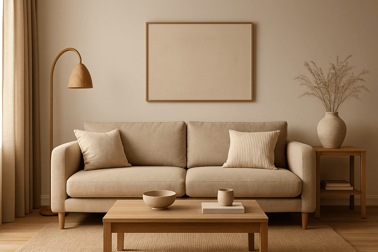
Warm Neutral Palette
The Warm Neutral Palette is a popular color scheme choice in design and AI-generated imagery for its timeless and soothing qualities. This palette combines warm earthy tones with soft neutrals, producing images that feel natural and approachable. Incorporating warm neutrals can enhance mood by bringing subtle warmth and comfort to visuals without overpowering them. When added to AI prompts, it guides the model to emphasize harmonious colors that evoke calmness and sophistication. The palette works well across various genres, including lifestyle, interiors, fashion, and nature themes, helping create polished and refined visuals suitable for editorial or commercial use.
Desaturated Colors
In AI image generation, 'desaturated colors' guide models to produce images with toned-down color intensity, resulting in a muted and understated appearance. This technique is valuable for conveying moods such as tranquility, nostalgia, or elegance by avoiding overly bright or saturated colors. Using desaturated colors can help shift the focus to composition, texture, and lighting rather than vivid color contrasts, making images more versatile for editorial content, fashion, or natural scenes. It balances realism and artistic subtlety, especially when paired with refined lighting and soft shadows to emphasize material qualities and depth.
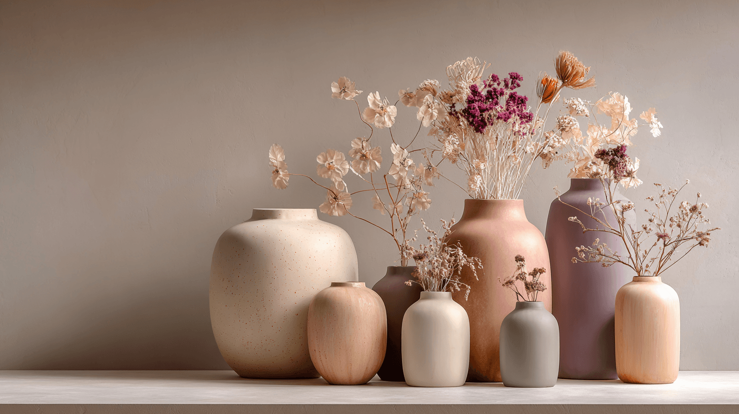
Morandi Palette
Morandi Palette is a color keyword inspired by the quiet, dusty tones associated with painter Giorgio Morandi. In AI image prompts, it usually points the model toward muted, low-saturation colors such as dusty rose, warm gray, clay, sage, beige, soft blue, faded mauve, and stone. The effect is refined, calm, and slightly editorial. This palette is useful when you want an image to feel sophisticated without becoming cold or overly minimal. For beginners, Morandi Palette is a practical way to control color harmony. It can make a scene feel more tasteful, cohesive, and brand-ready, especially when default AI colors look too bright or artificial.
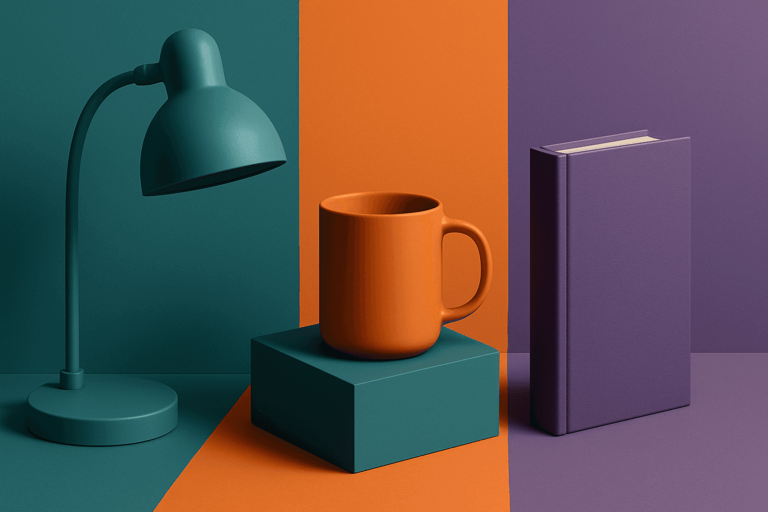
Triadic Color Scheme
The triadic color scheme is a classic color theory concept widely used in art and design, characterized by choosing three colors equally spaced around the color wheel, such as red, yellow, and blue. This approach produces vibrant, balanced images that are visually stimulating yet cohesive. When integrated into AI image generation prompts, directing the model to use a triadic palette influences the overall color composition, encouraging distinct color blocks or gradients that harmonize well. This can be particularly useful for achieving dynamic but balanced aesthetics, making compositions stand out while maintaining visual unity. Triadic schemes often evoke a lively, engaging mood, suitable for varied creative fields including branding, illustration, and editorial design.

Jewel Tone Colors
Jewel tone colors are a palette of rich, saturated hues inspired by natural gemstones like emerald green, sapphire blue, ruby red, and amethyst purple. These colors are known for their vibrant intensity and luxurious feel, making them popular across various creative fields including fashion, interior design, and digital art. Jewel tones stand out for their ability to add depth and sophistication to compositions, offering a bold yet elegant aesthetic. Their luminous quality helps convey a sense of opulence and timeless beauty, making them favored choices for premium design projects and high-end branding.