Analogous Warm Color Scheme
Analogous Warm Color Schemes employ colors adjacent on the color wheel within warm tones—reds, oranges, and yellows—to produce harmonious, vibrant images. In AI-generated art, specifying this scheme guides the model to focus on these related colors, resulting in visuals that feel unified and energetic. This scheme evokes warmth, comfort, and optimism, excellent for compositions needing a welcoming or lively mood. Using it strategically in prompts helps artists and designers achieve balanced, naturally blended color palettes that enhance emotional impact without overwhelming the viewer.

Definition
An Analogous Warm Color Scheme in AI image prompting refers to using colors adjacent on the color wheel within warm hues—mainly reds, oranges, and yellows—to create visual harmony and cohesion. This approach ensures generated images maintain a consistent warm feel and natural blending of colors by guiding the AI to emphasize related warm tones.
Prompt Formula
Use these patterns to incorporate an Analogous Warm Color Scheme effectively: - "[subject] with an analogous warm color scheme featuring reds, oranges, and yellows" - "[scene] illuminated by warm, analogous colors such as burnt orange, amber, and marigold" - "vivid [subject] bathed in harmonious warm hues: red, orange, yellow, smooth transitions" These formulas help the AI focus on a cohesive warm palette while maintaining creative flexibility.
- [subject] with an analogous warm color scheme featuring reds, oranges, and yellows
- [scene] illuminated by warm, analogous colors such as burnt orange, amber, and marigold
- vivid [subject] bathed in harmonious warm hues: red, orange, yellow, smooth transitions
Best Use Cases
This color scheme excels in situations needing warmth and cohesion: - Autumnal landscapes and nature scenes - Cozy, inviting interior design visualizations - Portraits and fashion photography emphasizing warm lighting Its dynamic yet harmonious palette energizes images without overwhelming viewers.
- Autumn-themed digital paintings or landscapes
- Warm, cozy interior design presentations
- Portraits with warm ambient or natural light
Industry Applications
Analogous Warm Color Schemes serve well across diverse commercial fields: - Advertising that evokes feelings of energy, passion, or comfort - Editorial content focusing on lifestyle, wellness, or seasonal topics - Ecommerce product imagery promoting warmth-related items like textiles or food Utilizing this color scheme helps brands create emotionally resonant visuals that engage their target audiences effectively.
- Advertising campaigns conveying warmth and enthusiasm
- Editorial illustrations for lifestyle and wellness magazines
- Ecommerce visuals for cozy or seasonal products
Common Mistakes
Typical errors include: - Using overly saturated reds and yellows causing visual fatigue - Introducing colors outside the adjacent warm range, breaking harmony - Neglecting subtle tonal variations that add depth To avoid these, maintain balanced saturation, limit palette strictly to warm adjacent hues, and use shading or light variations for realistic depth.
- Avoid excessively bright or clashing warm tones
- Do not mix in cool colors disrupting the analogous effect
- Incorporate variations in brightness and saturation for visual interest
FAQ
What makes an analogous warm color scheme different from other color schemes?
It focuses on colors next to each other on the color wheel within the warm spectrum—mainly reds, oranges, and yellows—creating a harmonious, cozy palette without strong contrast found in complementary schemes.
Can I mix analogous warm colors with cool colors in AI prompts?
While possible, mixing warm with cool colors can reduce the cohesive harmony of an analogous warm scheme and lead to less visually unified results unless carefully balanced.
Continue Exploring
Related Prompts
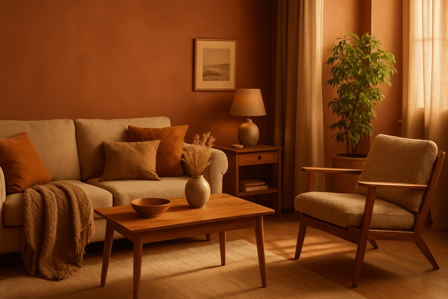
Earthy Warm Color Scheme
The Earthy Warm Color Scheme is a popular choice for artists and designers aiming to create images that feel natural, comforting, and connected to the environment. By focusing on warm, muted earth tones, this scheme lends a timeless aesthetic suited for a variety of subjects, including landscapes, portraits, interiors, and product shots. Using this palette in AI image prompts can help achieve visuals that emphasize quiet warmth and natural beauty, often evoking rustic charm or bohemian moods. It's well-suited for editorial photography, lifestyle branding, and environmental themes, enhancing images with a sophisticated yet approachable mood.
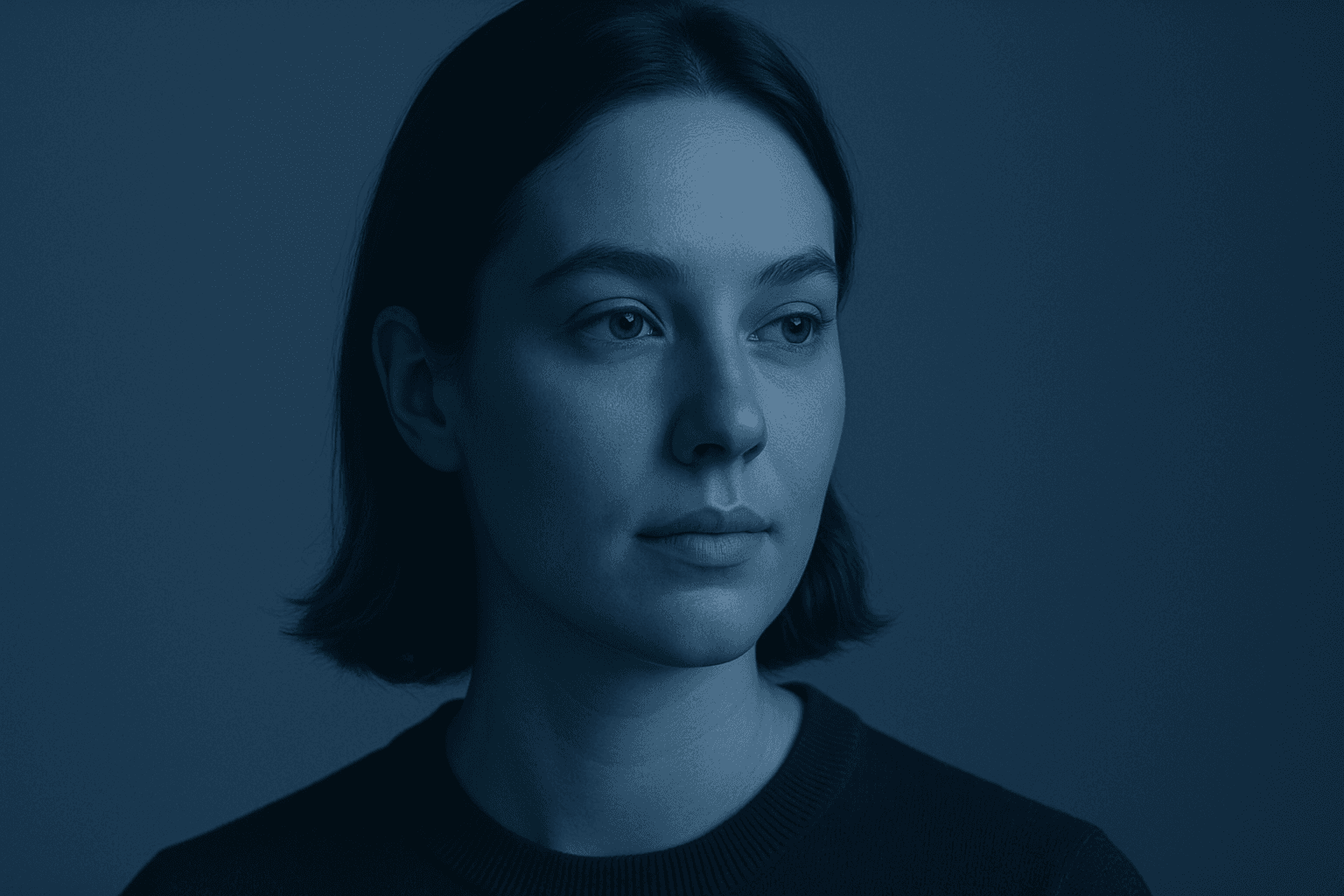
Monochromatic Color Scheme
Monochromatic color schemes leverage variations of one hue, combined with black or white, to build visually appealing images that convey mood and cohesiveness. This approach simplifies color interactions, allowing AI-generated artworks to focus on texture, lighting, and detail without distraction from multiple colors. In prompt engineering, adding this keyword helps produce images with elegant color unity often favored in editorial, fashion, and product photography. It aids in evoking specific emotions like calmness, sophistication, or minimalism by restricting the palette and accentuating tonal relationships.

Analogous Color Schemes
Analogous color schemes bring a visually pleasing harmony to AI-generated images by combining hues that neighbor each other on the color wheel. This creates images with gentle transitions and a cohesive mood, avoiding stark contrasts. When used in prompts, this scheme helps produce illustrations, photography-style renders, or digital art that feel naturally balanced—ideal for themes that require softness or unity like nature scenes, interiors, or fashion visuals. This approach makes images feel comfortable and inviting without overwhelming the viewer.
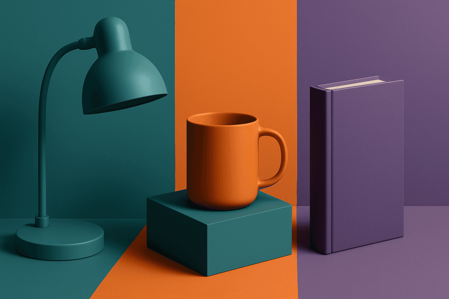
Triadic Color Scheme
The triadic color scheme is a classic color theory concept widely used in art and design, characterized by choosing three colors equally spaced around the color wheel, such as red, yellow, and blue. This approach produces vibrant, balanced images that are visually stimulating yet cohesive. When integrated into AI image generation prompts, directing the model to use a triadic palette influences the overall color composition, encouraging distinct color blocks or gradients that harmonize well. This can be particularly useful for achieving dynamic but balanced aesthetics, making compositions stand out while maintaining visual unity. Triadic schemes often evoke a lively, engaging mood, suitable for varied creative fields including branding, illustration, and editorial design.

Pastel Gradient Color Scheme
The pastel gradient color scheme is popular in AI-generated art for its serene and inviting aesthetic. It involves the blending of light, desaturated pastel tones in gradual transitions, which can add depth and softness to visuals without overwhelming details. Using this keyword in prompts helps create backgrounds, themes, or focal areas that evoke feelings of calmness and subtle sophistication. This scheme often suits digital art, branding visuals, and UI elements where gentle color progression supports readability and aesthetic appeal. Its balanced and harmonious style enhances mood and focuses attention, making it a versatile choice in many design contexts.

Muted Pastel Color Scheme
The muted pastel color scheme is popular in digital art and design for its delicate, understated quality. Unlike vibrant pastels, muted pastels involve desaturation and slight grey undertones, delivering a refined and peaceful visual experience. When included in AI image prompts, it guides models to focus on gentle colors that evoke softness and subtlety, making the images feel airy and inviting rather than vivid or loud. This approach works well for lifestyle, fashion, illustration, and branding content that aims to be modern, approachable, and aesthetically pleasing while maintaining elegance.