Analogous Color Schemes
Analogous color schemes bring a visually pleasing harmony to AI-generated images by combining hues that neighbor each other on the color wheel. This creates images with gentle transitions and a cohesive mood, avoiding stark contrasts. When used in prompts, this scheme helps produce illustrations, photography-style renders, or digital art that feel naturally balanced—ideal for themes that require softness or unity like nature scenes, interiors, or fashion visuals. This approach makes images feel comfortable and inviting without overwhelming the viewer.

Definition
An analogous color scheme in AI image prompts refers to specifying colors that lie next to each other on the color wheel. Using this palette guides the AI to produce images with harmonious and smooth color transitions, creating a unified and pleasing visual effect. This contrasts with other schemes that use contrasting or widely spaced colors. For beginners, including an analogous scheme means instructing the AI to blend related colors that evoke calmness or cohesion.
Visual Characteristics
- Colors smoothly blending with minimal harsh contrast
- Image dominated by hues within a narrow segment of the color wheel
- A balanced, restful mood conveyed through color relationships
Prompt Formula
To create an AI prompt using an analogous color scheme, start by choosing a base color and list two or three adjacent colors on the color wheel. Combine these in descriptive phrases that define the color palette, alongside the image subject and style. This formula helps standardize prompts for harmonious output.
- [Subject] with an analogous color scheme of [Color 1], [Color 2], and [Color 3]
- Description of lighting or mood to enhance colors, e.g., soft natural light, cinematic lighting
- Style or setting keywords, e.g., modern interior, vibrant landscape
Best Use Cases
- Designing interiors with naturally harmonious color palettes
- Creating nature scenes or landscapes that feel authentic and visually cohesive
- Fashion or editorial portraits emphasizing coordinated warm or cool tones
Related Styles
- Complementary Color Schemes — contrasting but balanced hues
- Monochromatic Color Palettes — variations of a single hue
- Triadic Color Schemes — three equally spaced colors for dynamic harmony
Model-Specific Tips
When working with modern AI image models, specify the exact colors that form your analogous scheme (e.g., blue, teal, and turquoise) for clearer output. Use descriptive modifiers like "soft transitions" or "harmonious color blending" to reinforce the palette intent. Also, pair color scheme instructions with explicit lighting and style details to guide color rendering behavior consistently across different AI engines.
FAQ
What is an analogous color scheme in AI image generation?
It is a color palette using adjacent colors on the color wheel to create harmonious and visually smooth images in AI-generated content.
Why use analogous colors in AI prompts?
They produce images with natural color harmony, avoiding harsh contrasts and enhancing mood and cohesion.
Can I combine analogous schemes with other styles?
Yes, analogous colors work well alongside styles like complementary or monochromatic palettes for varied effects.
Continue Exploring
Related Prompts

Analogous Warm Color Scheme
Analogous Warm Color Schemes employ colors adjacent on the color wheel within warm tones—reds, oranges, and yellows—to produce harmonious, vibrant images. In AI-generated art, specifying this scheme guides the model to focus on these related colors, resulting in visuals that feel unified and energetic. This scheme evokes warmth, comfort, and optimism, excellent for compositions needing a welcoming or lively mood. Using it strategically in prompts helps artists and designers achieve balanced, naturally blended color palettes that enhance emotional impact without overwhelming the viewer.

Pastel Color Harmonies
Pastel Color Harmonies are essential for creating gentle and visually pleasing images that emphasize softness and subtlety in color. Using pastel palettes, AI-generated images gain a delicate aesthetic often associated with calm, elegance, and modern minimalism. This approach mitigates harsh contrasts and intense hues, producing visuals ideal for editorial content, branding, and art that need a serene or sophisticated vibe. Incorporating pastel harmonies into AI prompts modifies the image’s overall mood, making scenes feel airy and inviting while maintaining a coherent and balanced color distribution.
Triadic Color Harmonies
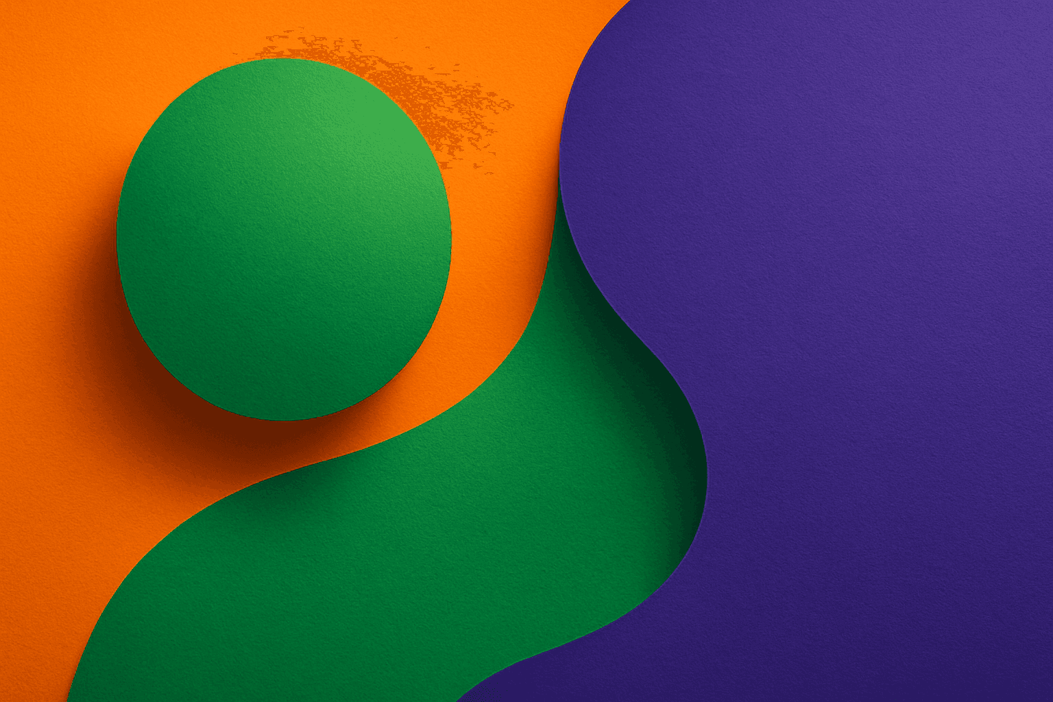
Triadic color harmonies provide a powerful method to generate visually striking AI images with balanced contrast. By selecting three colors evenly distributed on the color wheel, this technique injects vibrancy and diversity into the palette while maintaining harmony. When included in AI image prompts, it helps produce compositions that pop with color but remain cohesive, suitable for a wide range of creative projects. This approach avoids monotone or clashing visuals and offers a natural yet exciting look. Understanding and applying triadic color harmonies in prompts empowers creators to craft images that stand out with rich, lively color schemes across digital art, design mockups, and branding visuals.

Muted Pastel Color Scheme
The muted pastel color scheme is popular in digital art and design for its delicate, understated quality. Unlike vibrant pastels, muted pastels involve desaturation and slight grey undertones, delivering a refined and peaceful visual experience. When included in AI image prompts, it guides models to focus on gentle colors that evoke softness and subtlety, making the images feel airy and inviting rather than vivid or loud. This approach works well for lifestyle, fashion, illustration, and branding content that aims to be modern, approachable, and aesthetically pleasing while maintaining elegance.
Pastel Color Harmony
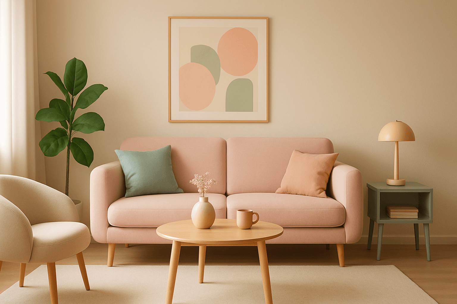
Pastel color harmony is a visually appealing approach that uses pale and muted colors to evoke feelings of softness, tranquility, and sophistication. By incorporating pastel tones, AI-generated images achieve a delicate balance that feels inviting and elegant without overwhelming the viewer. This makes pastel harmonies ideal for designs that require a gentle atmosphere or a subtle emotional impact. When included in AI prompts, the model focuses on blending compatible pastel shades to create coherent color schemes that look naturally integrated and aesthetically calming.

Pastel Gradient Color Scheme
The pastel gradient color scheme is popular in AI-generated art for its serene and inviting aesthetic. It involves the blending of light, desaturated pastel tones in gradual transitions, which can add depth and softness to visuals without overwhelming details. Using this keyword in prompts helps create backgrounds, themes, or focal areas that evoke feelings of calmness and subtle sophistication. This scheme often suits digital art, branding visuals, and UI elements where gentle color progression supports readability and aesthetic appeal. Its balanced and harmonious style enhances mood and focuses attention, making it a versatile choice in many design contexts.