Pastel Color Harmony
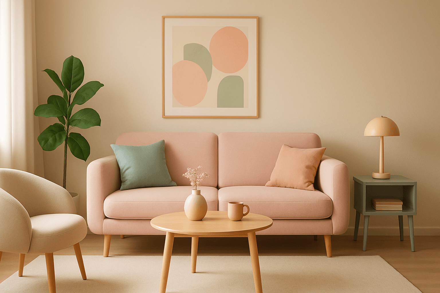
Pastel color harmony is a visually appealing approach that uses pale and muted colors to evoke feelings of softness, tranquility, and sophistication. By incorporating pastel tones, AI-generated images achieve a delicate balance that feels inviting and elegant without overwhelming the viewer. This makes pastel harmonies ideal for designs that require a gentle atmosphere or a subtle emotional impact. When included in AI prompts, the model focuses on blending compatible pastel shades to create coherent color schemes that look naturally integrated and aesthetically calming.
Definition
Pastel Color Harmony describes a color scheme where light, soft, and muted pastel hues are combined to produce a visually harmonious and calming palette. In AI prompts, it instructs the image generator to prioritize gentle color combinations that avoid harsh or saturated tones, creating a subtle and balanced visual effect.
Prompt Formula
Combine descriptive settings with pastel color qualities to achieve harmonious results. Use patterns like:
- [subject] in pastel color harmony, soft lighting, smooth textures
- [scene] with muted pastel palette, balanced tones, delicate highlights
- [concept] featuring pastel color harmony, airy atmosphere, gentle shadows
Best Use Cases
- Branding and packaging needing a calm and inviting look
- Greeting cards, invitations, and event visuals
- UI/UX mockups or digital art emphasizing softness and modernity
Industry Applications
The pastel color harmony keyword is widely applicable in commercial fields where gentle aesthetics are desired. It enhances beauty and wellness branding by reflecting softness and purity. Editorial content benefits from its elegant and modern feel for lifestyle magazines and blogs. Ecommerce product photography can use pastel tones to suggest approachability and subtlety, improving shopper engagement.
- Beauty and wellness product packaging
- Lifestyle and fashion editorial layouts
- Ecommerce websites and social media visuals
Common Mistakes
A frequent error is over-saturating colors, which defeats the soft pastel effect and creates harsh visuals. Avoid mixing too many contrasted hues that reduce harmony, leading to visual clutter. Using flat lighting without subtle gradations can make pastel tones appear lifeless. To prevent this, balance saturation levels, limit the color palette, and include gentle lighting with smooth transitions.
- Using overly bright or saturated colors
- Combining too many conflicting pastel shades
- Neglecting subtle lighting and shadow variations
Advanced Techniques
Enhance pastel color harmony by adding constraints like specific hue ranges (e.g., pastel pinks and blues) or combining with textures like matte or velvety finishes. Introduce directional soft lighting to emphasize color depth and layering. Experiment with complementary pastel accents for subtle focal points. Combining pastel harmony with styles such as minimalism or vintage adds refined complexity.
- Specify hue ranges for targeted pastel shades
- Use texture descriptors (matte, velvety) with pastel tones
- Apply soft directional lighting for depth
- Combine pastel harmony with minimal or vintage styles
FAQ
How can I ensure colors stay pastel in AI image generation?
Use explicit terms like 'pastel', 'muted', and 'soft' in your prompt, and avoid words that imply saturation or brightness. Including 'color harmony' helps the AI balance colors gently.
Can pastel color harmony work in realistic photography styles?
Yes, pastel color harmony can be applied in realistic or photorealistic prompts by focusing on soft natural lighting and desaturated color palettes to maintain subtlety while keeping realism.
Continue Exploring
Related Prompts

Muted Pastel Color Scheme
The muted pastel color scheme is popular in digital art and design for its delicate, understated quality. Unlike vibrant pastels, muted pastels involve desaturation and slight grey undertones, delivering a refined and peaceful visual experience. When included in AI image prompts, it guides models to focus on gentle colors that evoke softness and subtlety, making the images feel airy and inviting rather than vivid or loud. This approach works well for lifestyle, fashion, illustration, and branding content that aims to be modern, approachable, and aesthetically pleasing while maintaining elegance.

Pastel Color Harmonies
Pastel Color Harmonies are essential for creating gentle and visually pleasing images that emphasize softness and subtlety in color. Using pastel palettes, AI-generated images gain a delicate aesthetic often associated with calm, elegance, and modern minimalism. This approach mitigates harsh contrasts and intense hues, producing visuals ideal for editorial content, branding, and art that need a serene or sophisticated vibe. Incorporating pastel harmonies into AI prompts modifies the image’s overall mood, making scenes feel airy and inviting while maintaining a coherent and balanced color distribution.

Pastel Gradient Color Scheme
The pastel gradient color scheme is popular in AI-generated art for its serene and inviting aesthetic. It involves the blending of light, desaturated pastel tones in gradual transitions, which can add depth and softness to visuals without overwhelming details. Using this keyword in prompts helps create backgrounds, themes, or focal areas that evoke feelings of calmness and subtle sophistication. This scheme often suits digital art, branding visuals, and UI elements where gentle color progression supports readability and aesthetic appeal. Its balanced and harmonious style enhances mood and focuses attention, making it a versatile choice in many design contexts.

Analogous Color Schemes
Analogous color schemes bring a visually pleasing harmony to AI-generated images by combining hues that neighbor each other on the color wheel. This creates images with gentle transitions and a cohesive mood, avoiding stark contrasts. When used in prompts, this scheme helps produce illustrations, photography-style renders, or digital art that feel naturally balanced—ideal for themes that require softness or unity like nature scenes, interiors, or fashion visuals. This approach makes images feel comfortable and inviting without overwhelming the viewer.
Soft Pastel Color Palette
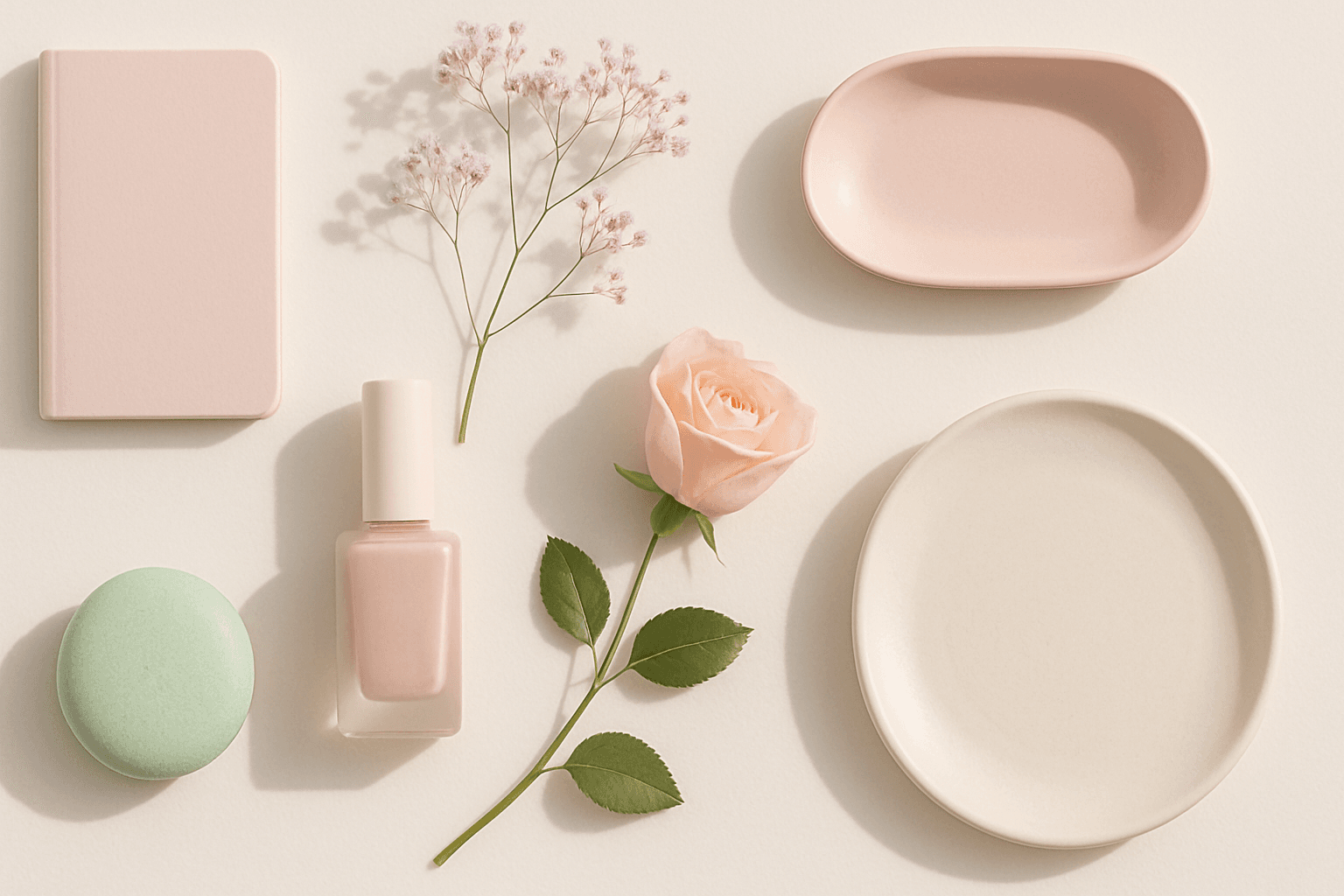
Soft Pastel Color Palette embodies a range of delicate and subdued colors that convey tranquility and subtlety. When directing AI models, mentioning this palette guides the generation toward gentle gradations and harmonious blends of pale pinks, blues, lavenders, and creams. This palette is often employed to produce images with a dreamy, refined aesthetic, fitting for designs needing understated elegance or a nostalgic feel. The softness reduces visual noise and enhances compositions focused on mood rather than bold contrasts.
Earthy Warm Color Scheme
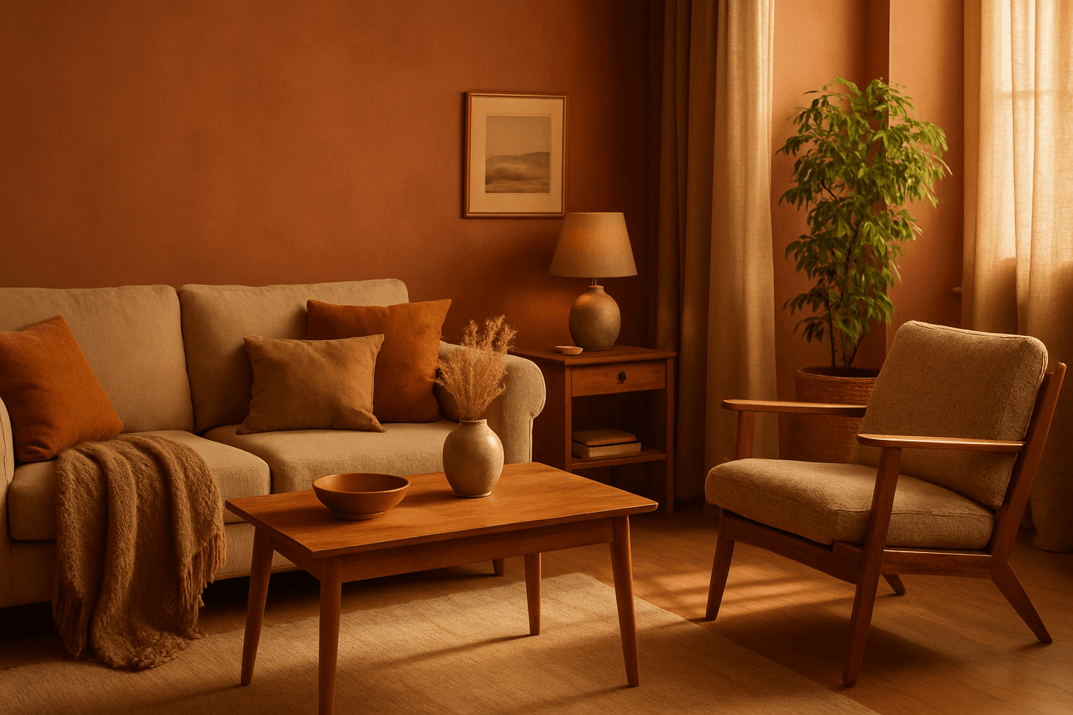
The Earthy Warm Color Scheme is a popular choice for artists and designers aiming to create images that feel natural, comforting, and connected to the environment. By focusing on warm, muted earth tones, this scheme lends a timeless aesthetic suited for a variety of subjects, including landscapes, portraits, interiors, and product shots. Using this palette in AI image prompts can help achieve visuals that emphasize quiet warmth and natural beauty, often evoking rustic charm or bohemian moods. It's well-suited for editorial photography, lifestyle branding, and environmental themes, enhancing images with a sophisticated yet approachable mood.