Triadic Color Harmonies
Triadic color harmonies provide a powerful method to generate visually striking AI images with balanced contrast. By selecting three colors evenly distributed on the color wheel, this technique injects vibrancy and diversity into the palette while maintaining harmony. When included in AI image prompts, it helps produce compositions that pop with color but remain cohesive, suitable for a wide range of creative projects. This approach avoids monotone or clashing visuals and offers a natural yet exciting look. Understanding and applying triadic color harmonies in prompts empowers creators to craft images that stand out with rich, lively color schemes across digital art, design mockups, and branding visuals.
Definition
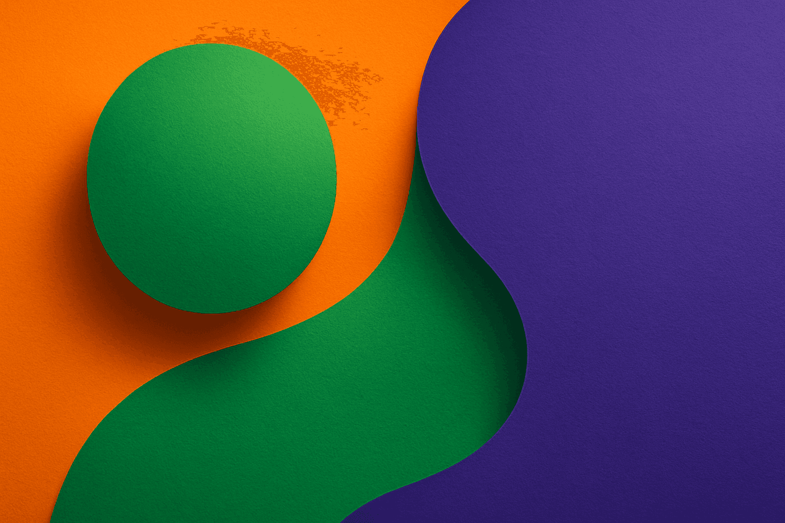
Triadic color harmonies arrange three colors evenly spaced on the color wheel, creating a balanced yet vibrant palette. In AI image prompts, mentioning triadic harmonies helps the model include three distinct but harmonious colors, improving visual interest and contrast while avoiding clashing or monotone effects. This foundational color theory concept guides color selection for cohesive, lively imagery.
Visual Characteristics
- Use of three distinct colors spaced evenly around the color wheel
- Balanced contrast without overpowering any single color
- Dynamic yet harmonious visual composition with vibrant tones
Prompt Formula
Incorporate triadic color harmony into prompts using patterns like: "[subject], triadic color harmony with [color 1], [color 2], and [color 3], [lighting style], [composition details]". Replace placeholders with desired subjects and colors evenly spaced on the wheel to ensure vibrant contrast and balance. Adding modifiers for lighting and texture enhances visual depth.
Best Use Cases
- Branding and logos requiring bold yet balanced palettes
- Editorial artwork demanding vibrant, eye-catching colors
- Fashion and product photography mockups emphasizing color contrast
Creative Variations
To avoid repetitive output, experiment with different lighting conditions (e.g., soft natural, dramatic spotlight), varied compositions (close-ups, wide shots), or style shifts such as minimalism, surrealism, or impressionism. Try swapping the triadic color set (e.g., red-blue-yellow to orange-green-violet) to evoke distinct moods or cultural associations. Integrate textures or realistic materials to add complexity while preserving the triadic harmony.
Industry Applications
- Advertising campaigns utilizing bold, harmonious color contrasts
- Ecommerce product photos that stand out with triadic palettes
- Interior design imagery showcasing color balance in decor
Model-Specific Tips
For best results across AI models, explicitly name the three triadic colors as part of the prompt rather than relying on vague terms like "triadic harmony" alone. Pair color names with clear descriptors (e.g., "vibrant orange, deep violet, fresh green") to guide the model precisely. Combine with modifiers like "balanced lighting" or "high contrast" to enhance color clarity. Test prompt variations to see how the model interprets color terms and adjust accordingly for vivid but harmonious outcomes.
FAQ
What are triadic color harmonies in AI image prompts?
They are prompts specifying three colors evenly spaced on the color wheel, ensuring vibrant color contrast and balance in AI-generated images.
Why use triadic color harmonies in AI art?
Because they create visually dynamic images with balanced contrast that attract and maintain the viewer's attention without clashing colors.
Can I customize which three colors to use in triadic harmonies?
Yes, you can specify any three colors spaced evenly on the color wheel, such as red, blue, and yellow or orange, green, and violet, depending on the desired mood.
Continue Exploring
Related Prompts
Triadic Color Scheme
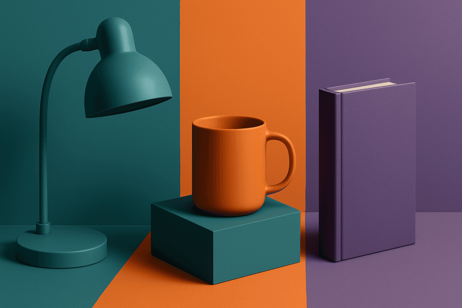
The triadic color scheme is a classic color theory concept widely used in art and design, characterized by choosing three colors equally spaced around the color wheel, such as red, yellow, and blue. This approach produces vibrant, balanced images that are visually stimulating yet cohesive. When integrated into AI image generation prompts, directing the model to use a triadic palette influences the overall color composition, encouraging distinct color blocks or gradients that harmonize well. This can be particularly useful for achieving dynamic but balanced aesthetics, making compositions stand out while maintaining visual unity. Triadic schemes often evoke a lively, engaging mood, suitable for varied creative fields including branding, illustration, and editorial design.
Triadic Color Harmony
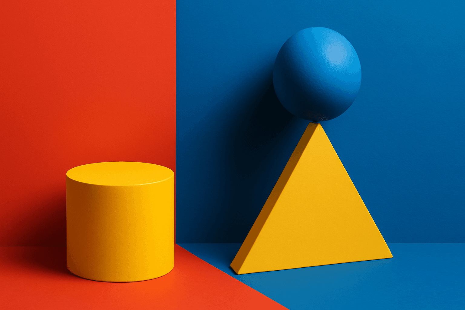
Triadic Color Harmony offers AI artists a powerful tool to create vibrant and balanced images by leveraging three colors equally spaced around the color wheel. This color scheme is known for producing striking yet harmonious compositions, making it ideal for colorful illustrations that maintain visual equilibrium. Including 'triadic color harmony' in your AI prompt encourages the model to incorporate this classic palette principle, resulting in images that pop with life but remain visually comfortable. This technique enhances themes ranging from nature scenes to abstract art and graphic design, providing a versatile framework for compelling color use.

Pastel Color Harmonies
Pastel Color Harmonies are essential for creating gentle and visually pleasing images that emphasize softness and subtlety in color. Using pastel palettes, AI-generated images gain a delicate aesthetic often associated with calm, elegance, and modern minimalism. This approach mitigates harsh contrasts and intense hues, producing visuals ideal for editorial content, branding, and art that need a serene or sophisticated vibe. Incorporating pastel harmonies into AI prompts modifies the image’s overall mood, making scenes feel airy and inviting while maintaining a coherent and balanced color distribution.

Analogous Color Schemes
Analogous color schemes bring a visually pleasing harmony to AI-generated images by combining hues that neighbor each other on the color wheel. This creates images with gentle transitions and a cohesive mood, avoiding stark contrasts. When used in prompts, this scheme helps produce illustrations, photography-style renders, or digital art that feel naturally balanced—ideal for themes that require softness or unity like nature scenes, interiors, or fashion visuals. This approach makes images feel comfortable and inviting without overwhelming the viewer.
Harmonious Color Triads
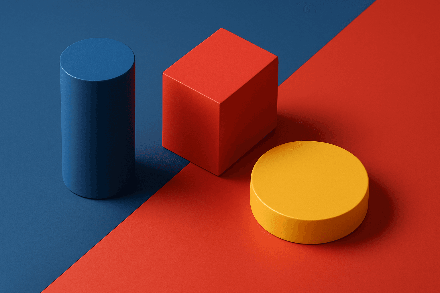
Harmonious color triads form a foundational concept in color theory, used to compose striking yet balanced color palettes by selecting three colors spaced evenly around the color wheel (120 degrees apart). In AI image generation, including harmonious color triads in prompts helps produce artworks or designs that display vibrant, dynamic color interplay while maintaining visual balance and unity. This technique prevents color over-saturation or dullness, enabling creation of visuals that feel lively without clashing. It is especially valued in editorial design, branding, digital art, and product visualization where color harmony impacts emotional and aesthetic response.
Complementary Color Pairing
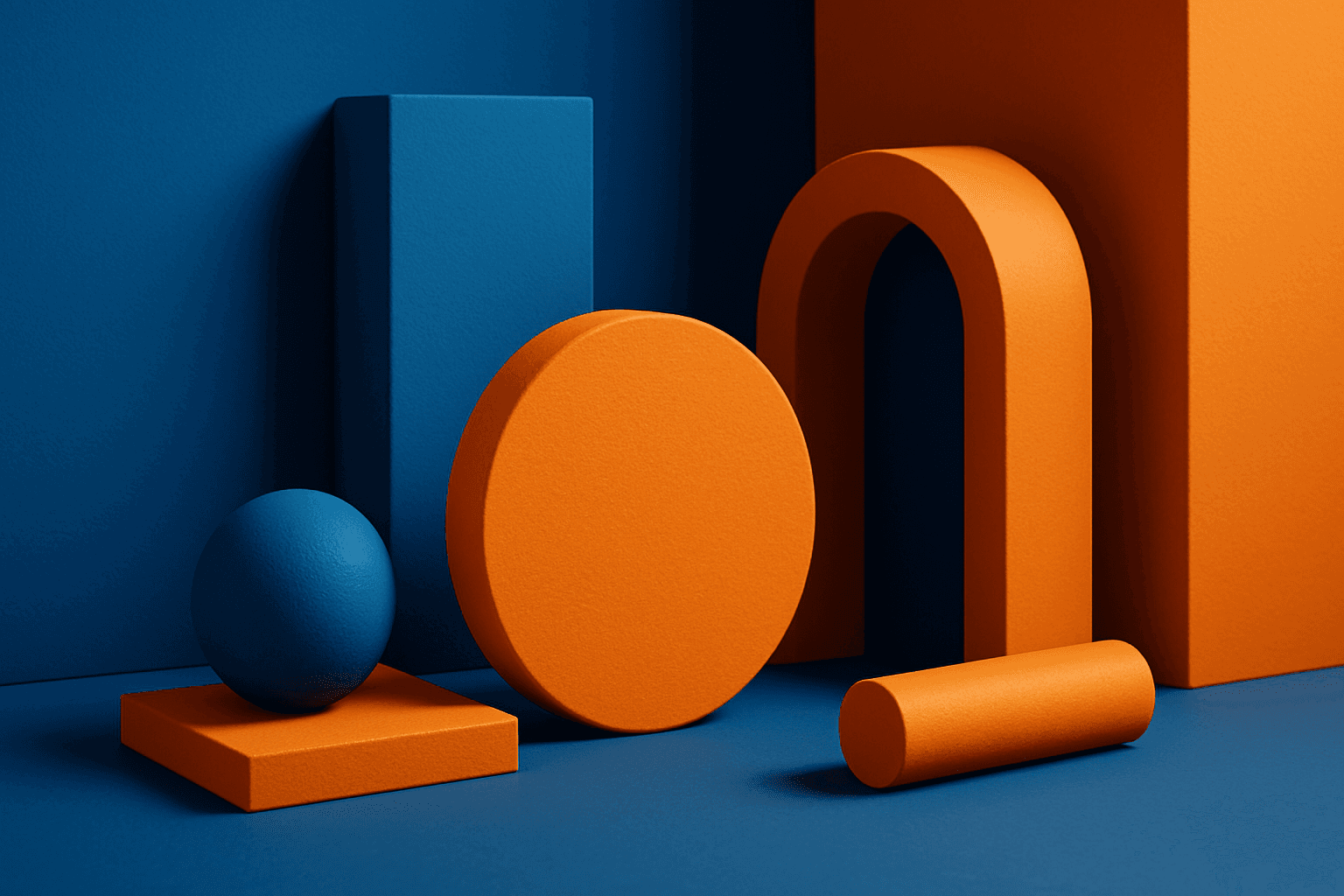
Complementary color pairing leverages color theory by using two colors directly opposite each other on the color wheel, such as blue and orange or red and green. This technique is widely used in design and art to create striking visuals that naturally draw the viewer’s attention. In AI image generation, incorporating keywords or prompt elements emphasizing complementary colors can help produce images with balanced color contrast and dynamic interplay, enhancing overall aesthetics. This approach suits various styles, from minimalistic editorial layouts to rich, textured artworks, providing versatility in creative applications.