Duotone Contrast Palette
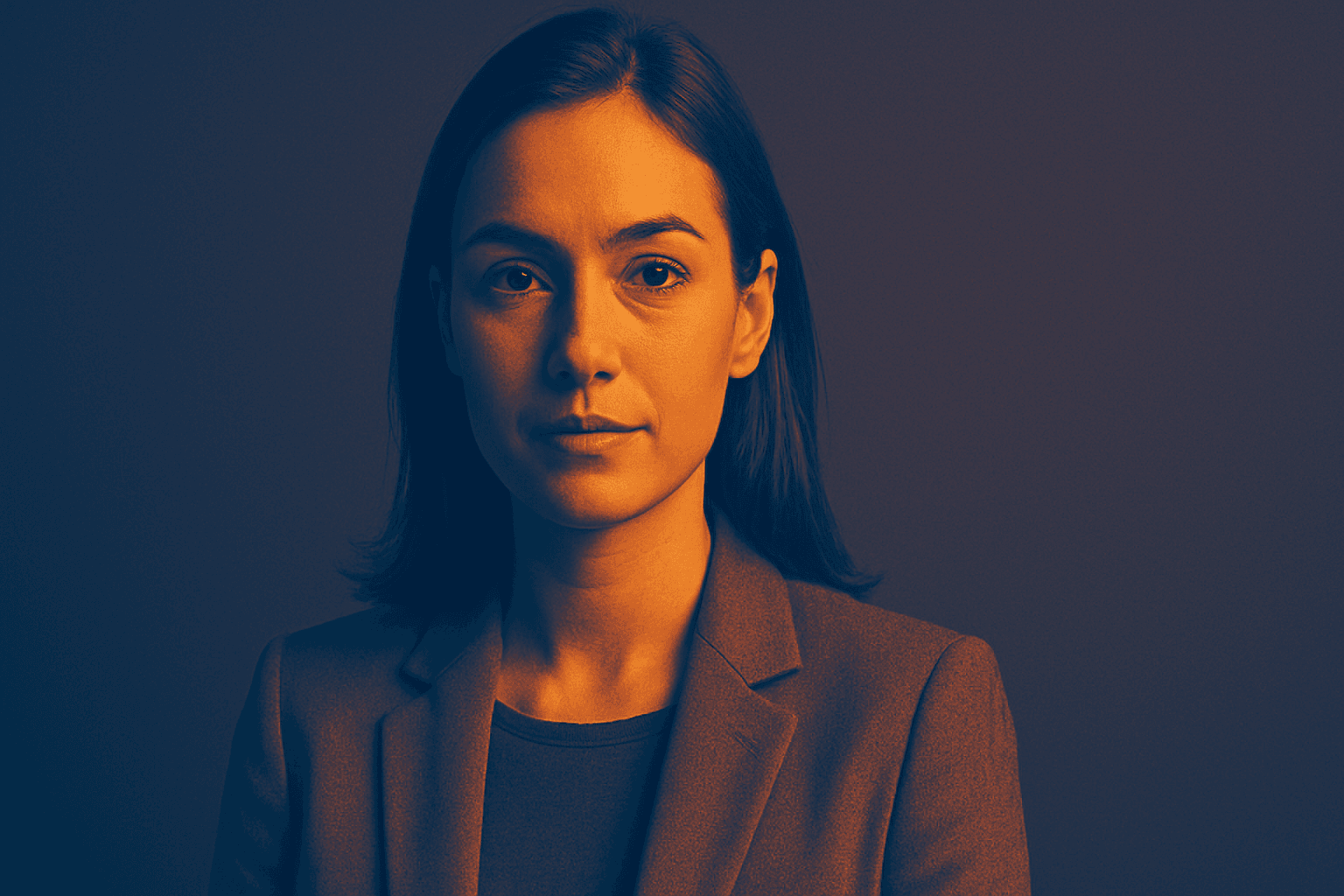
The Duotone Contrast Palette is a contemporary color technique often used in digital art, photography, and graphic design to create visually compelling images. By focusing on two contrasting colors, designers and AI image generators produce striking visuals that enhance mood and emphasize subject contours. This technique simplifies the color landscape, providing boldness and clarity, which is especially effective for editorial images, advertising, or brand messaging. Incorporating it as a prompt keyword guides AI models to generate images that leverage strong color contrasts, appealing to modern aesthetics with a clean, polished finish.
Definition
The Duotone Contrast Palette technique in AI image generation uses a pair of contrasting colors throughout an image to produce a bold and striking visual effect. Instead of using a full color spectrum, it narrows the palette to two dominant hues typically contrasting in tone or saturation. This approach guides AI to emphasize color contrast and simplicity. Including this keyword in prompts directs the model to craft images where lighting, shadows, and subject details harmonize through this high-contrast color pairing, resulting in dynamic yet minimal compositions.
Visual Characteristics
- Dominant presence of exactly two contrasting colors creating visual tension
- Clear differentiation between foreground and background through tonal contrast
- Simplified overall color complexity enhancing shapes and texture visibility
Prompt Formula
To effectively incorporate the Duotone Contrast Palette in your AI prompts, specify the two contrasting colors alongside the desired mood or subject detail. Common prompt patterns include pairing the palette with lighting conditions and style descriptors for richer output.
- "Portrait of [subject], duotone contrast palette, [color 1] and [color 2], dramatic lighting, ultra-detailed"
- "[Scene], duotone contrast palette, vibrant [color 1] paired with complementary [color 2], cinematic mood"
- "Minimalist composition, duotone contrast palette of [color 1] and [color 2], soft shadows, high contrast"]
Best Use Cases
- Advertising visuals requiring memorable, eye-catching color schemes to draw attention
- Editorial imagery on magazine covers or online articles needing modern, minimalist aesthetics
- Social media content and branding graphics that benefit from clear, bold mood setting
Professional Workflow
Start your workflow by defining the two colors that best represent your creative or brand vision—consider complementary or opposing hues for maximum effect. Prepare your prompt using the Duotone Contrast Palette keyword combined with subject and style details. Generate multiple images to explore variations in lighting and composition. Evaluate outputs focusing on color balance and subject clarity, selecting images that align with your goal. Finally, refine chosen images using post-processing tools to adjust tonal balance or add subtle textures, ensuring a polished, professional finish.
Related Styles
- Duotone – broader category focusing on two-color schemes
- Color Contrast – emphasizing tonal or hue opposition
- Minimalist Color Palette – limited color range creating simplicity and clarity
Model-Specific Tips
When working with different AI image models, emphasize clear color pair definitions using commonly recognized color names to reduce ambiguity. Pair the duotone concept with concrete lighting descriptions to help the model render tonal contrasts effectively. Avoid overly technical color jargon as models respond better to accessible language. To maintain consistency, reiterate the phrase "duotone contrast palette" and specify the exact two colors early in your prompt. Testing variations can help identify how different models interpret color dynamics for optimal results.
FAQ
What is a Duotone Contrast Palette in AI image prompts?
It's a prompt technique instructing AI to create images using two contrasting colors prominently for bold visual impact.
Can I specify which two colors to use with this keyword?
Yes, combining the keyword with specific color names lets the AI generate images with your chosen pair in high contrast.
Is the Duotone Contrast Palette suitable for all image types?
It works best with graphic, editorial, and minimalist images where color impact and clarity enhance the design.
Continue Exploring
Related Prompts

Duochrome Contrast Palette
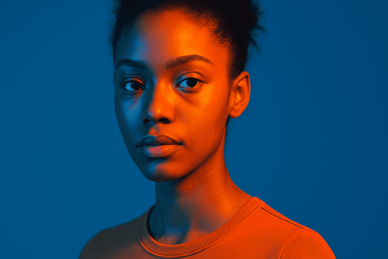
Using a Duochrome Contrast Palette in AI-generated images involves combining two distinct contrasting colors to produce lively, attention-grabbing visuals. This method enhances compositions by providing a harmonious yet striking balance between two hues, often playing with differences in saturation, brightness, or temperature to add depth and vibrancy. Ideal for editorial designs, product renders, and artistic portraits, this palette style helps images stand out with refined color clarity and intensity, evoking strong mood and atmosphere.
Duotone Colors
Duotone colors combine two distinct hues—often contrasting—to produce visually impactful images that balance simplicity and dynamism. This technique became popular in photography and graphic design where it adds a modern, artistic touch by emphasizing shadows and highlights through just two colors. Duotone visuals work well in various media including digital art, branding, and advertising. By limiting the color scheme, duotone designs offer clarity and a bold aesthetic that can communicate emotion effectively. With advances in AI image generation and editing, creating duotone visuals has become straightforward, allowing designers to experiment with color combinations and achieve stylized imagery that stands out.
Tonal Contrast Palette
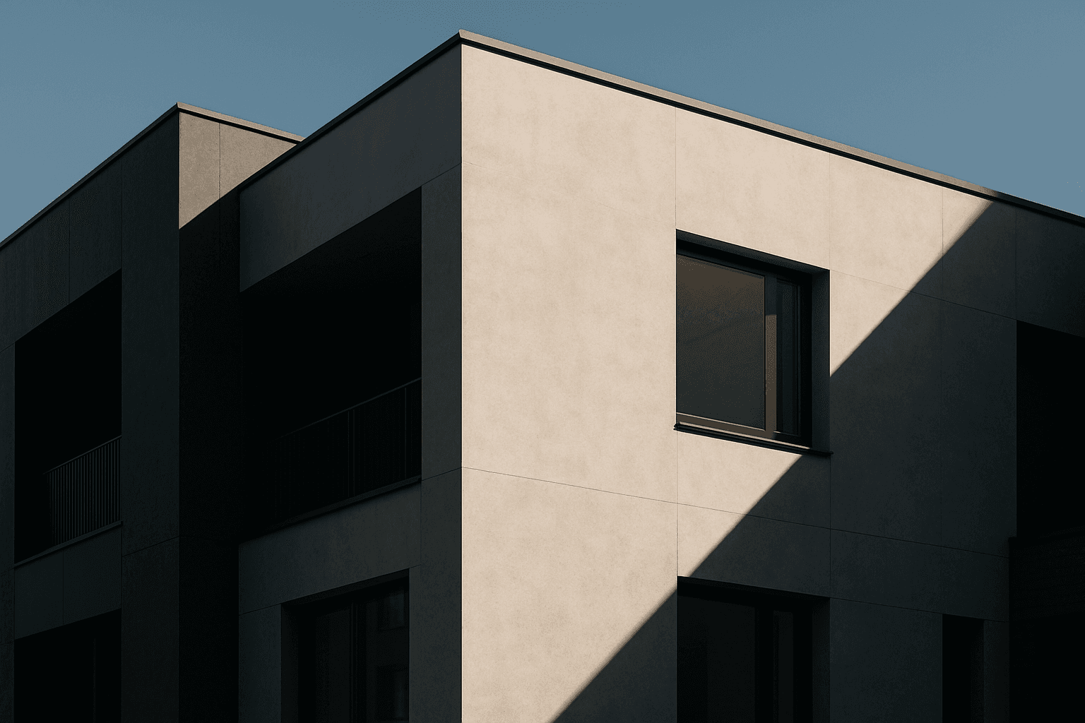
Using a Tonal Contrast Palette in AI image generation helps create compositions with clear differentiation of light and dark areas, which emphasizes structure and mood. This approach intensifies the visual impact by focusing on brightness contrasts rather than just color hues, enabling images with dramatic or refined atmospheres. As a color keyword, it guides AI models to adjust tone values cohesively, producing images that feel dynamic and balanced at once.
Vibrant Contrast Hues
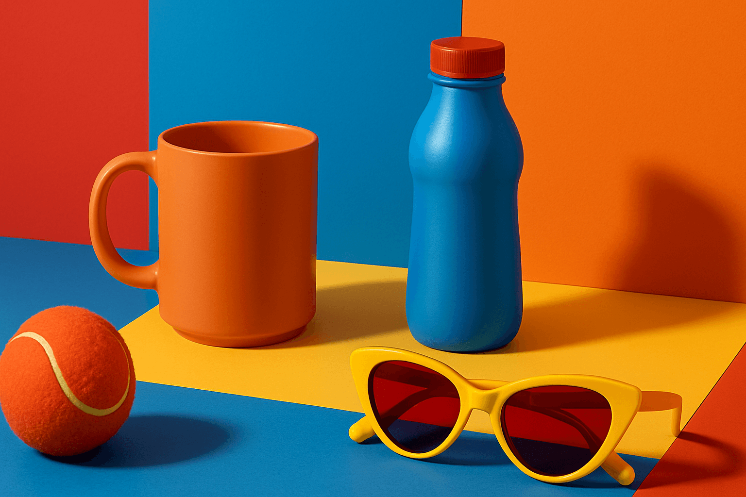
Vibrant Contrast Hues represent an essential color strategy in AI-generated imagery where vivid and complementary colors are juxtaposed to maximize visual appeal. Applying this concept in prompts leads to images with heightened energy and attention-grabbing qualities, often preferred in marketing materials, editorial photography, and creative digital art. The technique manipulates color relationships to create mood and focus, making elements within the frame more prominent and memorable. Integrating vibrant contrast hues can transform an ordinary image into a visually compelling composition that draws the eye and communicates with clarity and boldness.

High Saturation Color Palette
Utilizing a High Saturation Color Palette in AI image generation transforms visuals into bold, lively compositions that capture attention instantly. This approach amplifies the color intensity beyond natural or muted levels, creating a vivid scene bursting with hues that feel powerful and immersive. Often chosen for marketing materials, modern art visuals, and stylized photography, artworks generated with high saturation evoke energetic and emotional responses. When combined thoughtfully with lighting, texture, and composition, it creates a striking balance of vibrancy and clarity, making it ideal for covers, header images, and creative projects needing dynamic coloring.
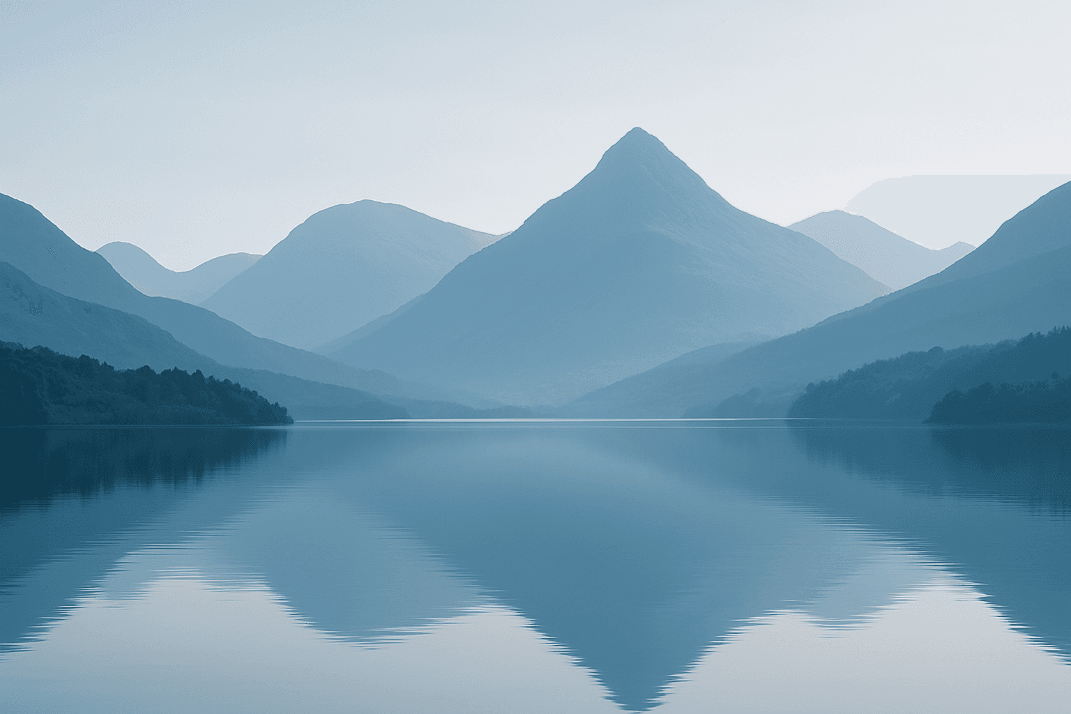
Monotone Blue Palette
The Monotone Blue Palette is a specialized coloring style used in AI-generated imagery that embraces blue tones exclusively, from pale icy blues to deep navy. This approach simplifies color complexity while adding a sophisticated, calming atmosphere to an image. It is ideal for creative projects necessitating mood-driven visuals or stylistic consistency. Incorporating this palette into prompts helps artists, designers, and marketers create images that evoke tranquility, stability, and trustworthiness. The technique fits a variety of themes including landscapes, portraits, and abstract compositions, providing a modern, refined aesthetic that stands out due to its monochromatic elegance.