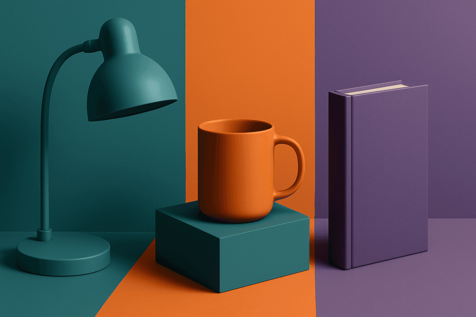
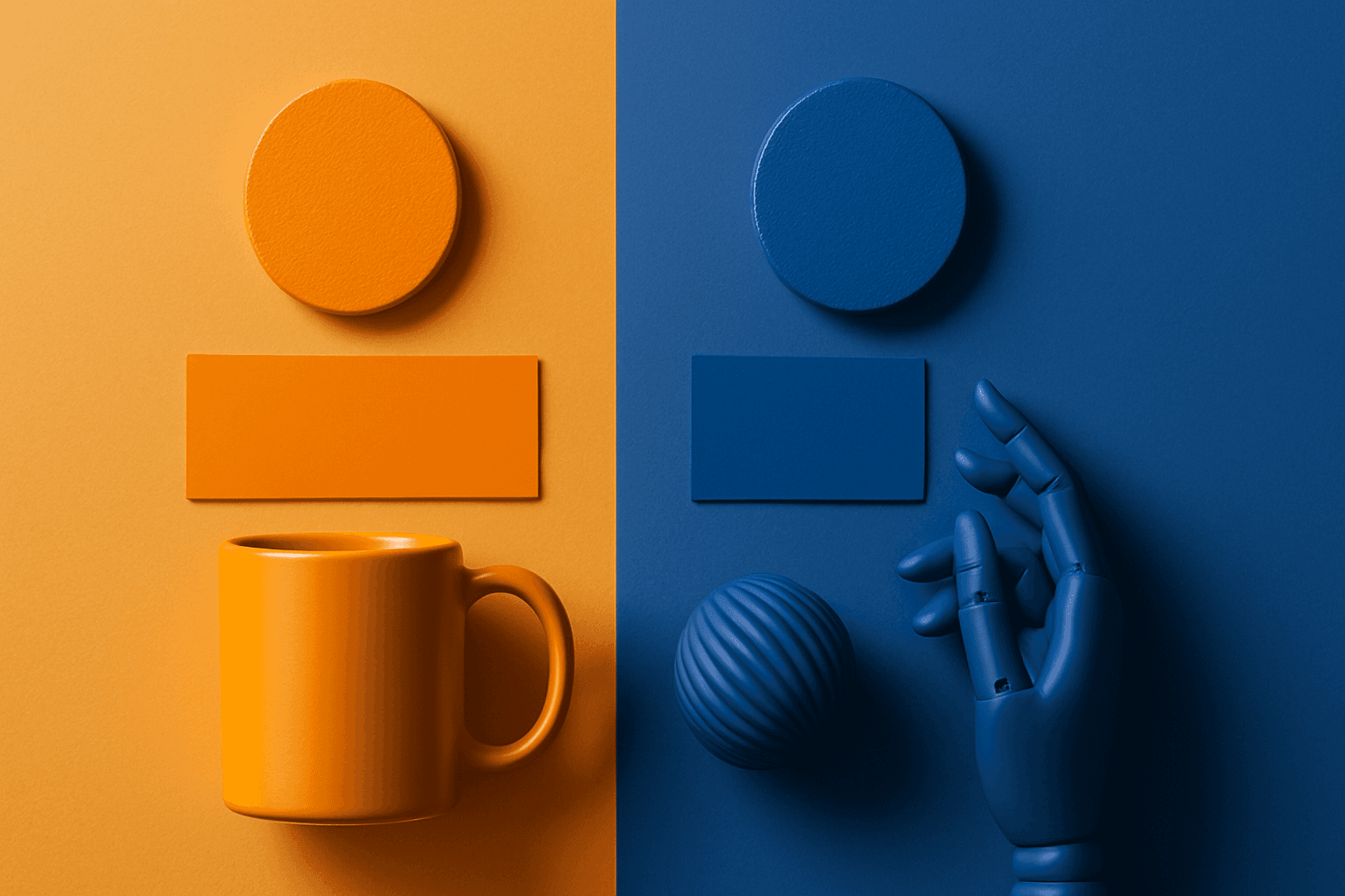
Duotone Colors
Duotone colors combine two distinct hues—often contrasting—to produce visually impactful images that balance simplicity and dynamism. This technique became popular in photography and graphic design where it adds a modern, artistic touch by emphasizing shadows and highlights through just two colors. Duotone visuals work well in various media including digital art, branding, and advertising. By limiting the color scheme, duotone designs offer clarity and a bold aesthetic that can communicate emotion effectively. With advances in AI image generation and editing, creating duotone visuals has become straightforward, allowing designers to experiment with color combinations and achieve stylized imagery that stands out.

Definition
Duotone colors refer to a design technique that uses two contrasting colors to create striking visual effects. Originally popularized in print media by overlaying two ink colors, duotone enhances depth, mood, and contrast in images, logos, or graphics. This method simplifies the color palette while adding artistic flair.
Visual Characteristics
- Uses two dominant contrasting colors
- Creates strong visual contrast and mood
- Simplifies images with minimal color palette
Best Use Cases
- Branding and logo design for memorable identities
- Hero images or website banners to create visual impact
- Advertising campaigns to evoke strong emotional responses
Prompt Examples
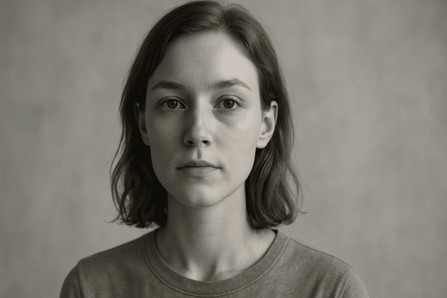
- Create a portrait with vibrant blue and orange duotone colors, minimal background
- Generate a cityscape using purple and yellow duotone, highlighting shadows
- Design a product shot in green and pink duotone emphasizing contours and materials
Adobe Stock Potential
Duotone images have significant potential on platforms like Adobe Stock, appealing to designers and marketers seeking trendy yet versatile visuals. Their simplified color schemes reduce complexity while offering striking impact, making them ideal for commercial use in branding, advertising, and digital content. Contributors can benefit by creating a range of duotone-themed assets — portraits, landscapes, product shots — that cater to various industries needing modern and eye-catching imagery. The demand for such stylistically bold yet minimalistic visuals is growing, especially in technology, fashion, and media sectors.
FAQ
What is the difference between duotone and monochrome?
Duotone uses two distinct colors to create contrast, whereas monochrome uses various shades of a single color.
Can I use any colors for duotone designs?
Yes, but contrasting or complementary colors often produce the most visually appealing results.
Is duotone suitable for all types of images?
Duotone works best on images with clear shapes and tonal variation; very complex images may lose detail.
Continue Exploring
Related Prompts

Gradient Colors
Gradient colors are a popular design element characterized by a seamless shift between two or more colors. They range from subtle transitions, such as a light blush to soft pink, to vibrant combinations like bright blue fading into emerald green. Used widely in digital design, web interfaces, branding, and art, gradients add visual interest and guide the viewer's eye across a composition. Modern tools allow designers to customize gradients with various styles — linear, radial, angular, or diamond-shaped — enhancing the flexibility and creative potential of this technique.

Jewel Tone Colors
Jewel tone colors are a palette of rich, saturated hues inspired by natural gemstones like emerald green, sapphire blue, ruby red, and amethyst purple. These colors are known for their vibrant intensity and luxurious feel, making them popular across various creative fields including fashion, interior design, and digital art. Jewel tones stand out for their ability to add depth and sophistication to compositions, offering a bold yet elegant aesthetic. Their luminous quality helps convey a sense of opulence and timeless beauty, making them favored choices for premium design projects and high-end branding.
Desaturated Colors
In AI image generation, 'desaturated colors' guide models to produce images with toned-down color intensity, resulting in a muted and understated appearance. This technique is valuable for conveying moods such as tranquility, nostalgia, or elegance by avoiding overly bright or saturated colors. Using desaturated colors can help shift the focus to composition, texture, and lighting rather than vivid color contrasts, making images more versatile for editorial content, fashion, or natural scenes. It balances realism and artistic subtlety, especially when paired with refined lighting and soft shadows to emphasize material qualities and depth.
Triadic Color Scheme
The triadic color scheme is a classic color theory concept widely used in art and design, characterized by choosing three colors equally spaced around the color wheel, such as red, yellow, and blue. This approach produces vibrant, balanced images that are visually stimulating yet cohesive. When integrated into AI image generation prompts, directing the model to use a triadic palette influences the overall color composition, encouraging distinct color blocks or gradients that harmonize well. This can be particularly useful for achieving dynamic but balanced aesthetics, making compositions stand out while maintaining visual unity. Triadic schemes often evoke a lively, engaging mood, suitable for varied creative fields including branding, illustration, and editorial design.
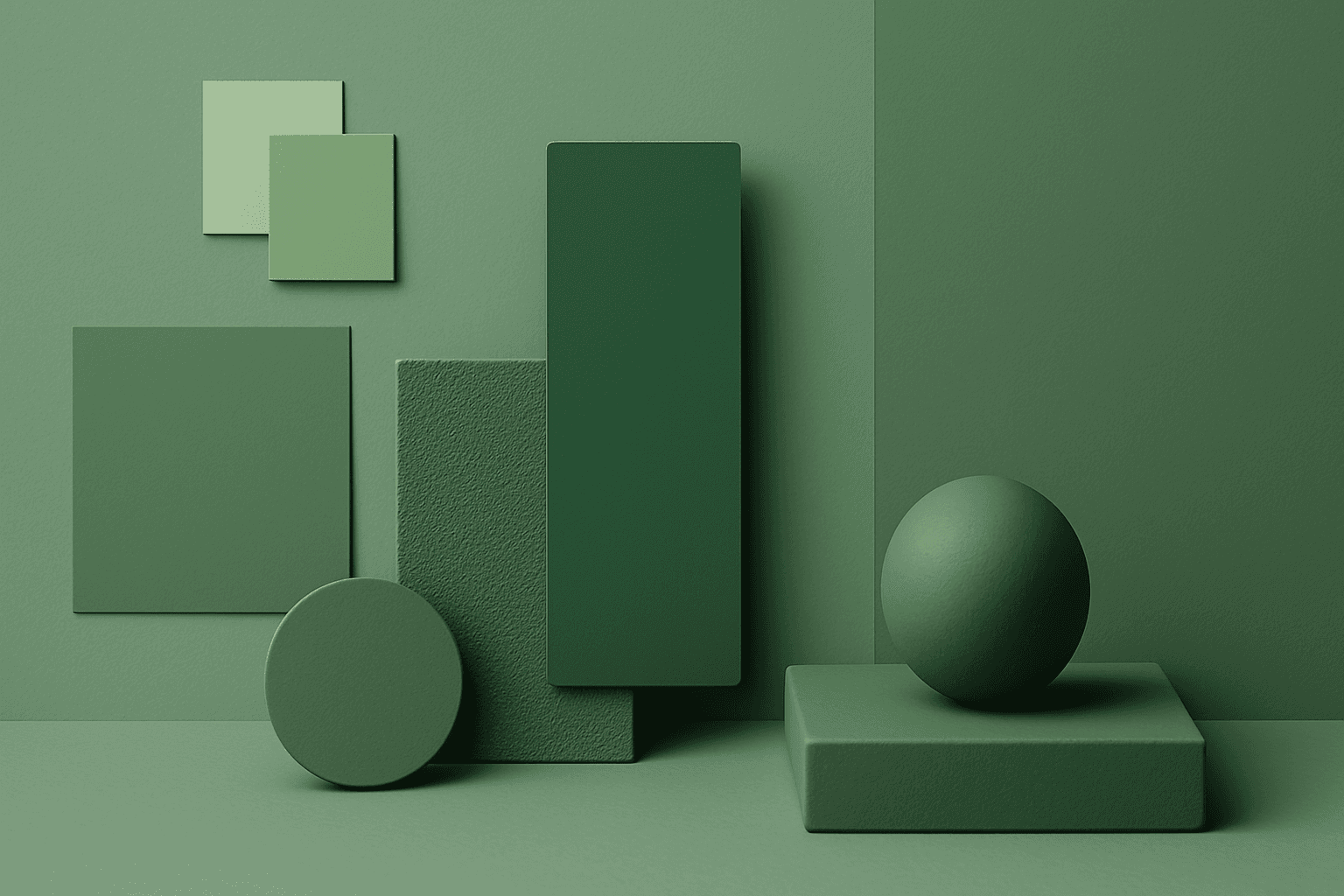
Monochromatic Colors
Monochromatic Colors are useful when an AI image needs strong cohesion and a design-led feel. Because the palette is limited, the viewer pays more attention to form, light, texture, and layout. This can make images feel editorial, premium, minimal, or graphic. For stock creators, monochromatic images can be useful for backgrounds, posters, fashion, architecture, product shots, and brand campaigns where color consistency matters.
Complementary Colors
Complementary Colors are useful when an AI image needs to stand out quickly. The contrast can make a subject pop, create visual tension, and improve thumbnail impact. This keyword is common in movie posters, sports ads, product campaigns, music visuals, gaming art, and modern editorial imagery. For beginners, the key is balance: complementary palettes work best when one color leads and the opposite color supports it.