Jewel Tone Colors
Jewel tone colors are a palette of rich, saturated hues inspired by natural gemstones like emerald green, sapphire blue, ruby red, and amethyst purple. These colors are known for their vibrant intensity and luxurious feel, making them popular across various creative fields including fashion, interior design, and digital art. Jewel tones stand out for their ability to add depth and sophistication to compositions, offering a bold yet elegant aesthetic. Their luminous quality helps convey a sense of opulence and timeless beauty, making them favored choices for premium design projects and high-end branding.

Definition
Jewel tone colors are deep, vibrant hues that resemble precious gemstones such as emerald, sapphire, ruby, and amethyst. These colors are rich, saturated, and evoke a sense of luxury and elegance, often featuring blues, greens, reds, purples, and yellows with a luminous quality.
Visual Characteristics
- Highly saturated with deep intensity
- Rich, vibrant hues mimicking gemstones
- Often possess a subtle glow or luminous quality
Best Use Cases
- Fashion design to create luxurious apparel collections
- Interior design for rich, inviting room palettes
- Digital art and illustration to add vivid depth and sophistication
Prompt Examples
- Create a portrait illuminated with jewel tone colors like sapphire blue and emerald green, featuring realistic textures and subtle lighting.
- Design a modern living room interior using jewel tone colors such as ruby red and amethyst purple with refined materials and ambient light.
- Illustrate a fantasy scene utilizing a palette of jewel tones including topaz yellow and garnet red, emphasizing depth and vibrant hues.
Adobe Stock Potential
Images featuring jewel tone colors hold strong commercial potential on Adobe Stock due to their versatility and frequent use in luxury branding, fashion editorials, and sophisticated design projects. These rich colors appeal to creatives seeking premium-quality visuals to enhance marketing materials, product presentations, and digital content. The luminous and elegant nature of jewel tones contributes to timeless imagery that performs well in competitive stock marketplaces, making such assets valuable for buyers targeting high-end clienteles and upscale aesthetics.
FAQ
What are the most common jewel tone colors?
The most common jewel tone colors include emerald green, sapphire blue, ruby red, amethyst purple, and topaz yellow, each inspired by classic gemstones.
How can jewel tone colors enhance a design?
Jewel tone colors add richness, vibrancy, and sophistication to designs, making them stand out while conveying luxury and depth.
Are jewel tones suitable for all design styles?
While jewel tones work best with elegant, luxurious, or dramatic styles, they can be adapted for modern and minimalist designs when used thoughtfully.
Continue Exploring
Related Prompts

Gradient Colors
Gradient colors are a popular design element characterized by a seamless shift between two or more colors. They range from subtle transitions, such as a light blush to soft pink, to vibrant combinations like bright blue fading into emerald green. Used widely in digital design, web interfaces, branding, and art, gradients add visual interest and guide the viewer's eye across a composition. Modern tools allow designers to customize gradients with various styles — linear, radial, angular, or diamond-shaped — enhancing the flexibility and creative potential of this technique.

Duotone Colors
Duotone colors combine two distinct hues—often contrasting—to produce visually impactful images that balance simplicity and dynamism. This technique became popular in photography and graphic design where it adds a modern, artistic touch by emphasizing shadows and highlights through just two colors. Duotone visuals work well in various media including digital art, branding, and advertising. By limiting the color scheme, duotone designs offer clarity and a bold aesthetic that can communicate emotion effectively. With advances in AI image generation and editing, creating duotone visuals has become straightforward, allowing designers to experiment with color combinations and achieve stylized imagery that stands out.

Black and Gold Palette
The Black and Gold Palette is a timeless color combination used widely across design, fashion, and branding to convey luxury, exclusivity, and elegance. The deep black background serves as a solid, grounding base that enhances the rich, lustrous tone of metallic gold accents. This pairing is versatile enough to appear in editorial layouts, product packaging, and digital art, offering a premium and refined visual appeal. The interplay between matte black and reflective gold elements creates subtle depth and sophisticated contrast, drawing viewers' attention effectively. Its association with opulence and tradition makes it a popular choice for high-end projects seeking a polished and stylish aesthetic.
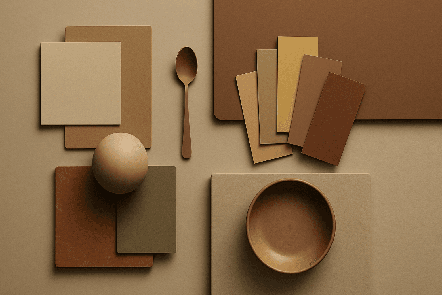
Earth Tone Colors
Earth Tone Colors are useful for creating grounded, organic, and commercially current AI images. They are common in wellness branding, sustainable packaging, interiors, handmade products, food, outdoor lifestyle, and natural beauty campaigns. For stock creators, earth tones can communicate authenticity and trust without needing obvious eco symbols. They also work well in minimalist layouts because the palette is calm but still warm.
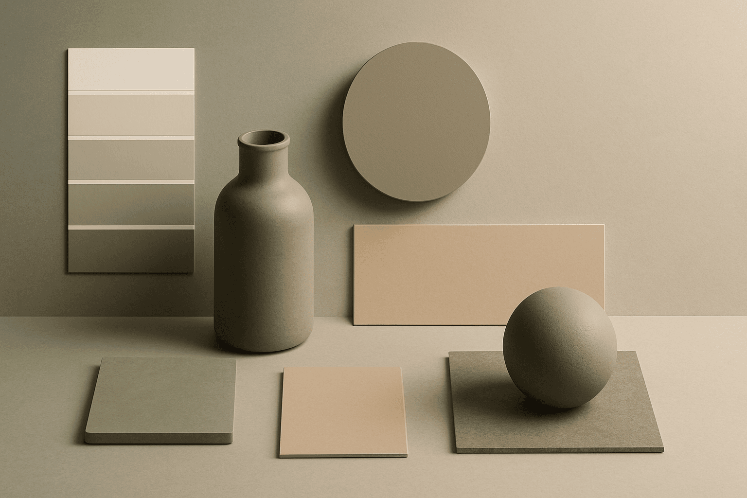
Muted Colors
Muted Colors are useful when you want AI-generated images to feel sophisticated instead of loud. They are common in interiors, lifestyle photography, fashion editorials, packaging, wellness brands, and business imagery. For stock creators, muted palettes can make images more flexible because they do not overpower text or brand elements. They also help avoid the overly saturated look that many AI images produce by default.
Analogous Colors
Analogous Colors are useful when you want an AI image to feel harmonious and easy to look at. Because the colors are related, the image often feels more cohesive and less visually jarring. This makes the keyword helpful for interior design, nature scenes, wellness branding, beauty campaigns, fashion styling, and editorial backgrounds. For beginners, Analogous Colors are easier to control than complex palettes because the colors naturally belong together.