Black and Gold Palette
The Black and Gold Palette is a timeless color combination used widely across design, fashion, and branding to convey luxury, exclusivity, and elegance. The deep black background serves as a solid, grounding base that enhances the rich, lustrous tone of metallic gold accents. This pairing is versatile enough to appear in editorial layouts, product packaging, and digital art, offering a premium and refined visual appeal. The interplay between matte black and reflective gold elements creates subtle depth and sophisticated contrast, drawing viewers' attention effectively. Its association with opulence and tradition makes it a popular choice for high-end projects seeking a polished and stylish aesthetic.

Definition
The Black and Gold Palette is a sophisticated color scheme that combines deep black tones with shimmering gold hues. It evokes luxury, elegance, and timelessness, commonly used to add a premium feel to various designs and artworks.
Visual Characteristics
- High contrast between dark black and bright gold
- Warm metallic gold shimmer with reflective highlights
- Deep, matte black providing a bold, grounding backdrop
Best Use Cases
- Luxury brand logos and packaging
- Event invitations and formal stationery
- Editorial layouts for premium magazines
Prompt Examples
- Portrait of a figure wearing black velvet and gold jewelry, refined lighting, subtle depth
- Minimalist product shot with black matte background and gold metallic accents, realistic materials
- Elegant interior scene featuring black furniture with gold decorative details under soft lighting
Adobe Stock Potential
The Black and Gold Palette holds strong commercial appeal for stock image platforms like Adobe Stock. Its association with luxury and premium quality renders it highly sought after in fashion, lifestyle, and branding sectors. Images exhibiting this palette often attract buyers looking for distinctive, elegant visuals perfect for advertising campaigns, editorial uses, and digital content creation. The palette’s versatility in various subjects—such as jewelry, interiors, and abstract art—extends its marketability and reuse potential. Contributors focusing on high-quality, well-lit photographs or digital renderings emphasizing rich black and shimmering gold elements can expect consistent demand and licensing opportunities.
FAQ
Why is the Black and Gold Palette considered luxurious?
Because black provides a deep, elegant background while gold adds a bright, metallic shine, their combination evokes wealth, sophistication, and timeless style.
Can the Black and Gold Palette be used in casual designs?
While it’s traditionally linked to luxury, it can be adapted for casual designs when balanced carefully, often by adjusting gold tones or spreading black more evenly.
What materials best showcase the Black and Gold Palette?
Metallic gold finishes paired with matte or glossy black surfaces like velvet, lacquer, or polished stone best highlight the palette’s contrasting qualities.
Continue Exploring
Related Prompts

Jewel Tone Colors
Jewel tone colors are a palette of rich, saturated hues inspired by natural gemstones like emerald green, sapphire blue, ruby red, and amethyst purple. These colors are known for their vibrant intensity and luxurious feel, making them popular across various creative fields including fashion, interior design, and digital art. Jewel tones stand out for their ability to add depth and sophistication to compositions, offering a bold yet elegant aesthetic. Their luminous quality helps convey a sense of opulence and timeless beauty, making them favored choices for premium design projects and high-end branding.
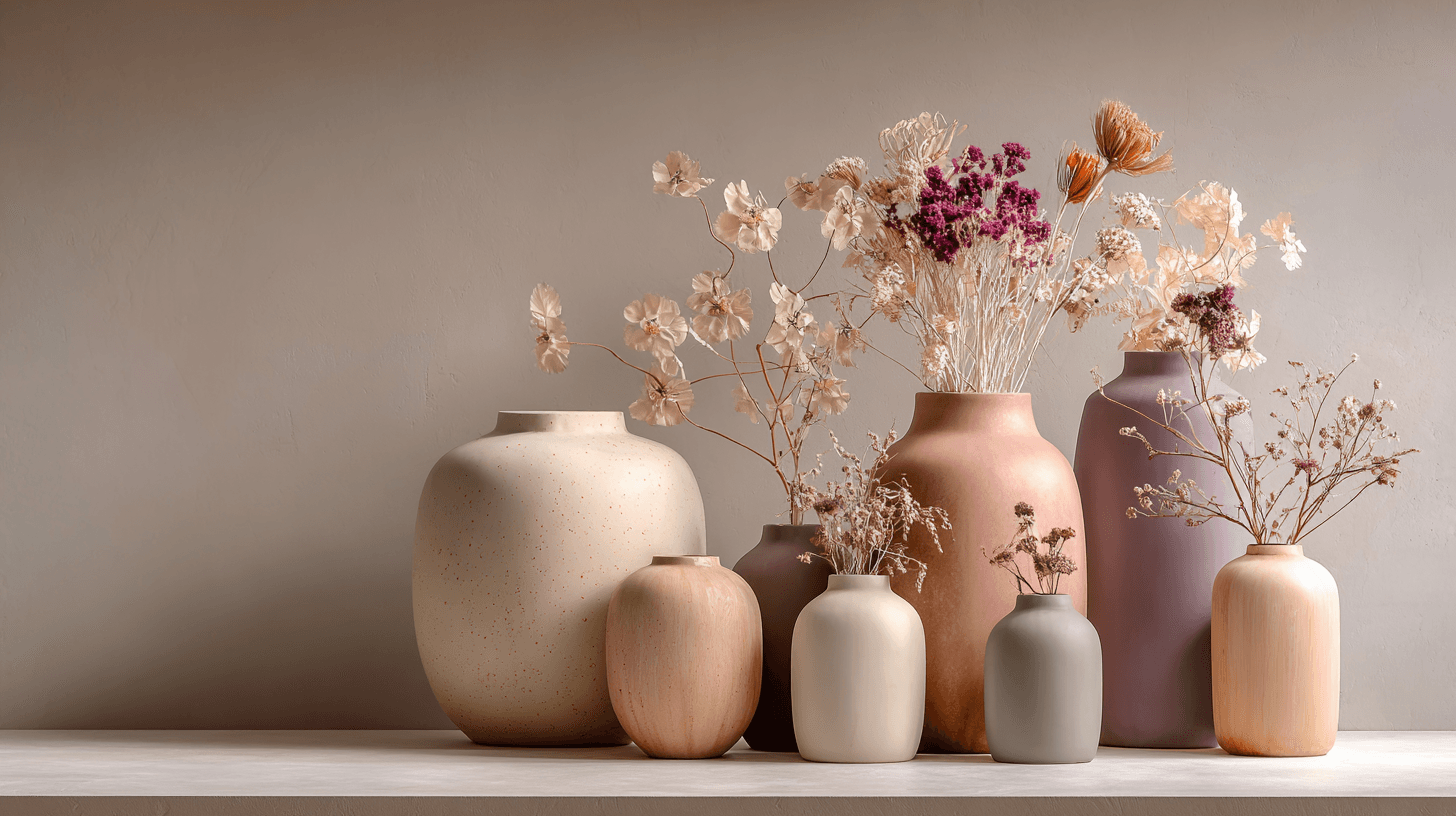
Morandi Palette
Morandi Palette is a color keyword inspired by the quiet, dusty tones associated with painter Giorgio Morandi. In AI image prompts, it usually points the model toward muted, low-saturation colors such as dusty rose, warm gray, clay, sage, beige, soft blue, faded mauve, and stone. The effect is refined, calm, and slightly editorial. This palette is useful when you want an image to feel sophisticated without becoming cold or overly minimal. For beginners, Morandi Palette is a practical way to control color harmony. It can make a scene feel more tasteful, cohesive, and brand-ready, especially when default AI colors look too bright or artificial.

Duotone Colors
Duotone colors combine two distinct hues—often contrasting—to produce visually impactful images that balance simplicity and dynamism. This technique became popular in photography and graphic design where it adds a modern, artistic touch by emphasizing shadows and highlights through just two colors. Duotone visuals work well in various media including digital art, branding, and advertising. By limiting the color scheme, duotone designs offer clarity and a bold aesthetic that can communicate emotion effectively. With advances in AI image generation and editing, creating duotone visuals has become straightforward, allowing designers to experiment with color combinations and achieve stylized imagery that stands out.

Gradient Colors
Gradient colors are a popular design element characterized by a seamless shift between two or more colors. They range from subtle transitions, such as a light blush to soft pink, to vibrant combinations like bright blue fading into emerald green. Used widely in digital design, web interfaces, branding, and art, gradients add visual interest and guide the viewer's eye across a composition. Modern tools allow designers to customize gradients with various styles — linear, radial, angular, or diamond-shaped — enhancing the flexibility and creative potential of this technique.
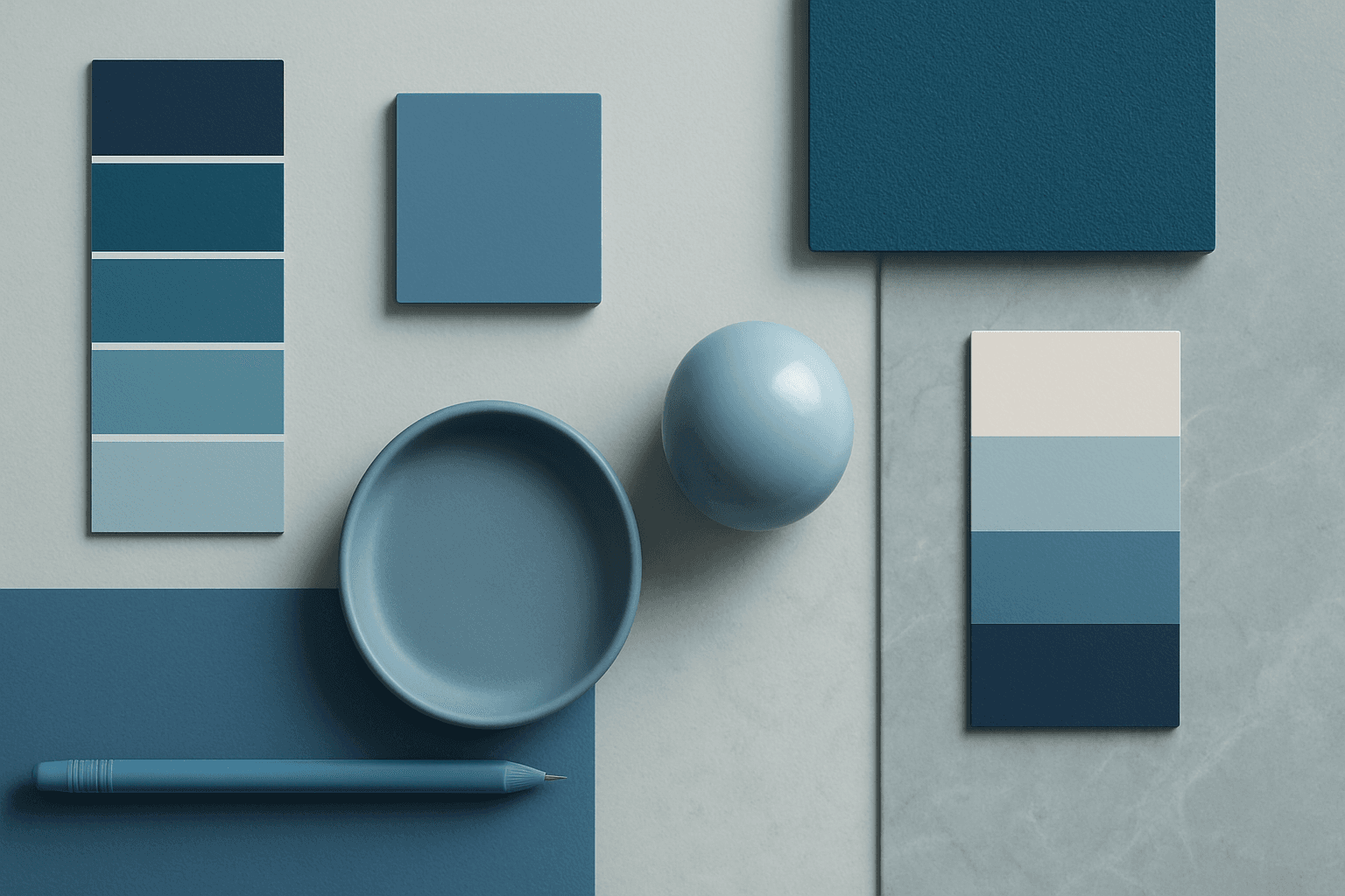
Cool Color Palette
Cool Color Palette is useful when you want an image to feel clear, composed, and modern. It is common in healthcare, technology, finance, architecture, SaaS, clean beauty, and wellness visuals. The palette can reduce emotional heat and make a design feel more trustworthy or focused. For AI creators, this keyword is helpful when a scene needs professionalism or calm rather than warmth and intimacy.
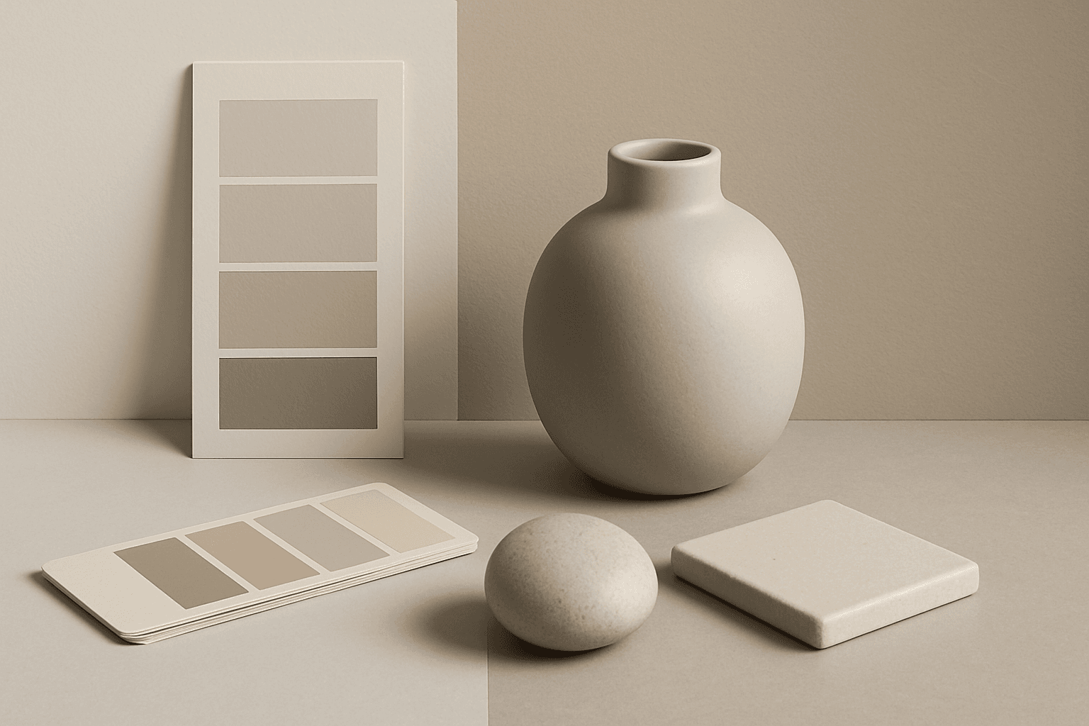
Neutral Colors
Neutral Colors are among the most commercially useful palette keywords. They help AI images feel clean, versatile, and layout-friendly. Neutral images can support text overlays, product packaging, editorial design, websites, and presentations without competing with brand colors. For stock creators, this is a practical keyword because buyers often need visuals that can blend into many design systems.