Saturated Primary Palette
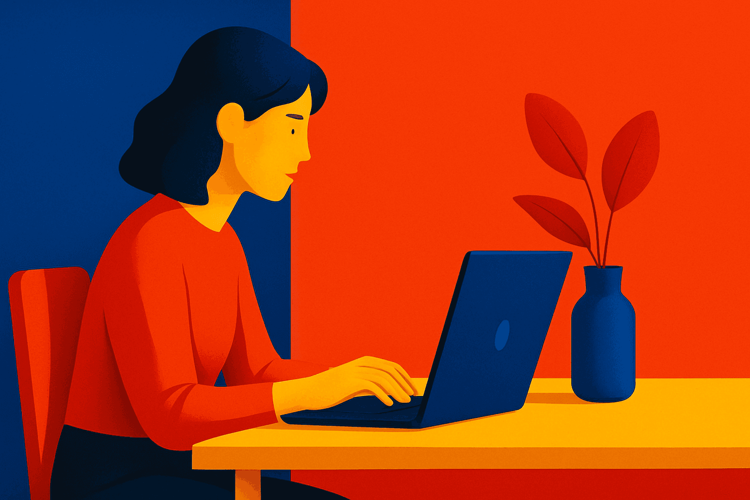
When you specify a saturated primary palette in AI image generation, you instruct the model to focus on vivid, pure red, blue, and yellow colors. This color scheme creates bold, energetic images with strong visual impact, often evoking feelings of playfulness or modern graphic design. Saturated primaries traditionally appear in pop art, children’s media, or minimalistic art with a color-blocking approach. Using this palette helps direct the AI to avoid washed-out, mixed, or complex color schemes, generating images that are visually striking and clean.
Definition
The saturated primary palette means using the pure, most intense forms of primary colors—red, blue, and yellow—in AI image prompts. These colors appear vibrant and energetic, avoiding desaturation or blending, creating strong visual emphasis. By specifying this palette, you guide the AI to produce images with bold, clearly separated hues ideal for impactful design and art.
Prompt Formula
To incorporate a saturated primary palette effectively, combine descriptive color terms with style and mood instructions. Use patterns like: - "[Subject] in a saturated primary palette, vivid red, blue, yellow colors, clean composition, vibrant lighting" - "Minimalistic design with saturated primary palette, bold red, blue, and yellow hues, graphic style" - "Illustration using saturated primary palette, intense reds, blues, yellows, sharp edges" This formula helps guide the AI toward bright, pure colors and a strong visual style.
- [Subject] in saturated primary palette
- vivid red, blue, yellow colors
- clean composition with vibrant lighting
Best Use Cases
- Graphic design posters needing bold statements
- Children’s book illustrations with bright, engaging colors
- Modern art and pop culture-inspired visuals
Industry Applications
The saturated primary palette is popular in fields where grabbing attention and delivering strong visual cues are important. In advertising, it generates compelling visuals that catch viewers' eyes instantly. Editorial illustration benefits from this palette to create vibrant, youthful imagery. Ecommerce packaging uses these bright colors to stand out on shelves, appealing to consumers seeking modern, dynamic products. These palettes evoke energy and clarity, suiting fast-paced industries.
- Advertising campaigns requiring attention-grabbing visuals
- Editorial illustrations for youthful magazines
- E-commerce packaging with bright, modern designs
Common Mistakes
Common errors include using 'saturated primary palette' but allowing the AI to produce muddied or secondary colors, defeating the palette’s purpose. Avoid vague descriptors that do not enforce color purity, which can lead to washed-out or pastel results. Another pitfall is adding too many conflicting color instructions, resulting in unrealistic or overly complex images. Be clear and focused in your prompt to maintain vivid, clean primaries.
- Specifying 'primary colors' without 'saturated' leads to muted colors
- Mixing too many color modifiers dilutes vividness
- Ignoring composition can cause visual clutter and reduce color impact
Advanced Techniques
Enhance your saturated primary palette prompts with nuanced controls such as: - Adding lighting descriptors like "refined soft shadows" or "dynamic studio lighting" to enrich realism. - Combining with 'minimalist composition' to emphasize color dominance. - Using modifiers like "matte finish" or "high-gloss reflections" to alter material perception. - Employing aspect ratios or camera angles to enhance color contrasts. - Requesting 'clean editorial style' to align with professional design aesthetics. These refinements ensure vivid colors integrate seamlessly into polished, sophisticated imagery.
- Add lighting descriptors (e.g., dynamic lighting)
- Combine with minimalist composition
- Use material finishes (matte, gloss)
- Specify clean editorial style
- Include camera angles to boost color contrasts
FAQ
What does 'saturated primary palette' mean in AI image prompts?
It means using the primary colors—red, blue, yellow—in their most vivid and intense form, resulting in bright, bold images.
How can I avoid muddy colors when using this palette?
Specify 'saturated' clearly and avoid combining conflicting color instructions that dilute the pure hues.
Continue Exploring
Related Prompts

Bright Primary Colors Palette
Using a Bright Primary Colors Palette in AI image generation emphasizes strong, pure colors—red, blue, and yellow—that are fundamental to color theory. This palette brings a dynamic, energetic feel to images, making them instantly attention-grabbing and easily distinguishable. It's ideal for designs aiming to evoke simplicity with power, evoke nostalgia for classic color schemes, or highlight specific elements through contrast. When integrated thoughtfully, it balances vibrancy with clarity, avoiding muddiness or oversaturation. This approach is especially popular in editorial, advertising, and graphic design work where visual directness is key.

High Saturation Color Palette
Utilizing a High Saturation Color Palette in AI image generation transforms visuals into bold, lively compositions that capture attention instantly. This approach amplifies the color intensity beyond natural or muted levels, creating a vivid scene bursting with hues that feel powerful and immersive. Often chosen for marketing materials, modern art visuals, and stylized photography, artworks generated with high saturation evoke energetic and emotional responses. When combined thoughtfully with lighting, texture, and composition, it creates a striking balance of vibrancy and clarity, making it ideal for covers, header images, and creative projects needing dynamic coloring.
Duotone Contrast Palette
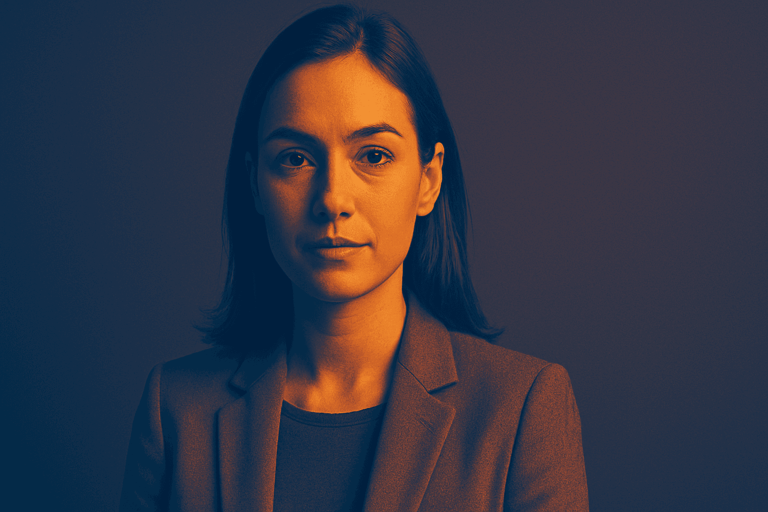
The Duotone Contrast Palette is a contemporary color technique often used in digital art, photography, and graphic design to create visually compelling images. By focusing on two contrasting colors, designers and AI image generators produce striking visuals that enhance mood and emphasize subject contours. This technique simplifies the color landscape, providing boldness and clarity, which is especially effective for editorial images, advertising, or brand messaging. Incorporating it as a prompt keyword guides AI models to generate images that leverage strong color contrasts, appealing to modern aesthetics with a clean, polished finish.
Bright Pastel Palette
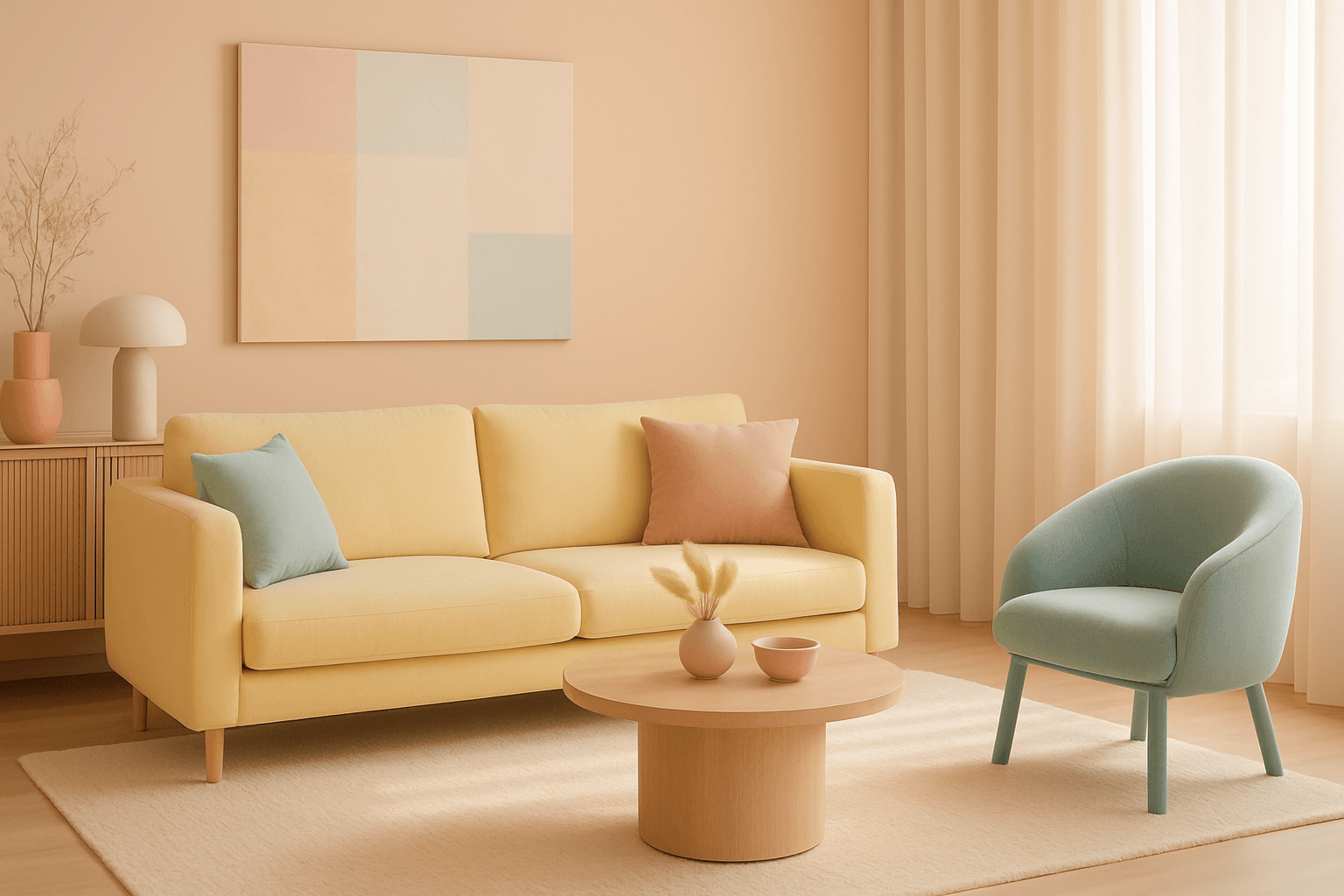
The Bright Pastel Palette is a popular choice in AI-generated imagery for creating visuals that combine softness with energy. These palettes blend traditional pastels—colors with low saturation and high lightness—with increased brightness to keep the colors gentle yet eye-catching. This balance serves to evoke feelings of calmness infused with optimism, making the color scheme widely favored in advertising, editorial spreads, and social media visuals. When used in AI image prompts, it steers the model to generate harmonious color compositions that are neither dull nor harsh, ideal for modern and clean aesthetics.
Morandi Palette
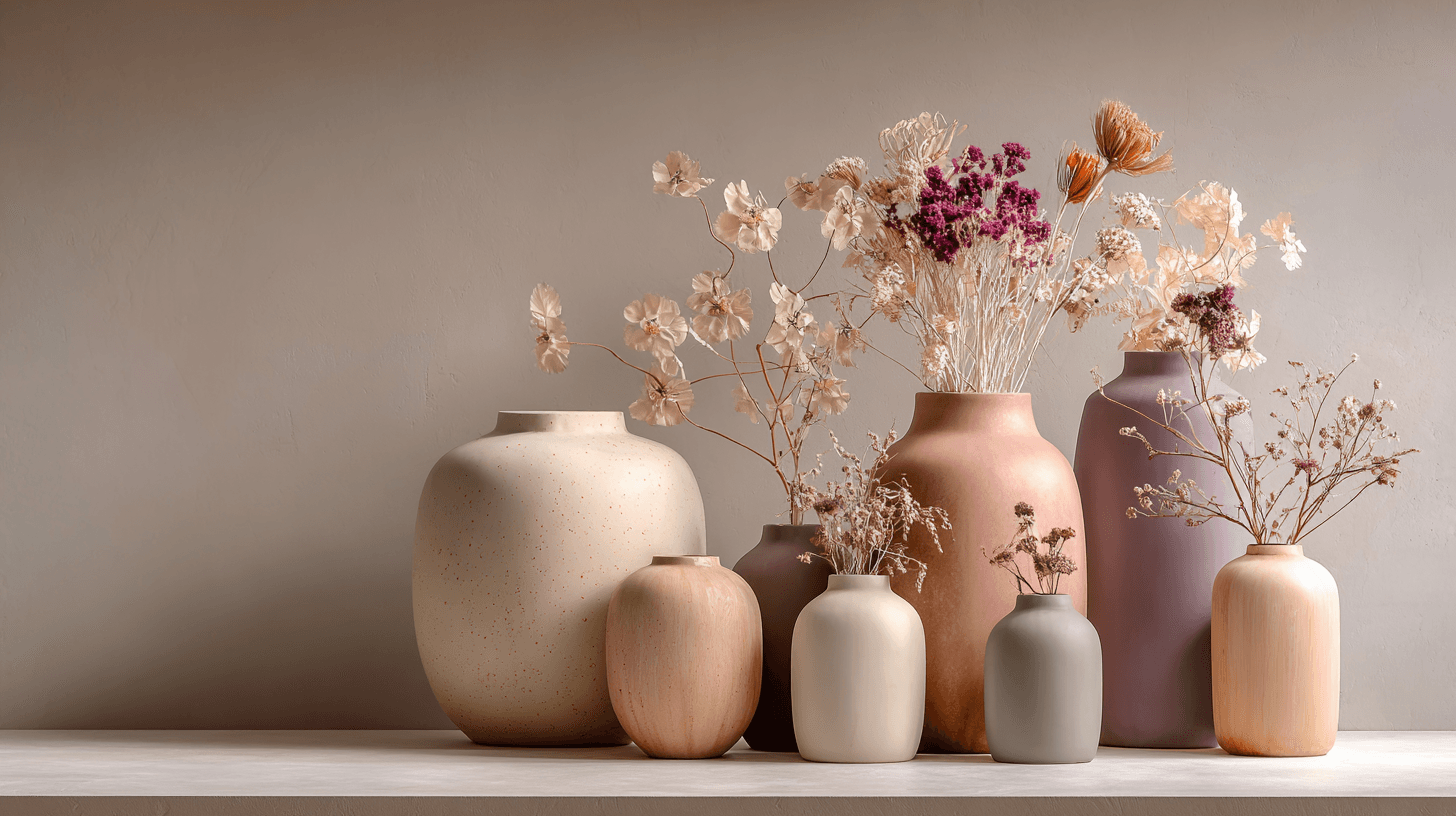
Morandi Palette is a color keyword inspired by the quiet, dusty tones associated with painter Giorgio Morandi. In AI image prompts, it usually points the model toward muted, low-saturation colors such as dusty rose, warm gray, clay, sage, beige, soft blue, faded mauve, and stone. The effect is refined, calm, and slightly editorial. This palette is useful when you want an image to feel sophisticated without becoming cold or overly minimal. For beginners, Morandi Palette is a practical way to control color harmony. It can make a scene feel more tasteful, cohesive, and brand-ready, especially when default AI colors look too bright or artificial.

Vibrant Accent Color Palette
Utilizing a vibrant accent color palette in AI image prompts transforms ordinary visuals into striking compositions by introducing bright, focused colors that highlight important elements. This technique leverages contrast and saturation to guide viewers' eyes toward key areas, adding energy and visual interest. When combined with modern design principles—such as clean layouts, realistic materials, and refined lighting—these palettes elevate the quality of AI-generated images, making them ideal for editorial designs, marketing materials, and digital art projects.