Monochrome
Monochrome is a color approach using one color family or black-and-white values. It creates strong unity, simplicity, and graphic focus.

Definition
Monochrome is a color approach using one color family or black-and-white values. It creates strong unity, simplicity, and graphic focus.
Visual Characteristics
- Limited color range with strong reliance on value, texture, form, and shadow.
- Can feel elegant, serious, minimal, editorial, or iconic.
- Works with fashion, architecture, products, portraits, and abstract backgrounds.
Best Use Cases
- Fashion portraits, architecture, luxury products, posters, editorials, and brand campaigns.
- Images where shape and contrast matter more than varied color.
- Stock concepts about elegance, simplicity, identity, structure, and timelessness.
Prompt Examples
- A monochrome fashion portrait, hard light, minimalist styling, strong shadow shapes.
- A monochrome architecture photo of a concrete museum, leading lines, high contrast.
- A black and white product image, studio lighting, clean shadow, premium composition.
Adobe Stock Potential
Monochrome images are useful for editorial, luxury, architecture, and design-led stock. Make sure there is enough contrast for thumbnail readability.
FAQ
Is monochrome always black and white?
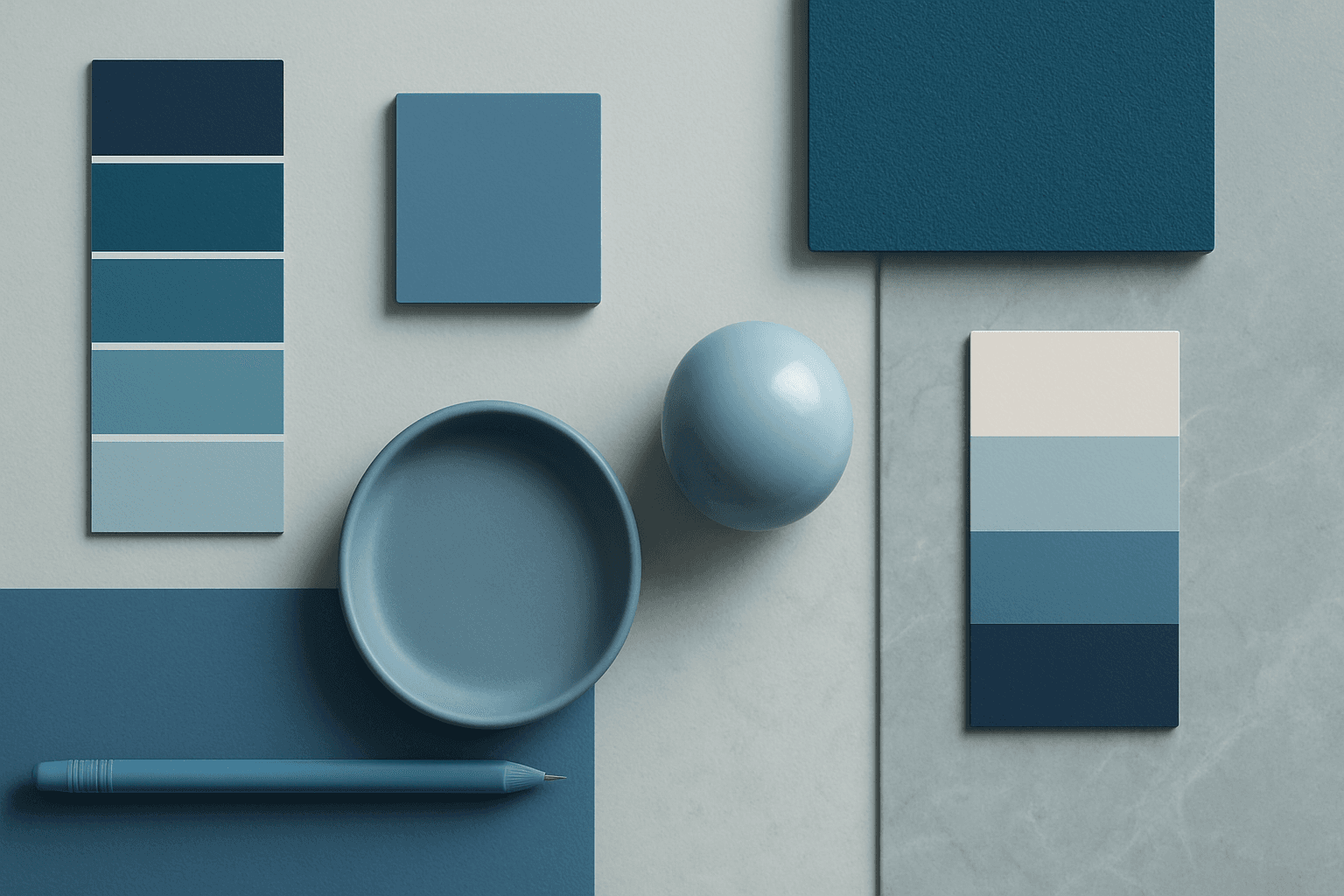
No. It can use one hue, such as blue monochrome or beige monochrome.
How do I make monochrome images interesting?
Use texture, light direction, shadows, and strong composition.
Continue Exploring
Related Prompts
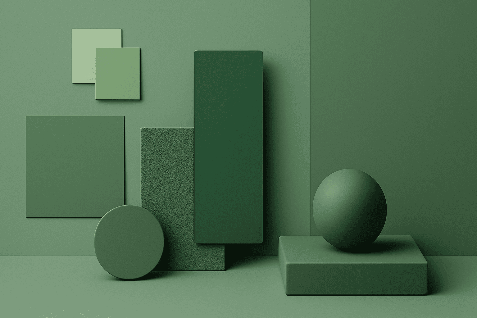
Monochromatic Colors
Monochromatic Colors are useful when an AI image needs strong cohesion and a design-led feel. Because the palette is limited, the viewer pays more attention to form, light, texture, and layout. This can make images feel editorial, premium, minimal, or graphic. For stock creators, monochromatic images can be useful for backgrounds, posters, fashion, architecture, product shots, and brand campaigns where color consistency matters.
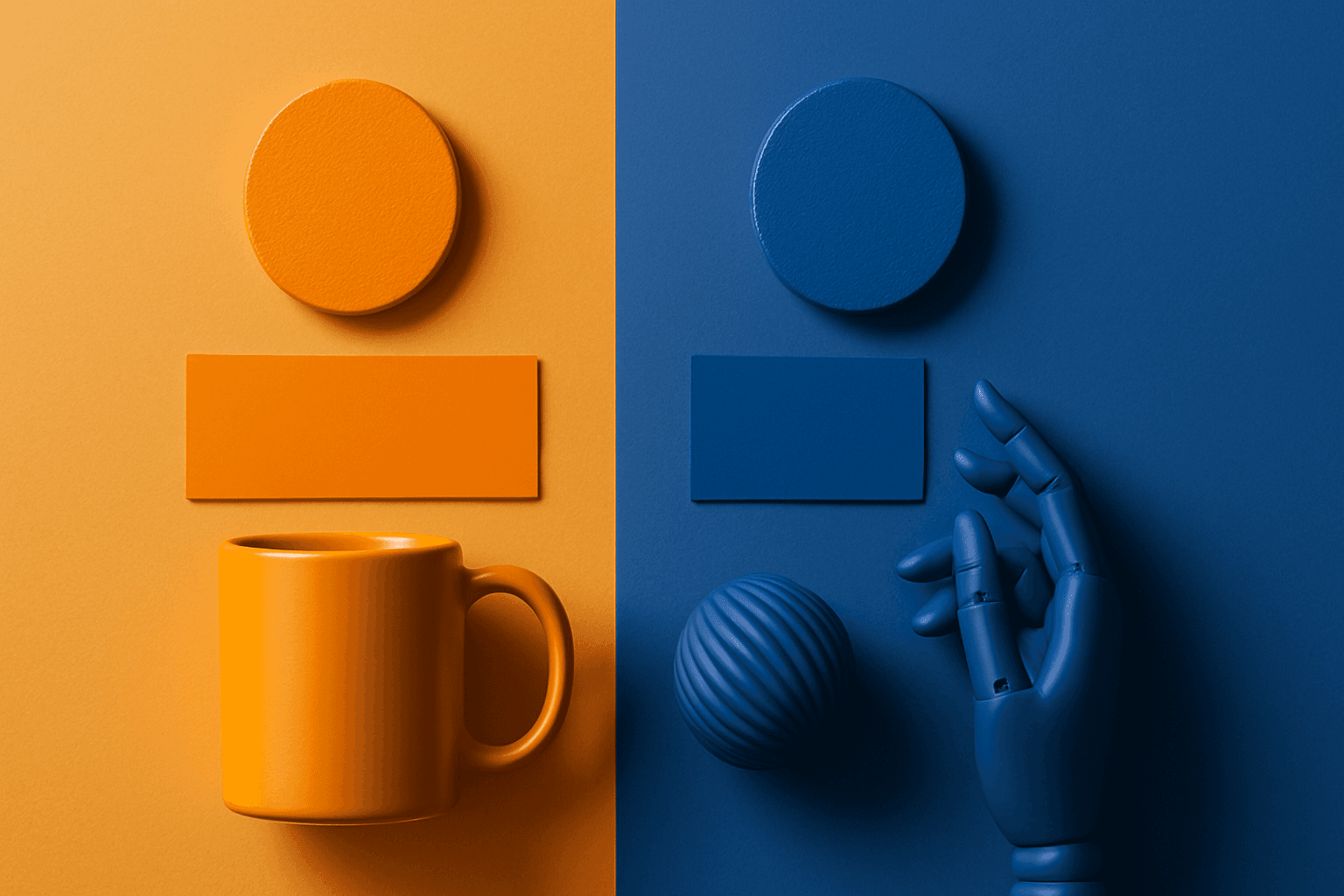
Complementary Colors
Complementary Colors are useful when an AI image needs to stand out quickly. The contrast can make a subject pop, create visual tension, and improve thumbnail impact. This keyword is common in movie posters, sports ads, product campaigns, music visuals, gaming art, and modern editorial imagery. For beginners, the key is balance: complementary palettes work best when one color leads and the opposite color supports it.
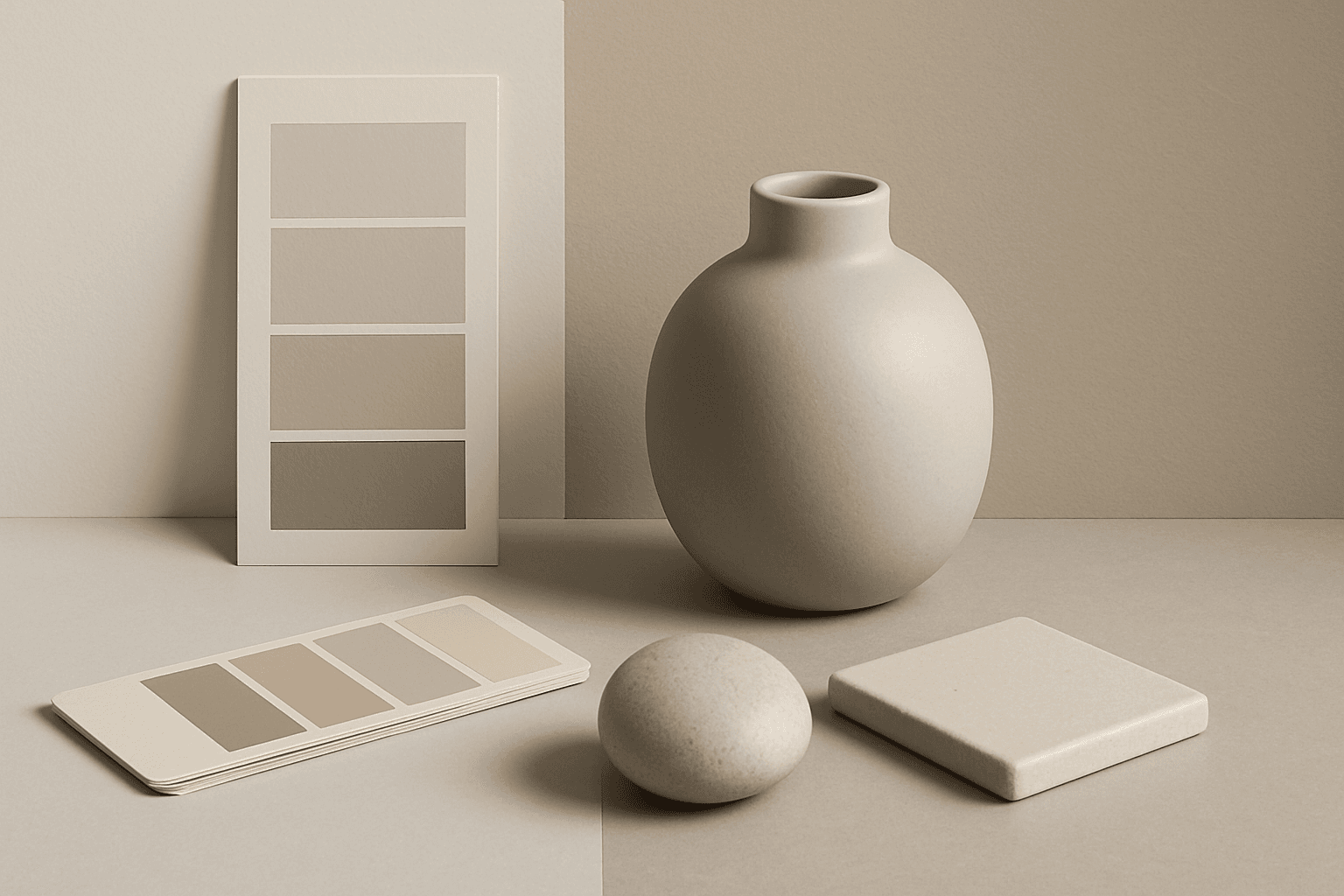
Neutral Colors
Neutral Colors are among the most commercially useful palette keywords. They help AI images feel clean, versatile, and layout-friendly. Neutral images can support text overlays, product packaging, editorial design, websites, and presentations without competing with brand colors. For stock creators, this is a practical keyword because buyers often need visuals that can blend into many design systems.

Monochrome Color Palette
Employing a monochrome color palette in AI-generated images allows for creating minimalistic yet striking visuals. By constraining colors to one hue family, creators can convey mood and style consistently while focusing on composition and detail. This technique excels in editorial photography, product presentations, and artistic portraits, where color distraction is minimized and storytelling through form and light is enhanced. Using monochrome prompts guides the AI to simulate realistic materials and subtle depth through nuanced shading, resulting in premium, polished images suitable for professional use.
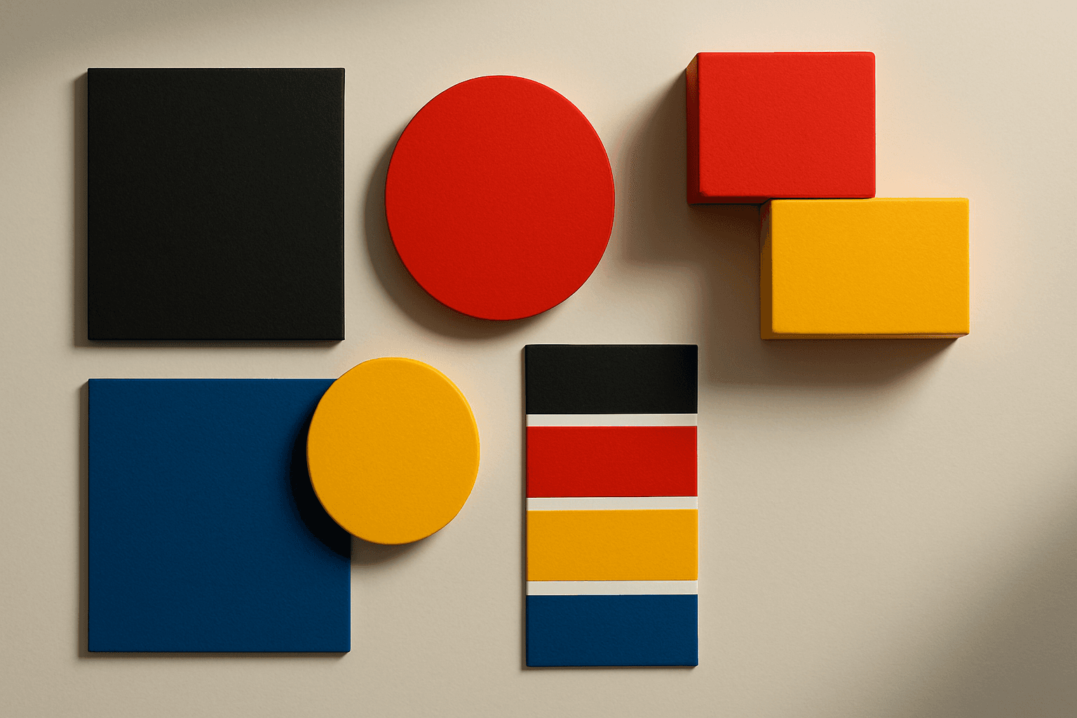
High Contrast Colors
High Contrast Colors use strong differences in hue, value, or saturation to create visual impact. They help subjects stand out quickly.
Cool Color Palette
Cool Color Palette is useful when you want an image to feel clear, composed, and modern. It is common in healthcare, technology, finance, architecture, SaaS, clean beauty, and wellness visuals. The palette can reduce emotional heat and make a design feel more trustworthy or focused. For AI creators, this keyword is helpful when a scene needs professionalism or calm rather than warmth and intimacy.