Earth Tones
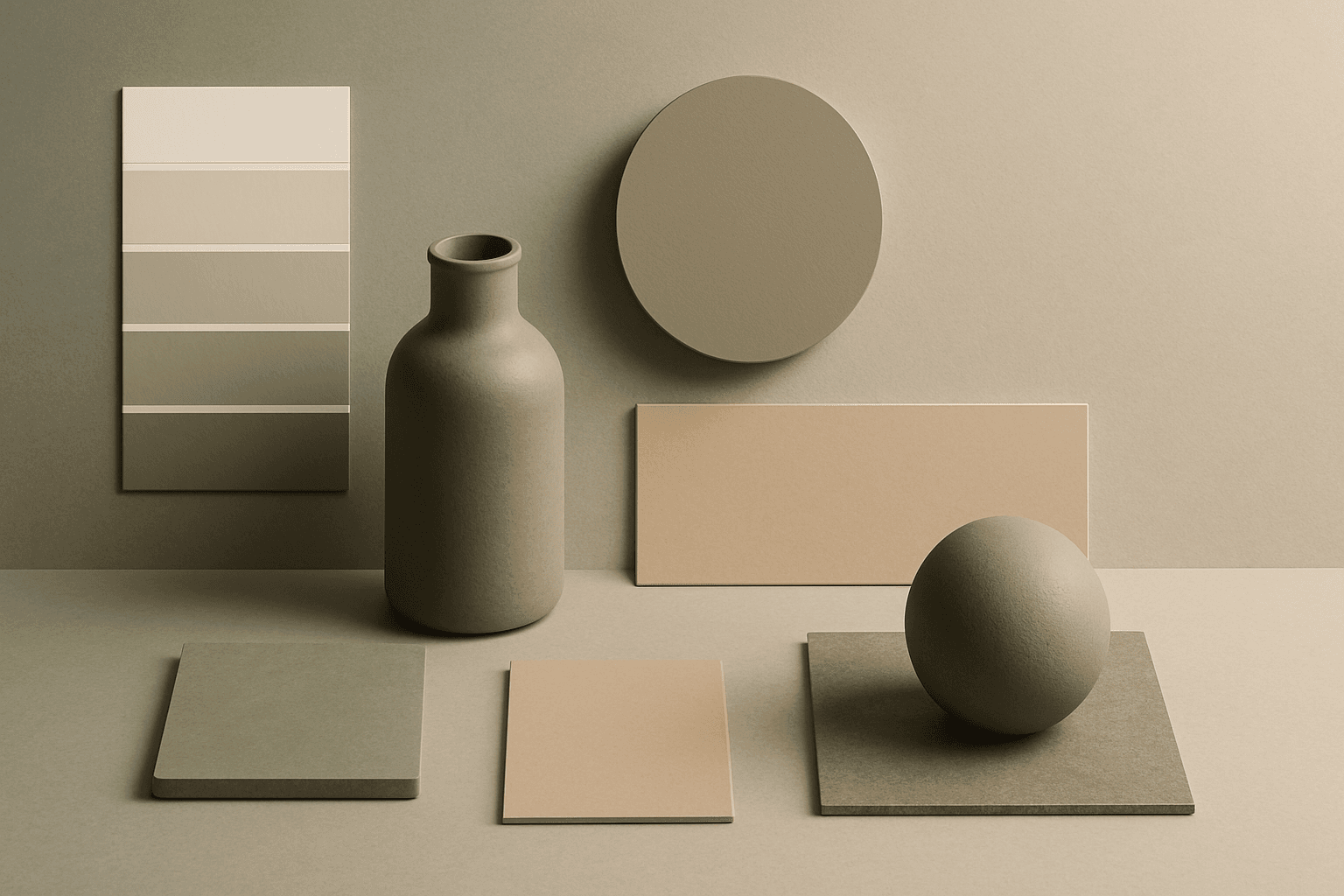
Earth Tones are natural colors inspired by soil, stone, clay, plants, wood, and sand. They create a grounded, organic, and sustainable feeling.

Definition
Earth Tones are natural colors inspired by soil, stone, clay, plants, wood, and sand. They create a grounded, organic, and sustainable feeling.
Visual Characteristics
- Brown, tan, olive, sage, terracotta, ochre, stone, cream, and warm gray tones.
- Natural, calm, warm, tactile, and environmentally aware mood.
- Works with organic modern, handmade goods, wellness products, and interiors.
Best Use Cases
- Sustainable brands, natural beauty, wellness, interiors, packaging, ceramics, and food.
- Stock concepts about ecology, grounding, craft, home, organic living, and care.
- Commercial visuals that should feel warm, natural, and trustworthy.
Prompt Examples
- A sustainable skincare package set, earth tones, paper texture, soft light, organic modern styling.
- An earth tones living room with linen sofa, olive pillows, clay vase, natural light.
- A handmade ceramic bowl product shot, earth tones, warm shadows, clean commercial composition.
Adobe Stock Potential
Earth Tones are strong for stock because wellness, sustainability, interiors, and organic lifestyle themes are broadly useful. Add contrast so images do not become muddy.
FAQ
Are earth tones only brown?
No. They include olive, sage, clay, sand, stone, cream, ochre, and muted greens.
What brands use earth tones well?
Wellness, eco, home decor, food, handmade, and natural beauty brands often benefit from them.
Continue Exploring
Related Prompts
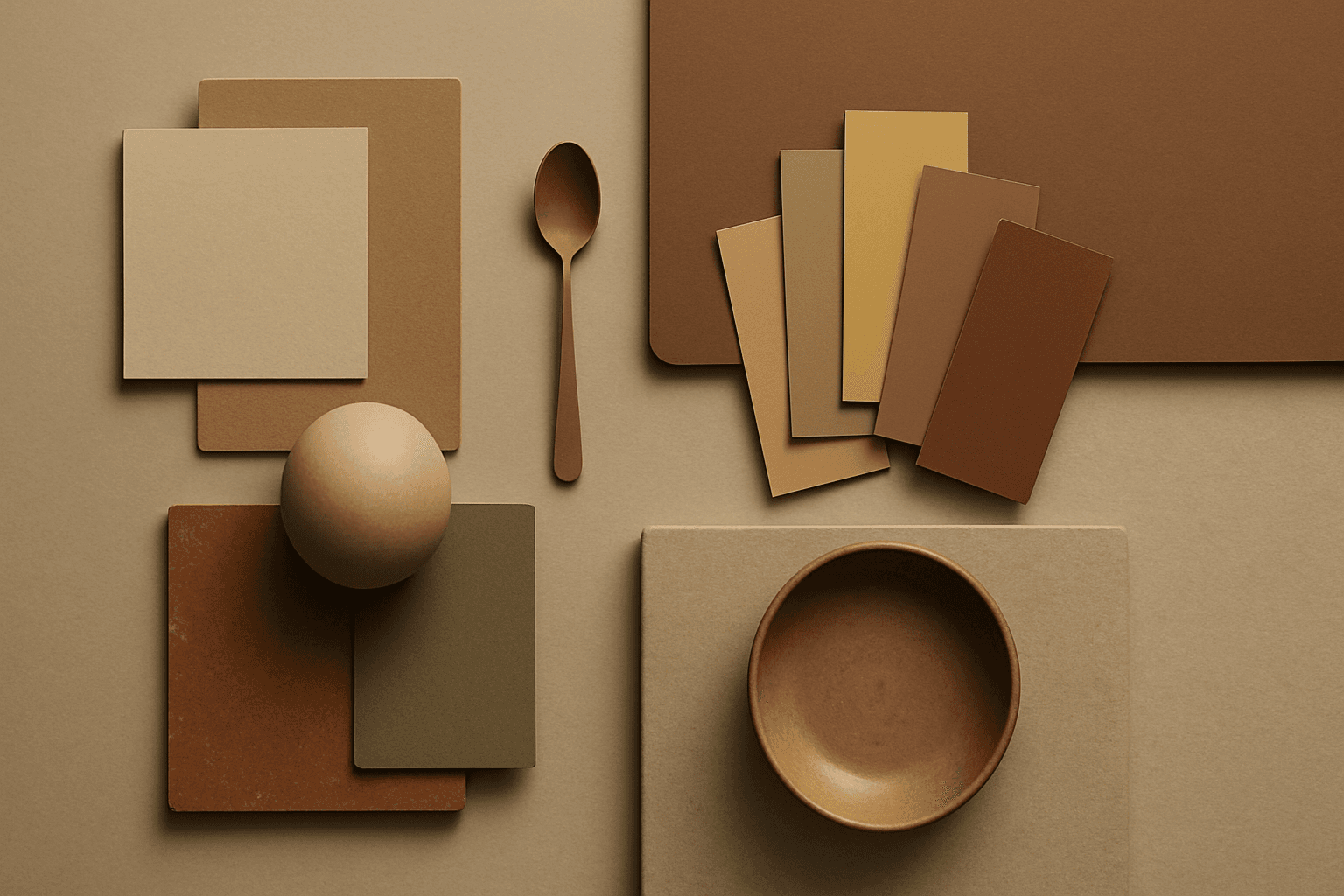
Earth Tone Colors
Earth Tone Colors are useful for creating grounded, organic, and commercially current AI images. They are common in wellness branding, sustainable packaging, interiors, handmade products, food, outdoor lifestyle, and natural beauty campaigns. For stock creators, earth tones can communicate authenticity and trust without needing obvious eco symbols. They also work well in minimalist layouts because the palette is calm but still warm.
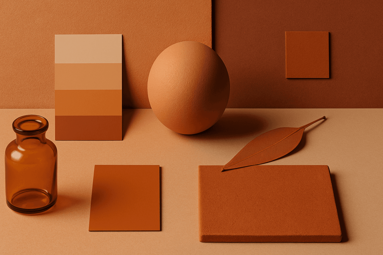
Warm Tones
Warm Tones are colors with red, orange, yellow, peach, tan, clay, or golden undertones. They create comfort, optimism, energy, and human warmth.
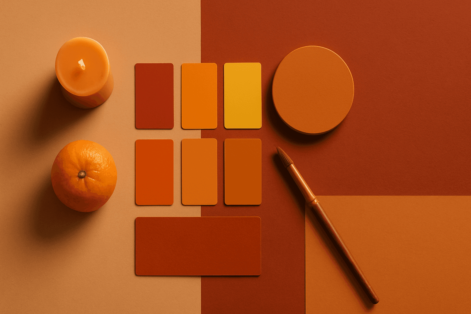
Warm Color Palette
Warm Color Palette is a practical keyword for guiding emotional tone. It can make a breakfast scene feel cozy, a travel image feel sunny, or a brand visual feel more approachable. Warm palettes are strong for commercial images because they connect quickly with themes like comfort, care, family, food, hospitality, wellness, and optimism. For beginners, this keyword is easier to control than listing many individual colors.
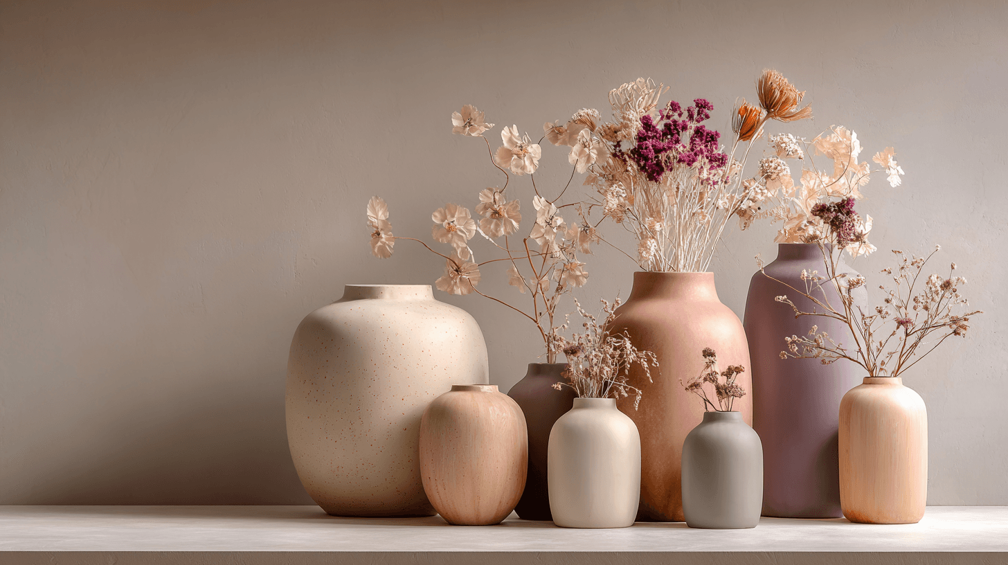
Morandi Palette
Morandi Palette is a color keyword inspired by the quiet, dusty tones associated with painter Giorgio Morandi. In AI image prompts, it usually points the model toward muted, low-saturation colors such as dusty rose, warm gray, clay, sage, beige, soft blue, faded mauve, and stone. The effect is refined, calm, and slightly editorial. This palette is useful when you want an image to feel sophisticated without becoming cold or overly minimal. For beginners, Morandi Palette is a practical way to control color harmony. It can make a scene feel more tasteful, cohesive, and brand-ready, especially when default AI colors look too bright or artificial.

Soft Desaturated Palette
In AI-generated imagery, color palettes significantly influence the mood and visual impact of the final output. The Soft Desaturated Palette keyword directs AI models to render images with subdued colors by lowering saturation and brightness levels. This approach creates an image that feels gentle to the eye, with a natural yet understated aesthetic. By avoiding vibrant hues and opting for soft tones, this palette supports designs requiring subtlety and sophistication. It is particularly beneficial when the goal is to communicate calmness, nostalgia, or elegance, making the image appropriate for editorial layouts, fashion shoots, interior designs, and social media visuals.
Muted Colors
Muted Colors are useful when you want AI-generated images to feel sophisticated instead of loud. They are common in interiors, lifestyle photography, fashion editorials, packaging, wellness brands, and business imagery. For stock creators, muted palettes can make images more flexible because they do not overpower text or brand elements. They also help avoid the overly saturated look that many AI images produce by default.